InkBand's Rebranding Success Featured on World Brand Design Society
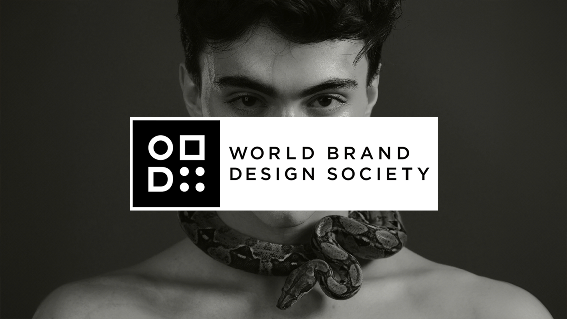
We are thrilled to announce that our comprehensive rebranding project for InkBand has been featured on World Brand Design Society (WBDS). This recognition underscores our commitment to creating impactful and innovative brand identities that resonate with target audiences and drive business success.
About InkBand
InkBand, a pioneering brand in tattoo care, was founded in 2016 through the collaboration of an anesthesiologist and a renowned tattoo artist. Their shared vision was to create innovative products tailored to the needs of tattooed individuals, quickly establishing InkBand as a trusted name in the industry. As the market evolved, InkBand recognized the need for a comprehensive rebranding to better align with its core values and capture the essence of its dynamic identity.
Challenges
InkBand faced several critical challenges in the competitive landscape of tattoo care:
Revitalizing Brand Image: The brand needed to resonate with its target audience while maintaining its reputation for credibility and boldness.
Redefining Positioning: InkBand aimed to reflect its innovative spirit and appeal to a diverse demographic of tattoo enthusiasts.
Differentiation: The brand sought to establish a fresh identity that would command attention and evoke a sense of empowerment.
Solution
Our team embarked on a strategic journey to reimagine InkBand’s brand identity:
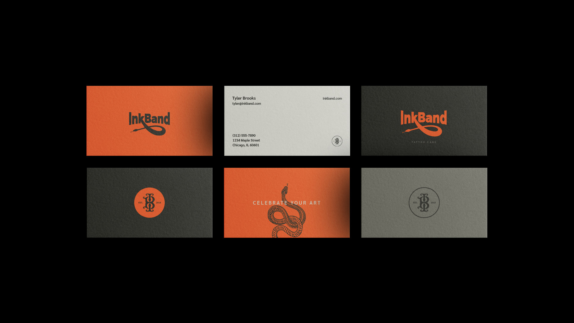
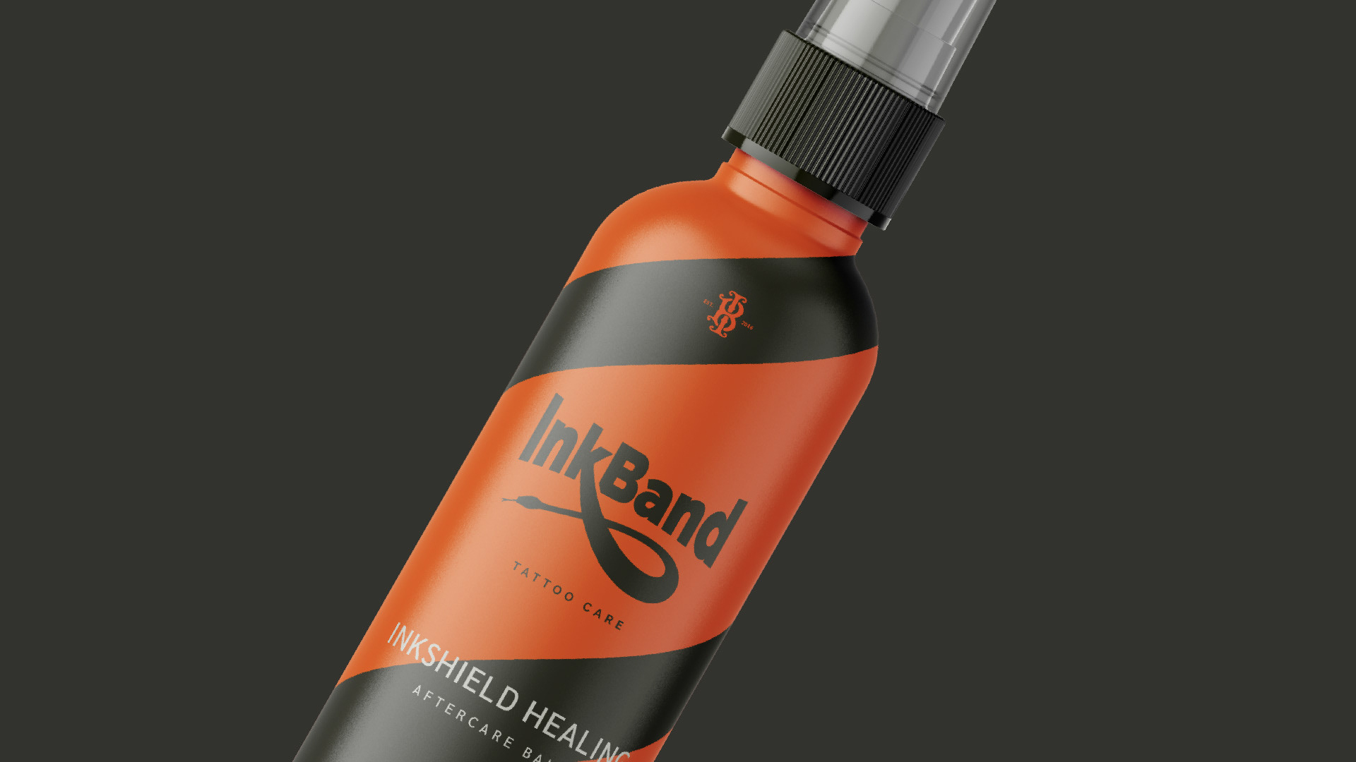
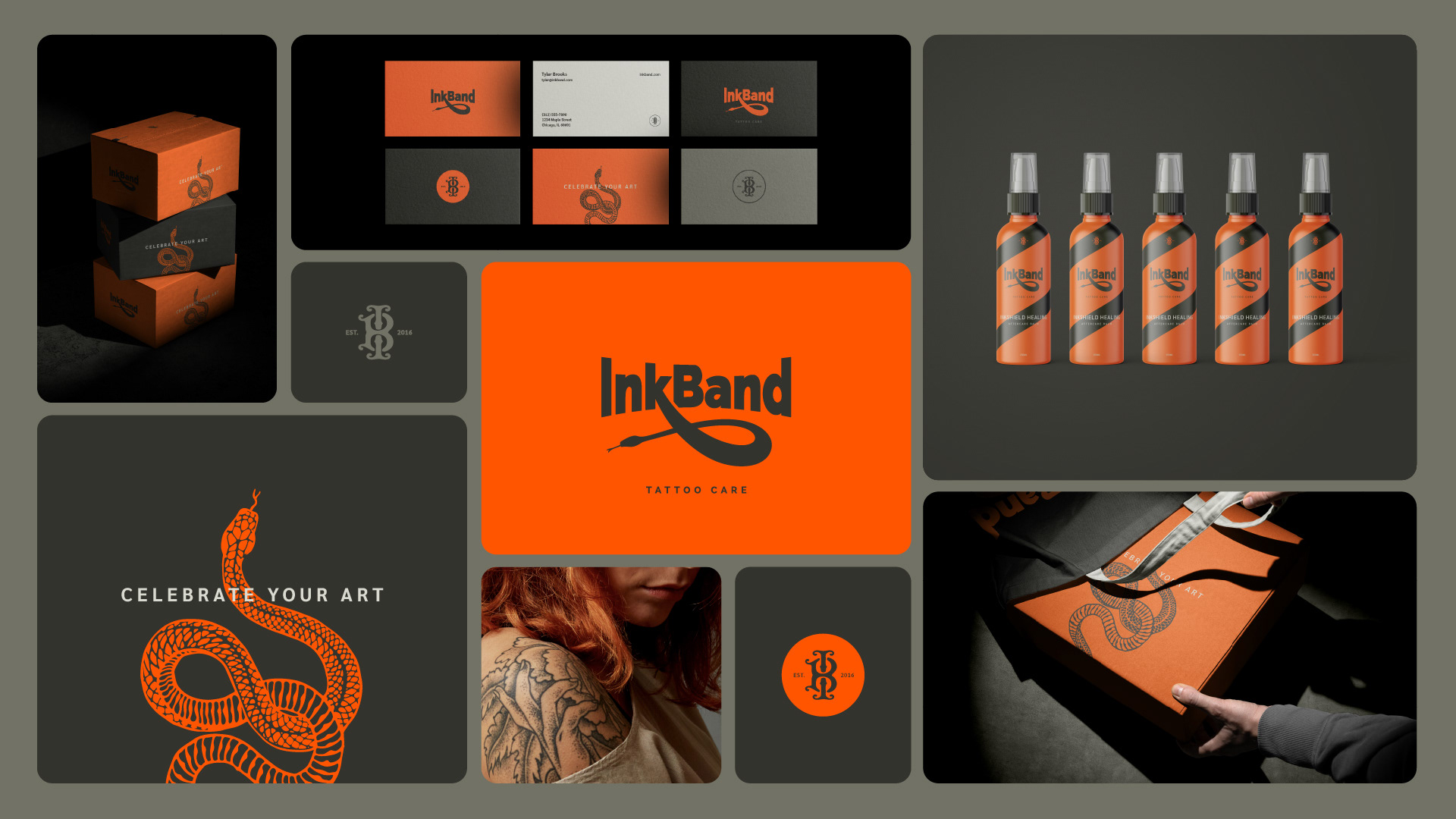
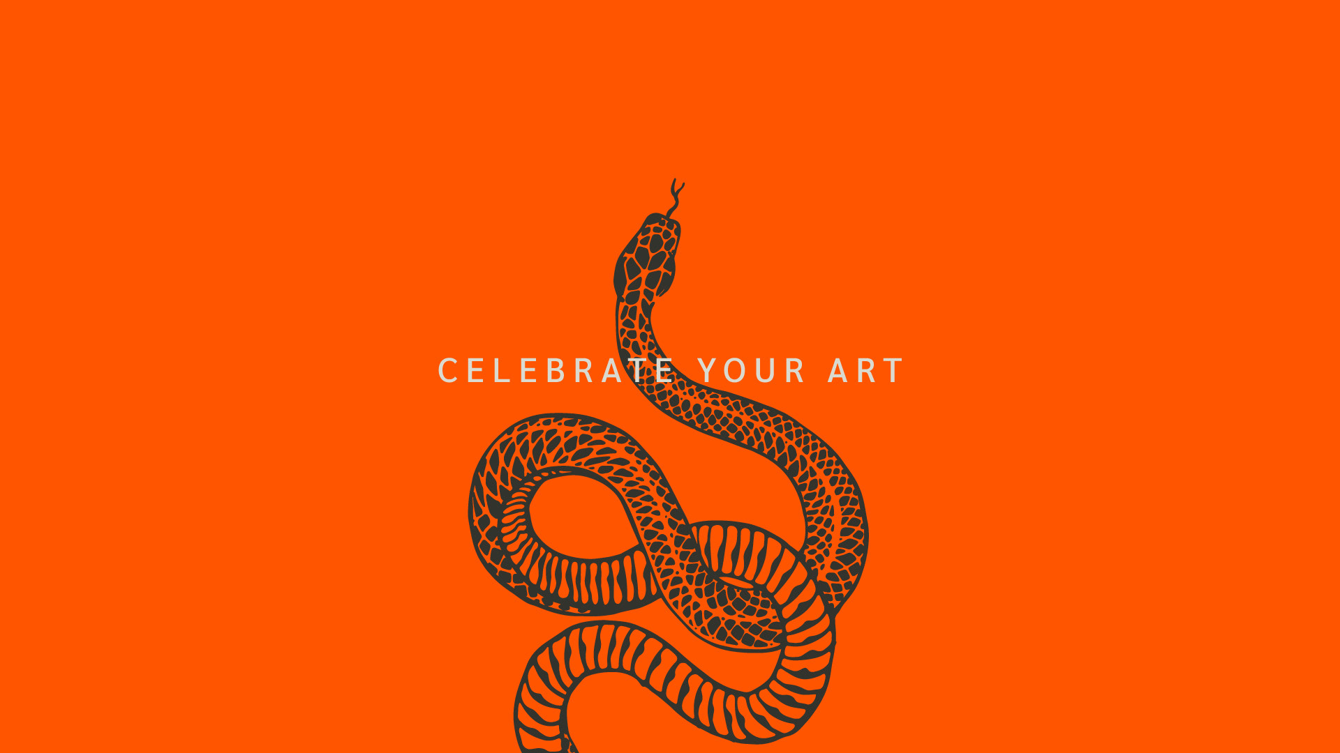
Inspired by Renewal: Drawing from the concept of skin renewal symbolized by the shedding of snake skin, we developed a bold and dynamic logo featuring a distinctive snake motif. This emblem not only conveyed the idea of renewal but also underscored the brand’s association with healing and aftercare.
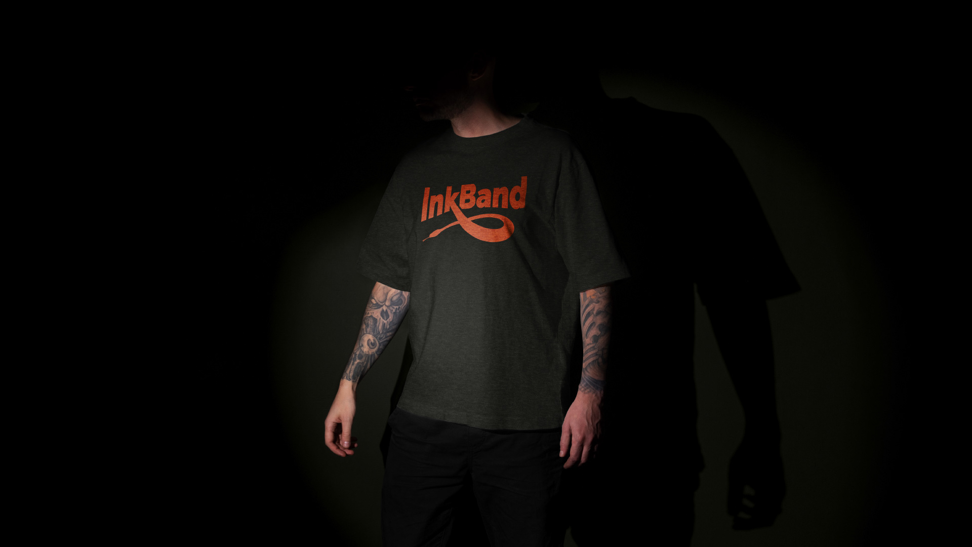
Visual Elements: Complemented by a custom monogram icon and a vibrant color palette, the new branding exuded energy and modernity while retaining credibility and professionalism.
Packaging Innovation: We implemented a cohesive packaging design featuring a spiral motif inspired by the snake’s coiled form. This not only enhanced product visibility but also reinforced InkBand’s identity as a leader in tattoo care.
Photography System: Our curated photography system showcased InkBand’s products in both vibrant color and soft grayscale tones, capturing the brand’s bold yet versatile personality.
Outcome
The rebranding initiative yielded remarkable results:
Recognition and Acclaim: InkBand soared to new heights within the tattoo care market. Consumers resonated with the refreshed brand identity, reflecting InkBand’s commitment to innovation, quality, and empowerment.
Symbol of Strength: With its bold aesthetic and compelling messaging, InkBand emerged as a symbol of strength, individuality, and self-expression.
Trusted Ally: Solidifying its position, InkBand continues to evolve and expand its product offerings, embodying the spirit of empowerment and self-expression.
We are proud of the transformation and success InkBand has achieved through our collaborative efforts. This feature on WBDS not only highlights the excellence of our work but also celebrates InkBand’s journey and growth within the tattoo care industry. We look forward to continuing to create brands that inspire and lead in their respective markets.