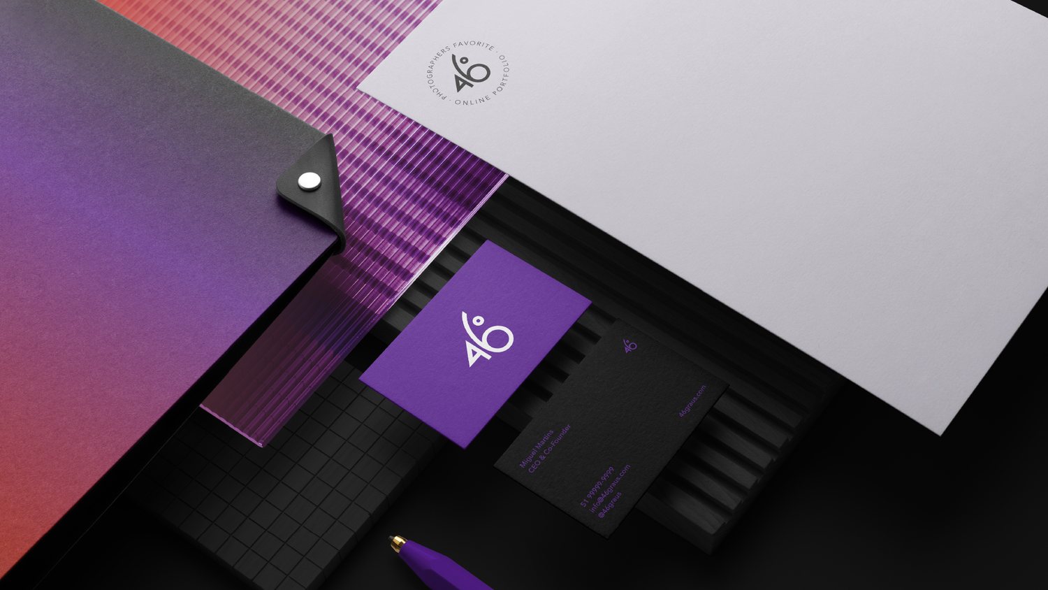
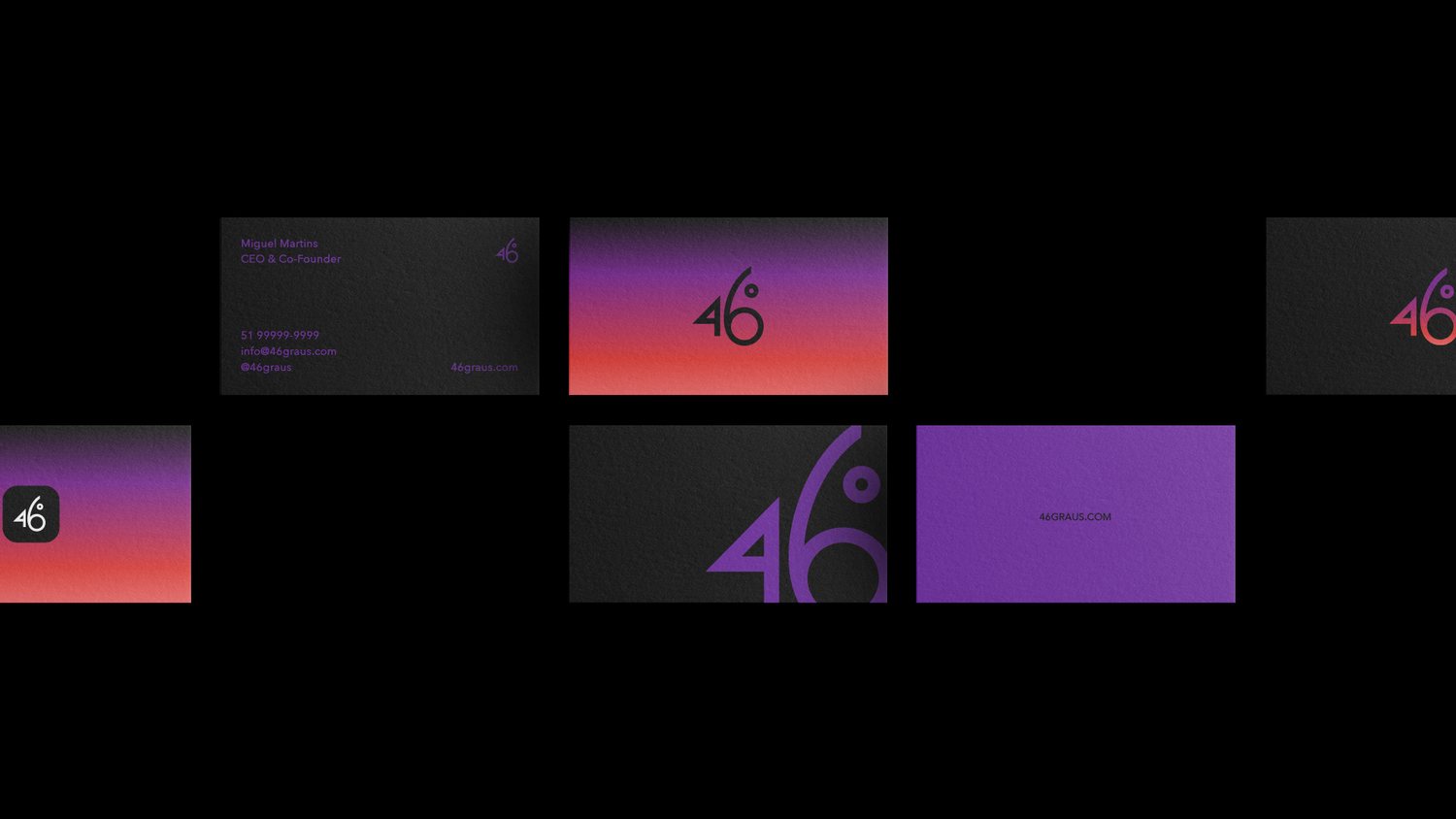
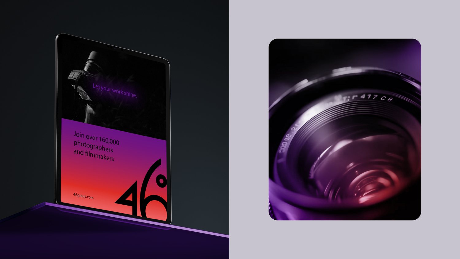
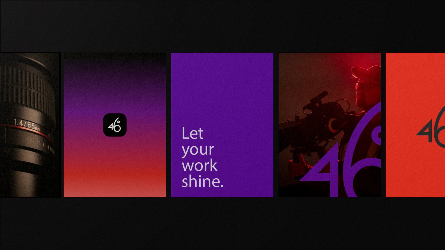
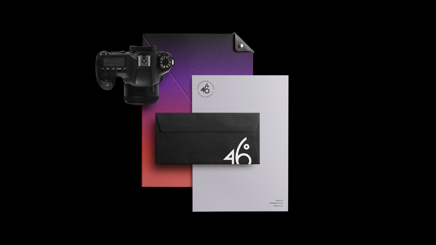
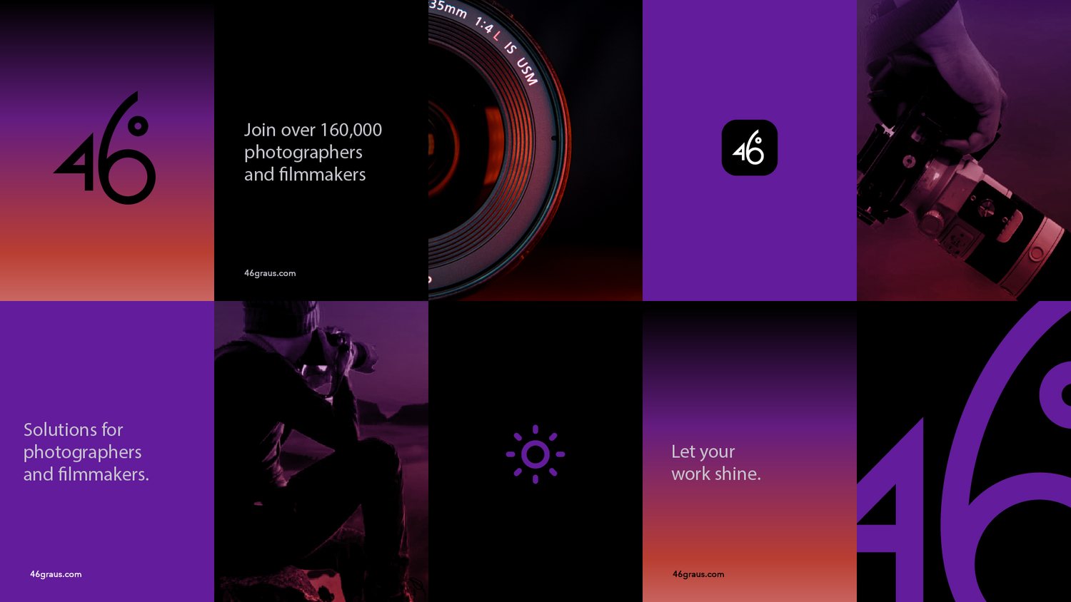
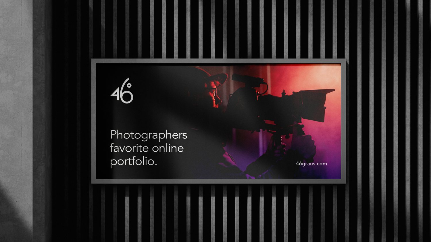
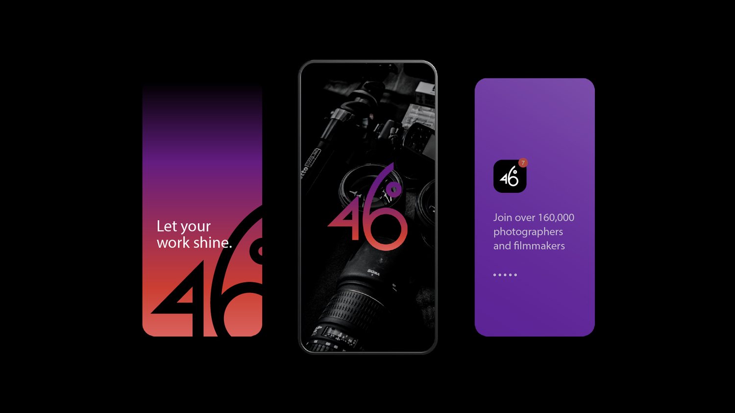
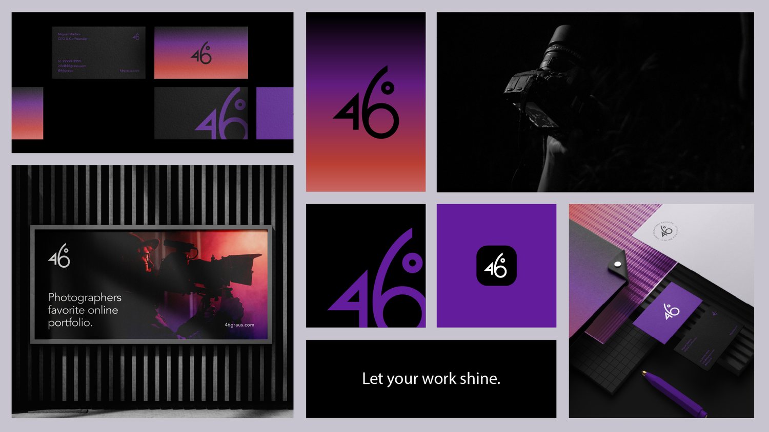
There's a version of this identity that leans harder into the angle: sharper type, louder color, a wordmark that shouts its own cleverness. INDUSTRIA didn't build that version. What shipped for 46º is quieter, and it's better for it.
The mark itself is almost embarrassingly simple: a number and a degree symbol, set in a single confident weight, with just enough negative space around the ring to let it breathe. It's the kind of solution that looks obvious in hindsight. That's usually the sign a studio spent real time getting it there.
What earns this a feature isn't the cleverness of the idea. It's the discipline in the execution: a monochrome palette, one typeface doing all the work, a guidelines system that resists the urge to add a single unnecessary flourish. At a time when identity work keeps reaching for more, 46º is a study in what happens when a studio decides less is actually the harder brief.