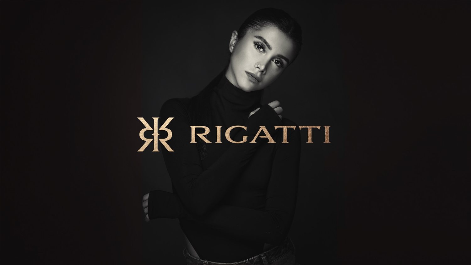
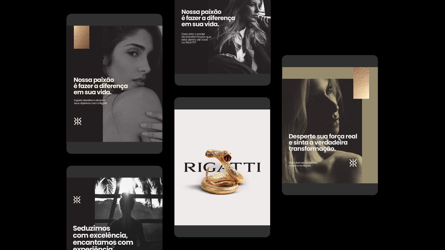
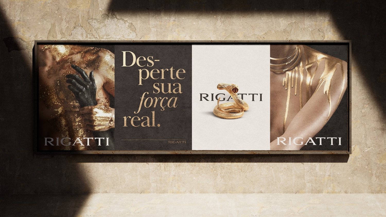
Medical branding has a sameness problem: clinical sans-serif, a blue that's trying too hard to say "trust," a stock photo of a handshake. RIGATTI is one of the rare identities in this year's selection that doesn't reach for any of it.
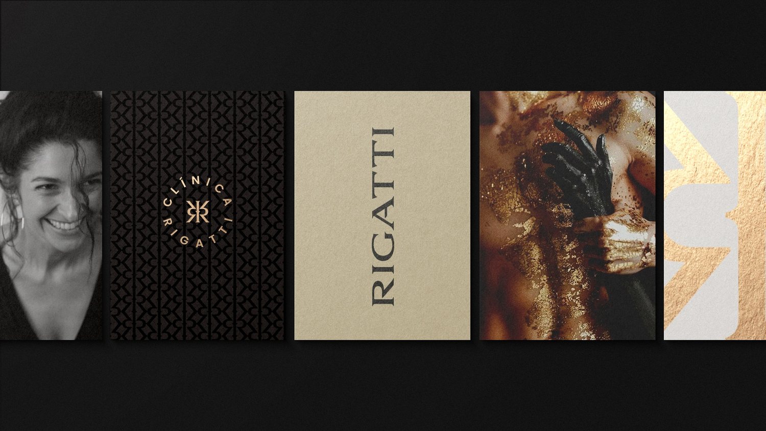
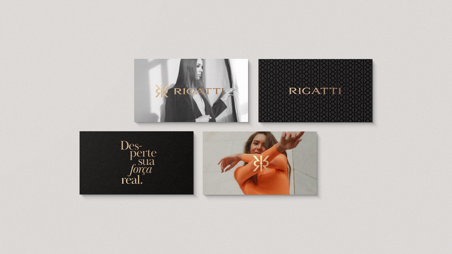
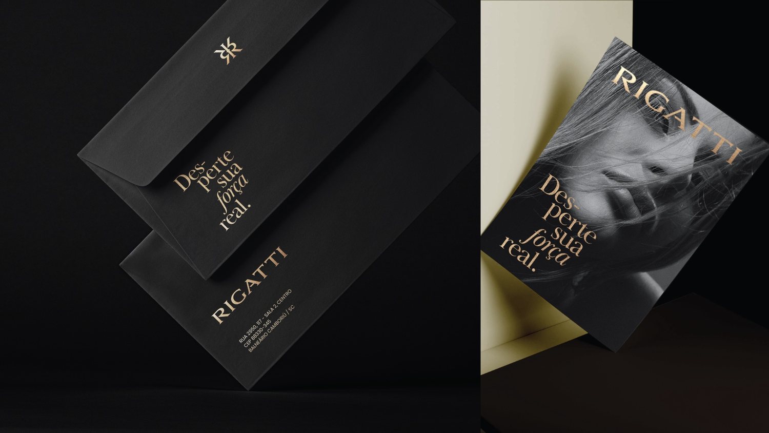
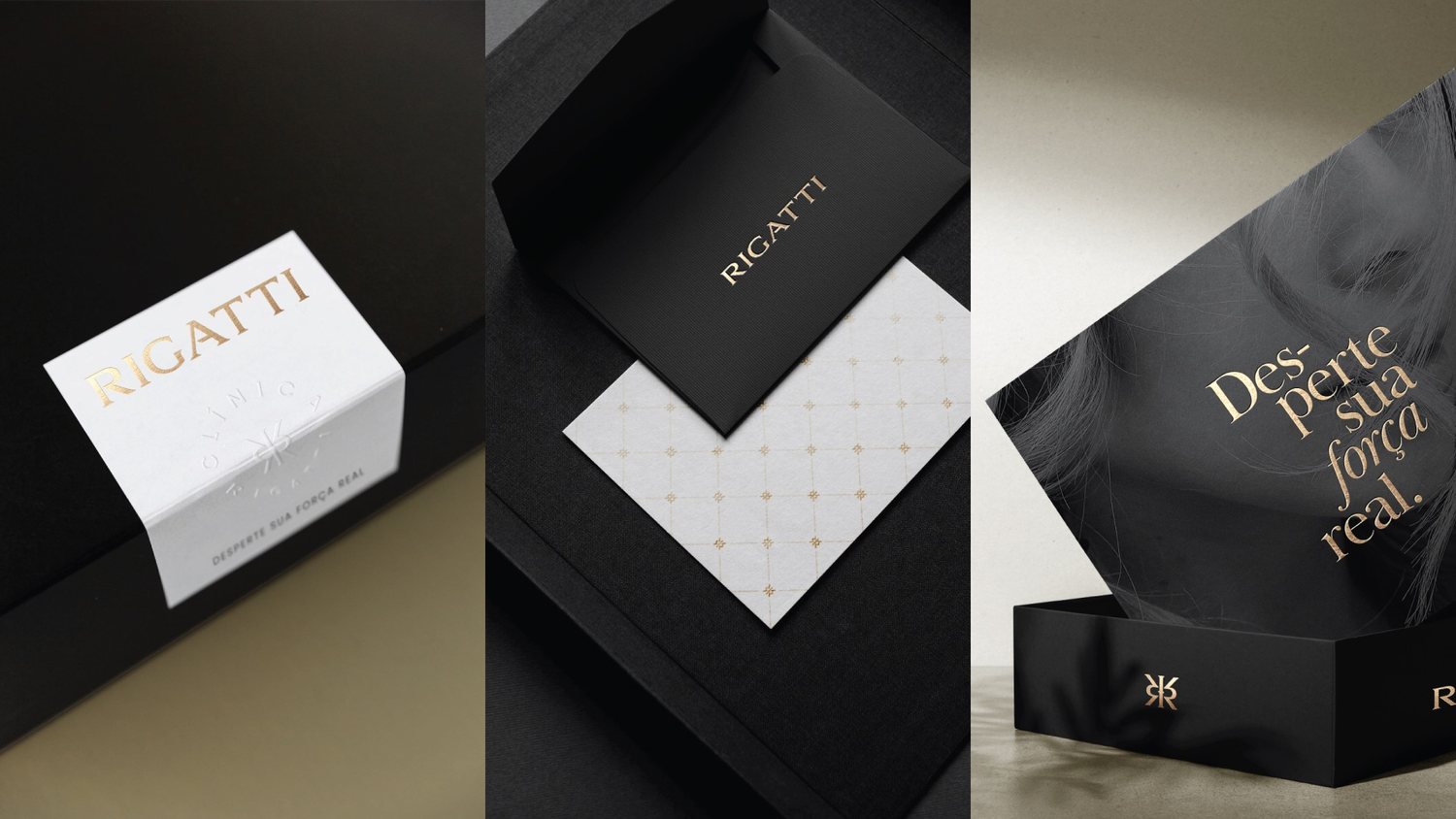
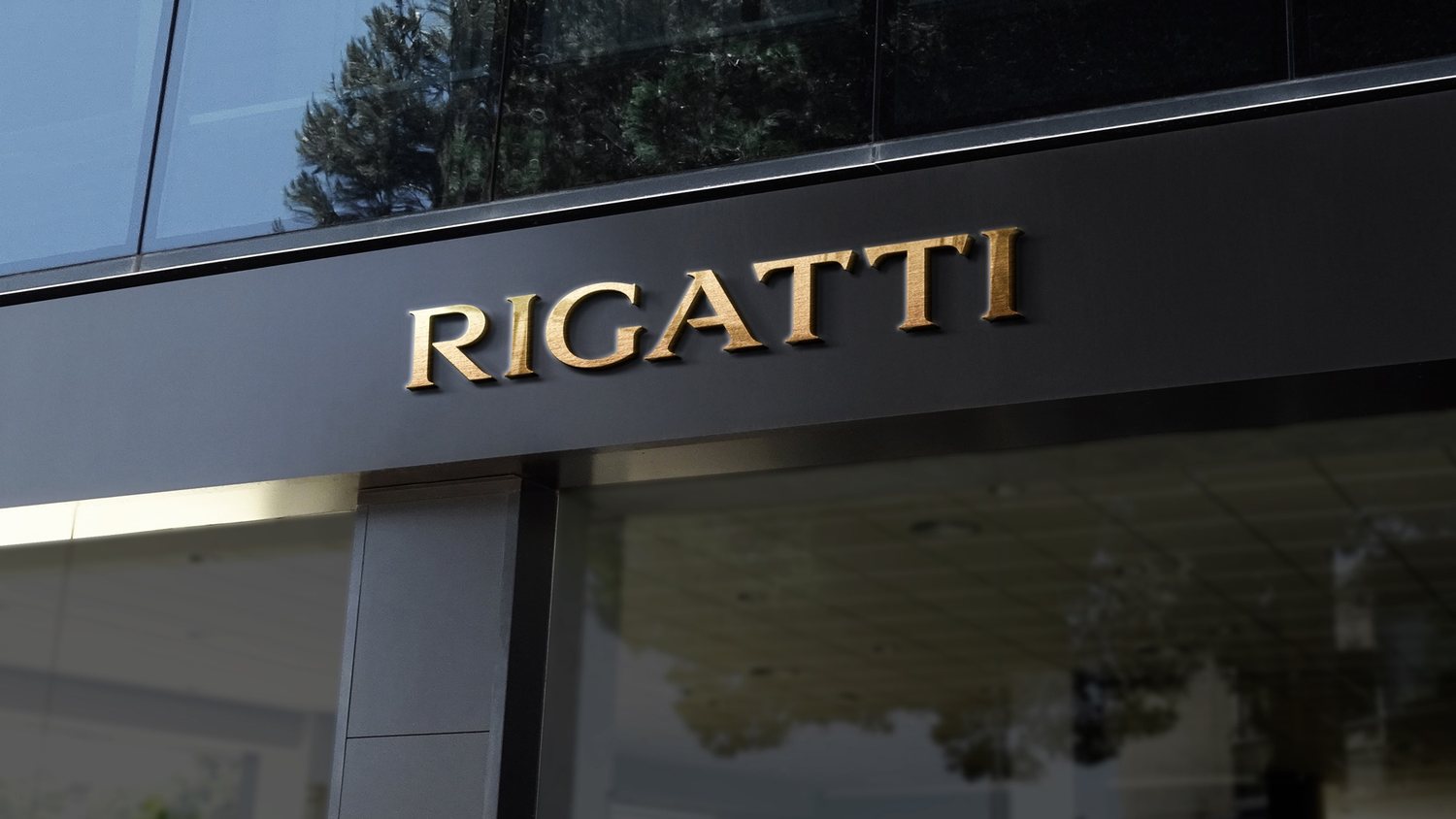
The monogram, two interlocking R's drawn with the precision of a signature rather than a logo, carries the whole system. It's confident enough to stand alone on clinic signage, refined enough to sit on a candle box without competing for attention. That balance is harder to hit than it looks, and it's exactly why the panel kept coming back to this one.
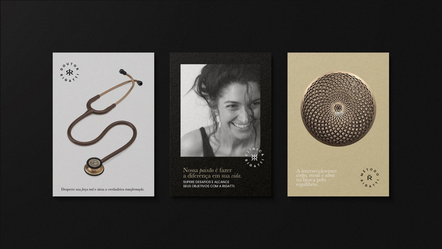
INDUSTRIA built RIGATTI a brand architecture around three pillars (Doctor, Clinic, Method) that lets a single practice read as a considered, established name instead of another wellness practitioner in a crowded feed. This year's list is full of loud ideas. RIGATTI made the cut on the strength of a quiet one, executed without a single wasted line.