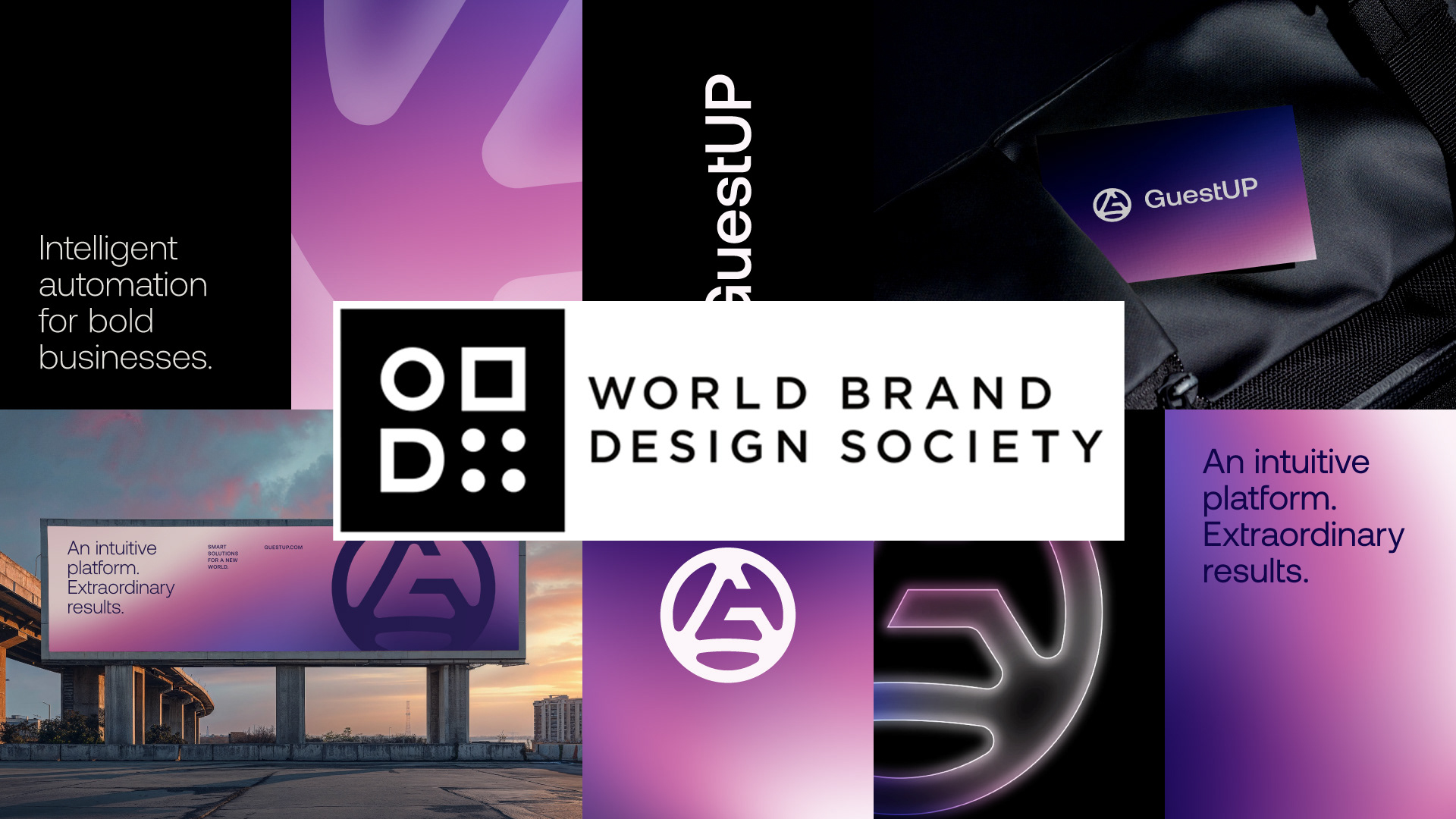
GuestUP Featured on World Brand Design Society
Elevating ERP Through Strategic Brand Identity
We are proud to announce that our branding project for GuestUP has been published on the prestigious World Brand Design Society (WBDS) — a global platform that benchmarks excellence in corporate and consumer brand design.
This recognition reinforces our commitment to developing strategic brand identities that transform complex businesses into clear, compelling, and scalable brands.
Repositioning ERP for the Modern Business Landscape
GuestUP is an innovative technology startup delivering customized ERP solutions designed to integrate and simplify core business operations. From financial management and payroll processing to workflow optimization and data visualization, the platform offers companies a unified and intuitive system experience.
The branding challenge was significant.
ERP systems are traditionally perceived as rigid, overly technical, and difficult to navigate. Our objective was to reposition GuestUP as a modern, intelligent, and user-centered technology partner — a platform that empowers businesses rather than overwhelms them.
Translating Complexity into Clarity
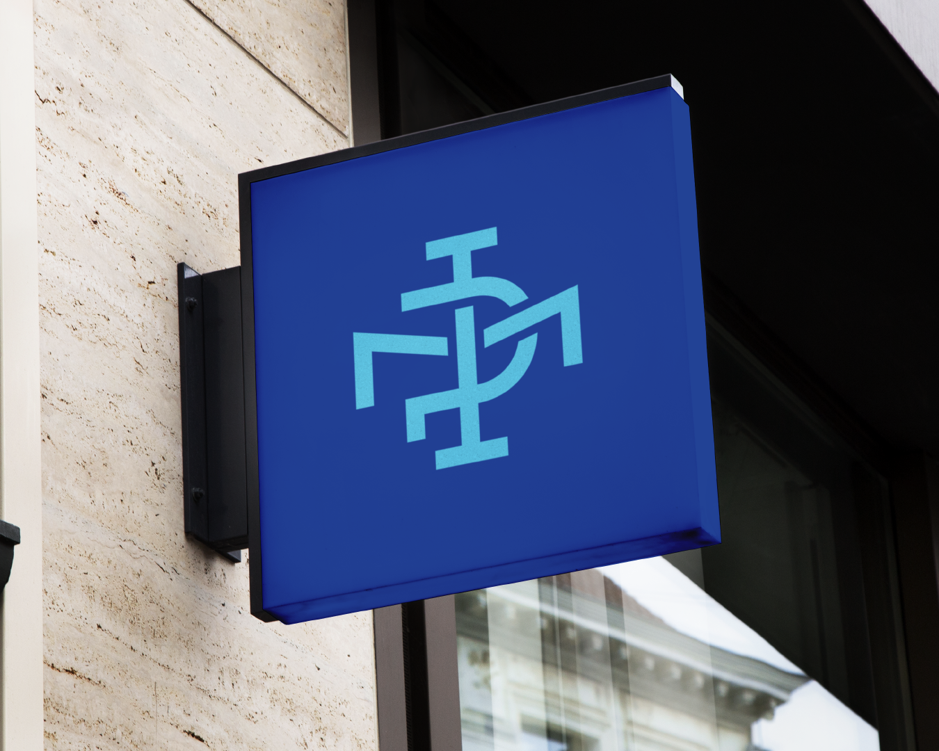
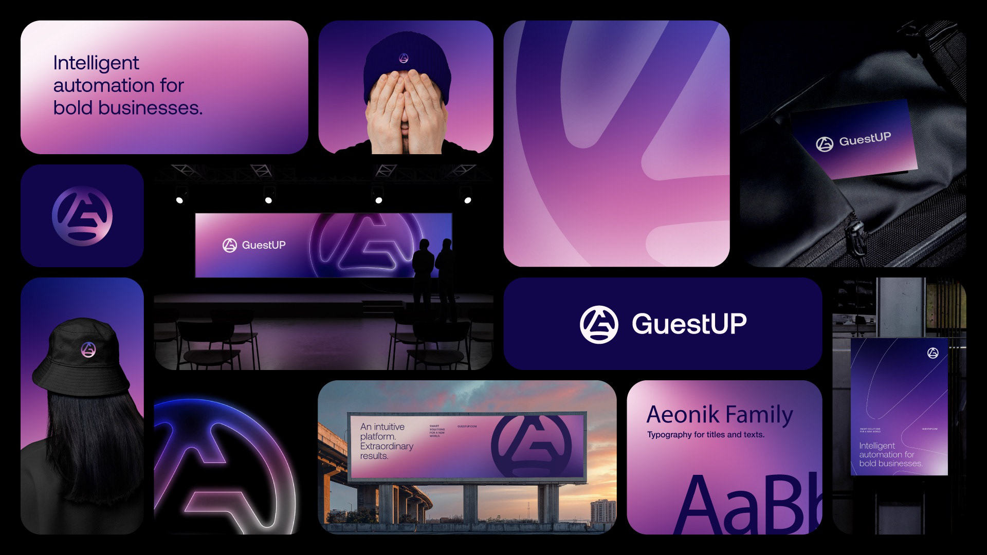
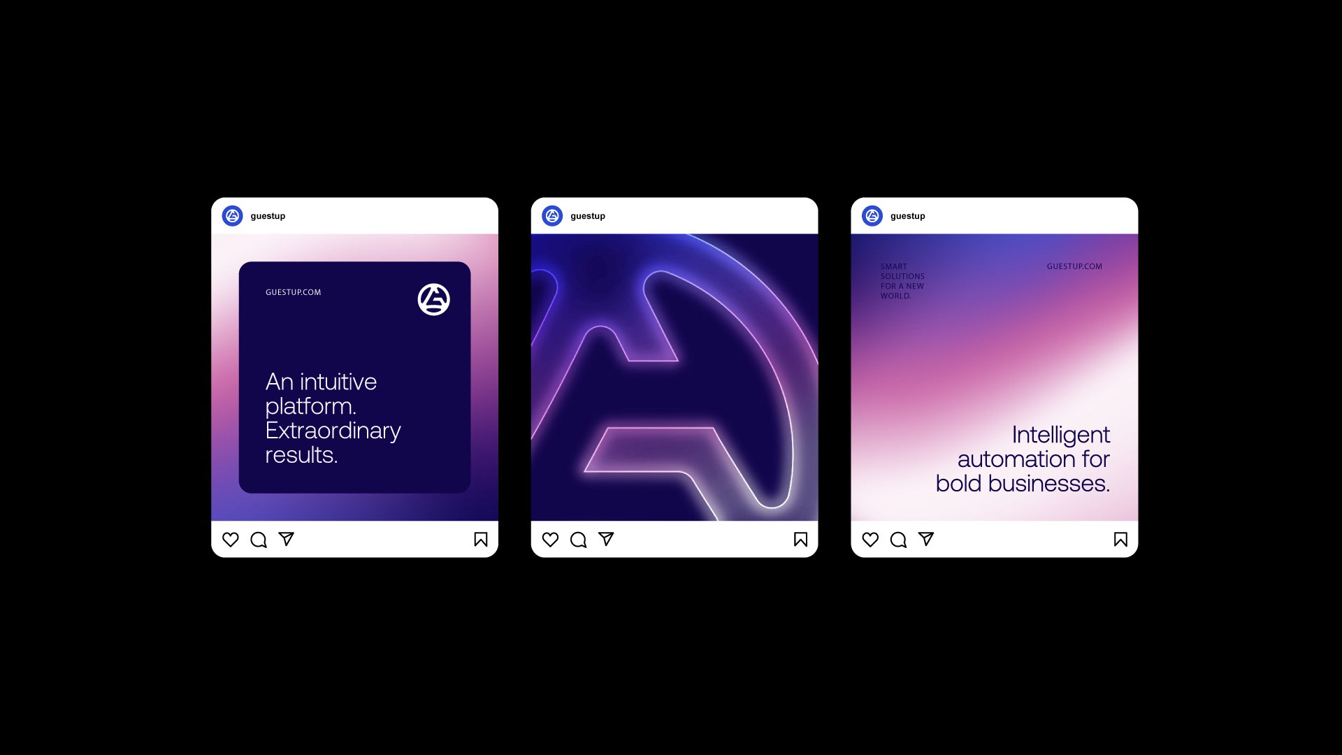
At the heart of the new identity is a strategic visual system built around growth, precision, and forward momentum.
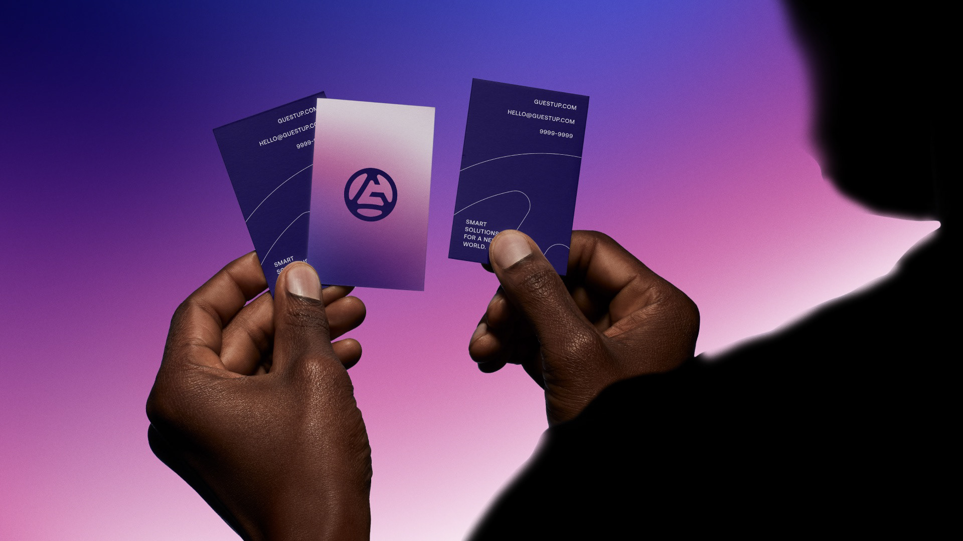
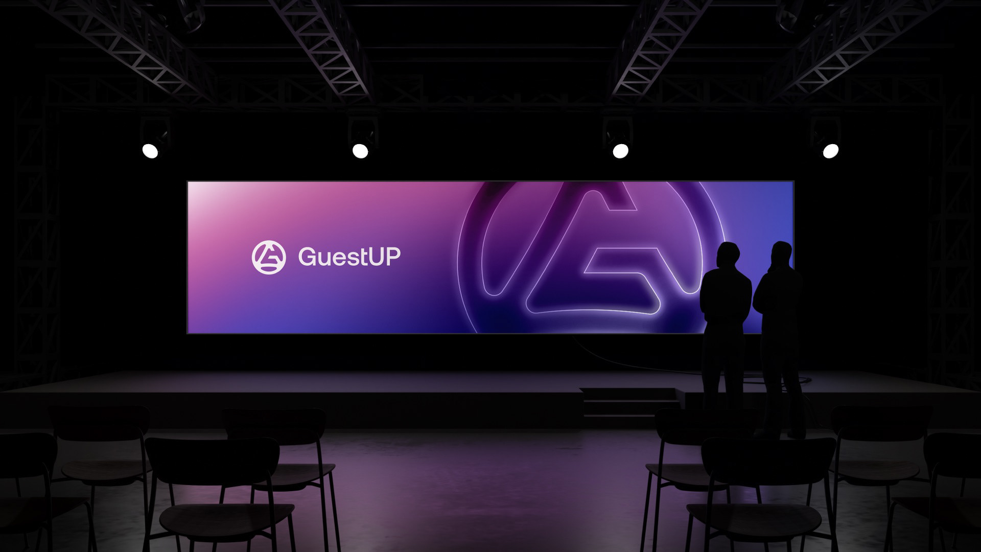
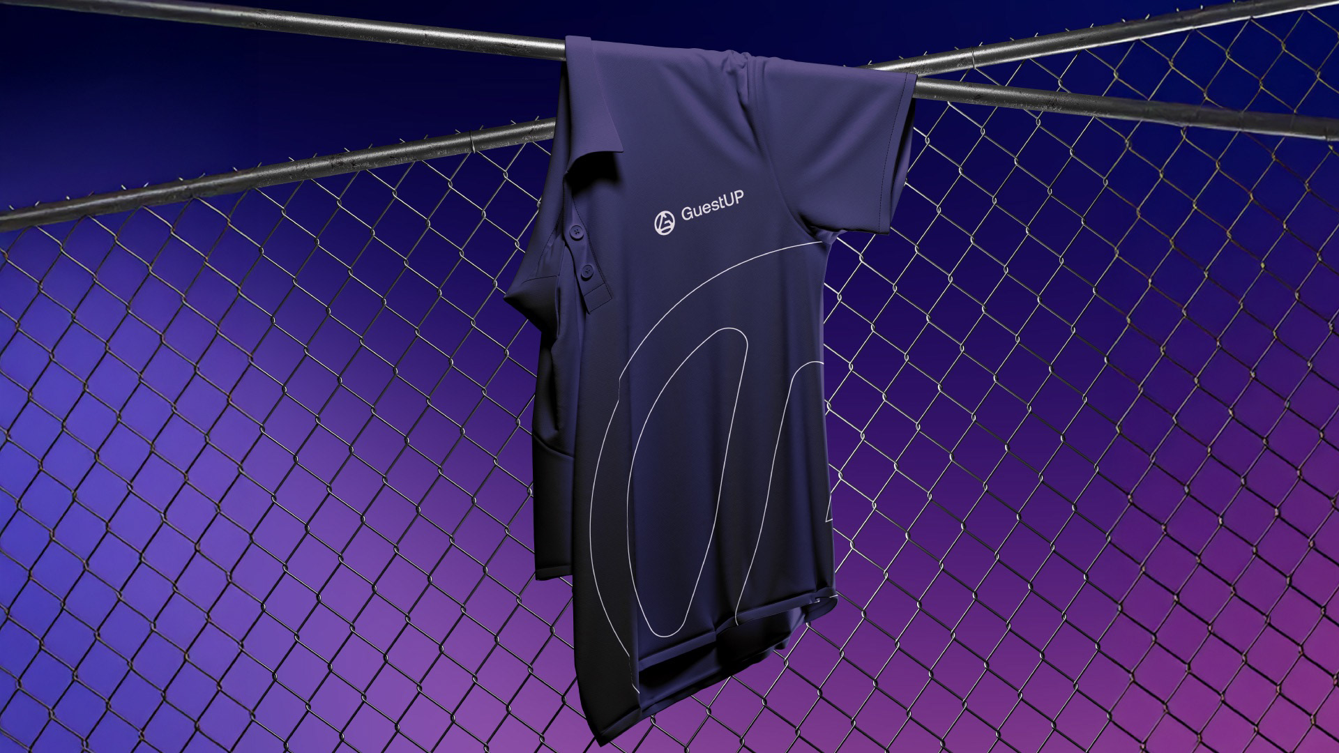
The custom “G” symbol was designed as an upward arrow — a visual metaphor for elevation, performance, and measurable progress. Enclosed within a circular form, the symbol represents the ecosystem of companies connected and supported by GuestUP’s integrated technology.
This balance between movement and structure mirrors the platform itself: dynamic, yet reliable.
A Color Strategy Built on Trust and Innovation
Color plays a critical role in technology branding.
We established a structured blue foundation to communicate stability, credibility, and technological authority. Complementing this base, a vibrant gradient introduces dynamism and innovation — reinforcing GuestUP’s forward-thinking mindset and adaptability in a fast-evolving digital environment.
Typography was selected to balance clarity and modernity, ensuring strong legibility across web platforms, dashboards, presentations, and marketing materials.
The result is a visual identity that feels intelligent, scalable, and confident.
A Cohesive System Designed for Growth
Beyond the logo, we developed a comprehensive brand identity system adaptable across:
Website and digital interfaces
Product dashboards
Corporate presentations
Sales materials
Marketing campaigns
The brand now reflects the true essence of GuestUP: a contemporary ERP partner built for ambitious companies seeking clarity, integration, and performance.
A Milestone Worth Celebrating
Being featured on World Brand Design Society highlights the strategic depth and design precision behind this project. It is a testament to how strong brand positioning can elevate even the most technical industries.
At INDUSTRIA® Branding Co., we believe technology brands should feel human, intelligent, and future-ready.
GuestUP is proof that when strategy and design align, complexity becomes clarity — and systems become experiences.