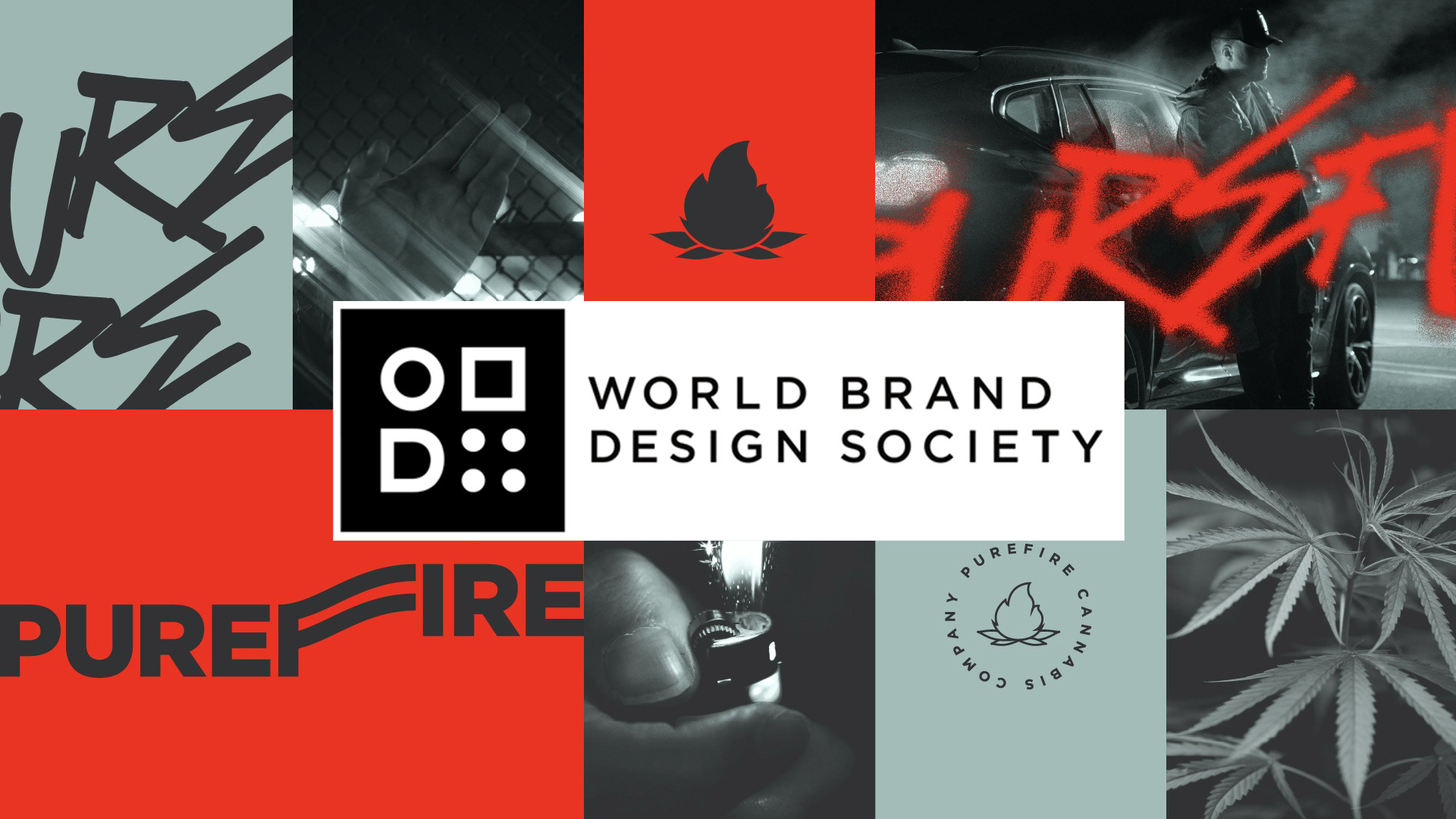
PUREFIRE® Featured on World Brand Design Society
We are proud to share that our branding work for PUREFIRE® has been officially featured on World Brand Design Society, one of the most respected global platforms recognizing excellence in branding and packaging design.
Igniting a New Cultural Narrative
PUREFIRE® was conceived to embody the ritual, energy, and cultural intensity surrounding modern cannabis consumption in Colorado. In a market often saturated with predictable aesthetics — botanical references, muted wellness palettes, and medicinal minimalism — our objective was to challenge the visual status quo.
Instead of softness, we chose ignition.
Instead of passivity, presence.
PUREFIRE® positions itself as bold, urban, and unapologetically expressive. It is a brand rooted in culture rather than cliché.
Built on Tension
At the heart of the identity lies a deliberate contrast: raw versus refined, street versus structured, ritual versus rebellion. This tension defines the system.
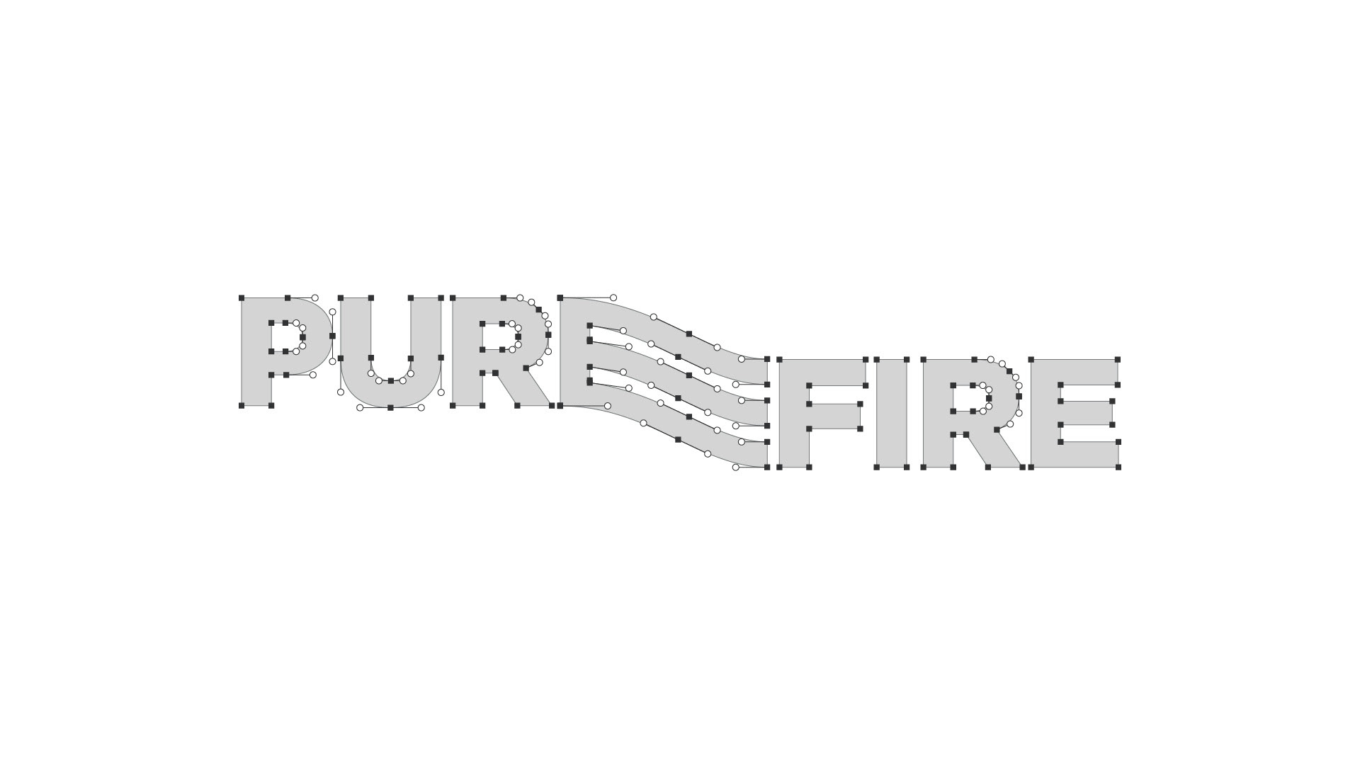
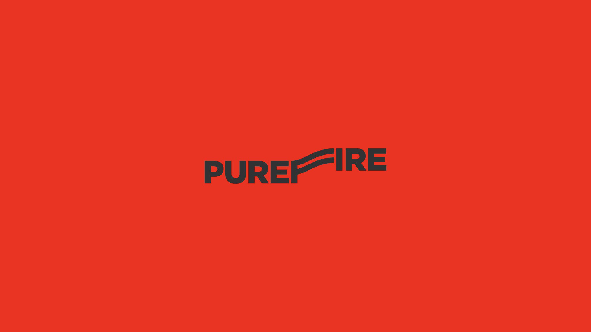
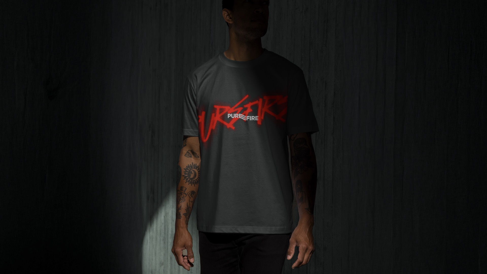
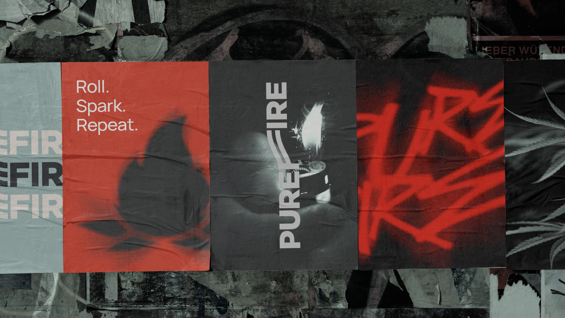
The custom wordmark integrates flowing linework within the typography, evoking smoke, heat, movement, and rhythm. These gestures symbolize repetition and ritual, reinforcing the brand mantra: Roll. Spark. Repeat.
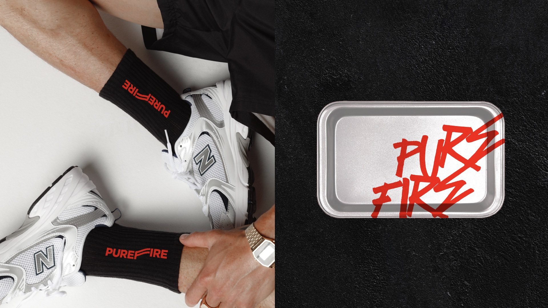
The flame emblem acts as a seal of purity and intensity, adaptable across packaging, apparel, retail materials, and lifestyle extensions. It signals authenticity while remaining flexible within a growing brand ecosystem.
Discipline Meets Disruption
The visual language balances structure with expressive energy. A minimal typographic foundation provides clarity and scalability, while red graffiti overlays inject cultural immediacy and edge. High-contrast photography and black-and-white textures amplify the urban dimension, grounding PUREFIRE® firmly within contemporary street culture.
The color strategy further reinforces the brand’s narrative. Muted sage introduces controlled calm. Deep charcoal anchors sophistication. Aggressive red ignites the composition with urgency and heat. Together, they create a visual dialogue between combustion and control.
Designed for Growth
Beyond aesthetics, PUREFIRE® was built as a scalable identity framework. The system performs seamlessly across product packaging, branded merchandise, social campaigns, and retail environments. It is structured for consistency, yet dynamic enough to evolve alongside the culture it represents.
PUREFIRE® is not about passive consumption.
It is about presence.
It is about spark.
It is about identity.
We are honored to see this project recognized by World Brand Design Society and to contribute to shaping contemporary cannabis branding through strategy, clarity, and cultural depth.