PUREFIRE®
BRAND POSITIONING + BRAND NAMING + BRAND DESIGN + LOGO DESIGN + PACKAGING DESIGN + BRAND GUIDELINES
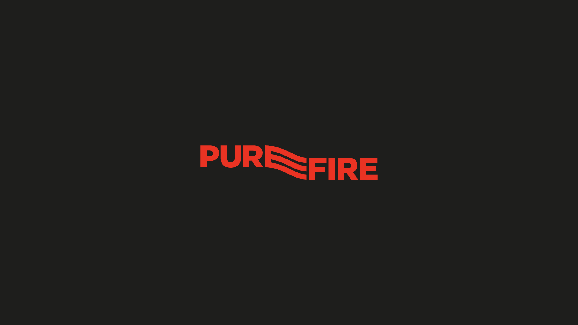
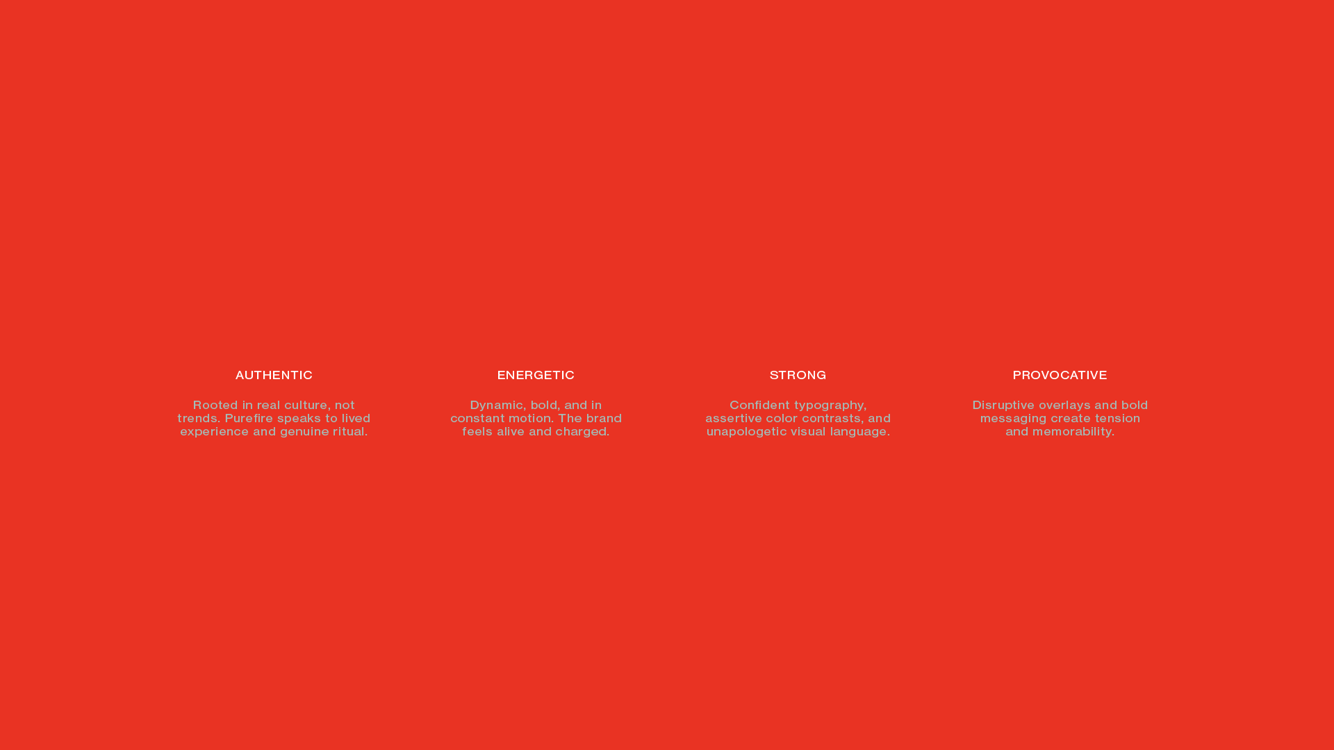
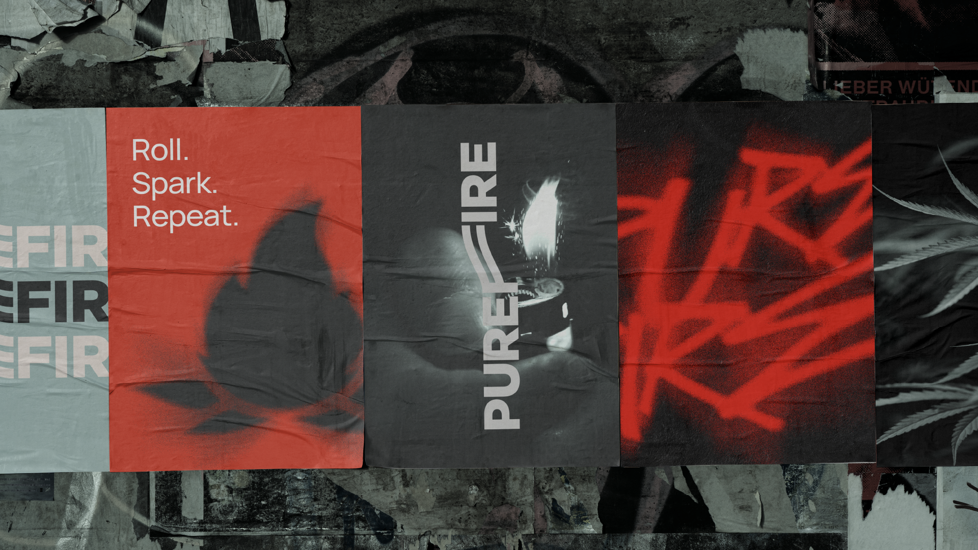
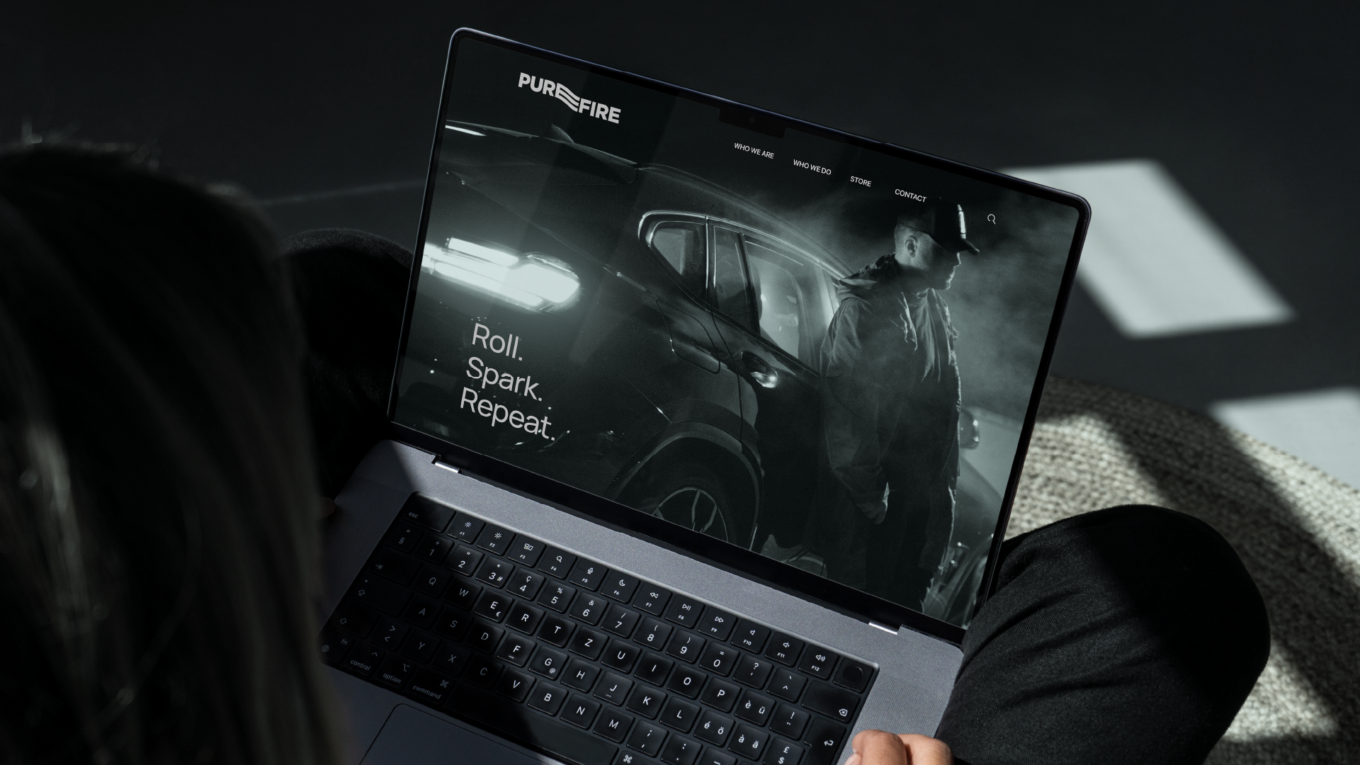
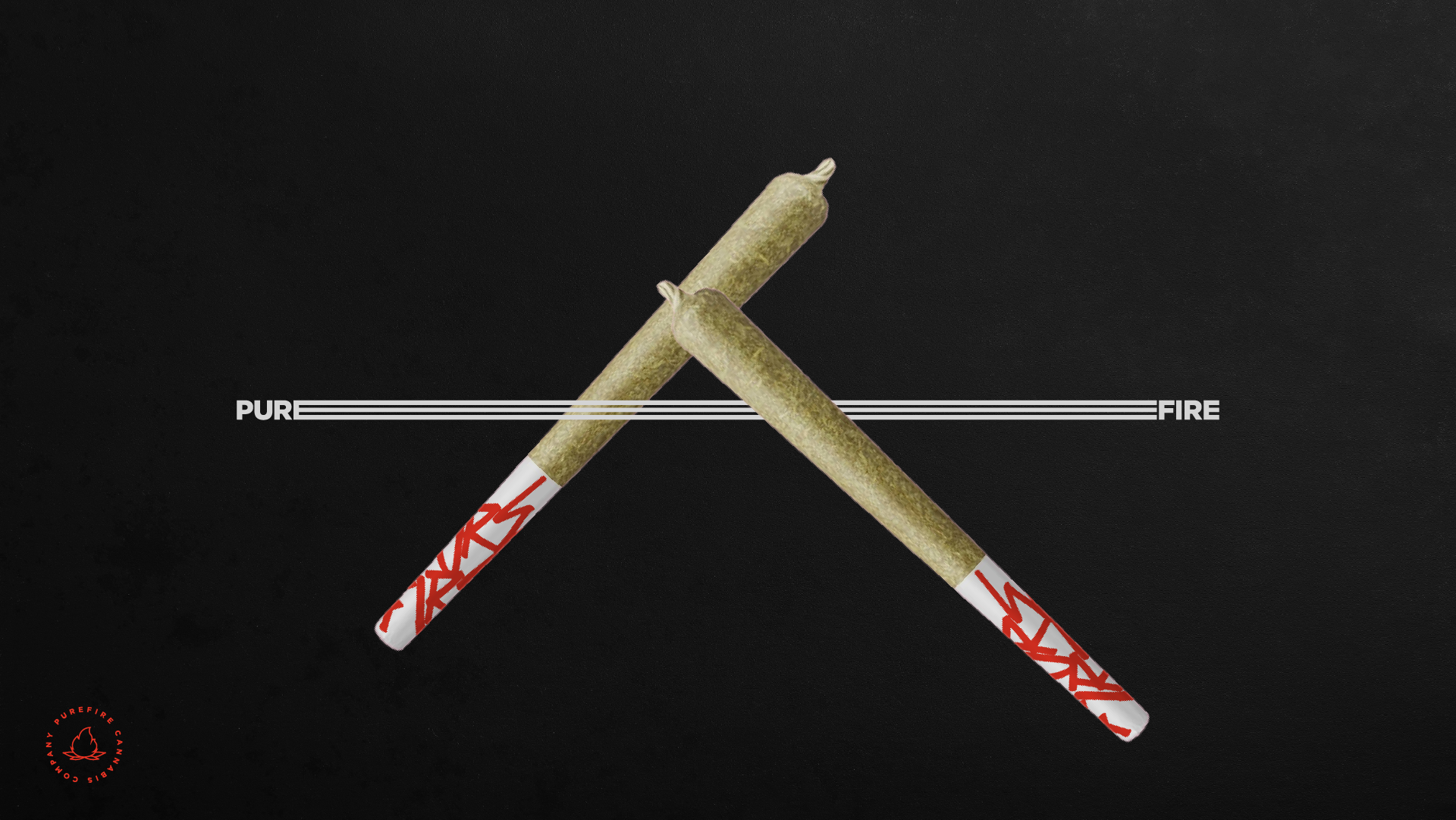
PUREFIRE® was created to embody the ritual, energy, and cultural charge surrounding modern cannabis consumption in Colorado. Rather than leaning into clichés of nature, relaxation, or medicinal minimalism, we positioned PUREFIRE® as a brand of ignition — bold, urban, and unapologetically expressive.
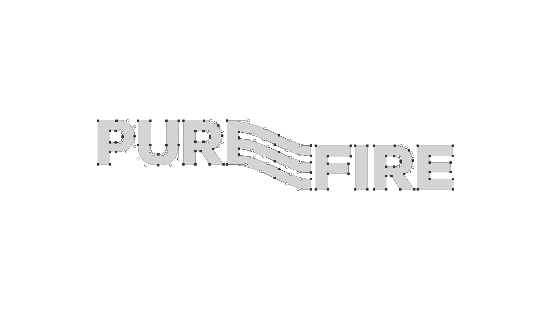
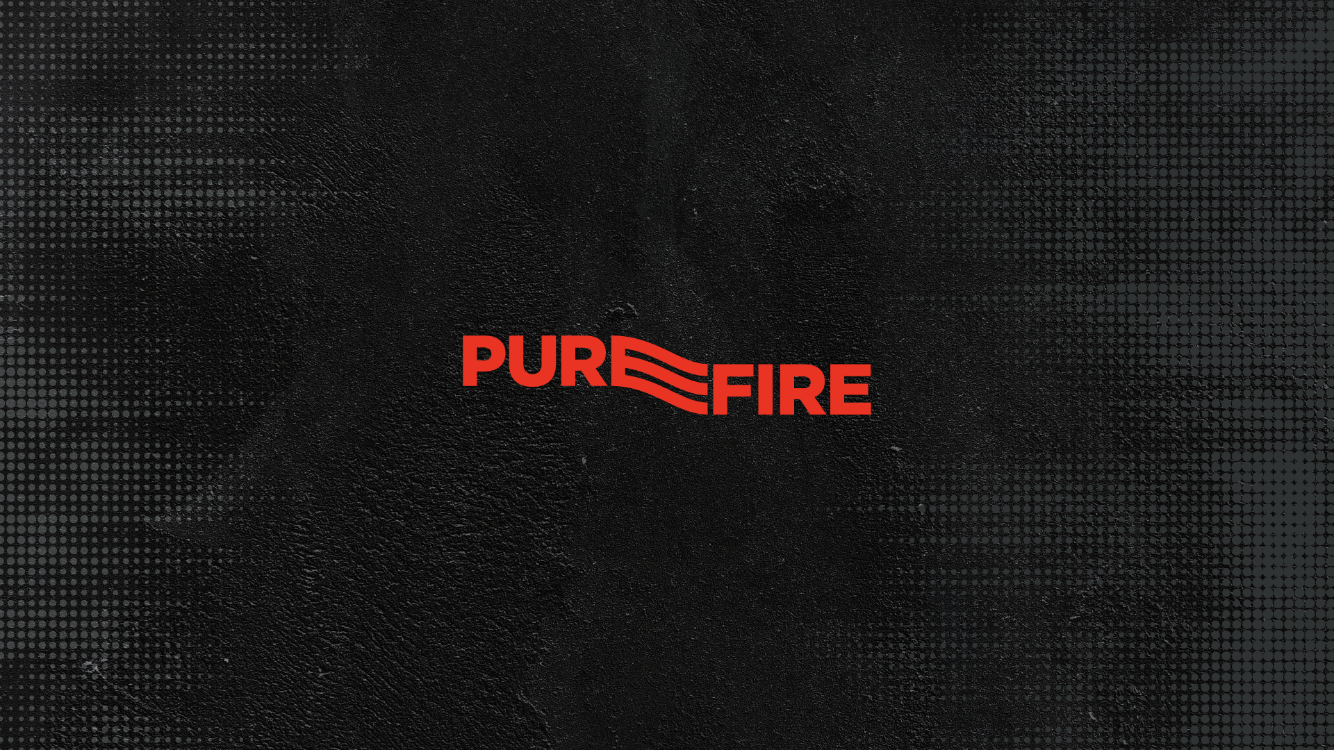
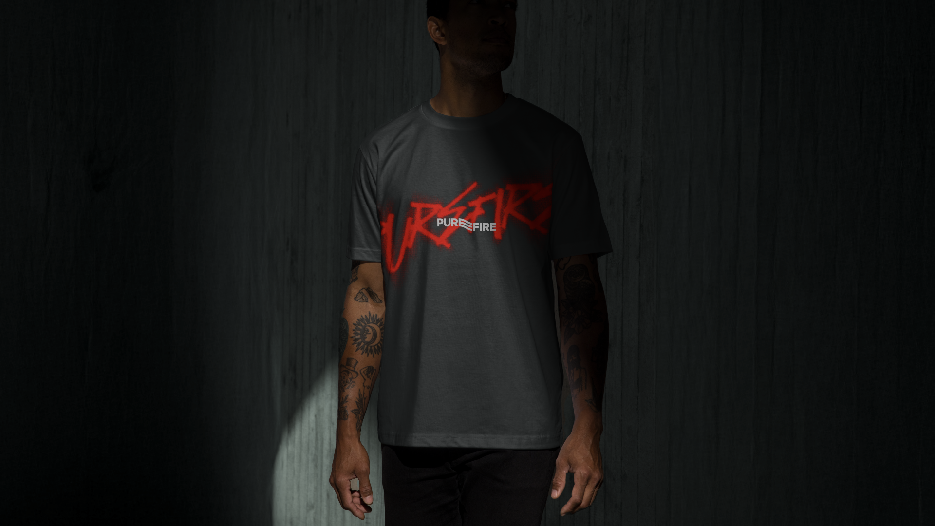
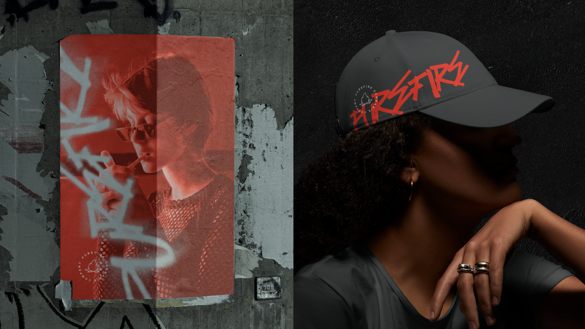
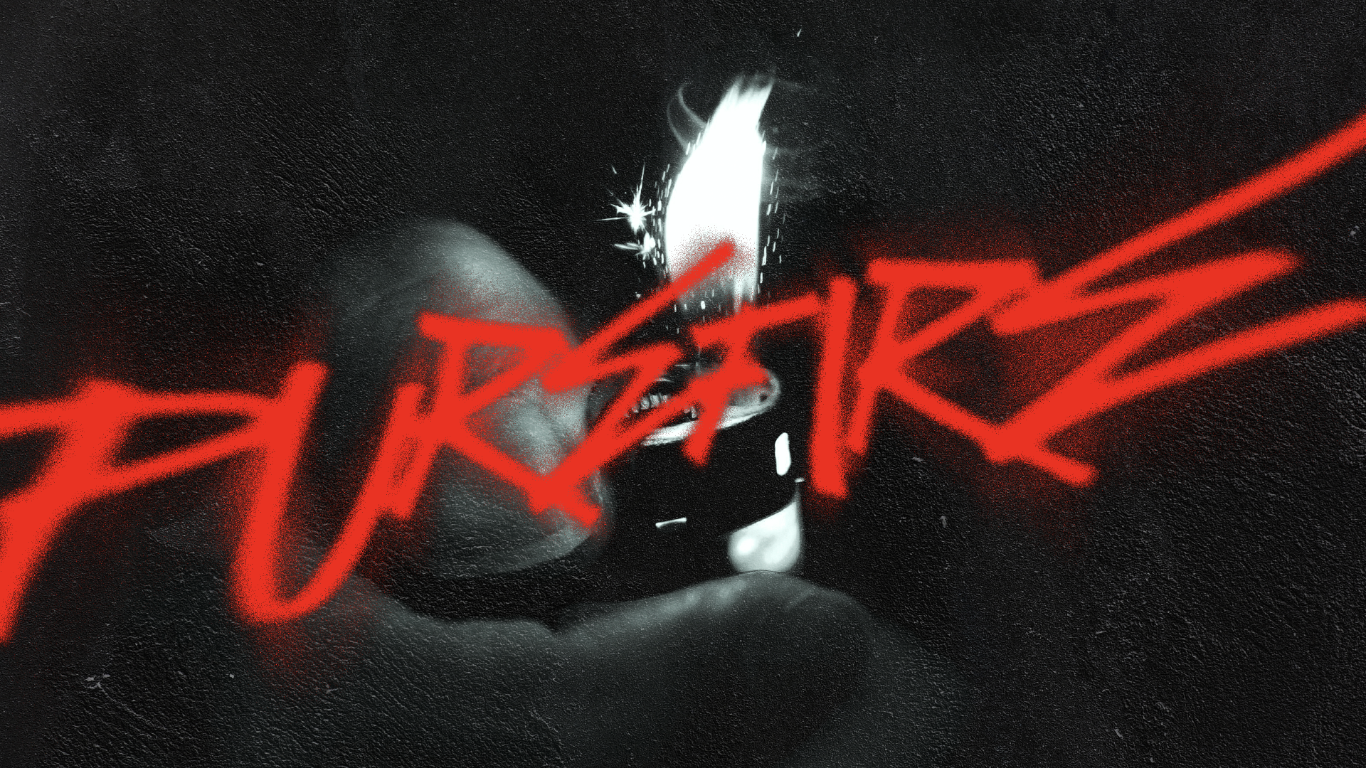
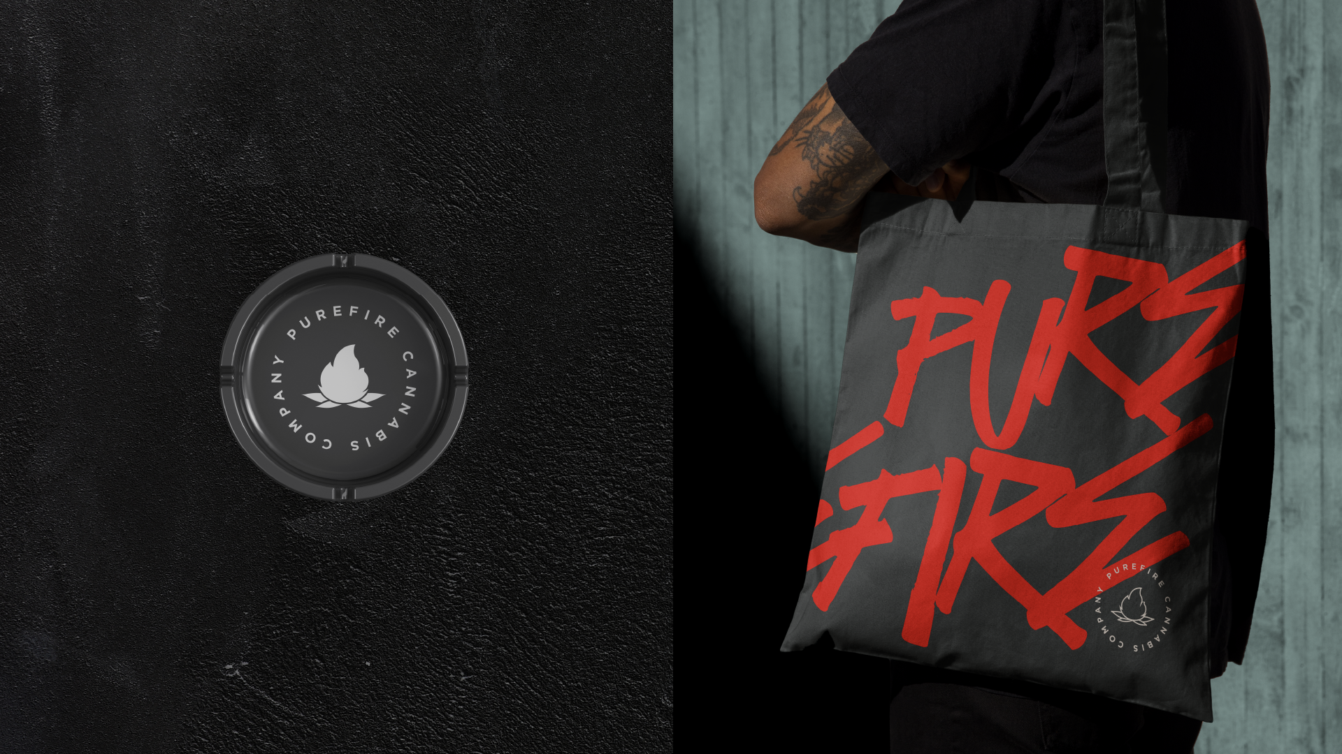
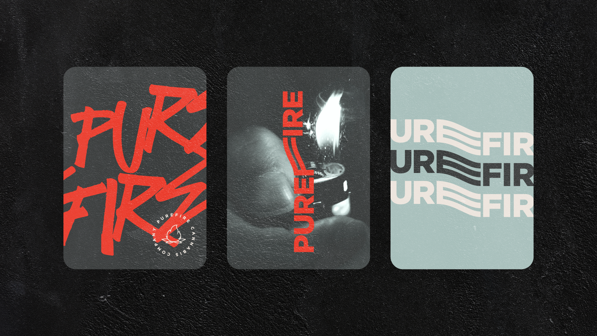
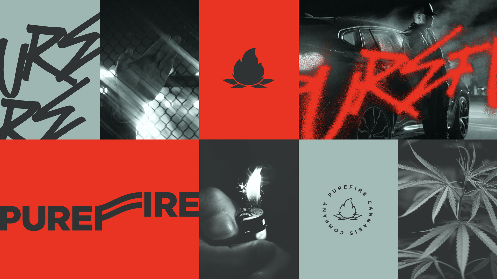
The identity is built around tension: raw versus refined, street versus structured, ritual versus rebellion. The custom wordmark integrates flowing lines within the typography, symbolizing heat, smoke, movement, and repetition — reinforcing the brand mantra: Roll. Spark. Repeat.
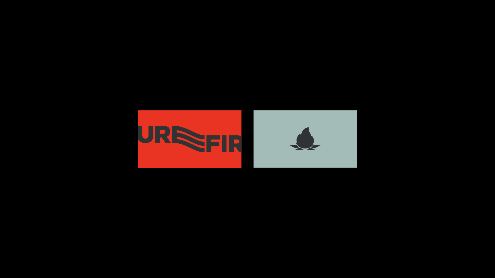
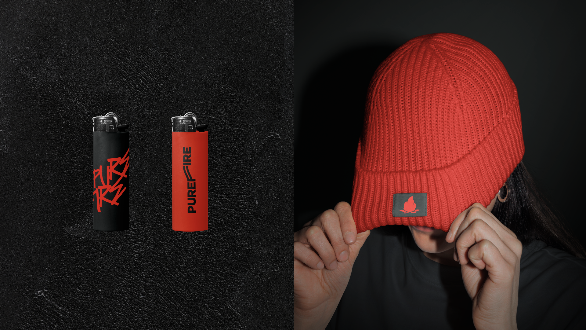
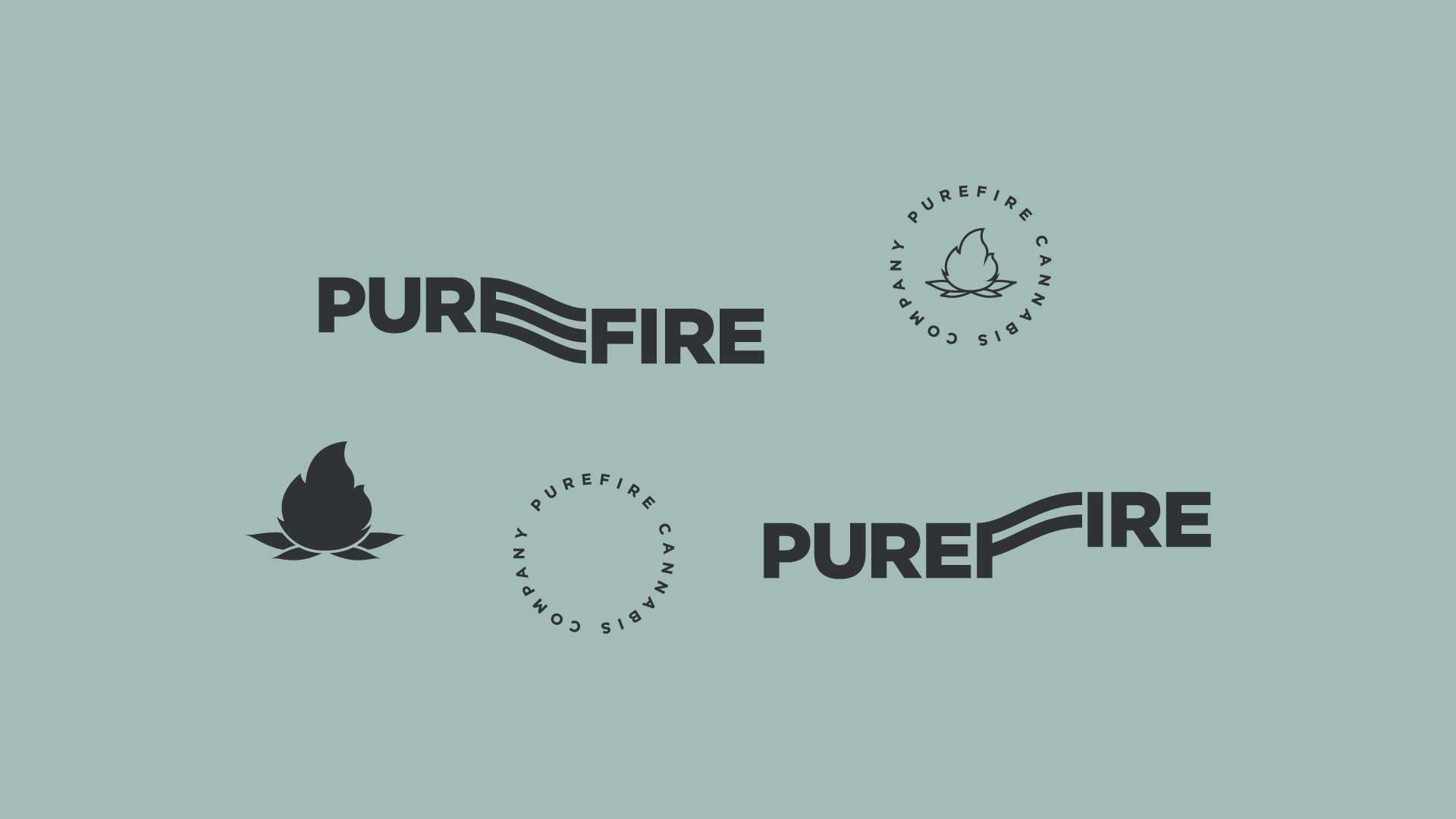
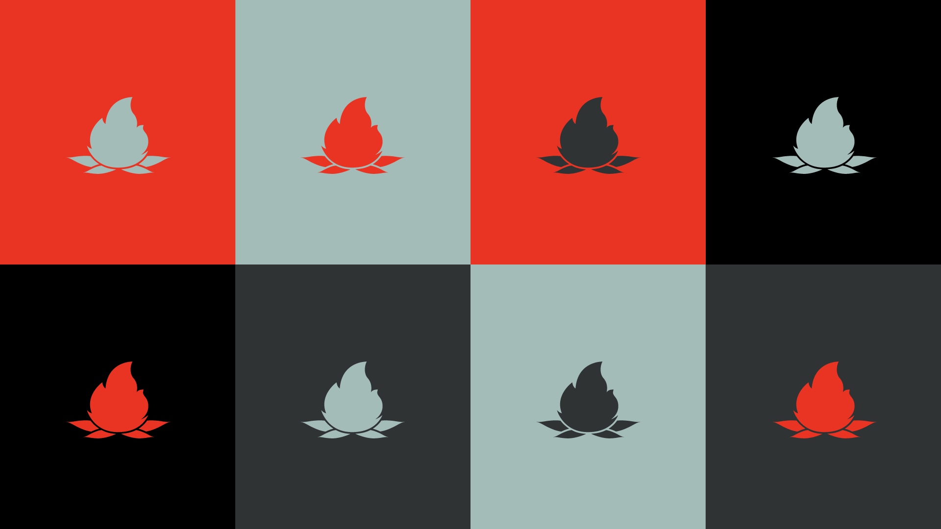
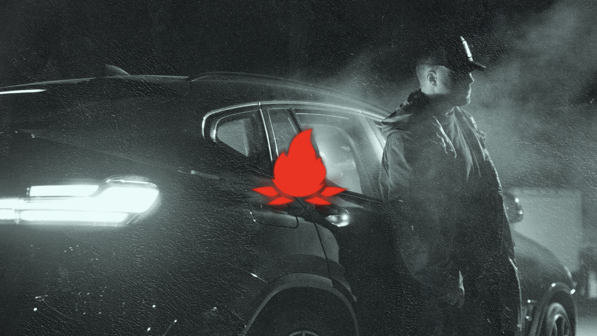
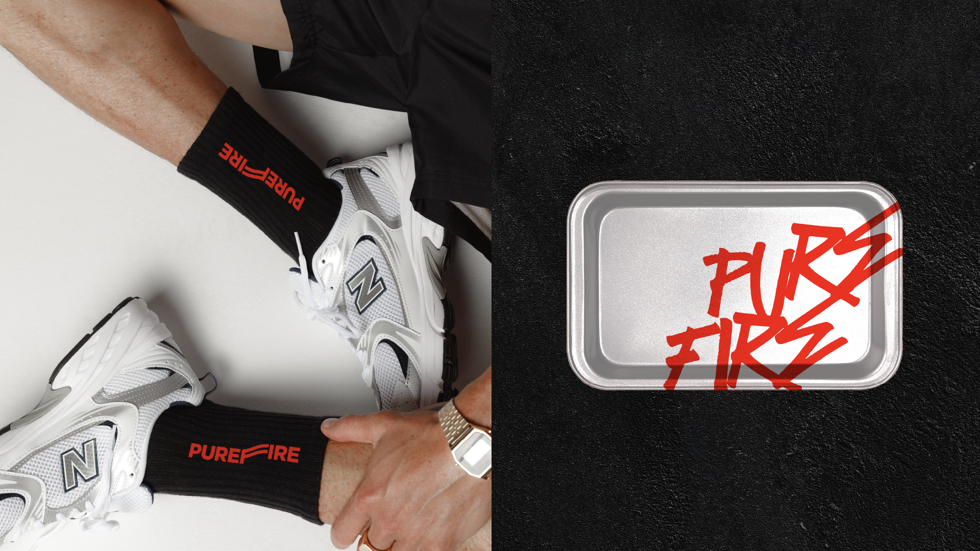
The visual system balances a minimal typographic foundation with disruptive overlays — red graffiti gestures, high-contrast photography, and stark black-and-white textures. The flame emblem functions as a seal of purity and intensity, adaptable across packaging, apparel, and brand collateral.
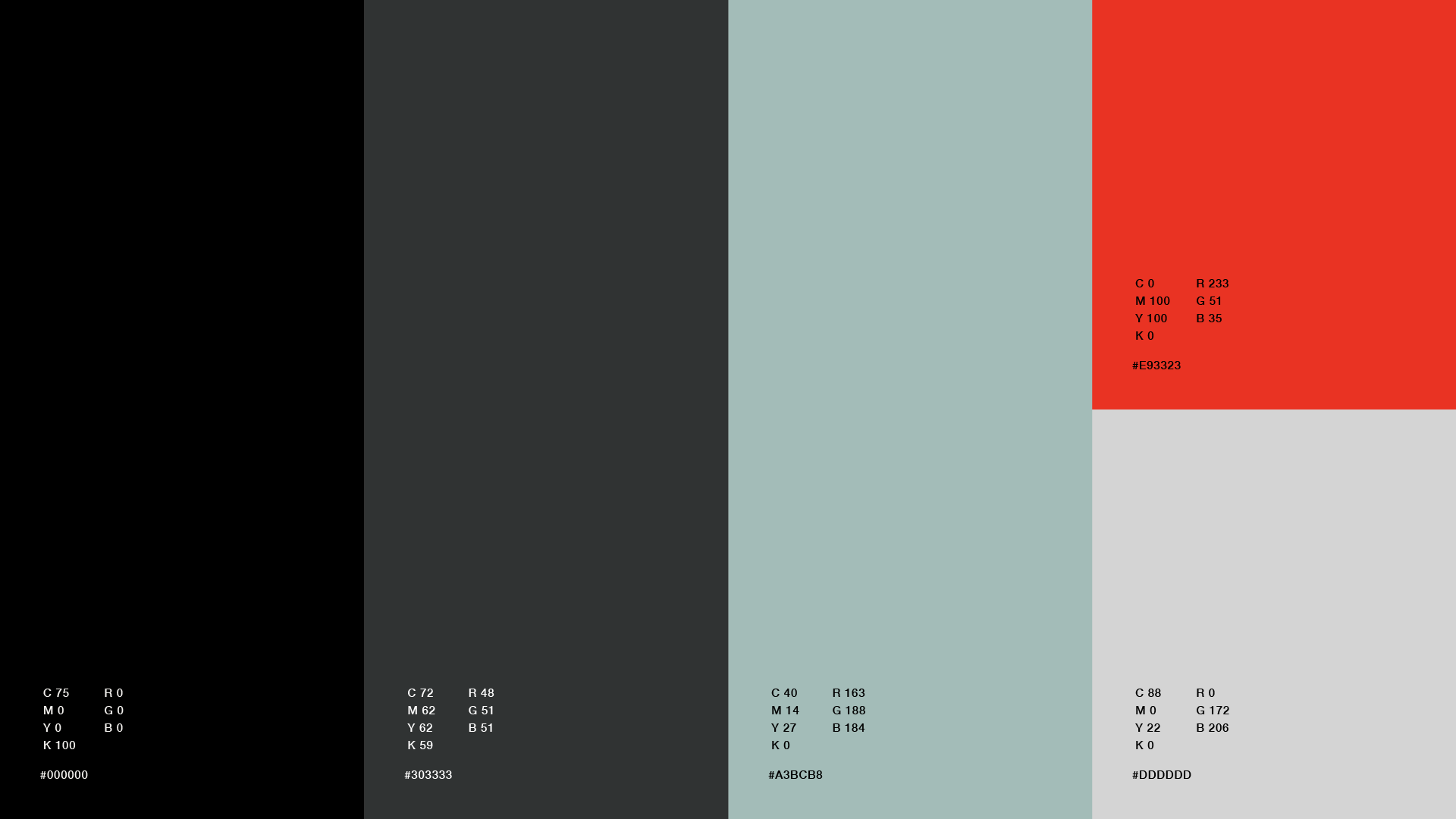
The color palette — muted sage, deep charcoal, and aggressive red — creates a distinctive contrast between calm and combustion. It speaks to authenticity, culture, and modern energy while maintaining a clean, reproducible system that works across retail, merchandise, and lifestyle extensions.
PUREFIRE® is not about passive consumption.
It’s about presence, spark, and identity.