FROSTTOWN
BRAND POSITIONING + BRAND DESIGN + LOGO DESIGN + BRAND GUIDELINES
INTRODUCTION
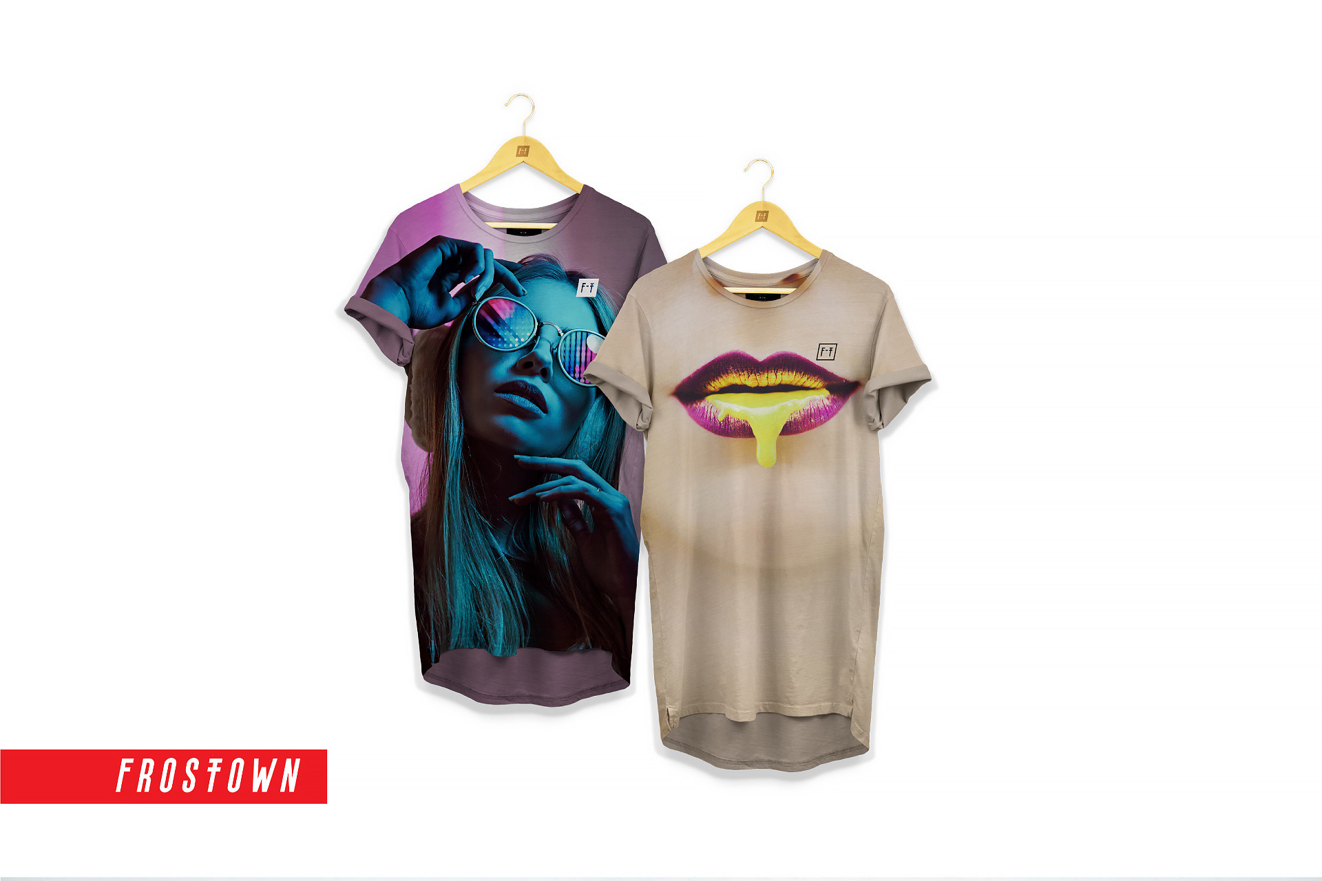
Welcome to the world of FROSTTOWN® – a clothing brand that artfully intertwines industrial elements with contemporary fashion. Our mission was to craft a brand identity that reverberates with a unique twist, capturing the essence of Houston's rich past and bold future.
CHALLENGES
The challenge was to infuse FROSTTOWN® with a distinct character that echoes the city's industrial roots while maintaining a fashion-forward edge. The brand needed an identity that would evoke the rugged spirit of the past while resonating with modern consumers seeking enigmatic and intriguing styles.
SOLUTION
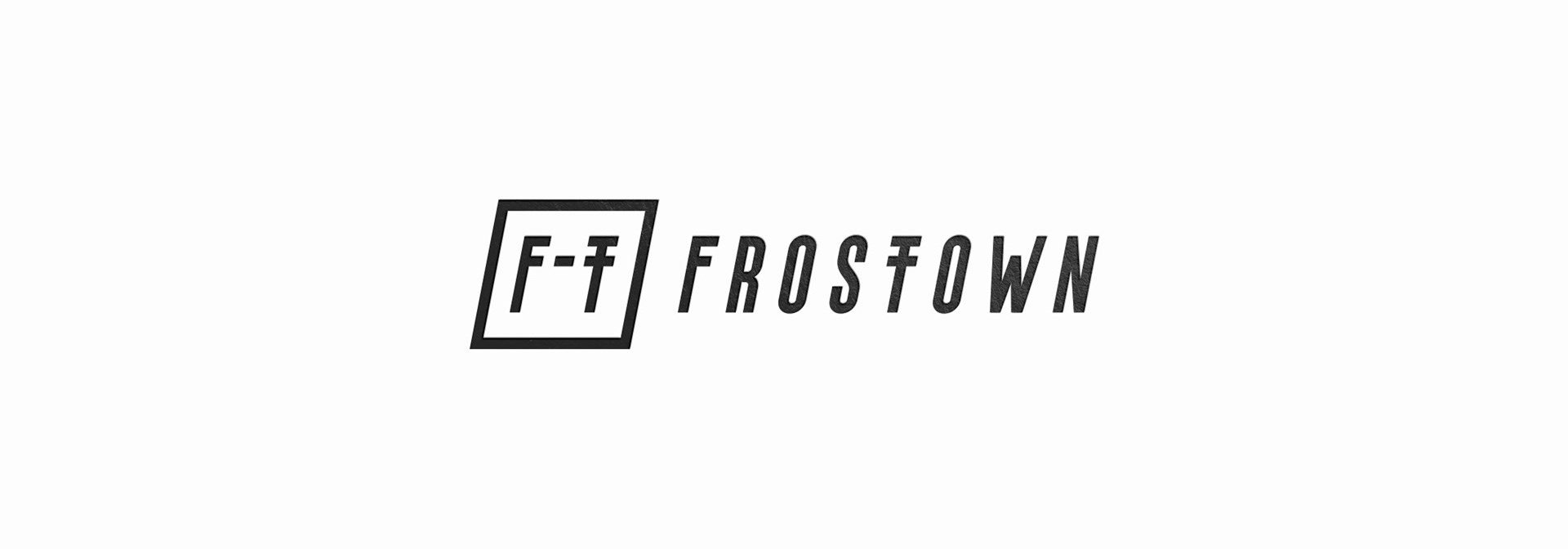
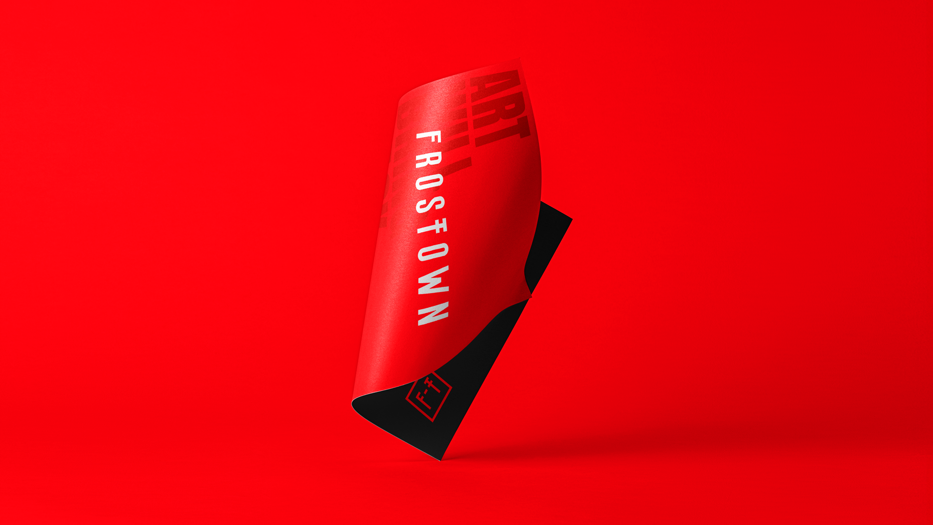
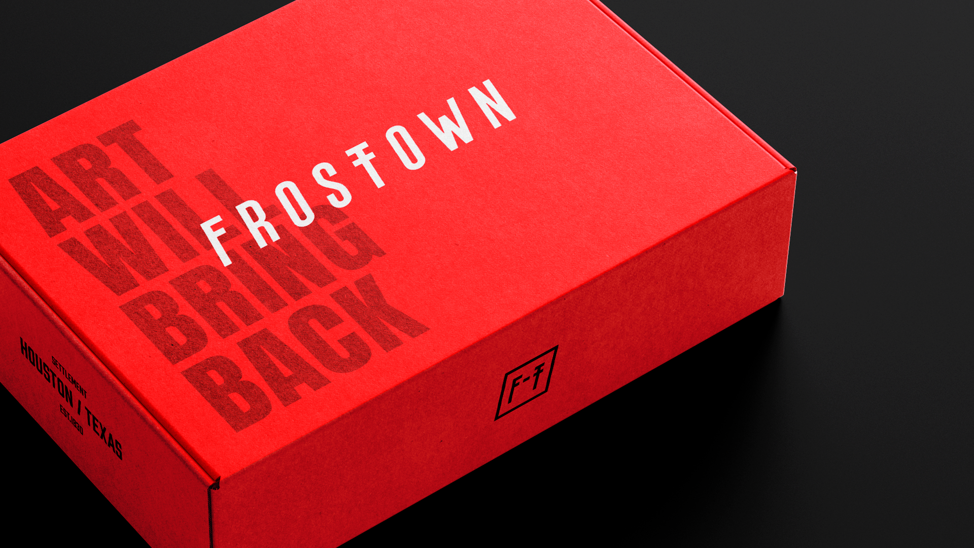
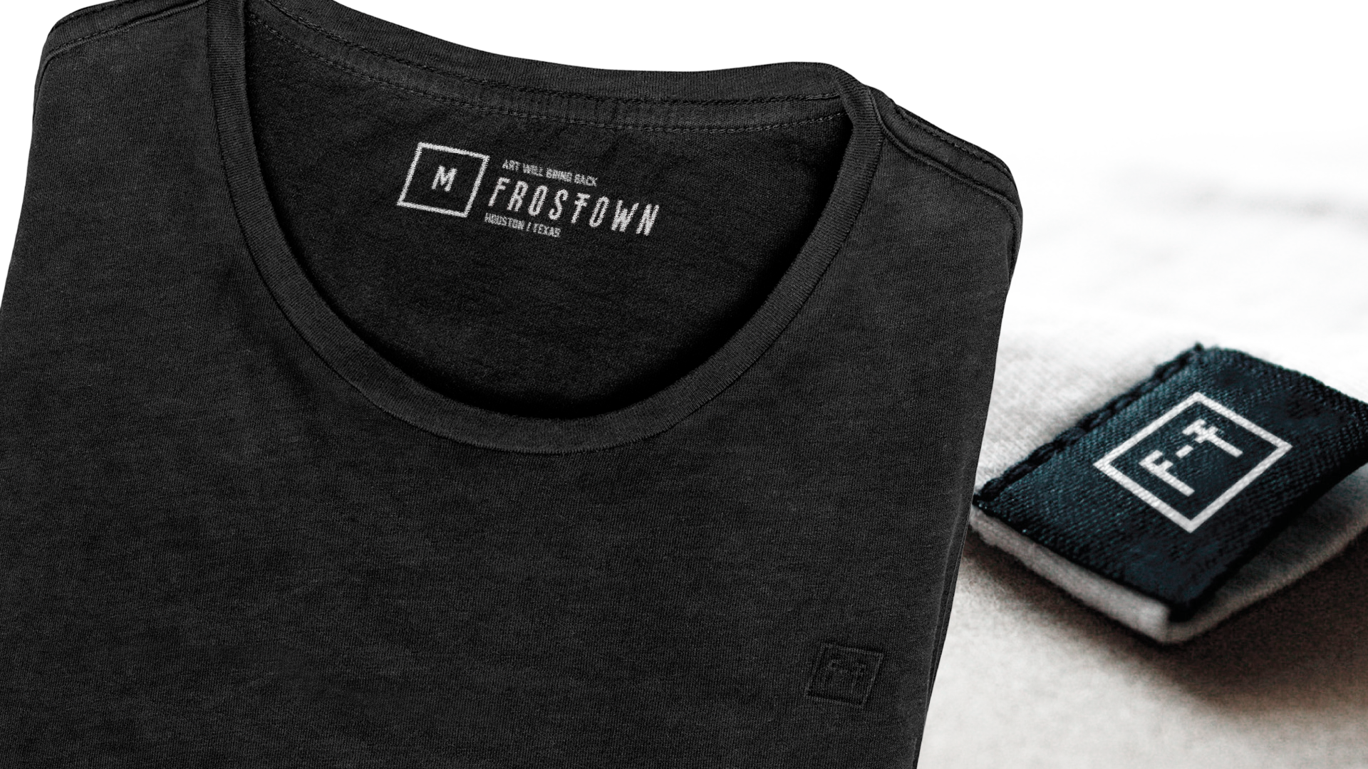
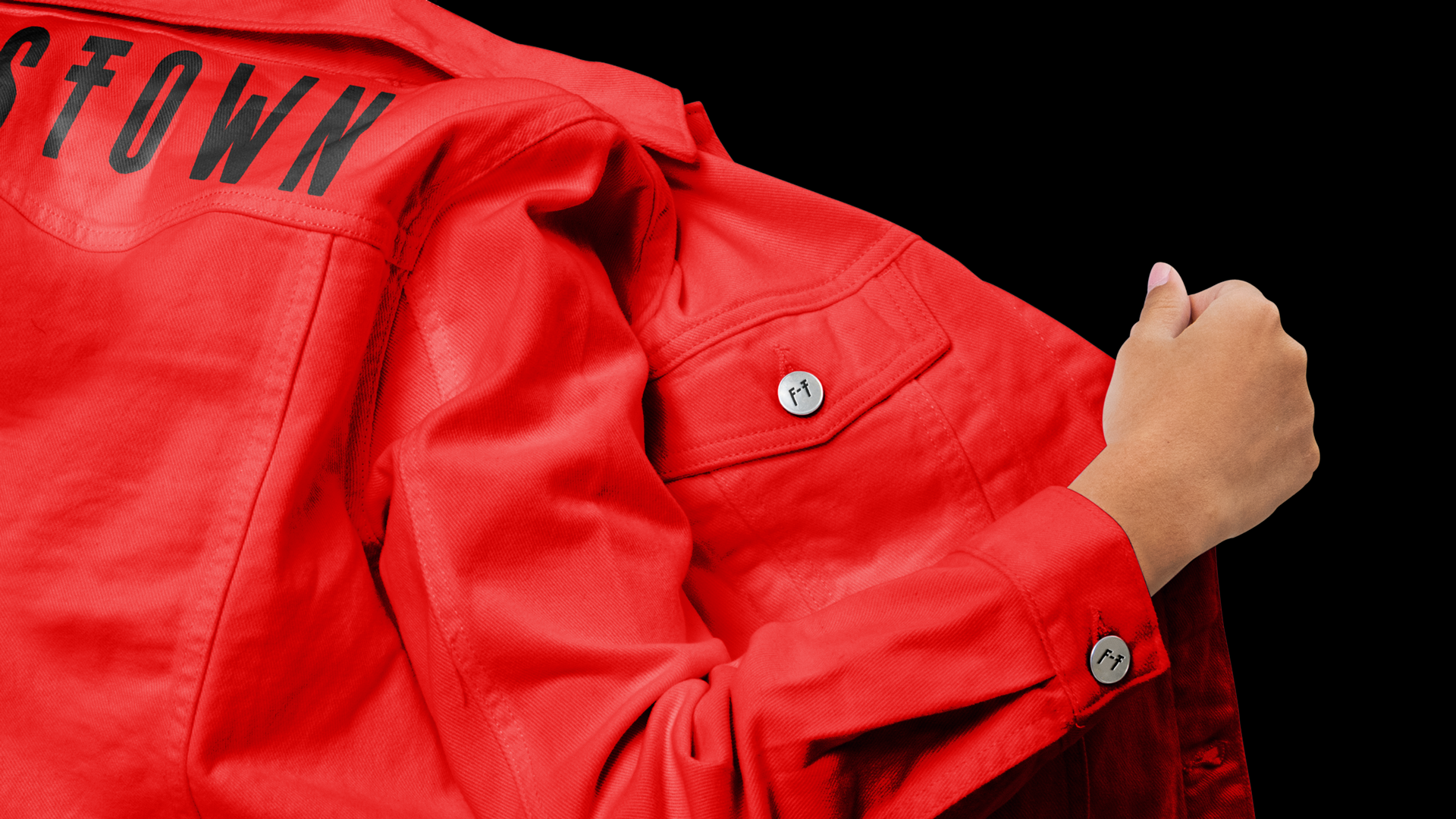
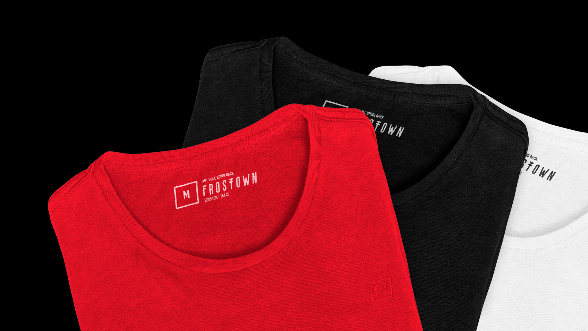
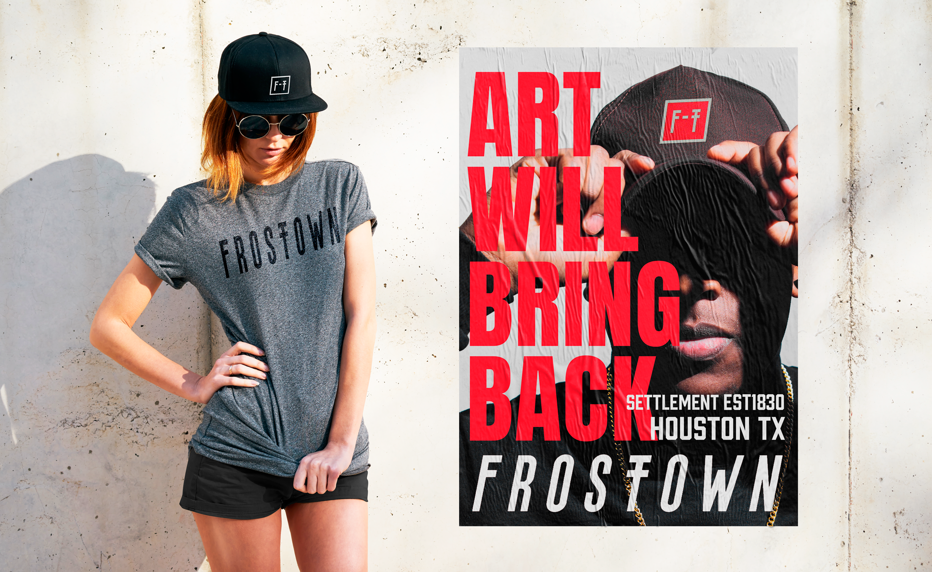
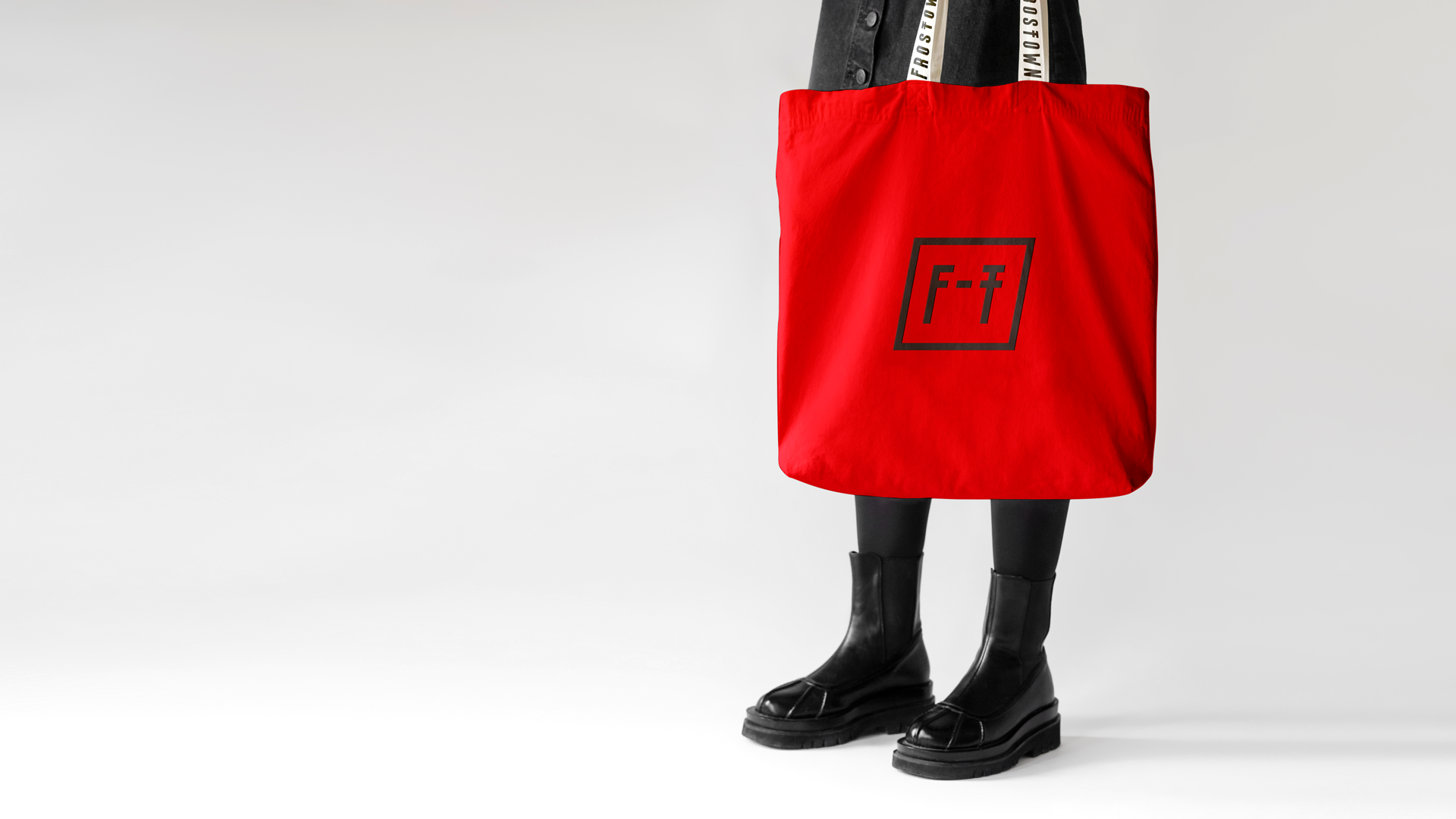
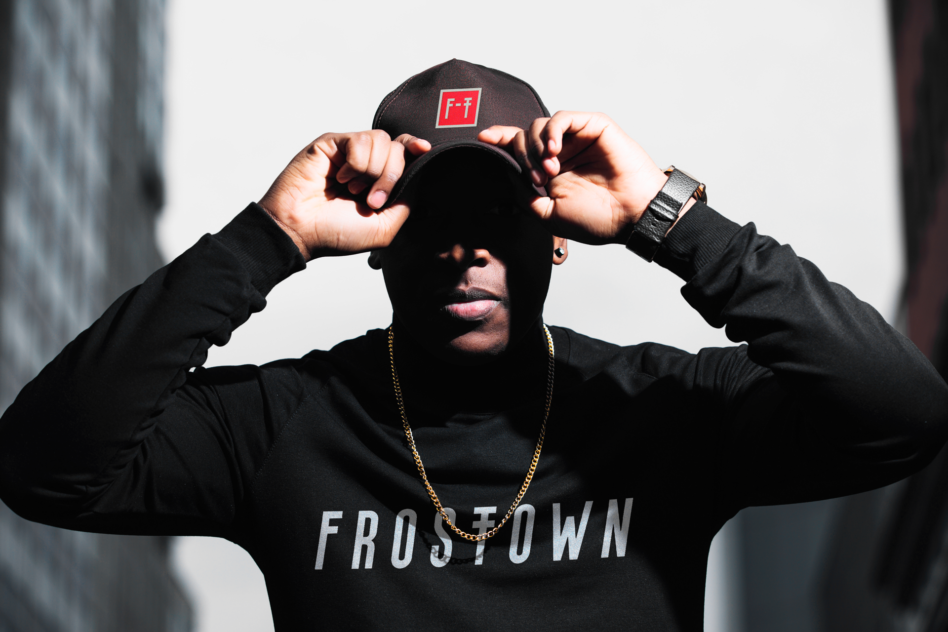
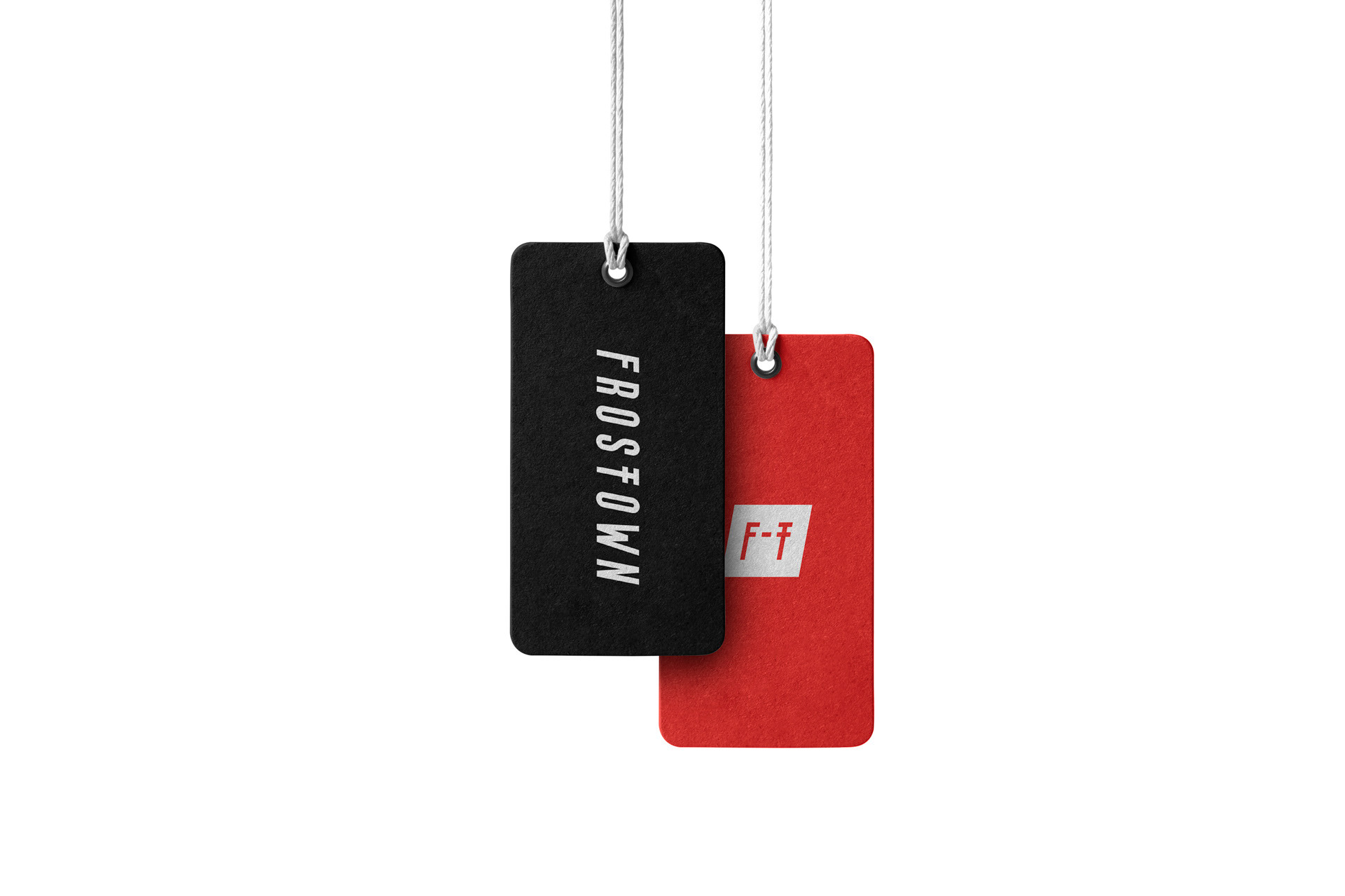
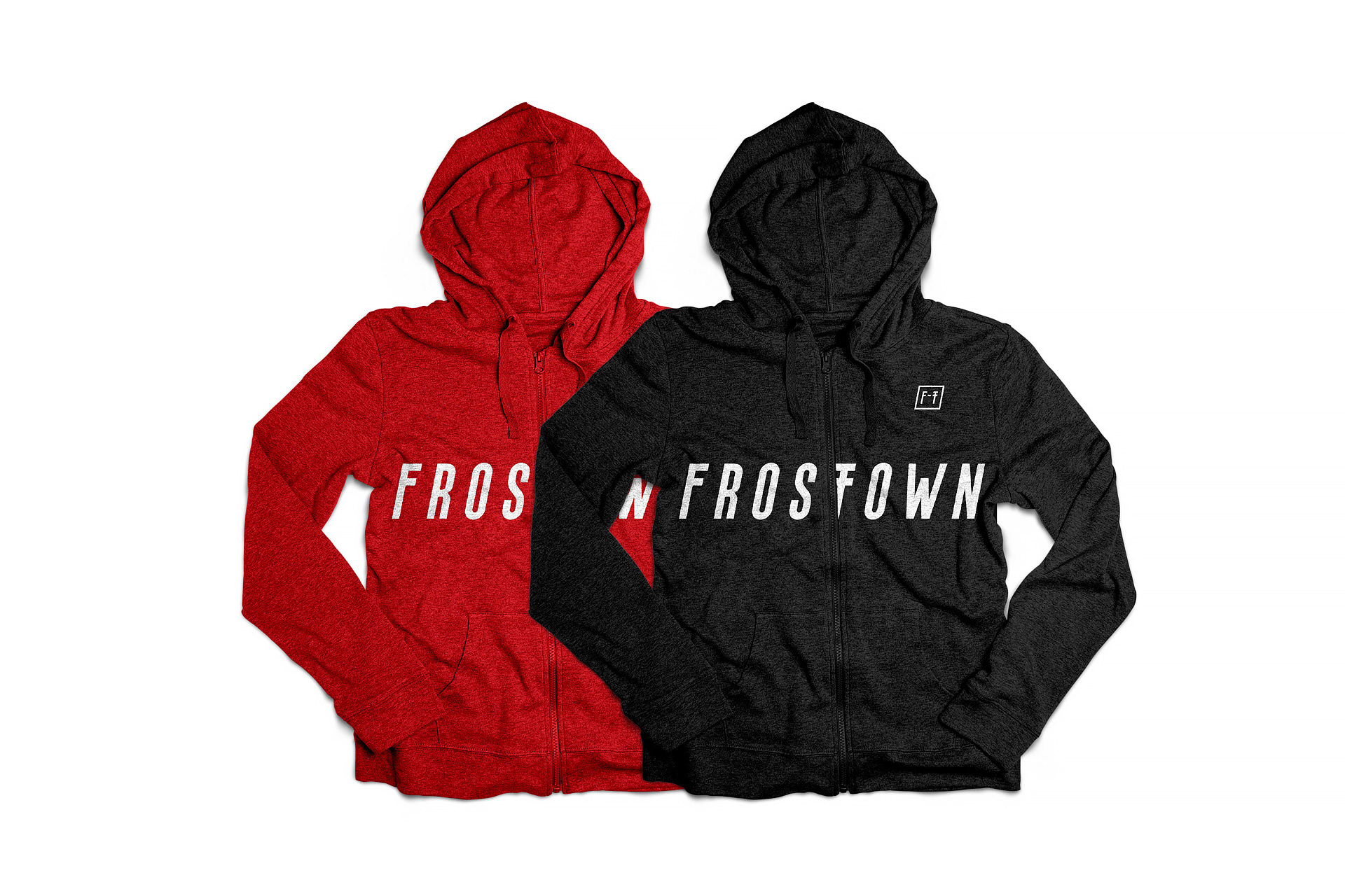
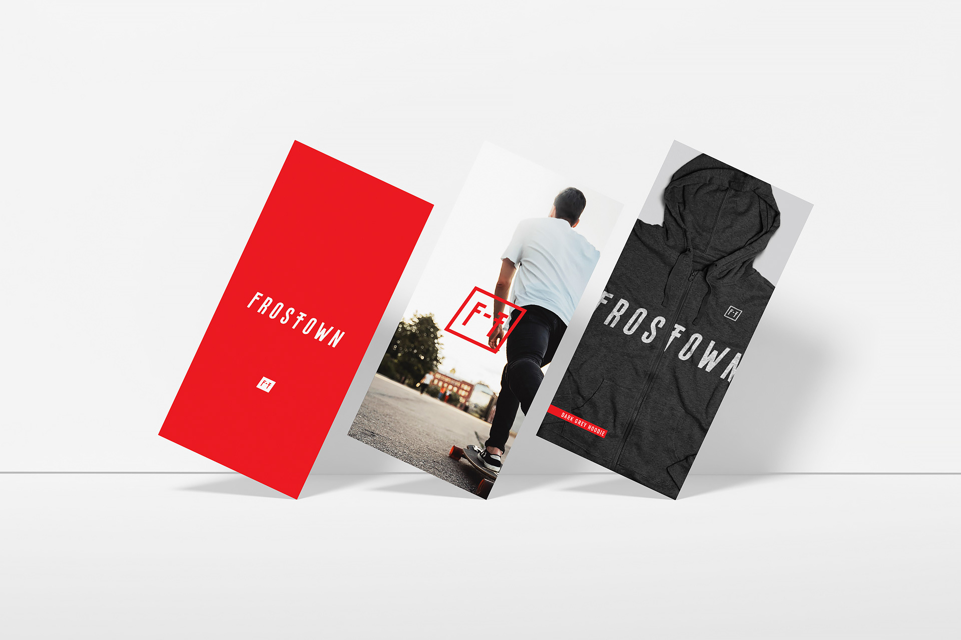
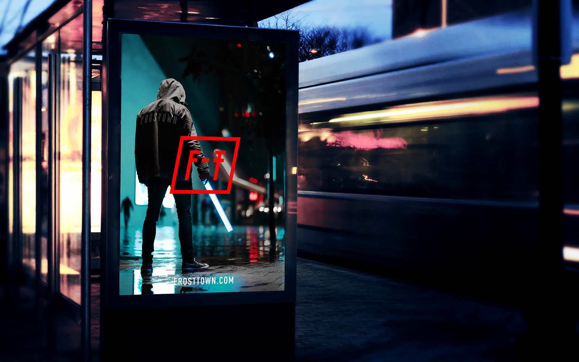
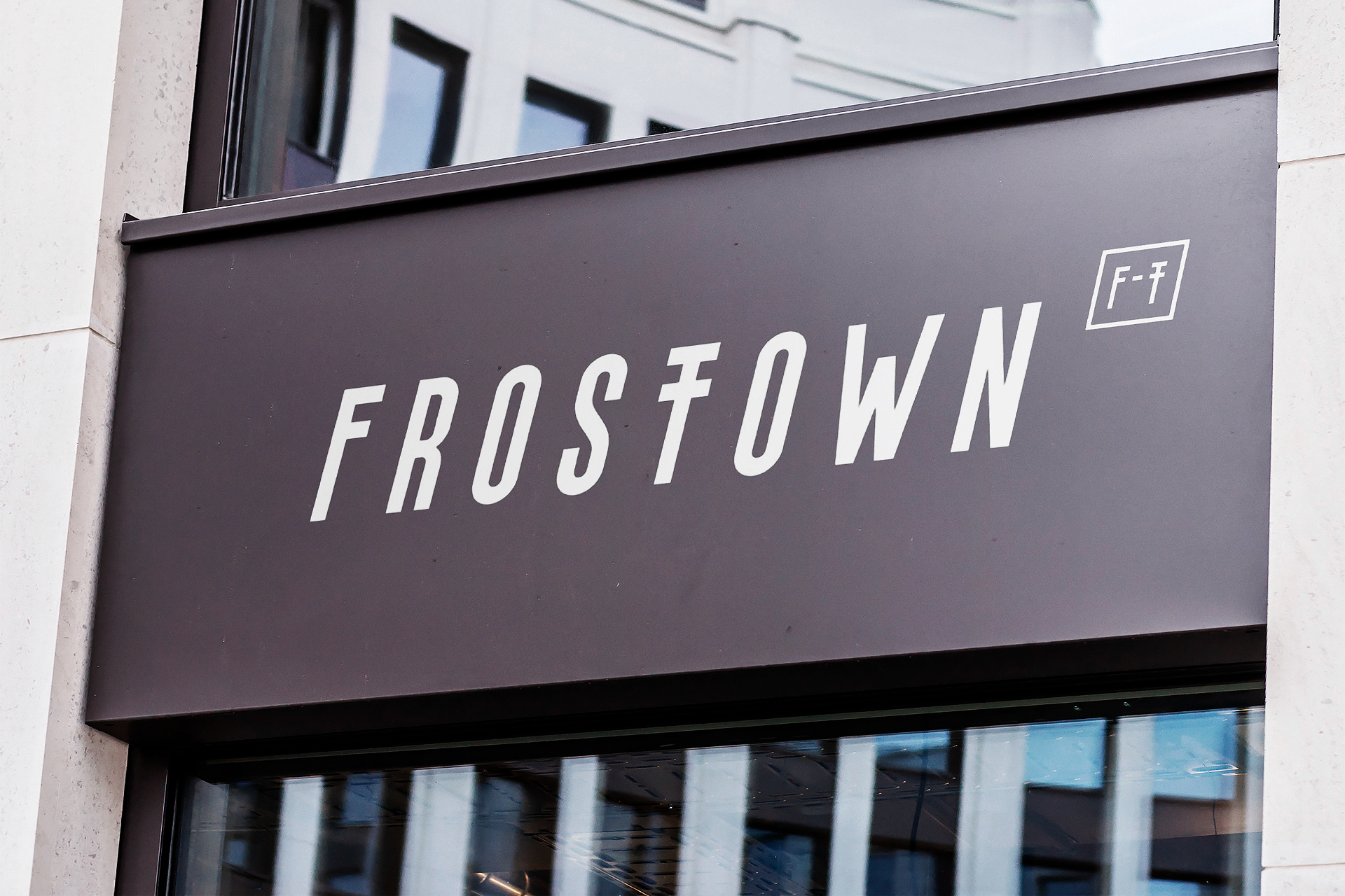
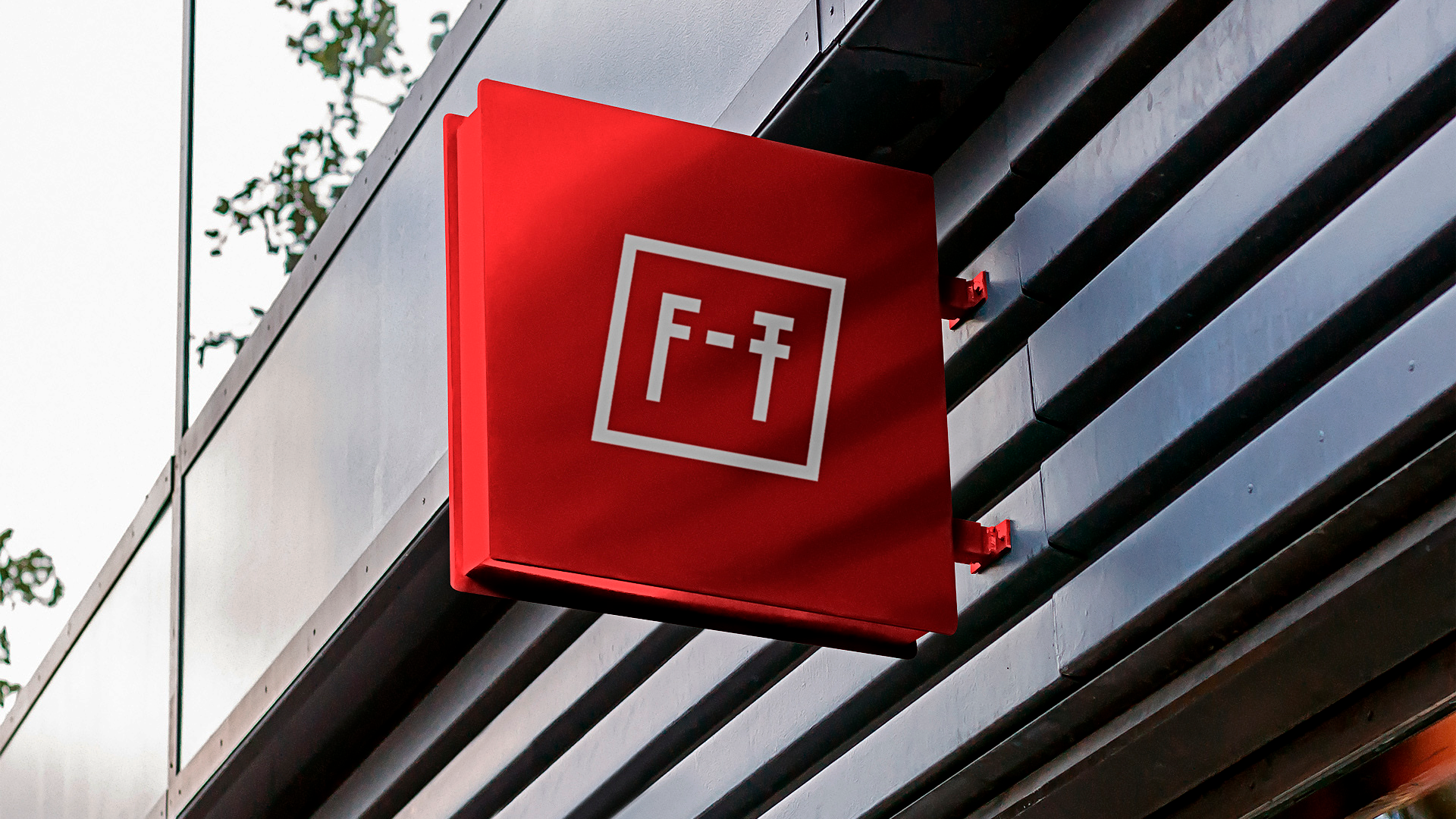
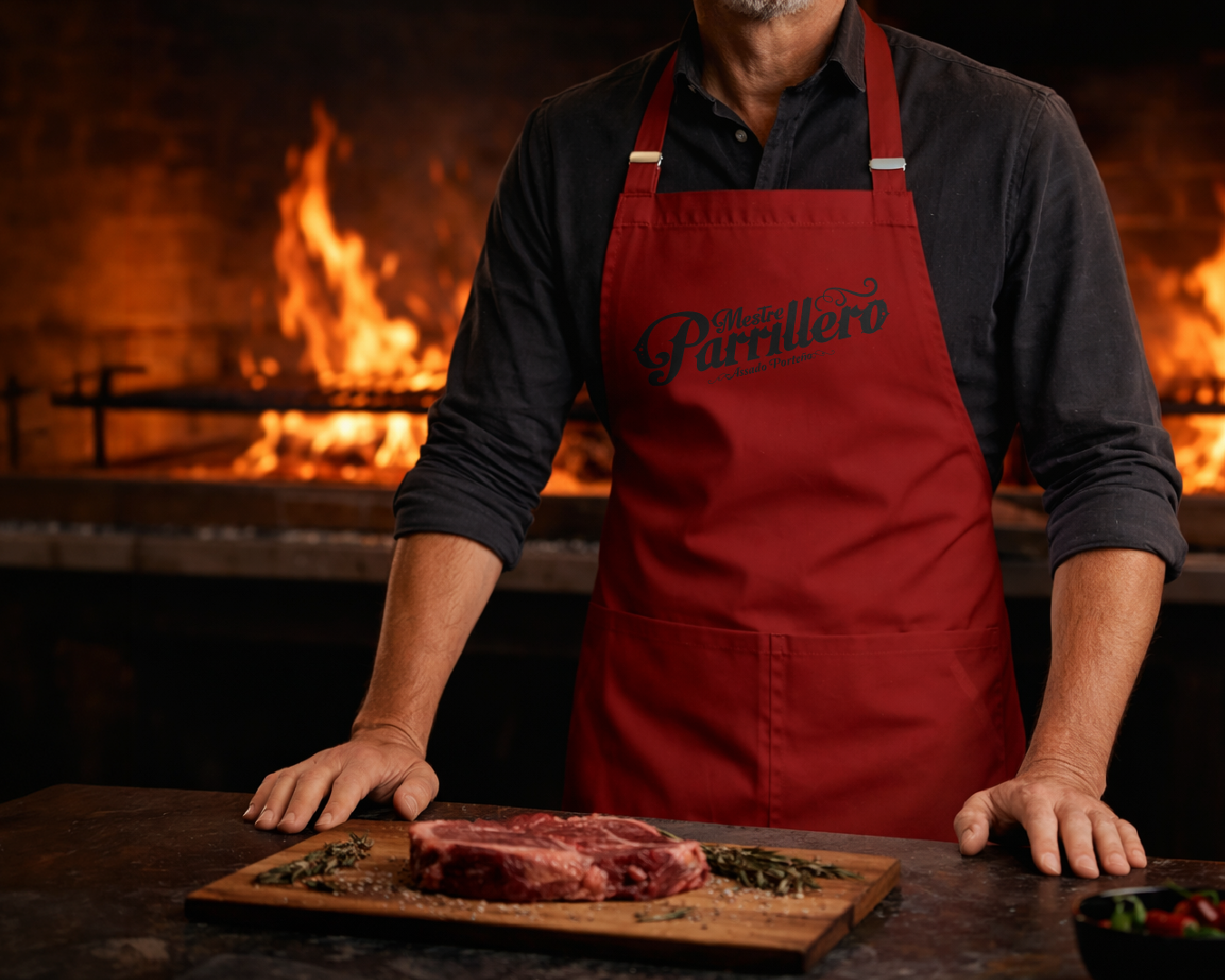
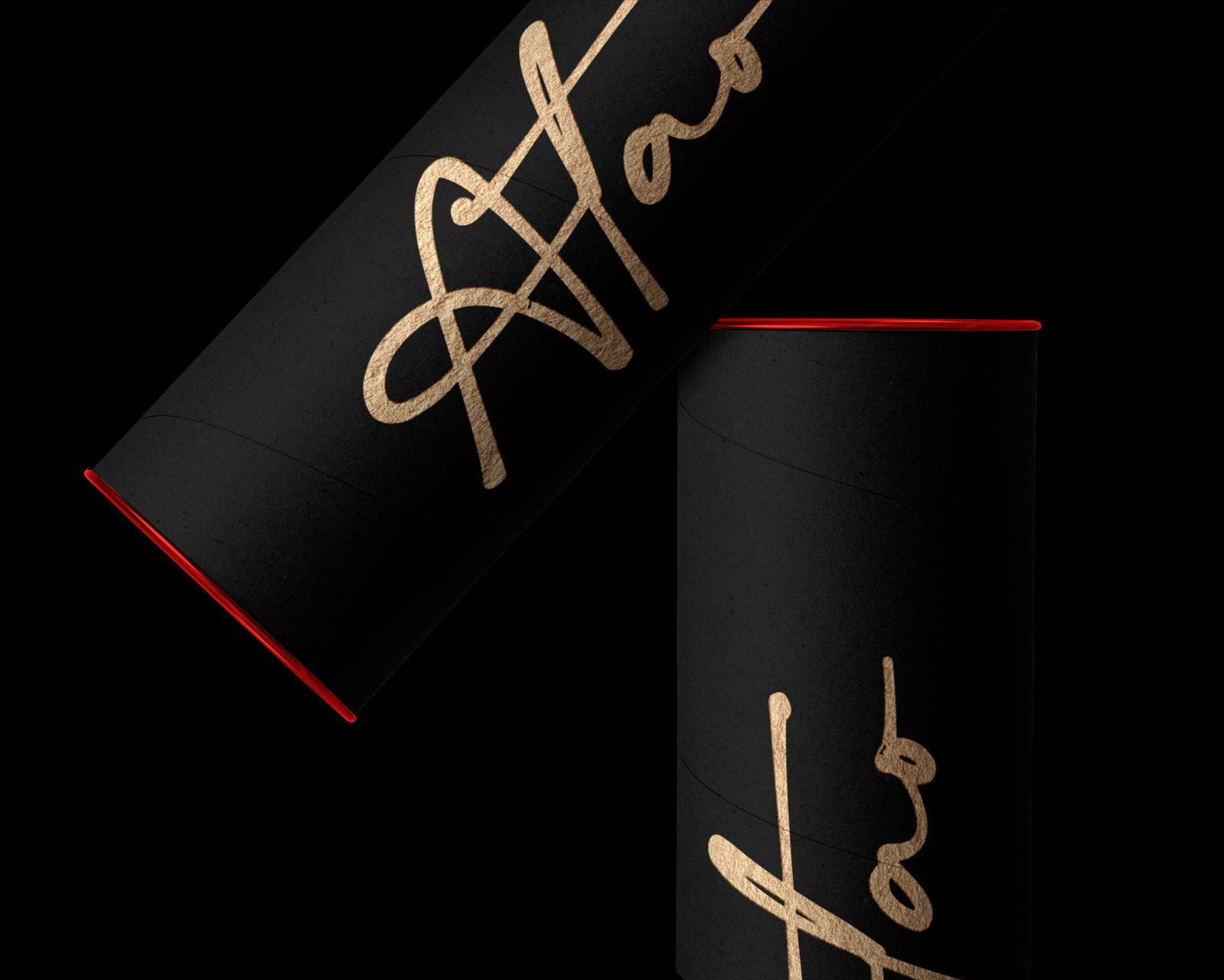
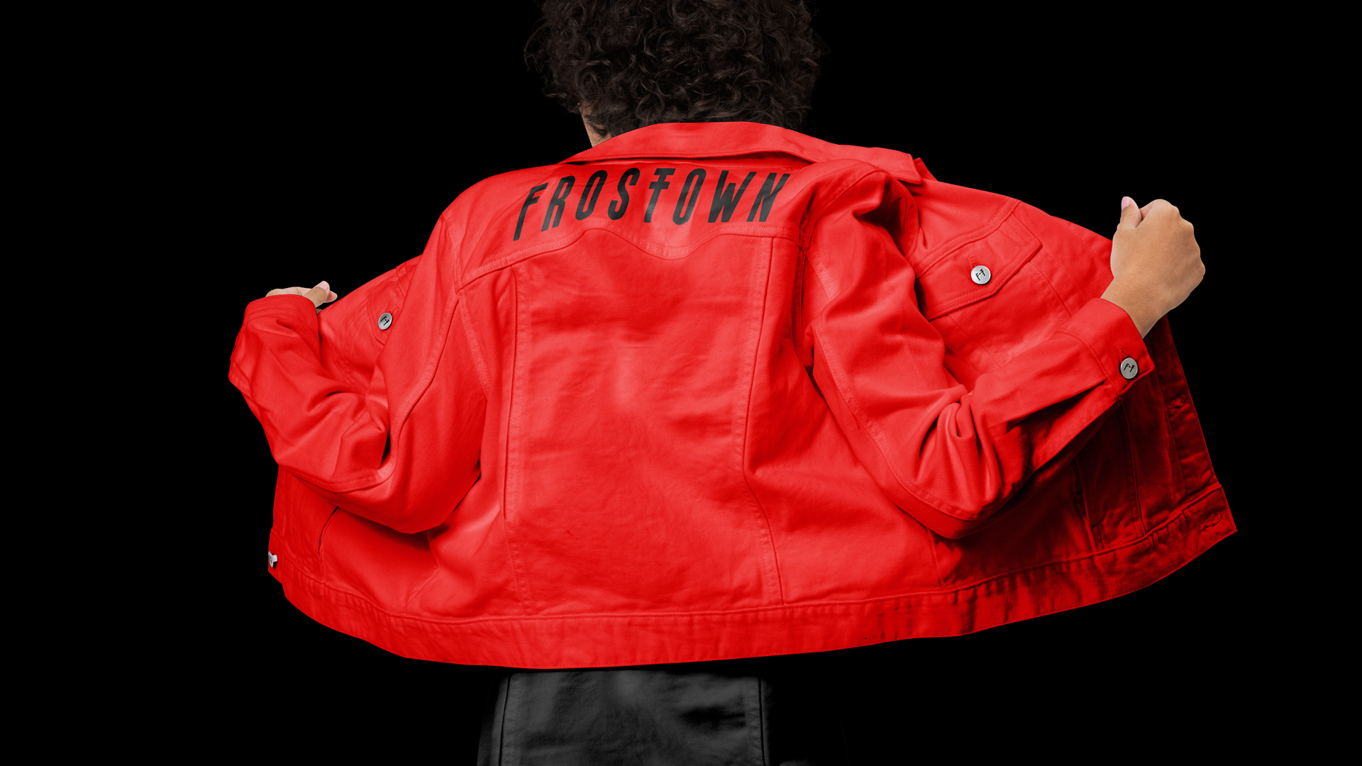
Our solution birthed a logo that boldly intertwines a sans-serif font with industrial-inspired vibe. This fusion resonates with the tenacity of Houston's history. The primary color palette of deep red and black adds an air of mystery and allure, amplifying the brand's enigmatic persona.
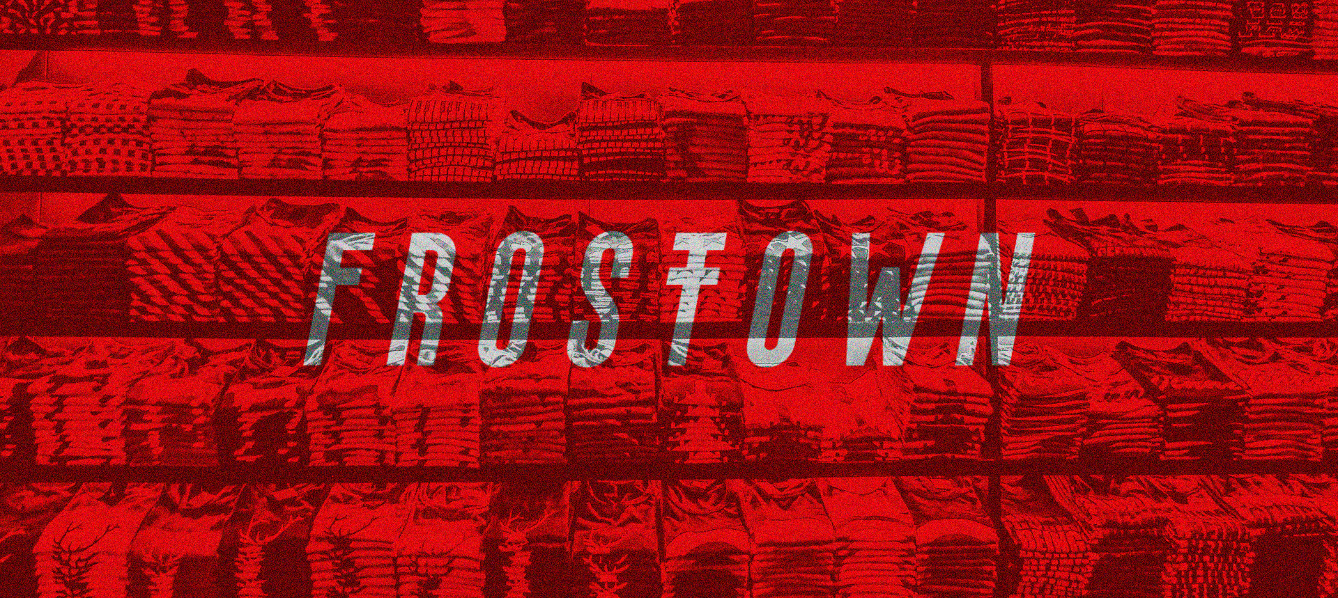
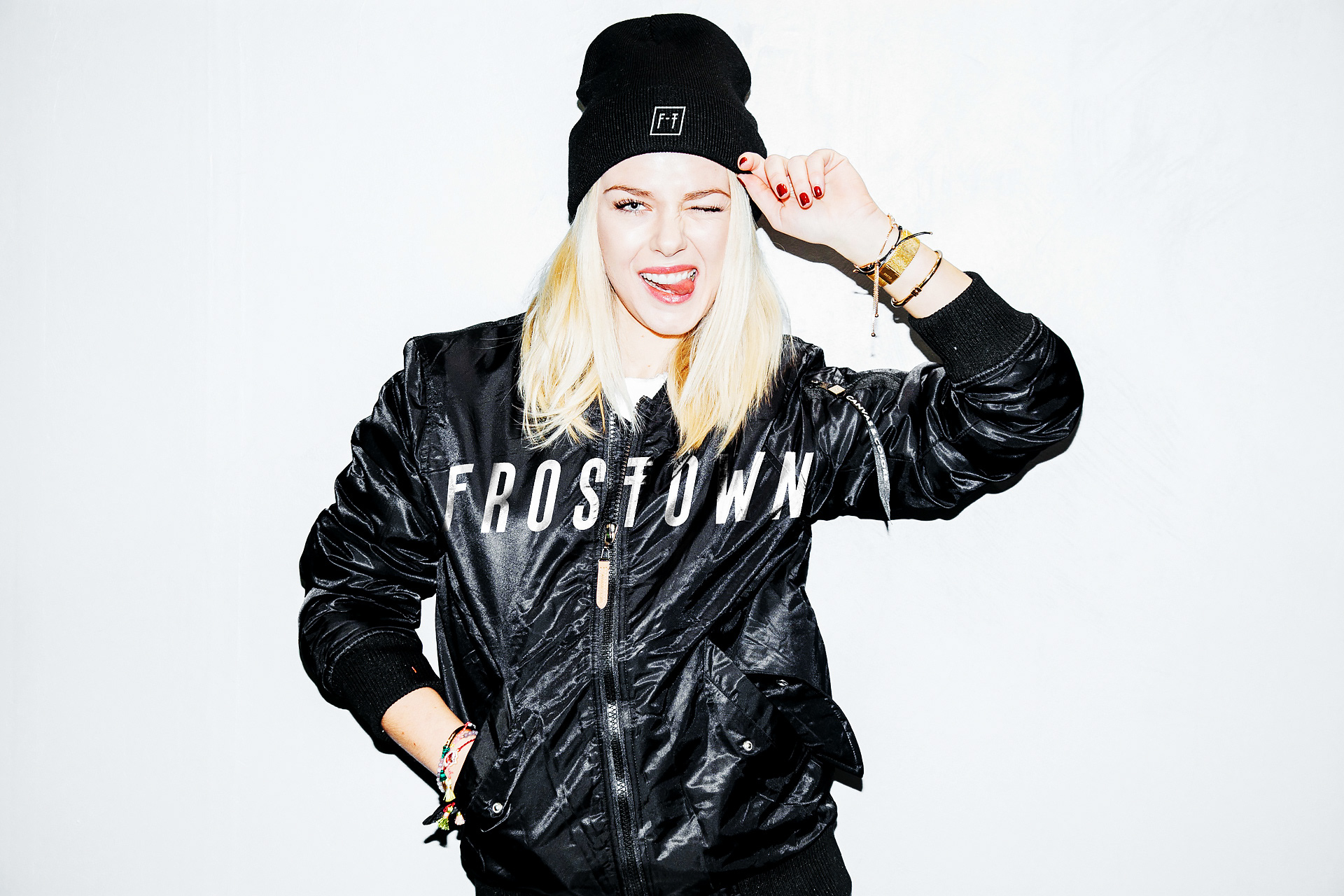
Beyond the logo, we extended the brand identity to include a complete system featuring patterns, typography, and packaging design. The typography, a mix of sans-serif fonts, infuses a touch of elegance and sophistication, juxtaposing with the industrial undertones.
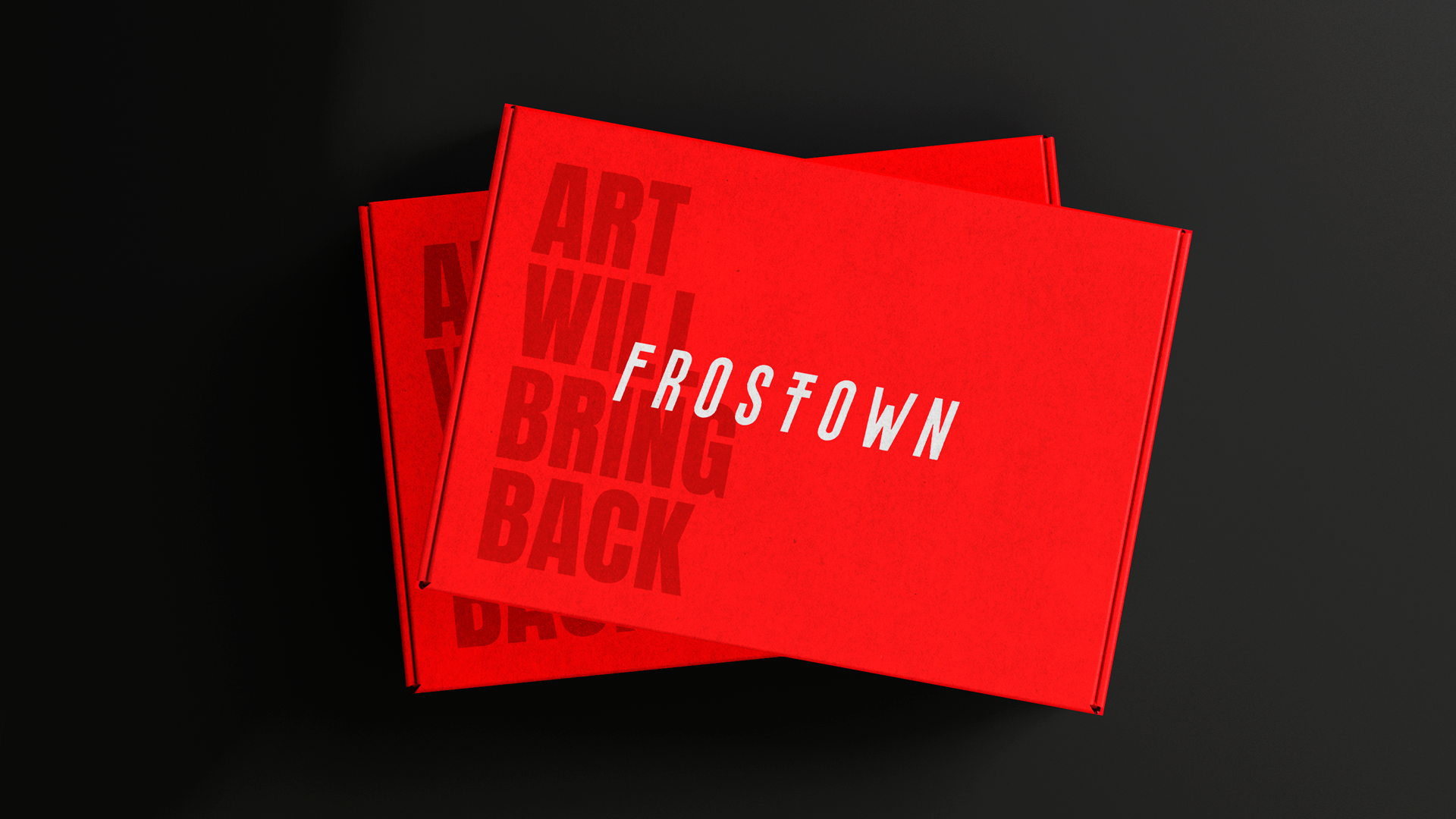
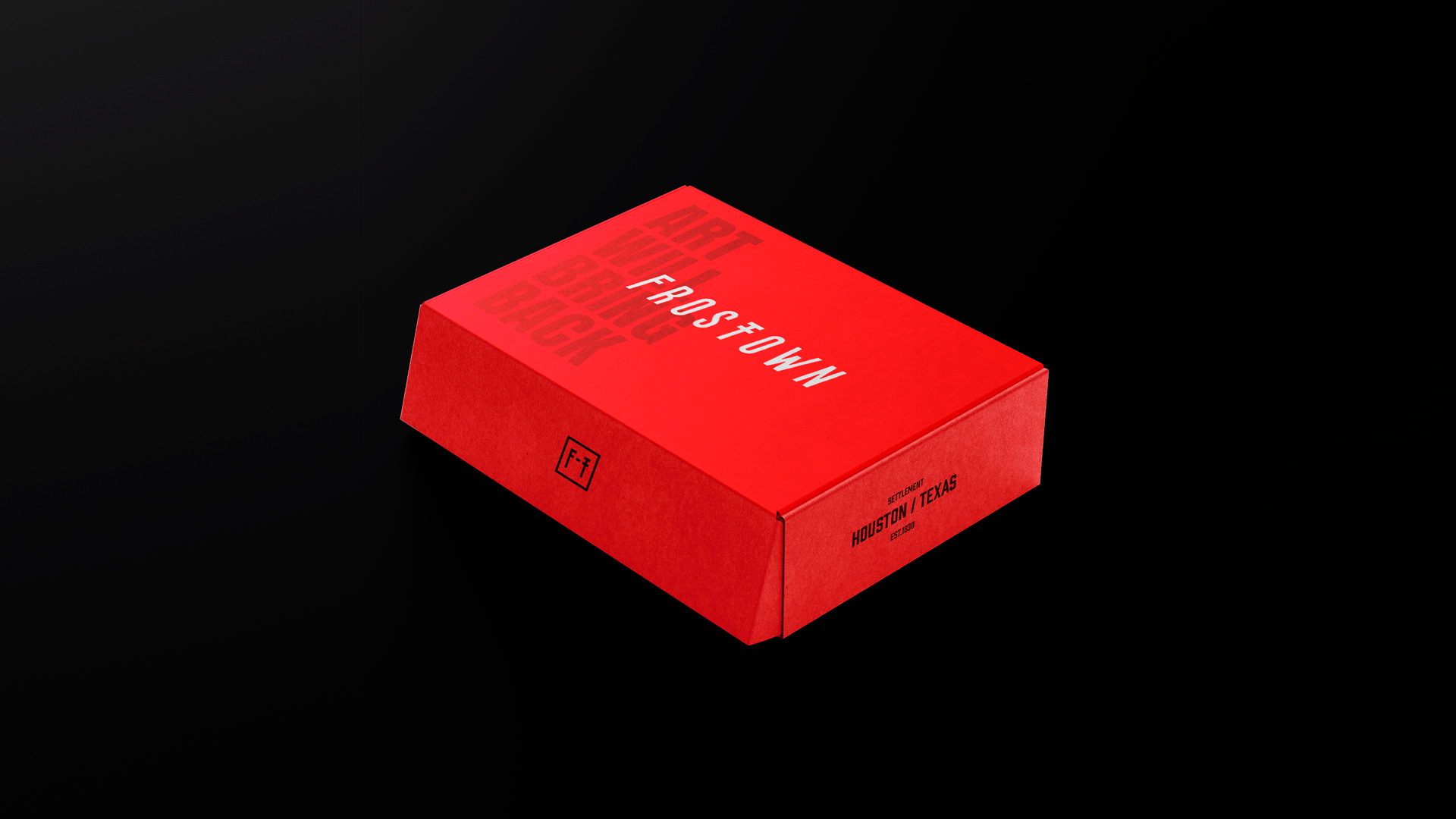
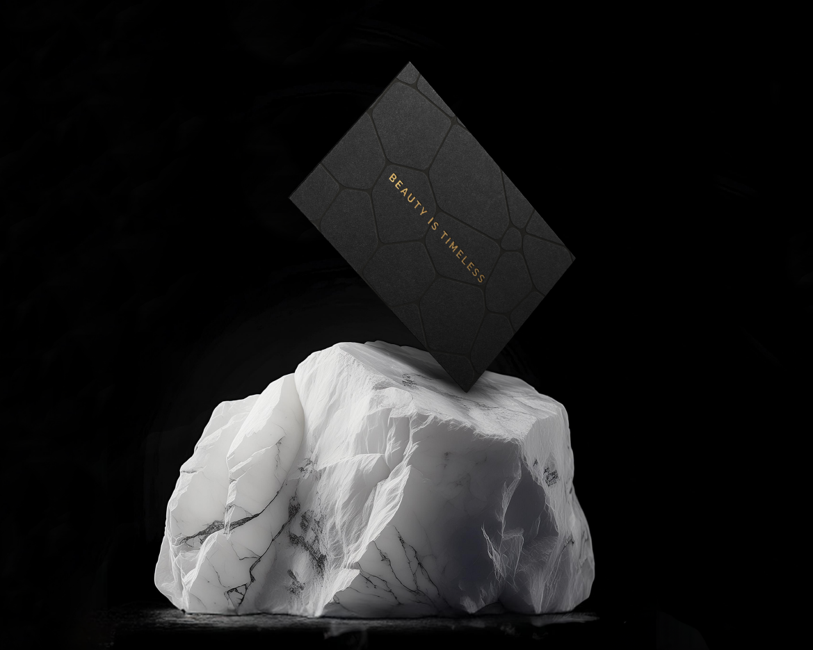
In packaging, we embraced minimalism, spotlighting the logo as the focal point. High-quality, durable materials echo the brand's dedication to excellence, showcasing its commitment to craftsmanship and distinction.
RESULTS
The culmination of these efforts is FROSTTOWN® – a fashion brand that reverberates with a dynamic and bold aura, steeped in mystique. This unique blend positions FROSTTOWN® as a pioneer in Houston's burgeoning design landscape. By amalgamating the city's industrial heritage with avant-garde fashion, the brand creates an unforgettable identity, carving its path towards being a symbol of Houston's industrial chic renaissance.