Corporate branding design is the system a company uses to be recognized by the audiences who decide its future: investors, partners, employees and regulators, not shoppers at a shelf. It isn't a logo and it isn't a famous name. It's a mark, a system and a voice that still work when nobody from the design team is in the room to explain them.
Most explanations of corporate branding design point at Nike, Apple and Coca-Cola and call it a day. That's a category error. Those are famous consumer brands, chosen because they're recognizable, not because they're corporate. A two-person investment boutique with no public products is exactly as corporate as a multinational, because the audience is institutional, not retail: the person deciding whether to trust the brand is a partner, an investor or an employee, not someone standing at a shelf.
We've built corporate identities for a marketing agency, an investment boutique, an insurance company, a networking platform and an ERP startup. None of them sell a product a customer picks up. All five had to win trust before a relationship even existed. This guide is what those projects taught us, with five real identities taken apart, and a free brand consistency audit to check your own.
01What corporate branding design actually is
Product packaging has to win a purchase decision in seconds, standing next to its competitors on a shelf. Corporate branding design has a different job: it has to hold up across a 40-page pitch deck, a signed contract, a careers page and a boardroom, often without a customer ever picking up anything with the company's name on it.
Stripped of the jargon, it does three things:
- Signals trust before a relationship exists. An investor, a partner or a candidate meets the brand before they meet the people behind it. The identity is doing the first conversation.
- Travels across formats that have nothing to do with a purchase. Contracts, decks, offices, uniforms, invoices. A brand that only looks right on a landing page isn't a corporate identity yet.
- Survives a handoff. A new employee, a vendor or a partner should be able to apply it correctly without calling the agency that built it. If every new deck looks slightly different, the system isn't finished.
02The 3 layers of a corporate identity
A corporate identity isn't one deliverable. It's three layers, built in order, each one load-bearing for the next.
Skip the system and voice layers, and what you have is a logo with no way to travel. Most of the corporate rebrands that fail aren't failing on the mark. They're failing because the other two layers were never built.
03Free brand consistency audit
Answer ten yes-or-no questions about how your brand actually gets used across the company, not how the guidelines say it should. Nothing is uploaded or saved; this runs entirely in your browser.
Does your logo have one approved file for every use: full color, reversed, and icon-only?
Are your brand colors locked to exact values (Pantone, CMYK, RGB, hex), not "sampled from the last file"?
Do you use one typeface pairing everywhere, not whatever's installed on the newest laptop?
Do every deck, proposal and invoice use the same template?
Do all your team's email signatures match?
Are your social avatars and banners identical across every platform?
Could someone outside the design team apply your brand correctly without calling you?
Is your tone of voice written down, not just "known" by whoever founded the company?
Do new vendors and partners get a one-page guide, instead of a logo file and a guess?
Has every touchpoint (signage, uniforms, vehicles, packaging) been reviewed in the last 12 months?
045 corporate identities, taken apart
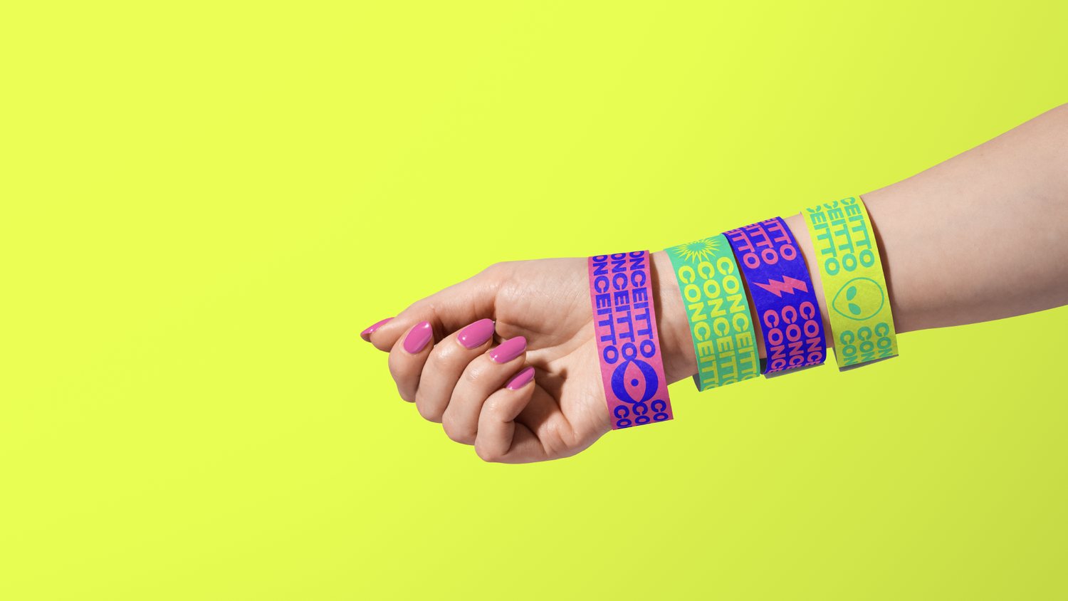
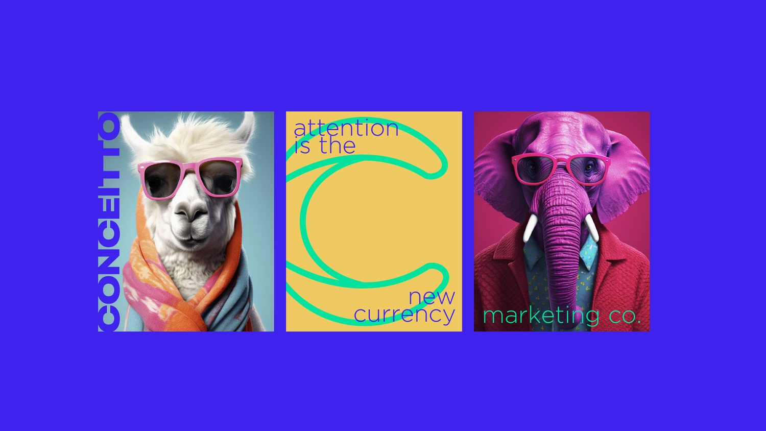
1. Conceitto: turning a letter into a symbol
- The brief
- A marketing agency serving a young, tech-savvy audience, needing a rebrand as bold as its own philosophy: attention is the new currency.
- The move
- The letter C became an eye, the art of seeing opportunities others miss, set inside a palette of neon pink, electric purple, lime green and sunshine yellow, tuned to stop a scroll or a city block dead.
- Steal this
- Turn a letter you already own into a symbol, instead of bolting a new icon beside it. Conceitto's eye costs nothing extra to produce and still reads at business-card size.
See the full Conceitto case study →
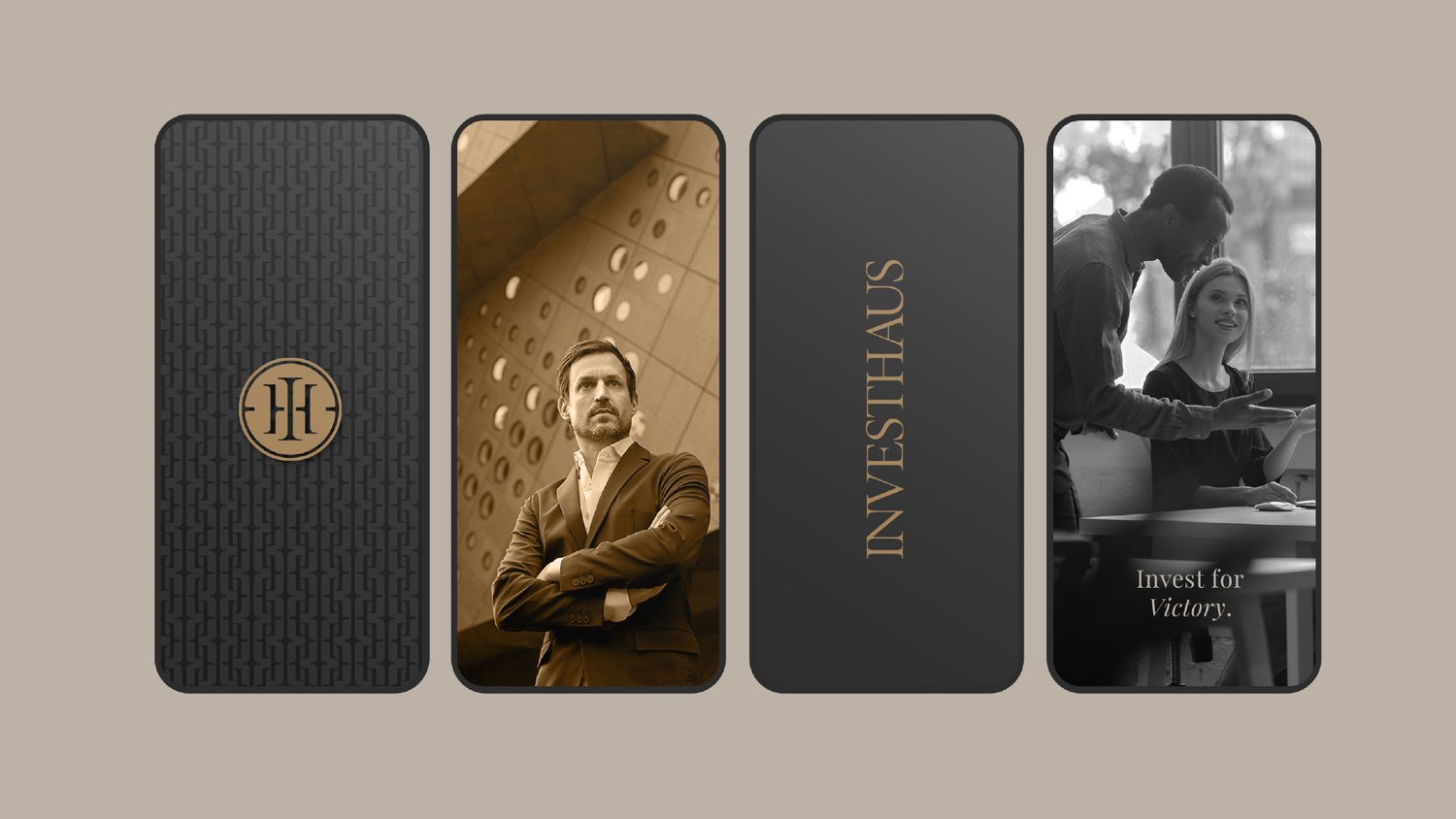
2. INVESTHAUS: the geometry of trust
- The brief
- An investment boutique with offices in Miami and Rio de Janeiro, needing to convey both financial authority and personal trust for a discerning, global clientele.
- The move
- The letters "I" and "H" fused inside a circle, a focal point of direction that doubles as a seal, carried by a formal, trust-forward palette from business cards to city billboards.
- Steal this
- A monogram sealed inside a circle reads as a stamp of approval before anyone parses the letters. Borrow that geometry whenever the category runs on trust, not excitement.
See the full INVESTHAUS case study →
3. LORENSEGS: a symbol older than the company
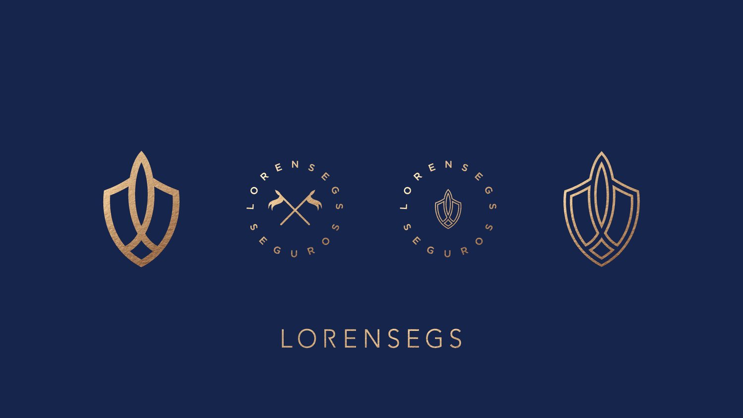
- The brief
- A Brazilian insurance company needing to communicate reliability and stability, without losing the warmth of what insurance is actually for: the people it protects.
- The move
- A shield with a lowercase "l" built into its core, carried by a bold, dark blue palette with gold accents marking growth and prosperity.
- Steal this
- A symbol older than your category, a shield, a key, a compass, imports centuries of meaning a five-year-old company hasn't earned yet. Use it honestly, as a promise to keep, not a shortcut around keeping it.
See the full LORENSEGS case study →
4. PROXI: merging two concrete symbols
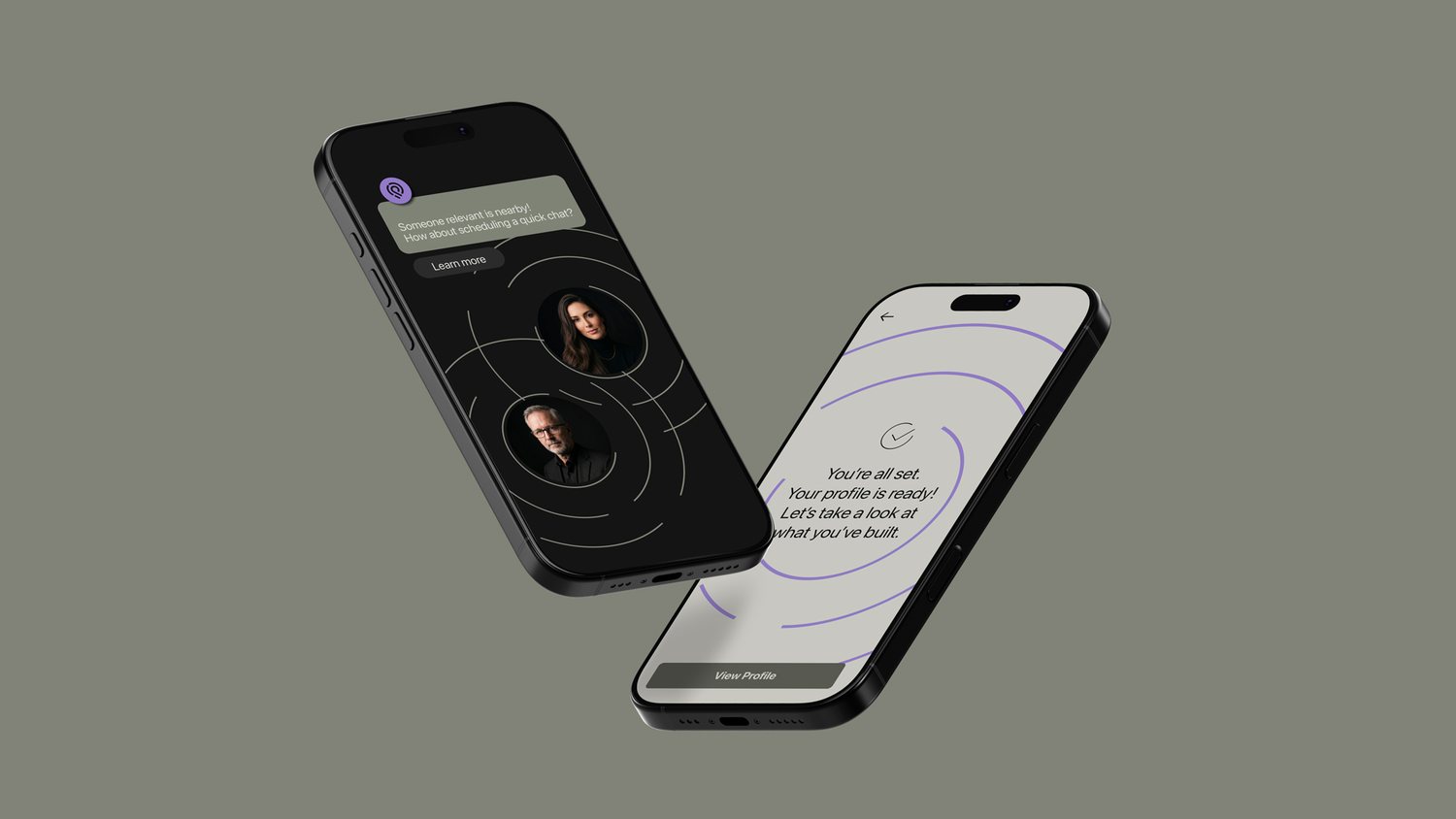
- The brief
- A closed-loop networking platform built for professionals in motion, needing to promise serendipity that feels effortless, yet is powered by intelligence.
- The move
- A location pin folded into a fingerprint, Imprint Connection, merging individuality with proximity: predictive introductions grounded in real-world presence.
- Steal this
- When the product is abstract, a network, a feeling, a timing mechanism, merge two concrete symbols instead of inventing one abstract shape from scratch. A pin plus a fingerprint says more than either alone.
See the full PROXI case study →
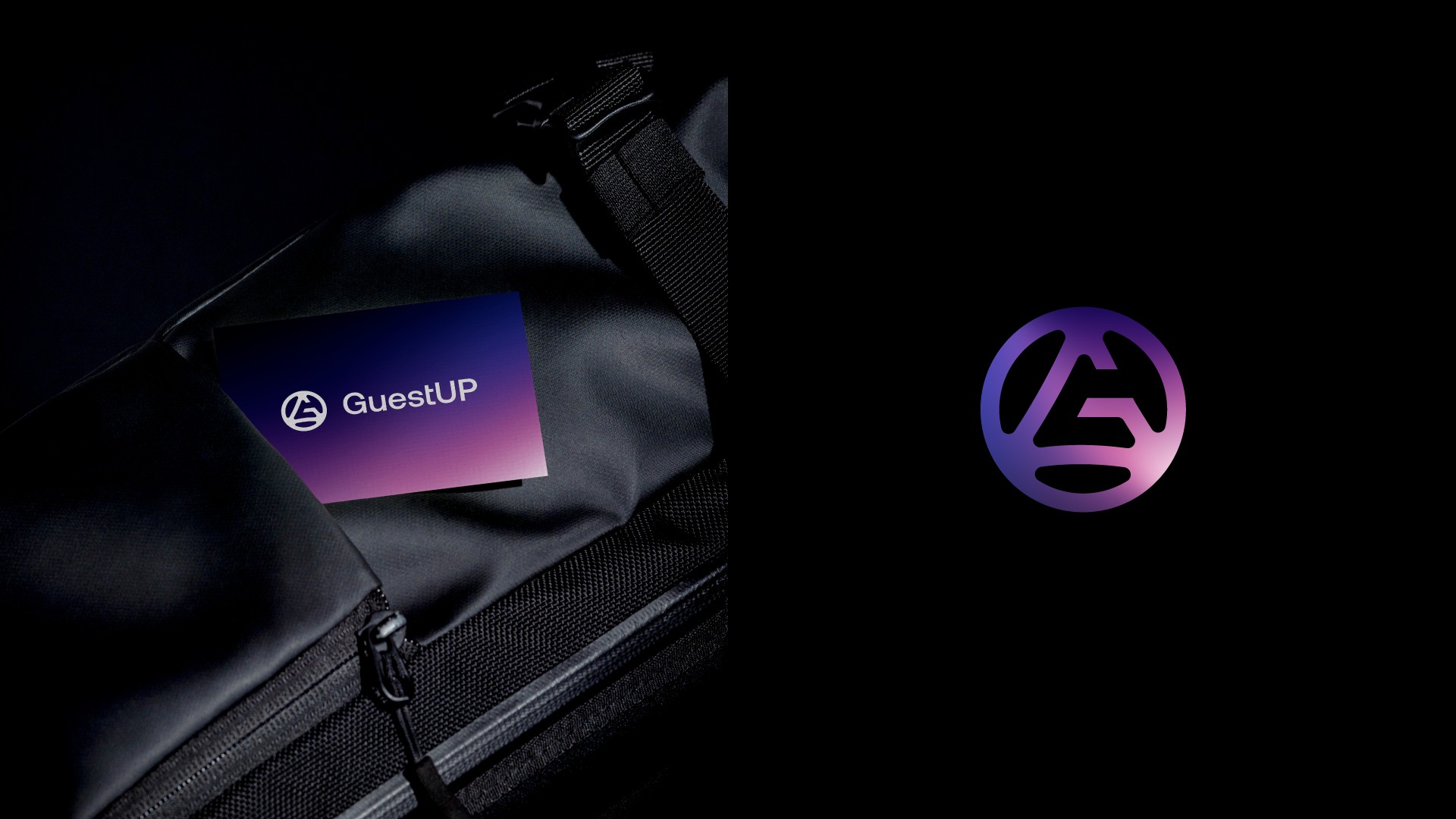
5. GuestUP: the shape of "up"

- The brief
- An ERP startup needing to reposition itself as modern and user-centered, in a category usually perceived as rigid, technical and hard to navigate.
- The move
- A custom G symbol reading as an upward arrow enclosed in a circle, on a structured blue foundation with a vibrant gradient layered on top for dynamism.
- Steal this
- An arrow is the fastest way to signal progress without a single word of copy. If your product's entire pitch is "things get better," find the geometric shape for "up" and build the mark around it.
See the full GuestUP case study →
05What actually makes a brand "corporate"
It isn't size, and it isn't fame. Apple gets cited as a "corporate branding" example constantly, but Apple's identity has one job: make a consumer want to buy a phone. INVESTHAUS has the opposite job, with a fraction of the budget: make an institutional client comfortable wiring money to a boutique they've never worked with before.
What actually separates a corporate identity from a consumer one is the audience and the format:
- The audience decides with their business, not their wallet. Investors, partners, employees, regulators. The decision is slower, more considered, and harder to reverse than a shelf purchase.
- The format is documents, not packaging. A corporate identity lives in decks, contracts, letterheads and signage, places where restraint and legibility matter more than shelf-stopping color.
- The relationship outlasts any single transaction. A customer can stop buying a product with no conversation. A corporate brand is usually in an ongoing relationship, with renewal, reputation and referral all riding on it.
A one-person consultancy with a sharp monogram and a one-page guideline is a corporate brand. A famous consumer label with no B2B relationship to manage, isn't, no matter how many people recognize the logo.
06What belongs in a brand guideline
A guideline isn't a mood board. It's the document that lets the identity survive without you. At minimum, it needs:
| Section | What it actually has to answer |
|---|---|
| Logo construction | Clear space, minimum size, what never happens to it (no stretching, no recoloring, no drop shadows) |
| Color build | Exact values for print and screen: Pantone, CMYK, RGB and hex, not just swatches on a screen |
| Type hierarchy | Rules for real documents, decks and emails, not only the marketing site |
| Voice, one page | Three real before-and-after sentence rewrites, not a list of adjectives |
| Who to ask | One named point of contact for the edge case the guideline didn't cover |
A guideline nobody outside the design team has opened isn't a guideline. It's a PDF.
077 corporate branding mistakes
- Confusing "corporate" with "boring." Treating an institutional audience as if it doesn't respond to craft is how brands end up forgettable, not trustworthy.
- No document templates. The deck and the invoice look like they're from two different companies, because nobody designed past the logo.
- A guideline nobody past the design team has opened. If it's not used, it's not a system, it's an artifact.
- One typeface "because it's close enough" to the brand font. Close enough is how a brand quietly dissolves over two years.
- No rule for co-branding. The first awkward lockup with a partner or vendor logo becomes the template for every one after it.
- The logo redrawn by hand in a slide deck by whoever needed it fastest, because nobody could find the real file.
- No review cadence. Brands drift for years between refreshes because nobody owns the question of whether it still fits.
08Frequently asked questions
What is corporate branding design?
Corporate branding design is the visual and verbal system a company uses to be recognized by the audiences who decide its future: investors, partners, employees, regulators and the press, not shoppers choosing between products on a shelf.
What's the difference between corporate branding and consumer branding?
Consumer branding has to win a purchase decision in seconds, usually standing right next to its competitors. Corporate branding has to hold up across a pitch deck, a contract, a careers page and a boardroom, often without ever touching a product a customer picks up directly.
How long does a corporate identity take?
A logo and core system typically takes 6 to 10 weeks from brief to guidelines. A full identity with document templates, a style guide and a rollout across an existing company's touchpoints can take several months.
What should be in a brand guideline?
At minimum: logo construction and clear space, exact color values for print and screen, a type hierarchy for real documents, a short voice guide with before and after examples, and a named point of contact for edge cases.
Is corporate branding just a logo?
No. The logo is the smallest part. The real work is the system around it, color, type, templates and voice, and whether someone outside the design team can apply it correctly without calling you.
More field guides: Packaging Design and How To Name A Brand.