Restaurant branding is the system that makes a restaurant recognizable and worth returning to: its position, name, logo, color, type, voice, packaging and space, designed to tell one story at every touchpoint. Good restaurant brands are built from the position outward, not from the logo inward.
Most restaurant branding guides are written by software companies. They'll tell you to "be consistent" and "know your audience," then show you a Starbucks logo. Useful, maybe, if you're Starbucks.
This one is different. INDUSTRIA has been building brands since 2010, and a good share of them have been restaurants: a fast-casual Asian fusion concept in Zurich, two fried-chicken chains, an Argentine grill house, a Nikkei fine-dining group across Brazil and Uruguay, and a dining room 605 feet above Manhattan. Below, we take six of them apart: the brief, the decision that made it work, and the one move you can steal.
01What restaurant branding actually is
A restaurant brand is not a logo. The logo is the most visible piece, but it's one of many. Your brand is everything a guest picks up before they taste anything: the name they say to a friend, the sign they spot from across the street, the menu's weight in their hand, the sauce packet in their takeout bag, the photo they post.
When these pieces agree, you get something every operator wants and few achieve: a place people describe the same way. When they don't, you get a restaurant that's "pretty good" and quickly forgotten.
That's why restaurants have harder branding problems than most businesses. A software company lives mostly on screens. A restaurant lives on a storefront, a menu, a uniform, a cup, a delivery-app thumbnail and a dining room, often all at once.
02The Restaurant Brand Stack
Every restaurant identity we build moves through the same seven layers, in this order. Skip a layer and the ones above it wobble.
Notice what's first. The most common, and most expensive, mistake in restaurant branding is starting at layer three. A logo designed without a position is a guess, and you'll be redesigning it in 18 months.
03Choose your lane: energy or restraint
Before color, before type, decide which side of this line you're on. Almost every restaurant brand that works commits hard to one of them. The ones that hedge end up looking like nobody in particular.
| Energy | Restraint | |
|---|---|---|
| Typical concepts | Fast-casual, QSR, street food, takeout-led | Fine dining, chef-led, destination, hospitality |
| Color | Bright, warm, high contrast | Black, white, deep neutrals, one quiet accent |
| Type | Custom, chunky, playful | Refined, spaced, often numerals or monograms |
| Voice | Punchy, funny, first-name basis | Few words, confident, never explains itself |
| Hero touchpoint | Packaging and social | The room, the menu, the signage |
| Our examples | Wokuma!, PopChicken, Cluckers | 300 Cosmo, SKY605NYC, Mestre Parrillero |
046 restaurant identities, taken apart
1. Wokuma! — fast-casual built to scale
- The brief
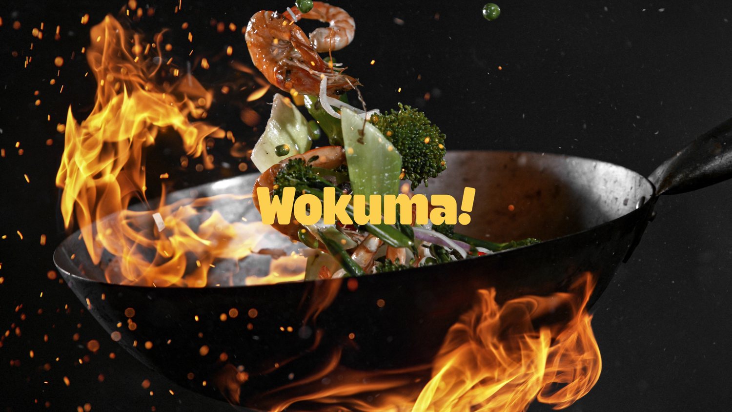
- A fast-casual Asian fusion restaurant in Zurich, founded by an entrepreneur planning to grow well beyond one location, entering a crowded food scene.
- The move
- The name does half the work: wok (the cooking method) plus umami (the fifth taste), ending on a punch. Around it, a kinetic custom logotype, loud color, and copy lines like "Let's Wok!" and "Full speed, full flavor" that turn packaging into advertising.
- Steal this
- If you plan to scale, design the system for location five, not location one. Every piece of Wokuma! was made to travel to new markets without losing its edge.
See the full Wokuma! case study →
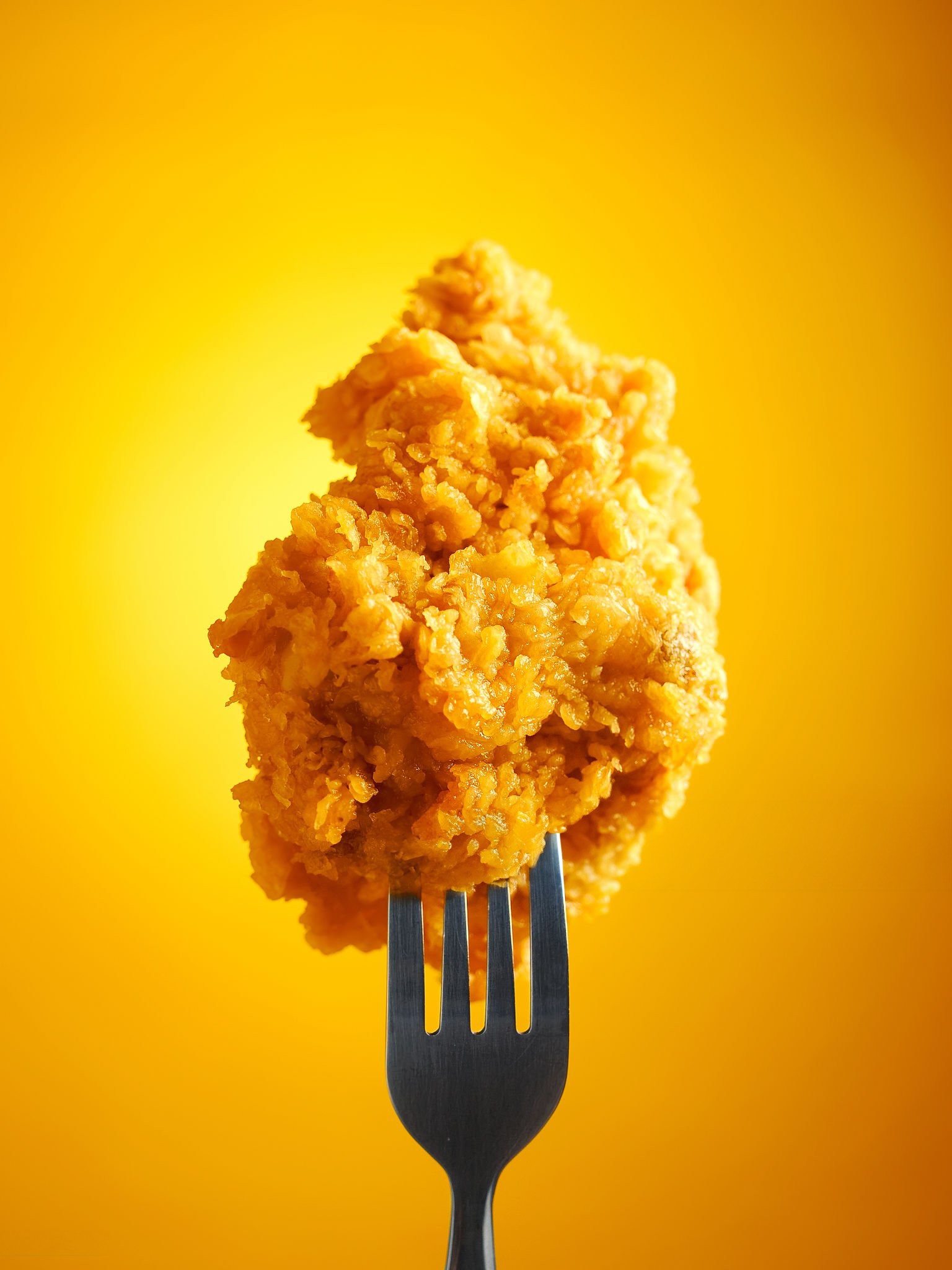
2. PopChicken — a character people want to share
- The brief
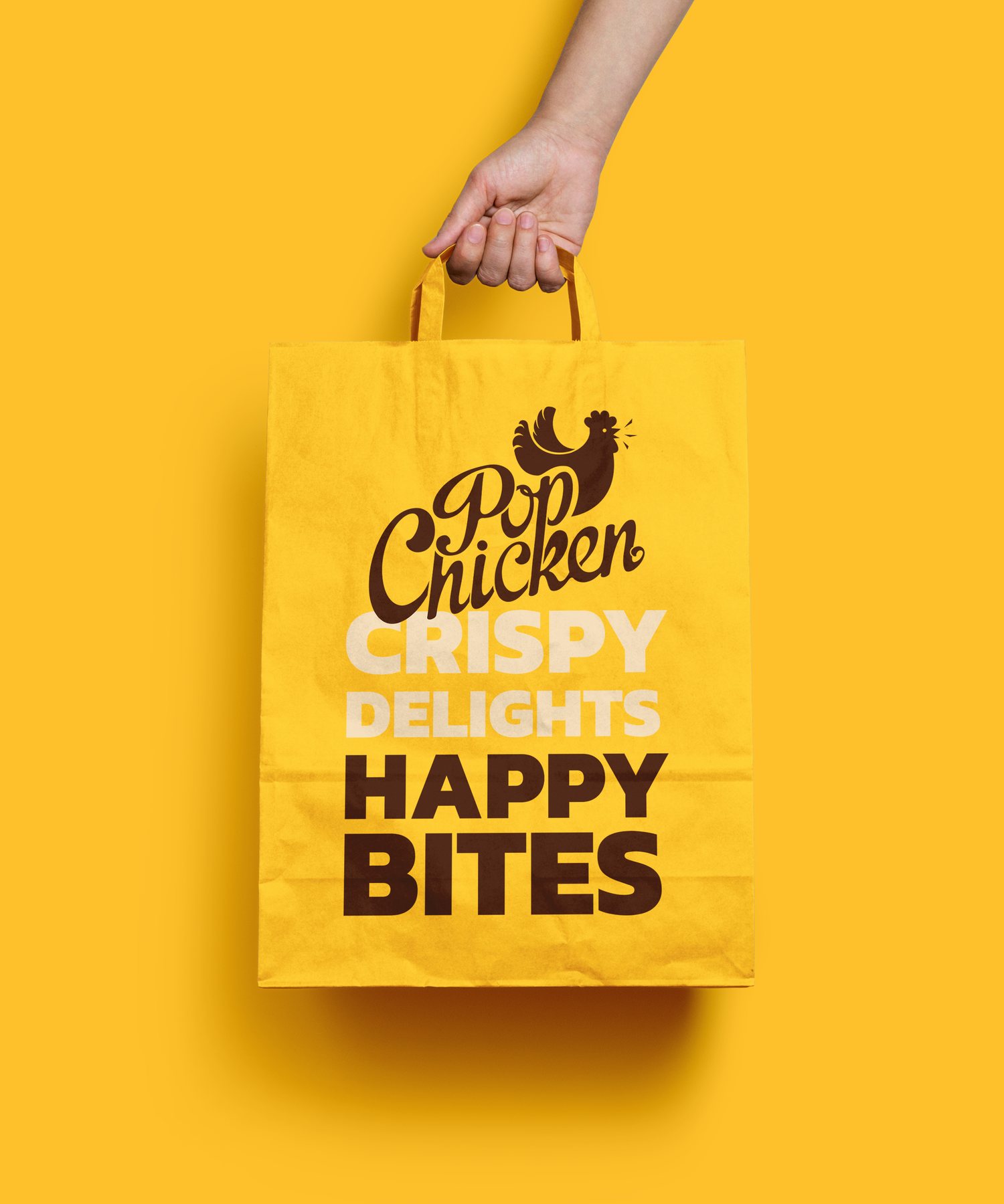
- A fast-food chicken chain aimed at a young audience. The ask was simple: pure energy, happy and friendly at first glance.
- The move
- A cute, quirky chicken character anchors the mark, backed by a playful custom font and a bright, high-contrast palette. Editorial illustration and a social-first content plan pushed the brand past the counter.
- Steal this
- A character is a content engine. It can react, celebrate and appear on merch in ways a wordmark never will. If your audience lives on social, give them something with a face.
See the full PopChicken case study →
3. Cluckers — one letter, everywhere

- The brief
- Another chicken concept, this one with a large menu of sides, needing to stand out next to established fried-chicken names.
- The move
- A custom mark built from the letter "C" that doubles as the brand's symbol, instantly recognizable on cups, coasters and signage. Bright orange and yellow signal warmth and appetite.
- Steal this
- Two chicken brands, two different answers: PopChicken went with a character, Cluckers with a letterform. In a category where competitors look alike, own one simple shape and repeat it until it's yours.
See the full Cluckers case study →
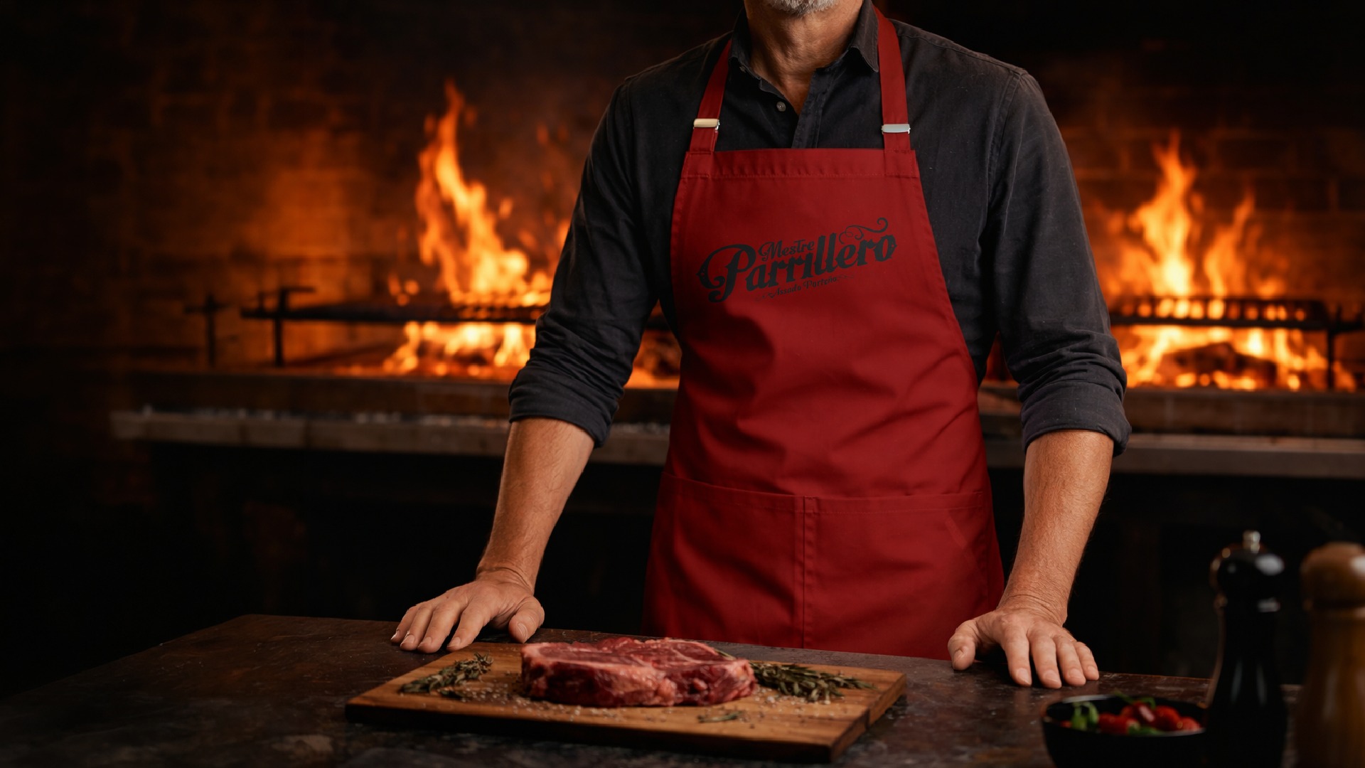
4. Mestre Parrillero — selling a ritual, not a menu
- The brief
- Bring Buenos Aires' parrilla culture, the ritual of slow-grilling meat over embers, to Brazilian diners as a modern, upscale experience.
- The move
- We built the brand around a person: the parrillero, the master griller who runs the fire. A refined wordmark meets hand-drawn illustration, with deep charcoal and terracotta for embers and aged metal. A grill-grid and flame emblem runs from foil-stamped menus to uniforms.
- Steal this
- If your cuisine has a ritual, brand the ritual. Guests don't remember "grilled meats." They remember the person at the fire.
See the full Mestre Parrillero case study →
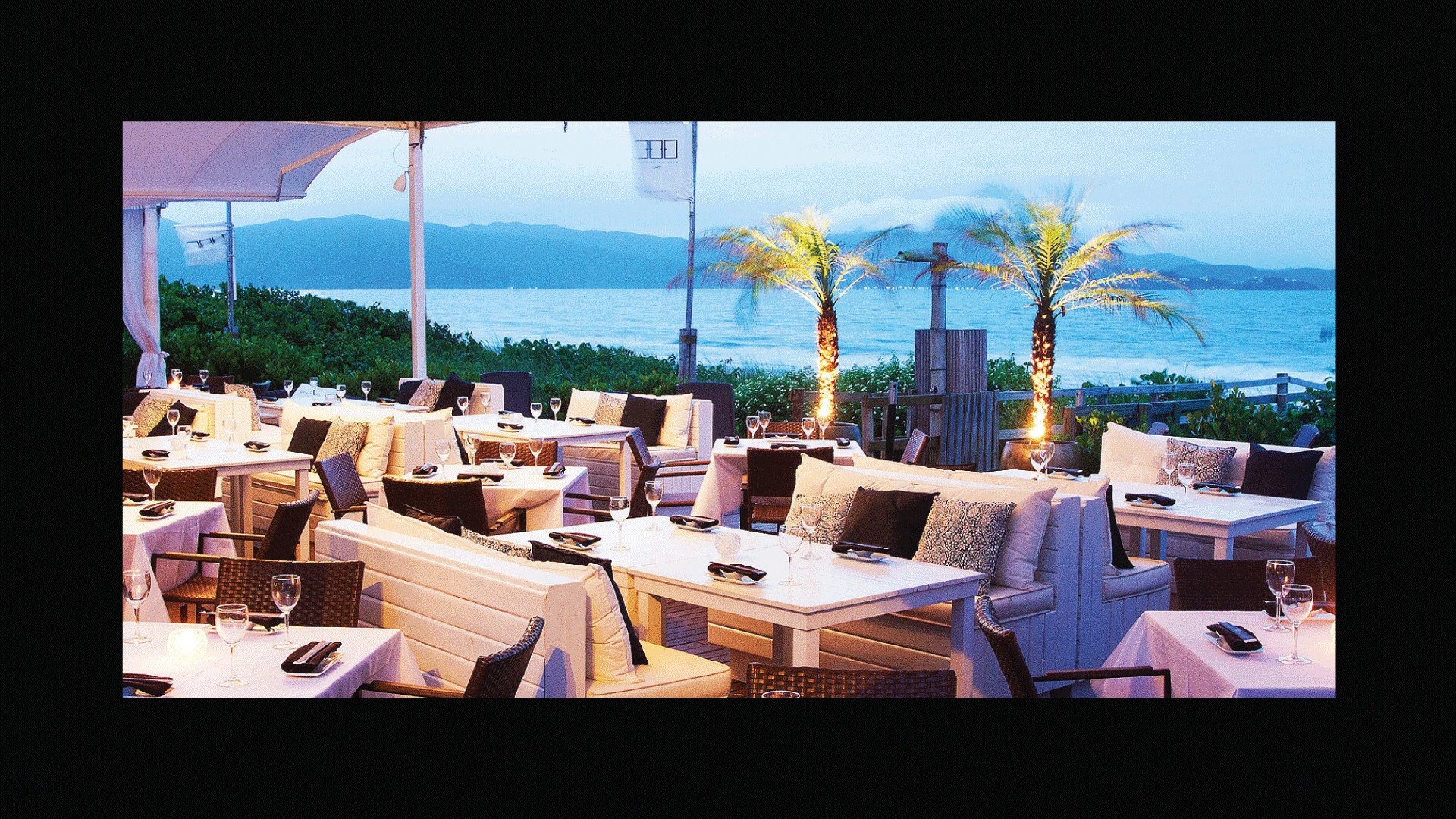
5. 300 Cosmo Dining Room — the power of saying less
- The brief
- A Nikkei (Japanese-Peruvian) restaurant and social destination with locations across Brazil and Uruguay, for guests who expect the top of fine dining.
- The move
- A logo built from custom numerals and a strict black-and-white system. It's restrained in a category that usually goes ornate. The same discipline carries into the Cosmo Beach Club, down to laser-drawn backlit panels.
- Steal this
- In luxury, restraint reads as confidence. If the food is the spectacle, the brand's job is to frame it, not compete with it.
See the full 300 Cosmo case study →
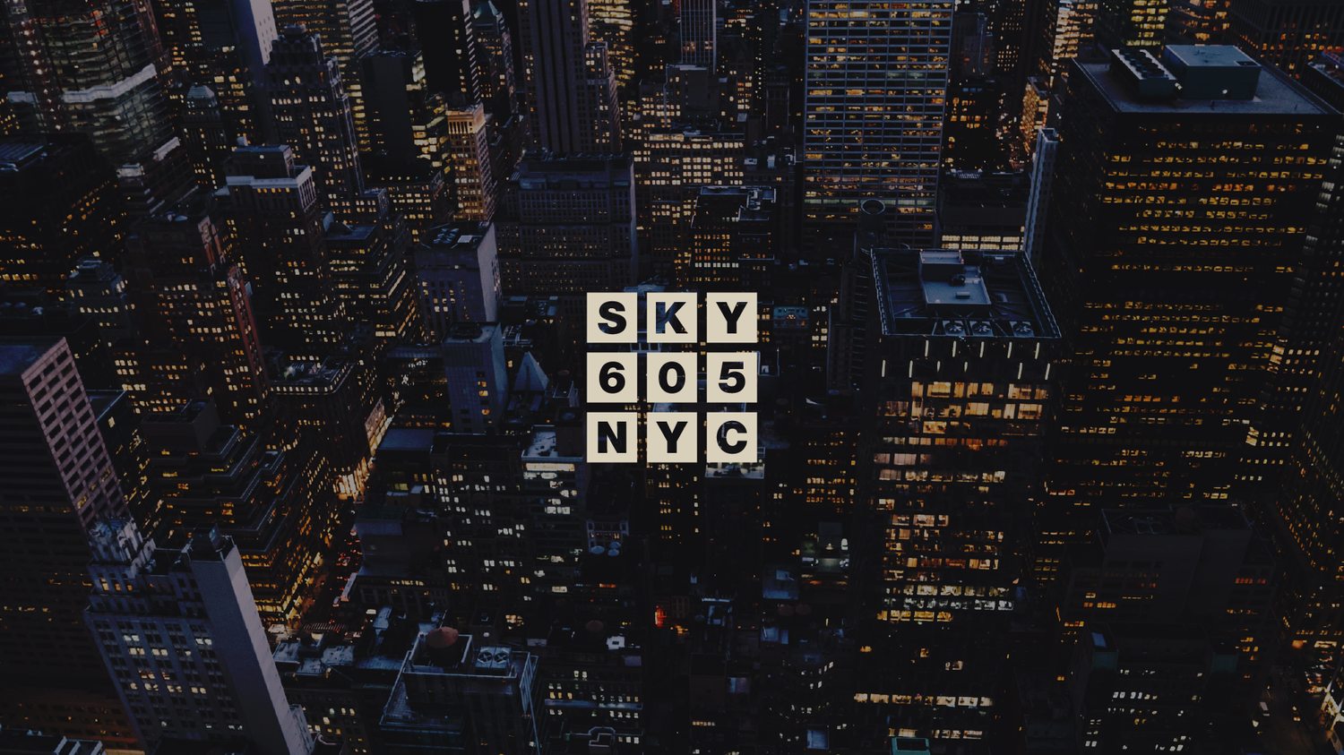
6. SKY605NYC — branding a view without the clichés
- The brief
- A dining room 605 feet above Manhattan, built around chef Andrew Grayen's shared-plate menu, with no interest in the usual rooftop clichés.
- The move
- The mark is a nine-square grid, a window onto the city, repeated as a system across signage, stationery and the room itself. Charcoal, warm brown and soft neutrals keep it architectural but warm.
- Steal this
- Find the one thing only you have (here, the height and the view) and turn it into a shape. A brand asset that comes from a real fact about the place can't be copied by the competitor down the street.
See the full SKY605NYC case study →
055 formulas for naming a restaurant
Restaurant naming is where most owners get stuck, and where shortcuts like name generators produce the most forgettable results. Here are five formulas that have worked for us, with the real names behind them.
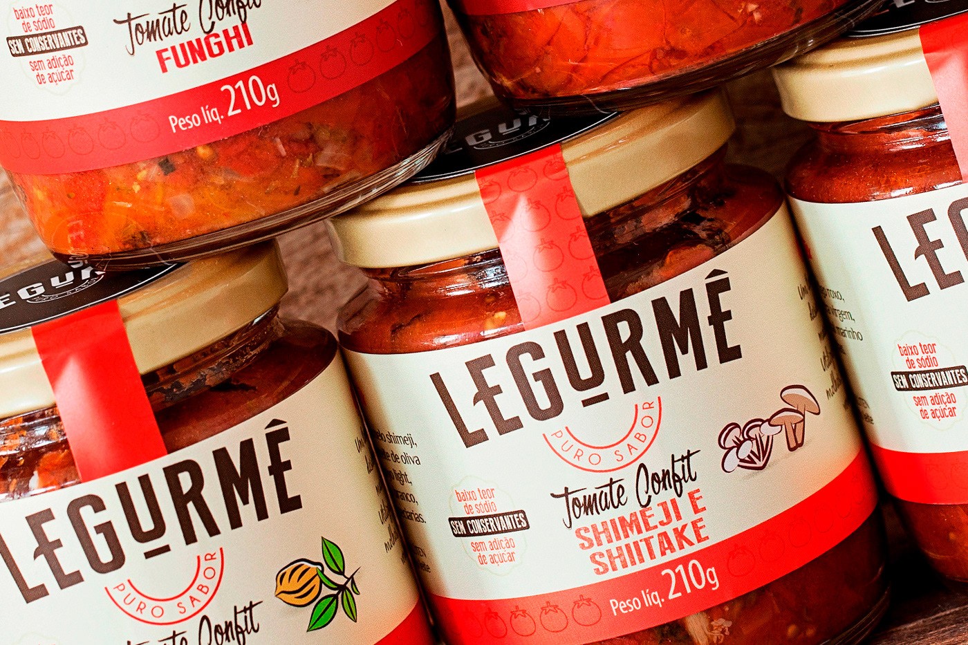
- The fusion. Combine two words that hold the concept. Wokuma! = wok + umami. Legurmê = legumes (Portuguese for vegetables) + gourmet. Good when you need a name that's ownable and still explains itself.
- The role. Name the person at the heart of the experience. Mestre Parrillero means "master griller." Good for chef-led, craft and ritual-driven concepts.
- The number. A number from a real fact about the place. SKY605 is the height in feet; 300 anchors the Cosmo group. Numbers are short, international and easy to turn into a logo.
- The sound. Onomatopoeia or a sound linked to the food. Cluckers, PopChicken. Great for fast-casual: playful, easy to remember, kid-friendly.
- The place. Name it after where it is or where the food comes from. Strong for local pride, weaker if you plan to expand far from home. Test it against your five-year map.
Whatever you pick, run it through four checks before you fall in love: Can a stranger spell it after hearing it once? Is the domain or a close variant available? Are the social handles free? Does it mean something unfortunate in the languages of the markets you'll enter?
Going deeper on names? Read our full guide on how to name a brand, with a free name stress test.
06The 60-second restaurant brand audit
Answer honestly. This is the same quick check we run in the first call with a new restaurant client.
Can you say who your restaurant is for, and who it's against, in one sentence?
Would a regular describe your place with the same three words you would?
Is your logo still readable as a small app icon on a delivery platform?
Could someone recognize your packaging with the logo covered?
Is your main color different from your three closest competitors' colors?
Do your menu, signage, social and delivery listings look like the same brand?
Does your brand have a recognizable voice: a line or phrase guests repeat?
Do you have written brand guidelines that a new manager or printer could follow?
Would your identity work, unchanged, for a second location in a different city?
Do guests regularly photograph and post something branded: a cup, a bag, a wall, a dish?
Answer all ten questions to see where your brand stands.
Talk To Us About Your Score →077 restaurant branding mistakes that cost covers
- Starting with the logo. Without a position, you're designing decoration. Start at layer one of the stack.
- Borrowing your category's uniform. Red-and-yellow burgers, green-and-wood salad bars. If you look like the category, guests file you under "another one."
- Designing for the façade only. For many concepts, more guests meet your brand as a delivery-app thumbnail than as a sign. Design for both.
- Treating packaging as an afterthought. The bag leaves the restaurant, rides the subway, sits on an office desk. It's your most mobile advertising. (More in our Packaging Design Guide.)
- A name that doesn't travel. Hard to spell, already taken online, or tied to a neighborhood you'll outgrow.
- No guidelines. Without a written system, every new menu, sign and Instagram post drifts a little further away from the original.
- Rebranding the furniture, not the idea. A new logo on the same muddled position is a costly coat of paint.
08How much does restaurant branding cost?
It depends on scope more than on anything else. Published 2026 market ranges look roughly like this:
| Who | Typical range (USD) | What you usually get |
|---|---|---|
| Freelancer | $500 – $5,000 | Logo, palette, basic guidelines |
| Boutique studio | $5,000 – $20,000 | Strategy-led identity, guidelines, key applications |
| Full-service agency | $20,000 – $100,000+ | Positioning, naming, full identity, packaging, rollout support |
Ranges compiled from published 2026 pricing guides by Logotio, DesignRush and ManyPixels.
For restaurants, three things move the number most: naming (if you don't have a name yet), packaging (takeout-led concepts need a real packaging system, not a sticker), and number of locations (a brand built to scale needs more rules and more tested applications). The cheapest identity is rarely the cheapest outcome. Reprinting menus, re-wrapping a storefront and re-training a team after a failed launch costs more than doing it right the first time.
09Frequently asked questions
What is restaurant branding?
Restaurant branding is the system that makes a restaurant recognizable and worth returning to: its positioning, name, logo, color, typography, voice, packaging and physical space, designed to work together so every touchpoint tells the same story.
How long does it take to brand a restaurant?
A focused identity typically takes 6 to 12 weeks. Adding naming, packaging systems or interior signage extends that. Start branding before you sign off on signage, menus and fit-out, because those depend on it.
What colors are best for a restaurant brand?
There is no single best color. Fast-casual brands often use bright, warm palettes for energy and appetite, as Cluckers does with orange and yellow. Fine-dining brands often use restraint, like the black-and-white system of 300 Cosmo. Pick color for your position first, then make sure it's distinct from your direct competitors.
Do I need a brand before I open?
Yes. Signage, menus, uniforms, packaging, delivery-app listings and social accounts all need the identity before opening day. Rebranding after launch costs more because everything is already printed, installed and known by guests.
Can a restaurant rebrand without losing regulars?
Yes, if you keep what guests already love and change what's holding you back. Audit which assets carry recognition (a color, a character, a dish name) and evolve around them instead of starting from zero.