Good packaging does three jobs: get seen from across the aisle, get chosen at arm's length, and reward the buyer up close. Design for all three distances, own one visual signal your competitors don't use, and build a system, not a single label, so every new product strengthens the brand.
Packaging is the only piece of branding that's there at the exact moment of purchase. Advertising made a promise somewhere else, earlier. The package has to close the sale on a crowded shelf, or as a thumbnail in a list of twenty near-identical results.
When INDUSTRIA designed the label for ATAO, a Chilean reserve red, the brief described a market where every bottle is fighting for the same few seconds of attention. That's true for nearly every category we've designed for: wine, sparkling wine, craft beer, gourmet food and dermocosmetics. This guide is what those projects taught us, with five real packaging systems taken apart, and a free shelf simulator to test your own.
01The 3 jobs of packaging
- Be seen. Interrupt a shopper who isn't looking for you. This is a job for color, contrast and shape, not words.
- Be chosen. Once someone looks, make the decision easy: what it is, who it's from, why it's worth the price. This is a job for hierarchy.
- Be kept. Reward the buyer after the purchase, on the kitchen counter, the bathroom shelf, the dinner table. This is a job for materials, details and story.
Most packaging is designed at desk distance, on a screen, at 100% zoom. That's the one distance at which no shopper ever sees it first.
02The 3-Distance Rule
We review every pack at three distances. Each one has a different job and needs a different kind of design decision.
A useful shortcut: if a design decision doesn't help at one of these three distances, it probably doesn't belong on the pack.
03The free shelf simulator
Upload a photo or render of your packaging and see roughly how it reads at each distance and as an online thumbnail. Your image stays in your browser; nothing is uploaded.
 30 cm · In the hand
In the hand: is there a detail that rewards a closer look? Texture, a finish, a line of story?
A simulation for quick comparison, not an optical model. Nothing replaces printing a proof and putting it on a real shelf next to your competitors.
Get A Packaging Review →045 packaging systems, taken apart
1. ATAO Wine — recognized before it's read
- The brief
- A full-bodied red blend from Polkura Winery in Chile's Colchagua Valley, aged 12 months in French oak, entering a shelf full of high-quality wines with longer pedigrees.
- The move
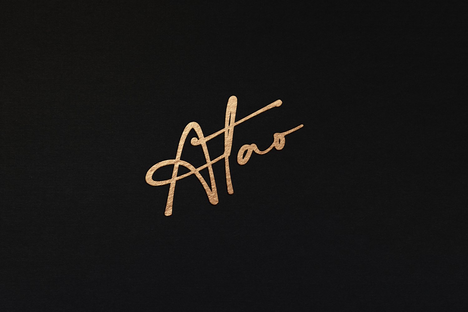
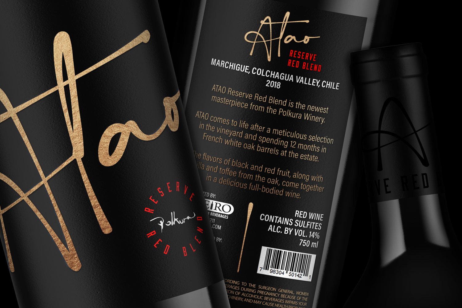
- A handmade script logo with interwoven letterforms, in gold foil on a black ground. The script is the label: big enough to work as the bottle's main image, not a small logo sitting above a picture.
- Steal this
- At 3 meters, a single high-contrast gesture beats a detailed illustration. Let your mark become the image, and use one premium finish where it does the most work.
See the full ATAO case study →
2. BONEVI — packaging an occasion, not a product
- The brief
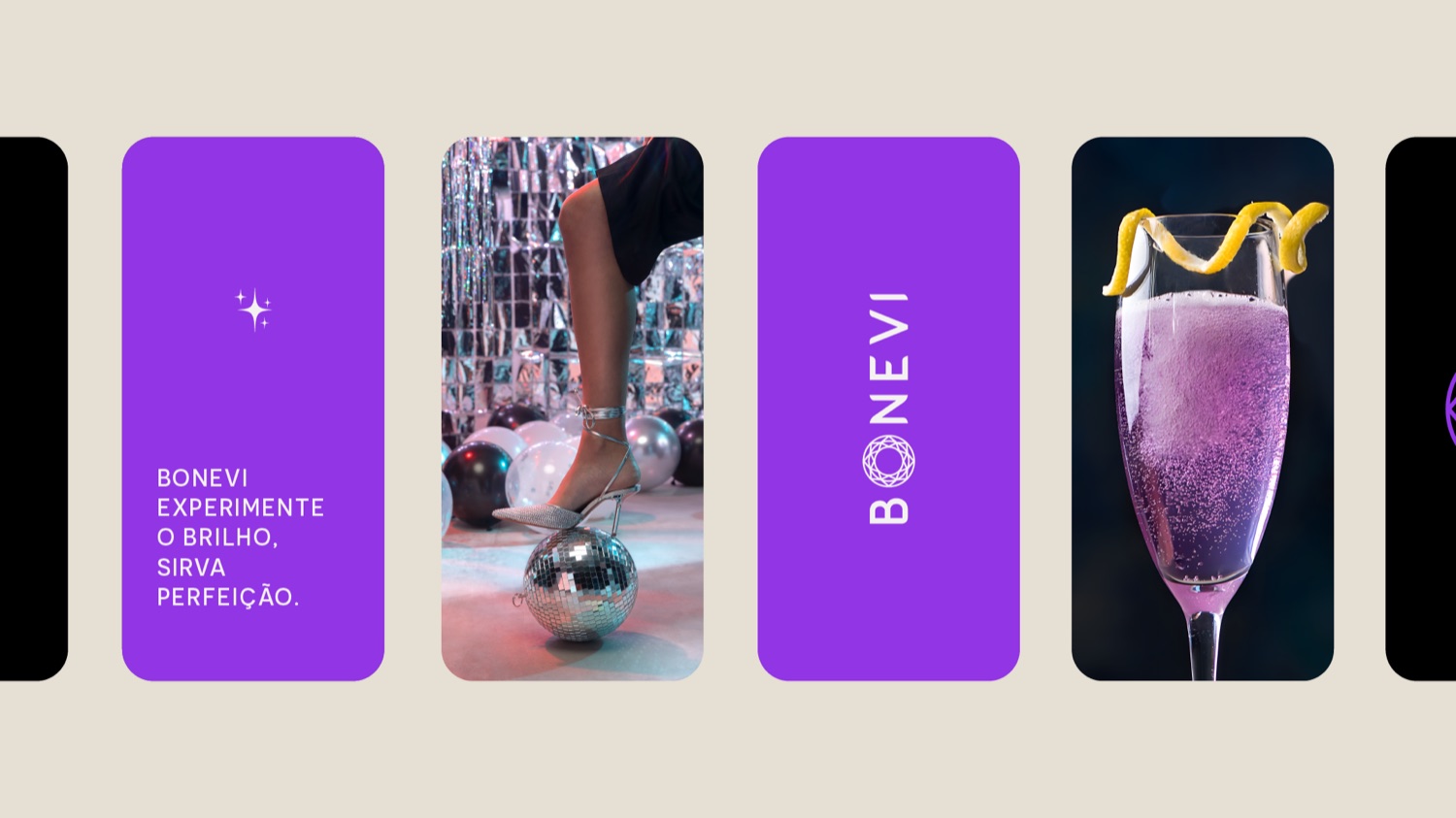
- A sparkling wine served from an on-tap dispensing system, aimed at a modern audience in a category dominated by traditional wine brands.
- The move
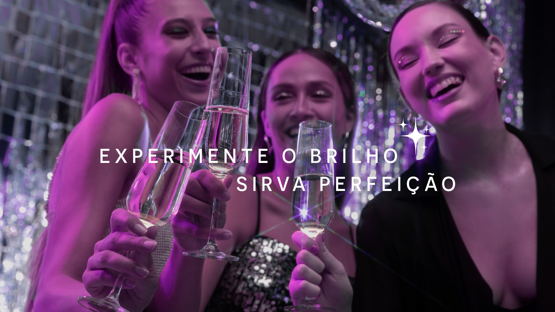
- A logotype with a diamond-faceted icon and a lilac palette, a color almost no traditional wine brand uses. The messaging talks about moments of sharing a glass, not about the wine itself.
- Steal this
- When your category's colors are fixed by tradition (burgundy, gold, cream), a color from outside the category is the fastest way to be seen. Make sure it fits your audience, then commit to it everywhere.
See the full BONEVI case study →
3. IndHed — one beer that looks like a collection
- The brief
- A Brazilian craft brewery born in 2012 inside INDUSTRIA's own studio, brewing small-batch American lagers and pale ales.
- The move
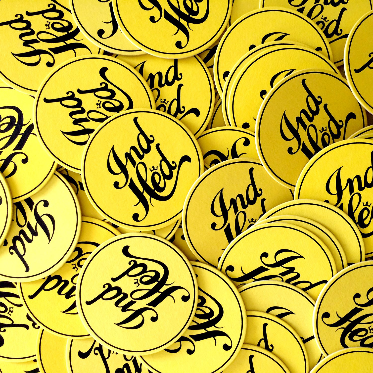
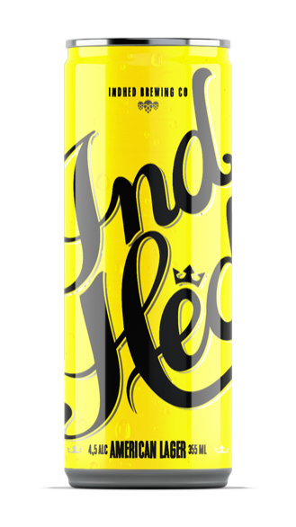
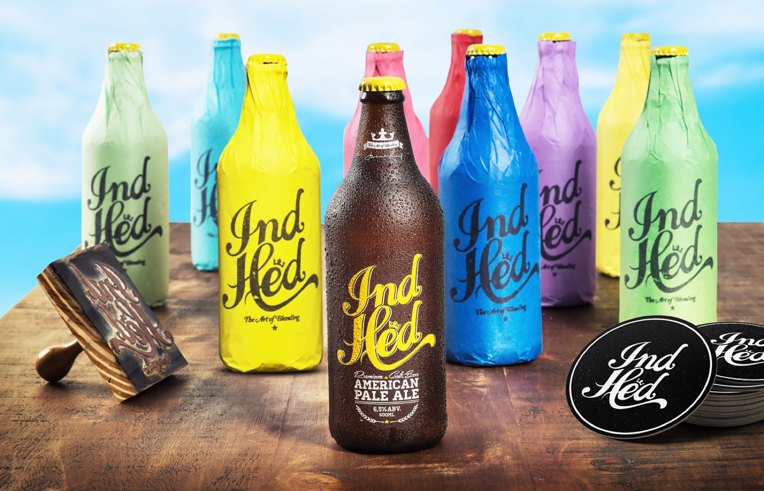
- A bold hand-lettered script topped with a small crown, carried across a rotation of vivid bottle-wrap colors: blue, pink, yellow and green.
- Steal this
- Color rotation turns a small range into a visible block on the shelf, and gives fans a reason to collect. IndHed's system went on to be featured in The Dieline, Abduzeedo and Computer Arts.
See the full IndHed case study →
4. LEGURMÊ — the jar tells you what's inside
- The brief
- Organic, ready-to-eat food from local producers, positioned as premium in a crowded natural-food market, across a growing number of flavors.
- The move
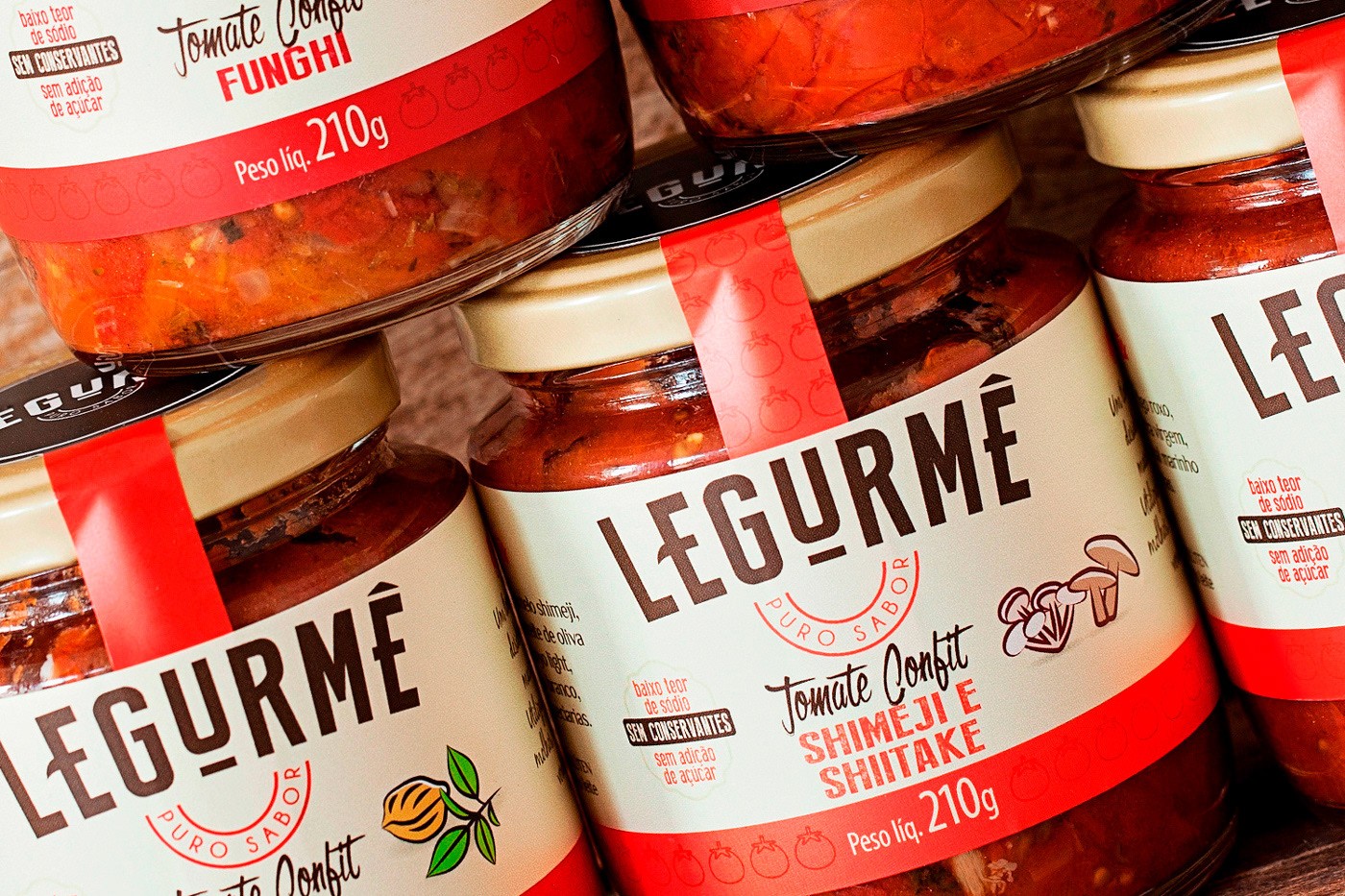
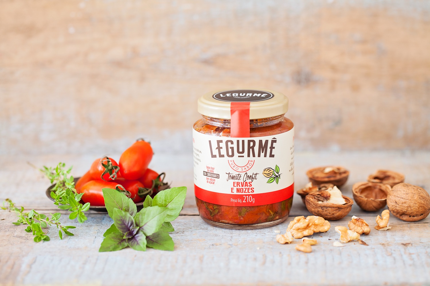
- Every flavor gets its own ingredient-inspired color, so the jar tells you what's inside before you read a word. Cursive and sans-serif type hold the range together as one family.
- Steal this
- For ranges, color should mean something, not just decorate. The Dieline featured the system for looking as good as it tastes.
See the full LEGURMÊ case study →
5. KN Skincare — clinical care, without the clinic
- The brief
- A dermocosmetics line formulated by cosmetologist Karolina Niewiadomska. The Polish shelf was split between cold pharmacy-clinical brands and soft wellness brands that are vague about ingredients. KN belonged to neither.
- The move
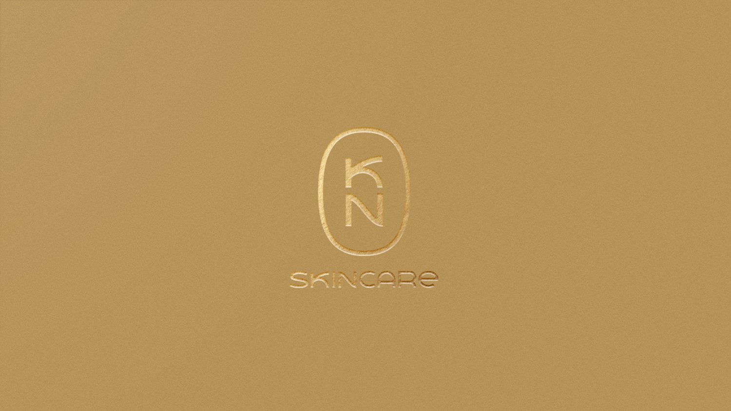
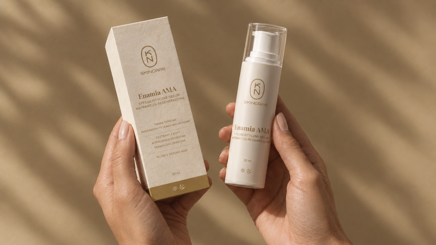
- One fixed pack architecture: mark, name, function line, a ruled ladder of three to five actives, volume, and a sun/moon pair showing when to use it. A single gold band ties the range together. The monogram is drawn at one continuous weight so it embosses, foils and debosses cleanly at 8 mm on a carton flap; supporting type holds up down to 5 pt.
- Steal this
- Design the 30 cm experience on purpose. KN prints a monogram lattice inside every carton, a detail only the buyer ever sees. That's what "be kept" looks like.
See the full KN Skincare case study →
05Designing a range: fixed vs. flexible
The moment you have more than one product, packaging becomes a system problem. Decide in advance what never changes and what each product is allowed to change.
| Brand | Fixed (the family) | Flexible (the variant) |
|---|---|---|
| LEGURMÊ | Wordmark, type pairing, layout | One color per flavor |
| IndHed | Script wordmark and crown | Bottle-wrap color |
| KN Skincare | Monogram, pack architecture, gold band, palette | Product name, actives, day/night marker |
The rule of thumb: one variable per range. If flavor changes the color and the illustration and the type, shoppers lose the family. If nothing changes, they can't find the variant they want.
06Materials, finishes and print
- Use one hero finish. Foil, embossing, spot varnish or textured stock all signal quality, but they compete with each other. ATAO uses gold foil and lets it do the work.
- Design the mark for the process. Fine hairlines can fill in when foiled or embossed. KN's monogram was drawn at a single weight specifically so it would survive these processes at small sizes.
- Check minimum type sizes. Legibility rules depend on the market and category. For example, EU food labelling rules (Regulation 1169/2011) set a minimum x-height of 1.2 mm for mandatory information, with 0.9 mm allowed on small packs.
- Proof on the real substrate. Colors shift on kraft, textured paper, glass and metal. Always approve a physical proof, not a PDF.
- Check the regulations early. Wine, beer, food and cosmetics all have mandatory label content that varies by country. In the EU, wine labels must now also give ingredient and nutrition information, which can be provided via a QR code. Plan the space before the layout, not after.
General guidance only. Confirm label requirements with a regulatory specialist for each market you sell in.
07Packaging for e-commerce
Online, a shopper's "across the aisle" is a grid of small product thumbnails. Use the thumbnail view above and check:
- Is your mark still recognizable at thumbnail size? If not, consider a secondary mark, like a monogram or symbol, designed for small sizes.
- Can shoppers tell the variants apart? Color-coded ranges like LEGURMÊ work just as well online as on the shelf.
- Does the box arriving at the door look like you? For direct-to-consumer brands, the shipping box and unboxing moment are packaging too.
087 packaging design mistakes
- Designing at desk distance. Review at 3 m, 1 m and 30 cm, and as a thumbnail.
- Five focal points. When the logo, illustration, claim, flavor and badge all compete, nothing wins.
- Copying the category leader. Looking like the market leader makes you look like the cheaper alternative.
- Every finish at once. Foil plus emboss plus spot gloss plus a die-cut rarely reads as luxury. It reads as trying.
- No room for growth. A layout that only works for one product will break when the range grows.
- Regulatory text as an afterthought. Mandatory information squeezed in at the end ruins carefully designed layouts.
- Approving on screen. Screens glow; packaging reflects. Print it, hold it, put it on a shelf.
09Frequently asked questions
What makes good packaging design?
Good packaging gets seen from across the aisle, gets chosen at arm's length and rewards the buyer up close. That means one owned visual signal, a clear information hierarchy, and materials and finishes that match the price point.
How long does packaging design take?
A single product typically takes 6 to 10 weeks from brief to print-ready files. A full range with structural packaging, regulatory review and printed proofs can take several months.
What has to be on a wine label?
It depends on the market. Typical items include product category, alcohol by volume, volume, producer or bottler, origin and allergens such as sulfites. The US TTB and EU rules differ; EU wine labels must now also give ingredients and nutrition, which can be via a QR code. Confirm with a specialist for each market.
How do you design packaging for a product range?
Fix the elements that make the family (logo, type, layout) and let each product change one thing, usually color. One variable per range keeps it both recognizable and easy to navigate.
Does packaging design matter for e-commerce?
Yes. Online, the pack is first seen as a small thumbnail, so the mark and product type must be recognizable at that size. And once it arrives, the unboxing becomes part of the brand.
More field guides: Restaurant Branding and How To Name A Brand.