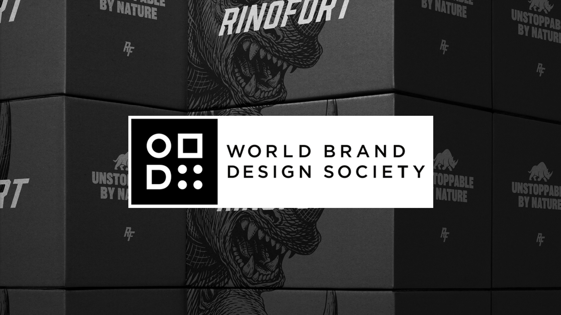
Rinofort® Featured on World Brand Design Society
A Bold Minimal Identity for a Strength-Driven Fitness Brand
We’re proud to share that RINOFORT® has been featured on World Brand Design Society, one of the most respected global platforms showcasing excellence in branding and design.

A Brand Built on Strength, Not Noise
RINOFORT® was never meant to blend in.
From the very beginning, the ambition was clear: create a fitness brand that embodies strength, discipline, and forward motion, not just visually, but conceptually. A brand that speaks to individuals who don’t rely on motivation alone, but on consistency, mindset, and presence.
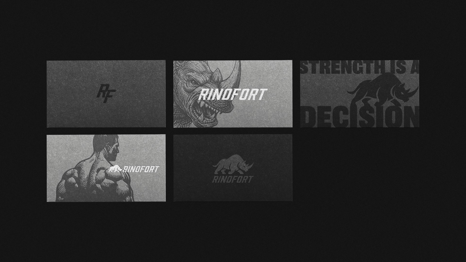
The result is a bold identity system rooted in clarity and intention.
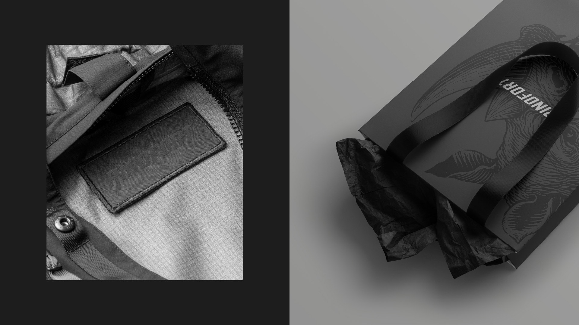
As highlighted in the feature, the project explores a minimal yet powerful visual language, where every element is designed to perform across apparel, packaging, and digital touchpoints.
The Power of Reduction
In a category often dominated by excess, aggression, and visual noise, RINOFORT® takes a different path.
We chose reduction.
A system where:
• Form replaces decoration
• Presence replaces complexity
• Clarity becomes strength
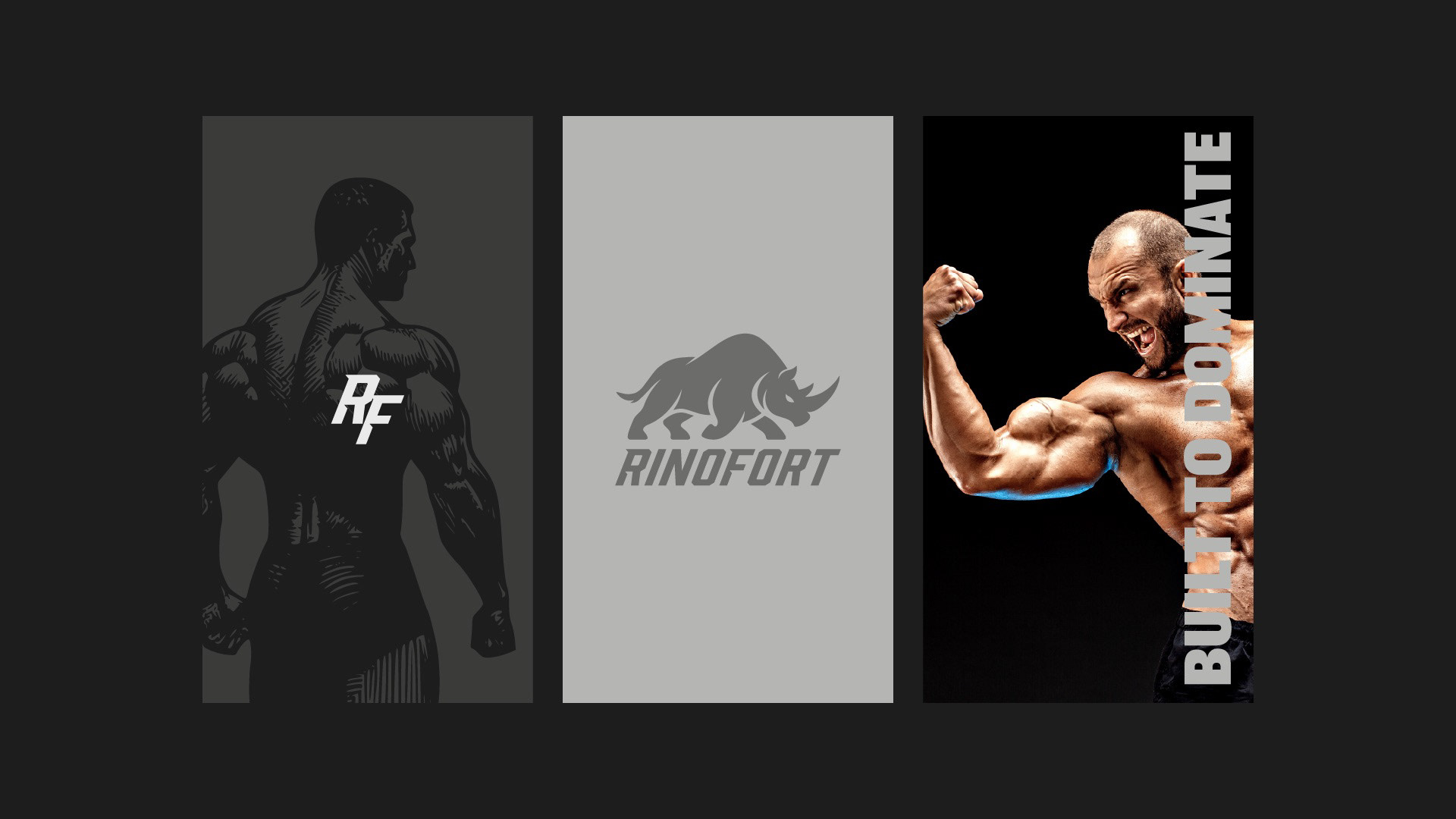
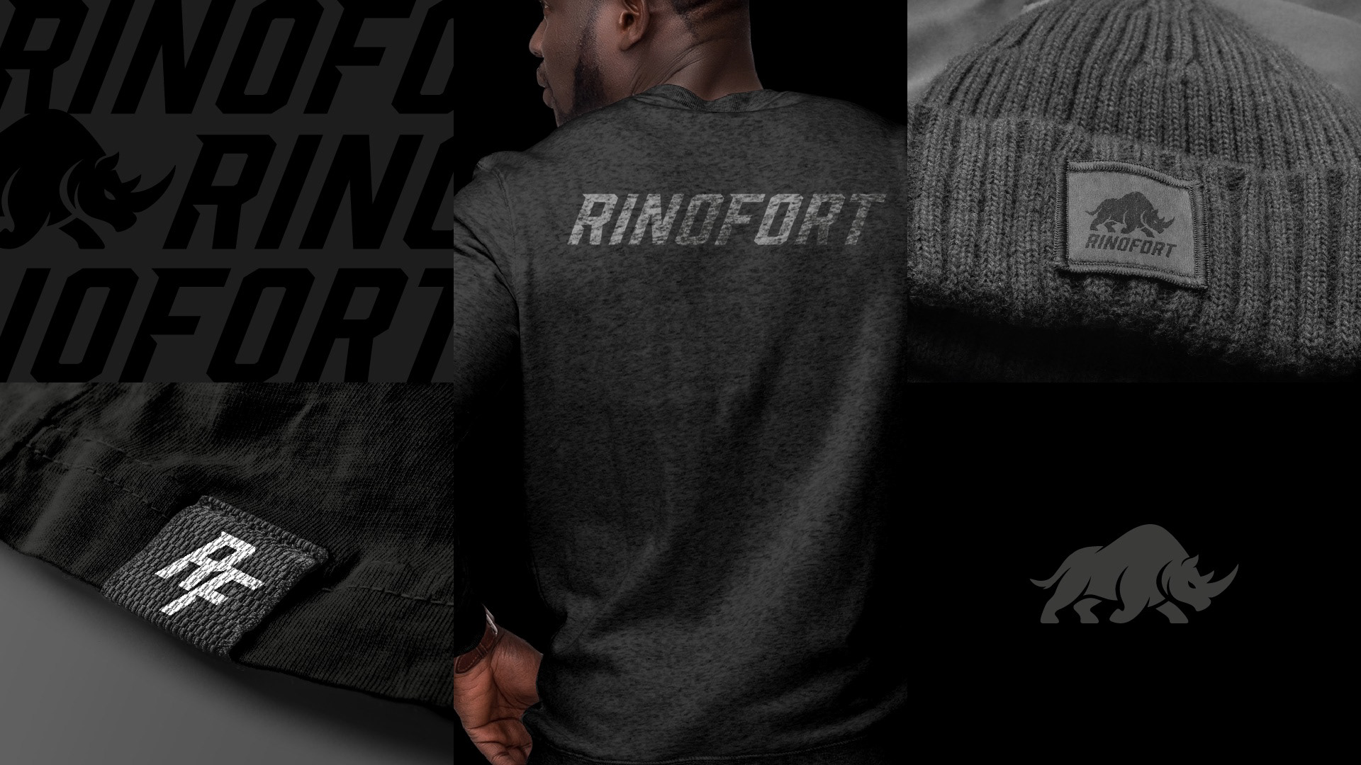
The custom RF monogram, the dynamic wordmark, and the iconic rhino symbol work together to create a cohesive identity that is both recognizable and scalable.
The rhino, in particular, is not just a symbol. It represents resilience, dominance, and unstoppable energy — core attributes of the brand’s philosophy.
Strength Is a Decision
At the heart of RINOFORT® lies a simple but powerful idea:
Strength is not given. It is chosen.
This belief shaped not only the visual identity but also the voice and positioning of the brand. Taglines like “Unstoppable by Nature” and “Built to Dominate” reinforce a mindset that goes beyond fitness — into identity.
Because the strongest brands are not just seen.
They are carried.
They are carried.
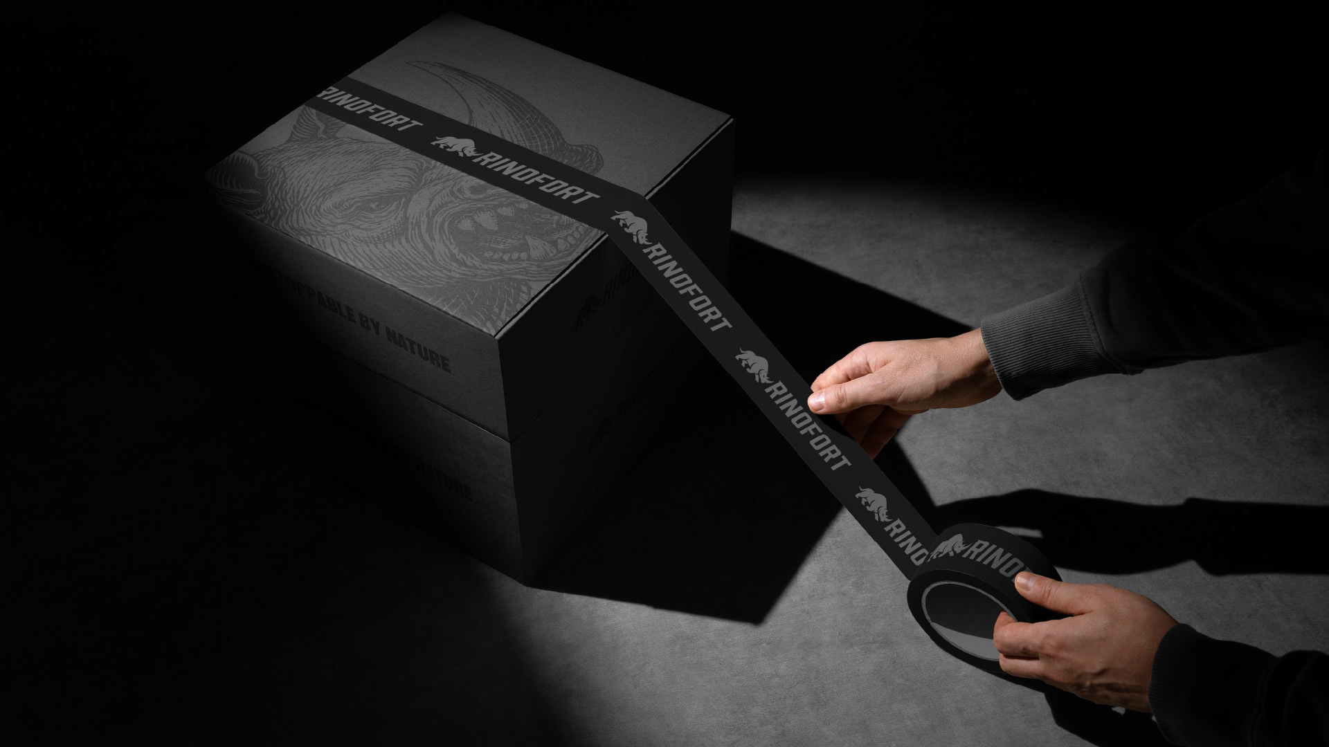
Designed to Perform
RINOFORT® was built as a system, not just a logo.
Every element was carefully crafted to translate seamlessly across:
• Apparel and performance wear
• Packaging and labels
• Digital platforms and social media
• Brand communication and campaigns
This ensures consistency, scalability, and long-term brand recognition — essential for a brand designed to grow beyond its initial launch.
Recognition That Reinforces the Vision
Being featured on World Brand Design Society is more than recognition.
It’s validation that strong, strategic branding — rooted in clarity and purpose — continues to stand out on a global stage. WBDS regularly showcases projects that push the boundaries of identity and visual communication, placing RINOFORT® among a curated selection of impactful brand work worldwide.
Influence, by Design.
At INDUSTRIA®, we believe that branding is not about decoration.
It’s about influence.
RINOFORT® reflects this philosophy in its purest form:
A brand stripped to its essence.
A system built to perform.
An identity designed to endure.
A brand stripped to its essence.
A system built to perform.
An identity designed to endure.