RINOFORT®
Brand Positioning + Brand Design + Logo Design + Packaging Design + Brand Guidelines
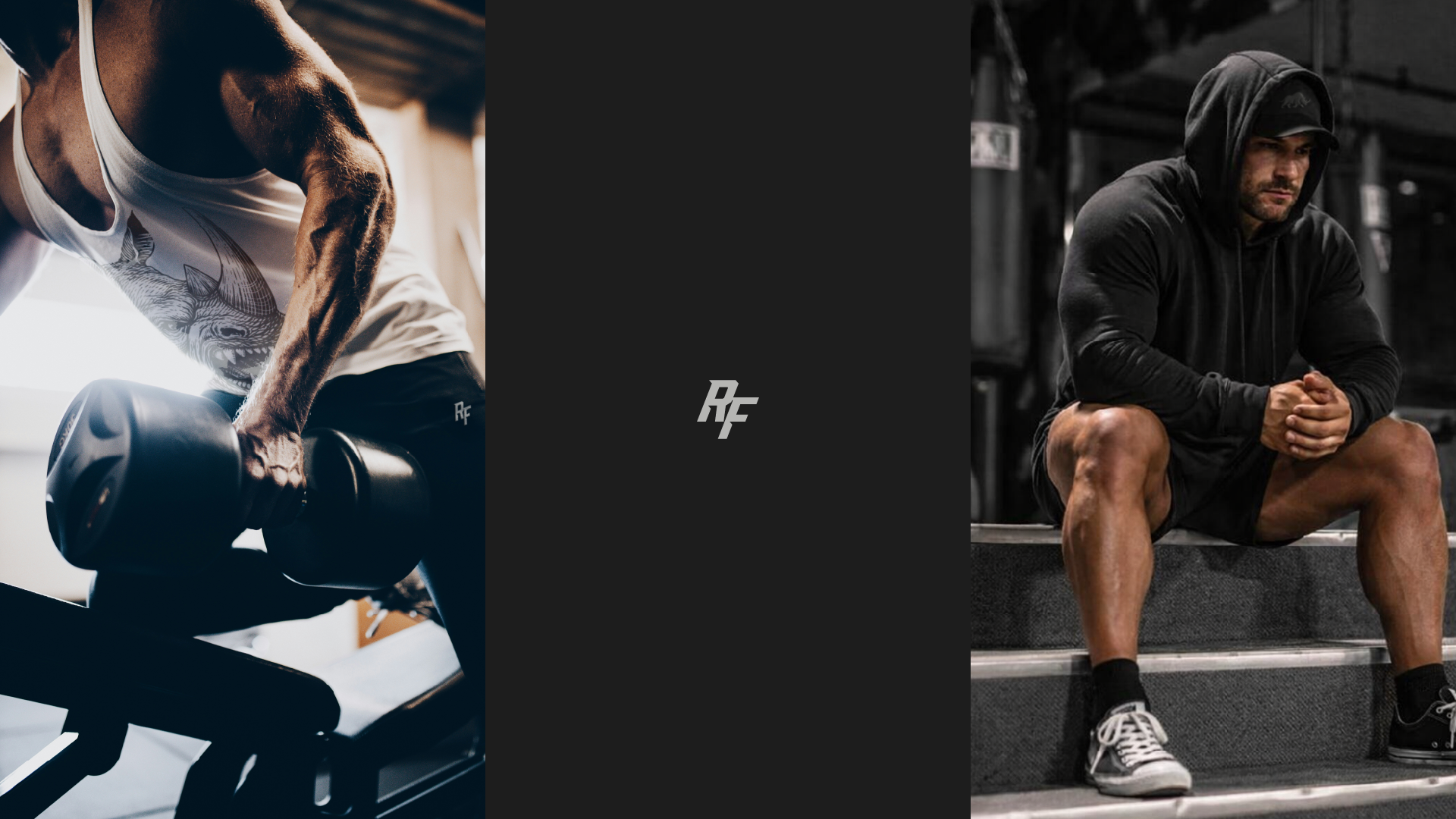
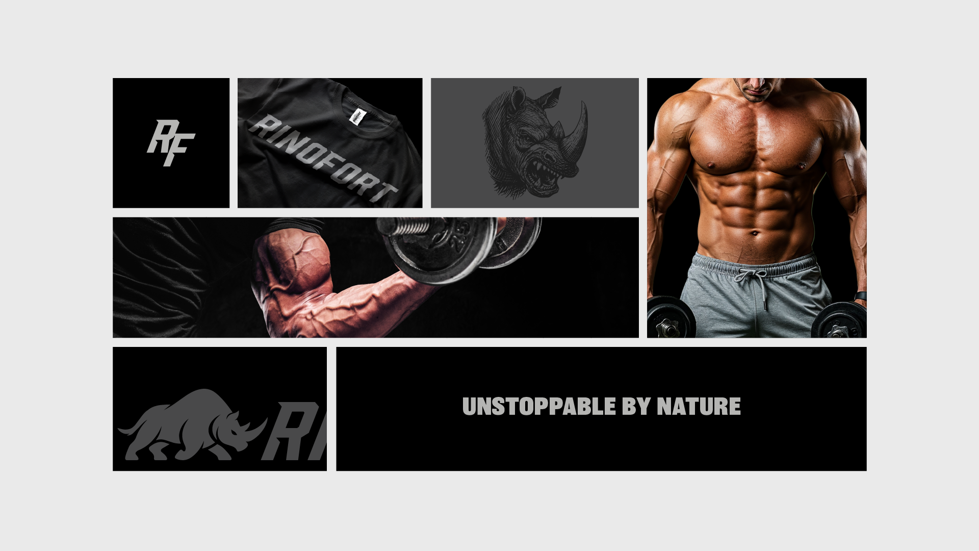
RINOFORT®
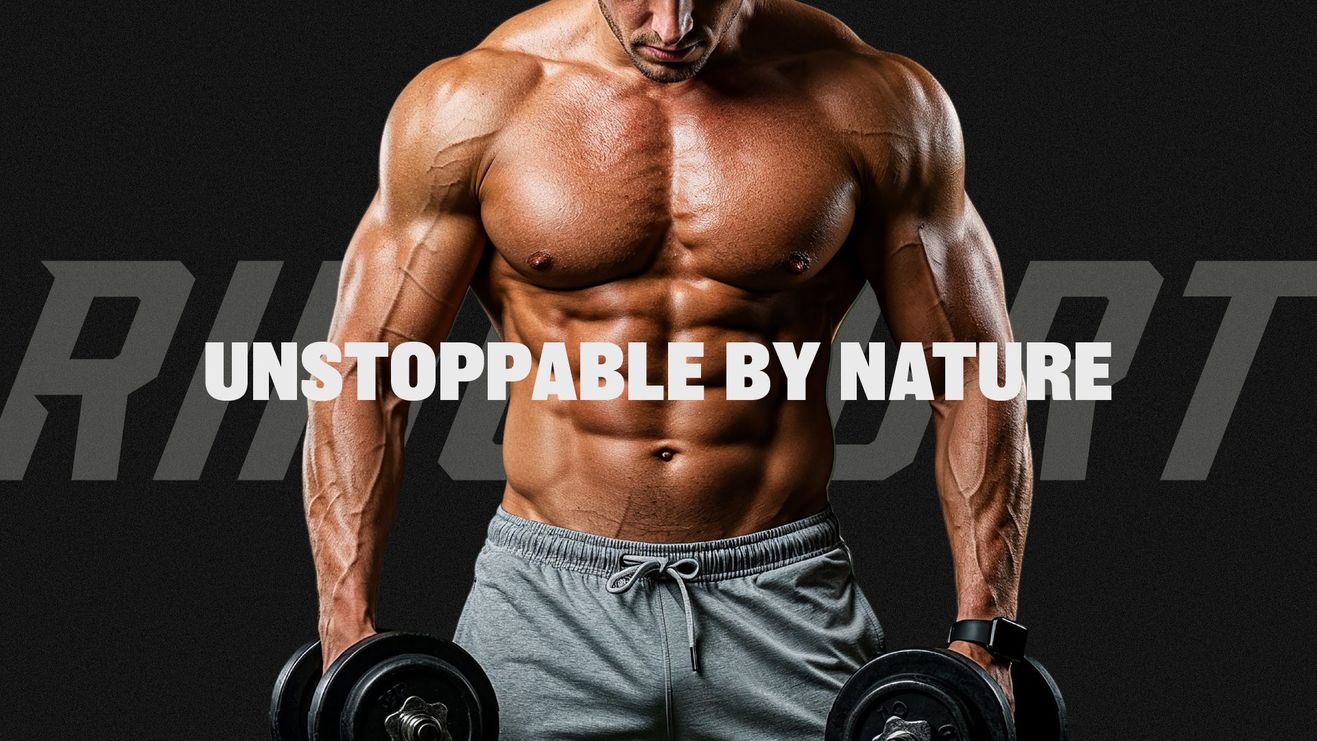
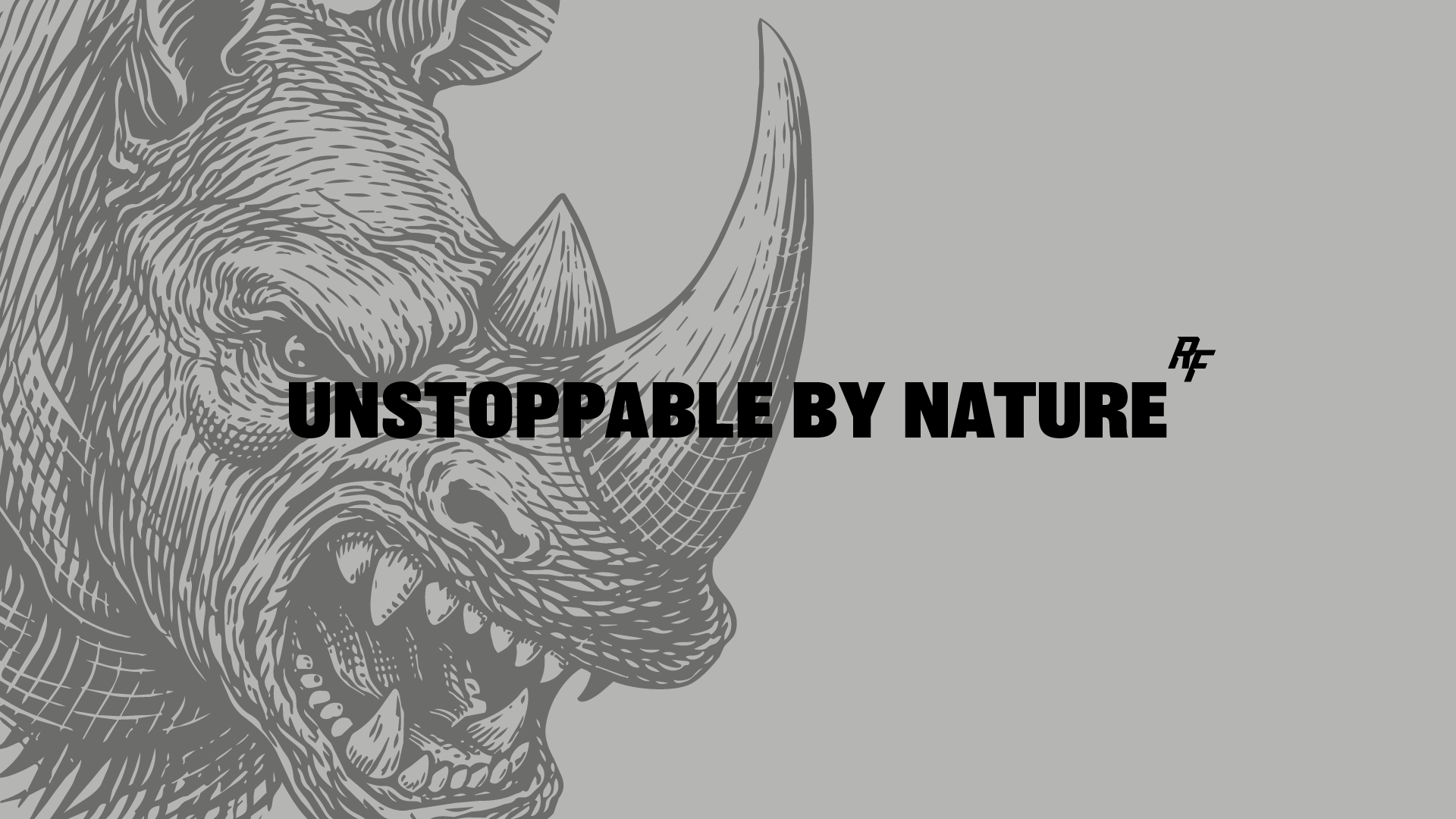
Unstoppable by Nature
A bold identity for a fitness clothing brand built on strength, attitude, and forward motion.
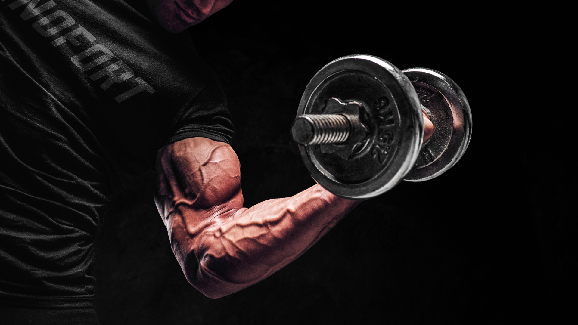
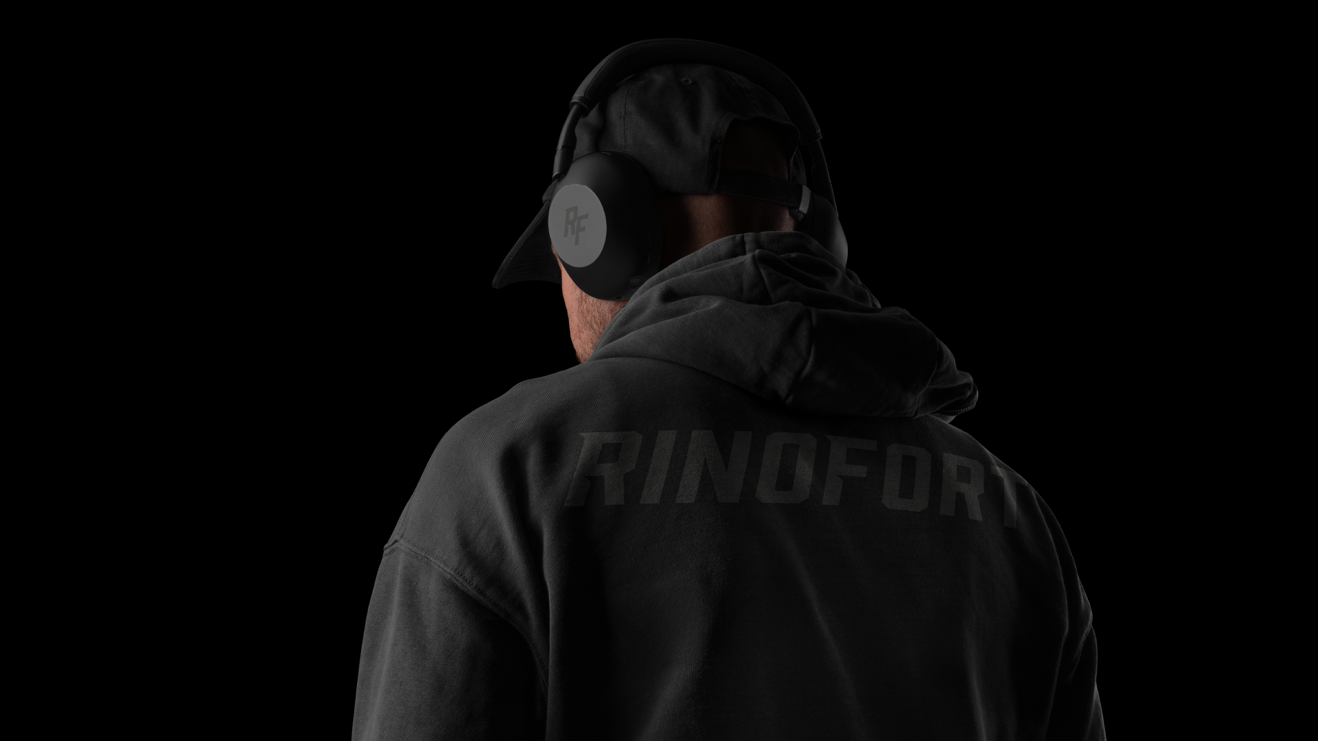
RINOFORT is a new lifestyle and performance-driven clothing brand from Miami, Florida, created for men who train with intensity and carry strength as part of their identity. More than activewear, the brand was envisioned as a statement, something that feels powerful before it is even worn.
From the beginning, the goal was clear: create a brand that could speak directly to a masculine audience through a visual language that feels sharp, disciplined, and unmistakably strong.
The Challenge
In a saturated fitness market, standing out requires more than aggressive visuals or generic sportswear codes. RINOFORT needed a brand identity with real presence, one that could feel modern and minimal while still expressing force, resilience, and dominance.
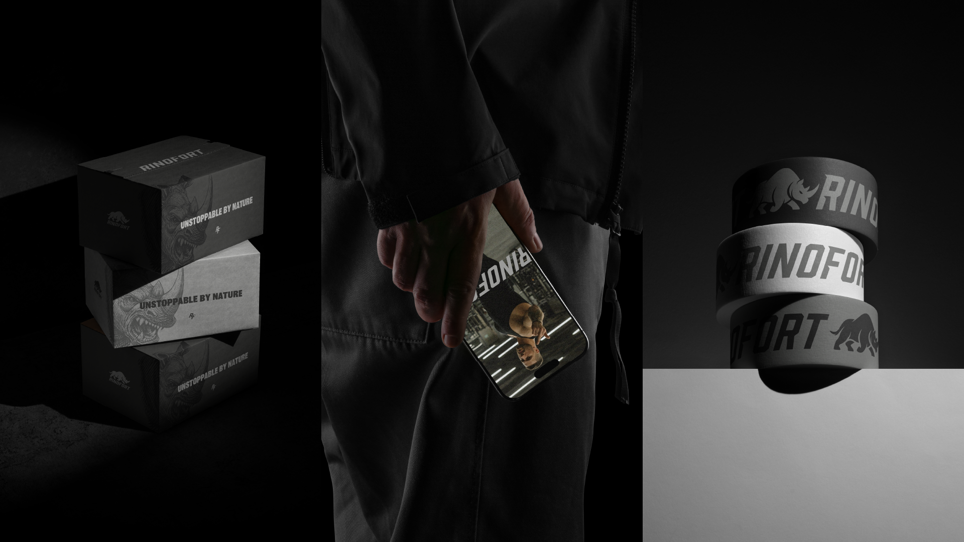
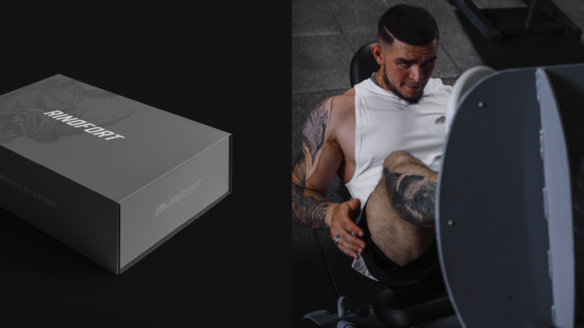
The challenge was to build a system that balanced clarity and impact. It needed to work across apparel, labels, digital media, packaging, and future brand extensions, while still feeling cohesive and iconic at every touchpoint.
At the same time, the brand had to resonate emotionally with its audience: men who see strength not only as physical performance, but as mindset, discipline, and attitude.
Our Approach
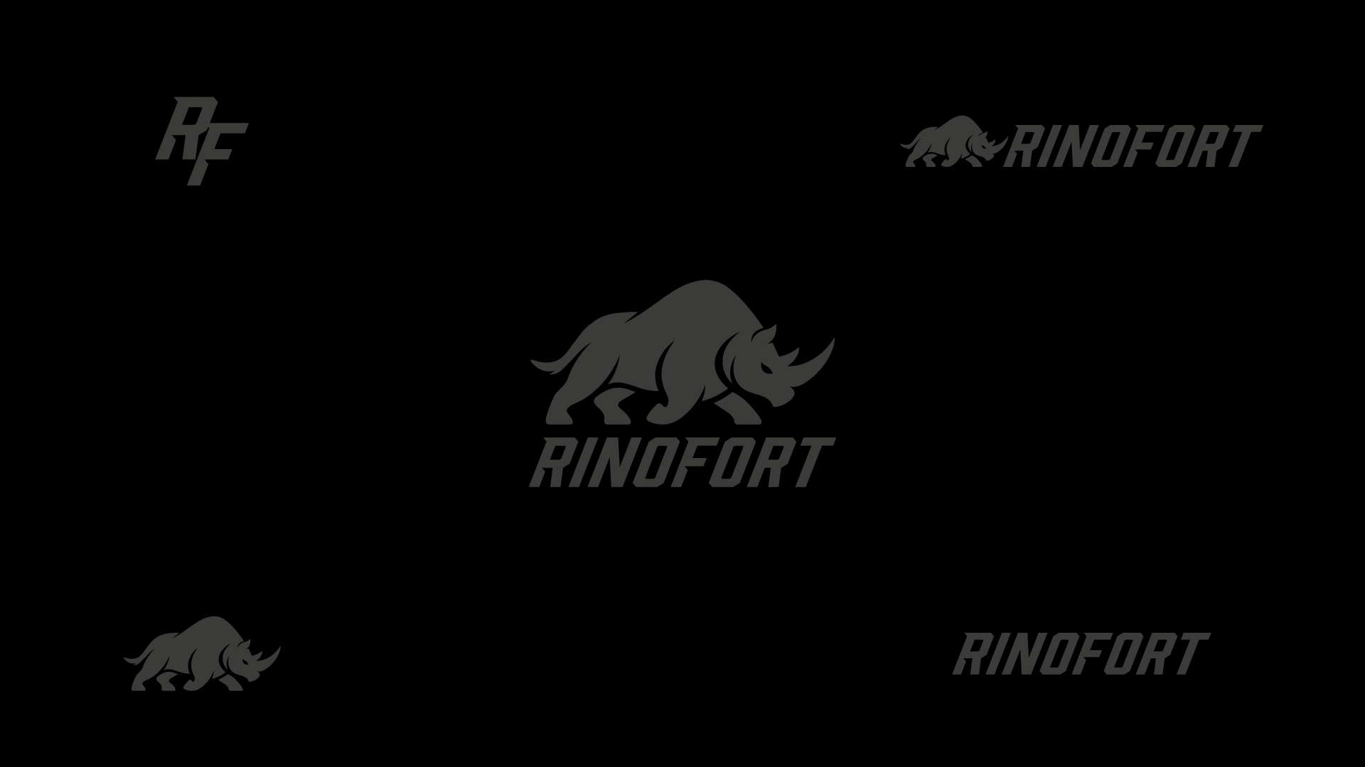
We developed the RINOFORT identity around the idea of controlled power.
The name itself already carried a sense of weight and solidity, so our role was to translate that into a visual system that felt equally commanding. Rather than overcomplicate the brand, we chose a direction rooted in bold minimalism. Every element was designed to feel direct, muscular, and intentional.
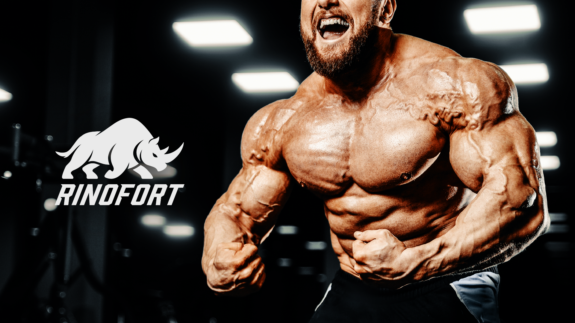
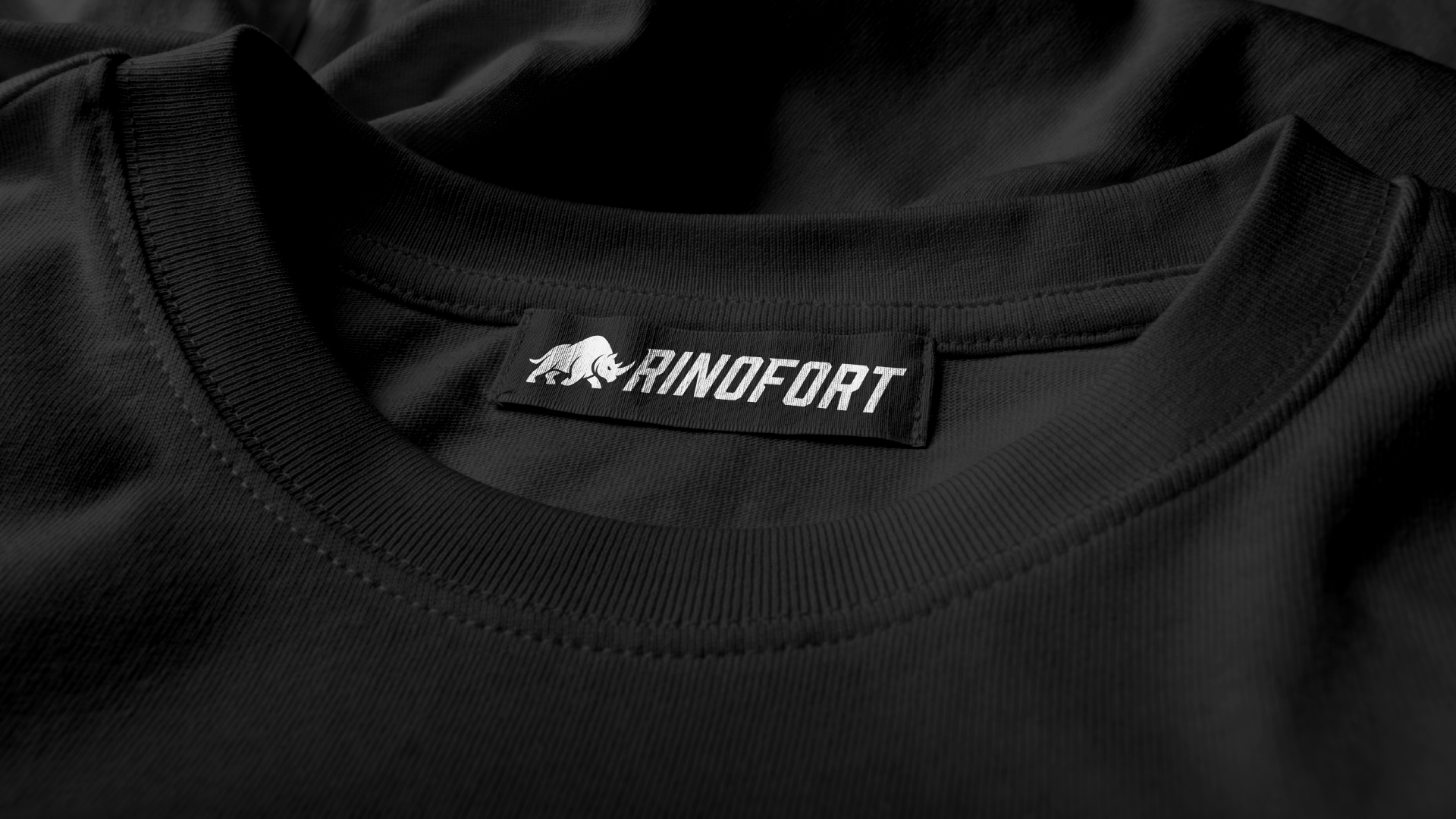
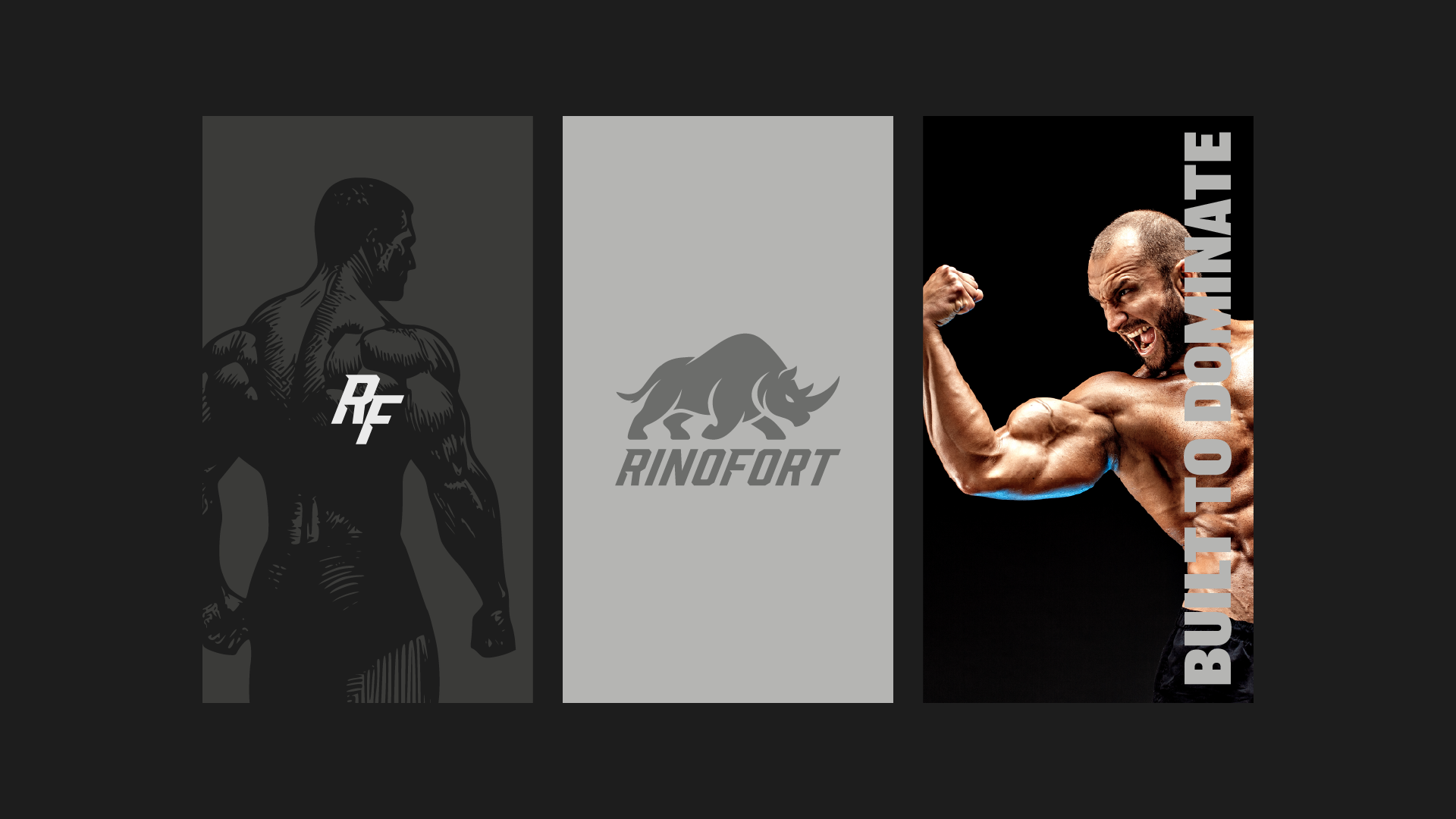
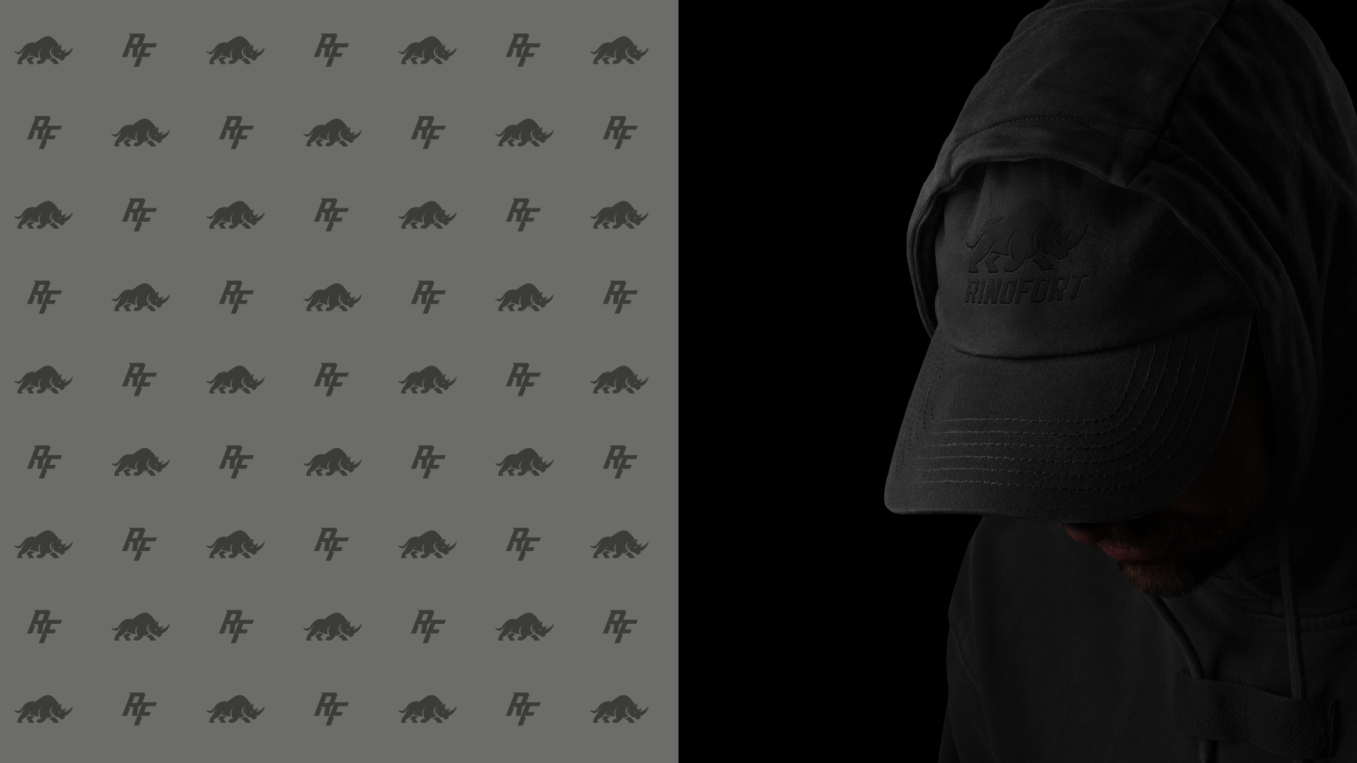
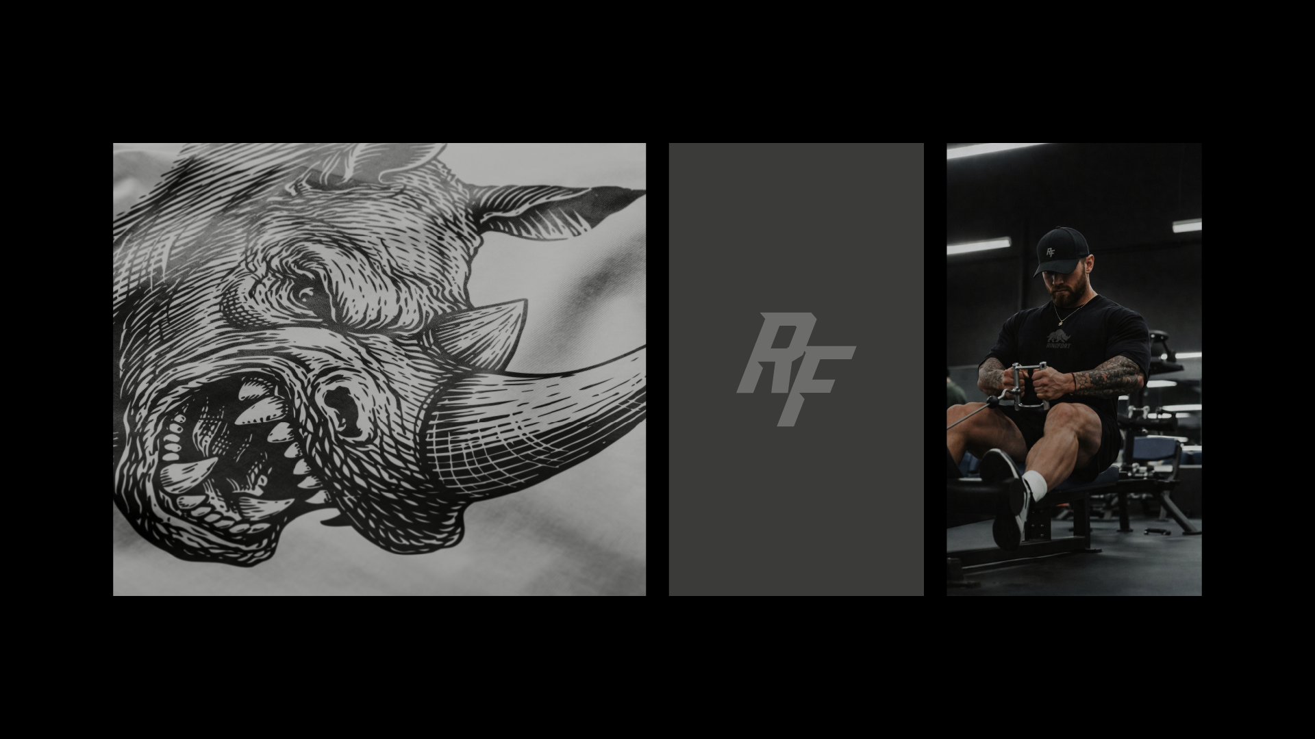
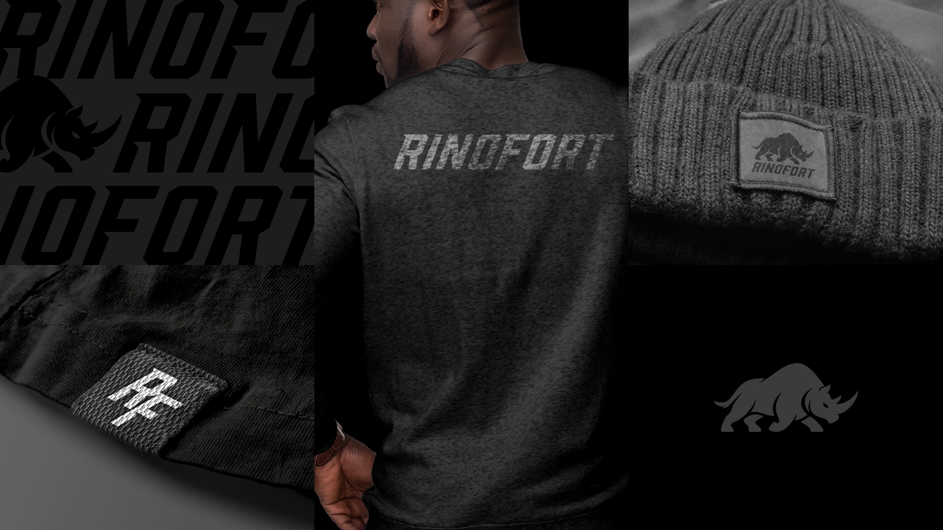
At the center of the identity is a custom RF monogram, built to be compact, recognizable, and versatile across applications. It works as a performance mark on garments, a badge of belonging, and a symbol of the brand’s no-excess attitude.
Supporting it is a dynamic wordmark with a forward-leaning, athletic posture. The typography feels sharp and energetic, reinforcing movement, speed, and pressure, while maintaining a clean structure that gives the brand a premium edge.
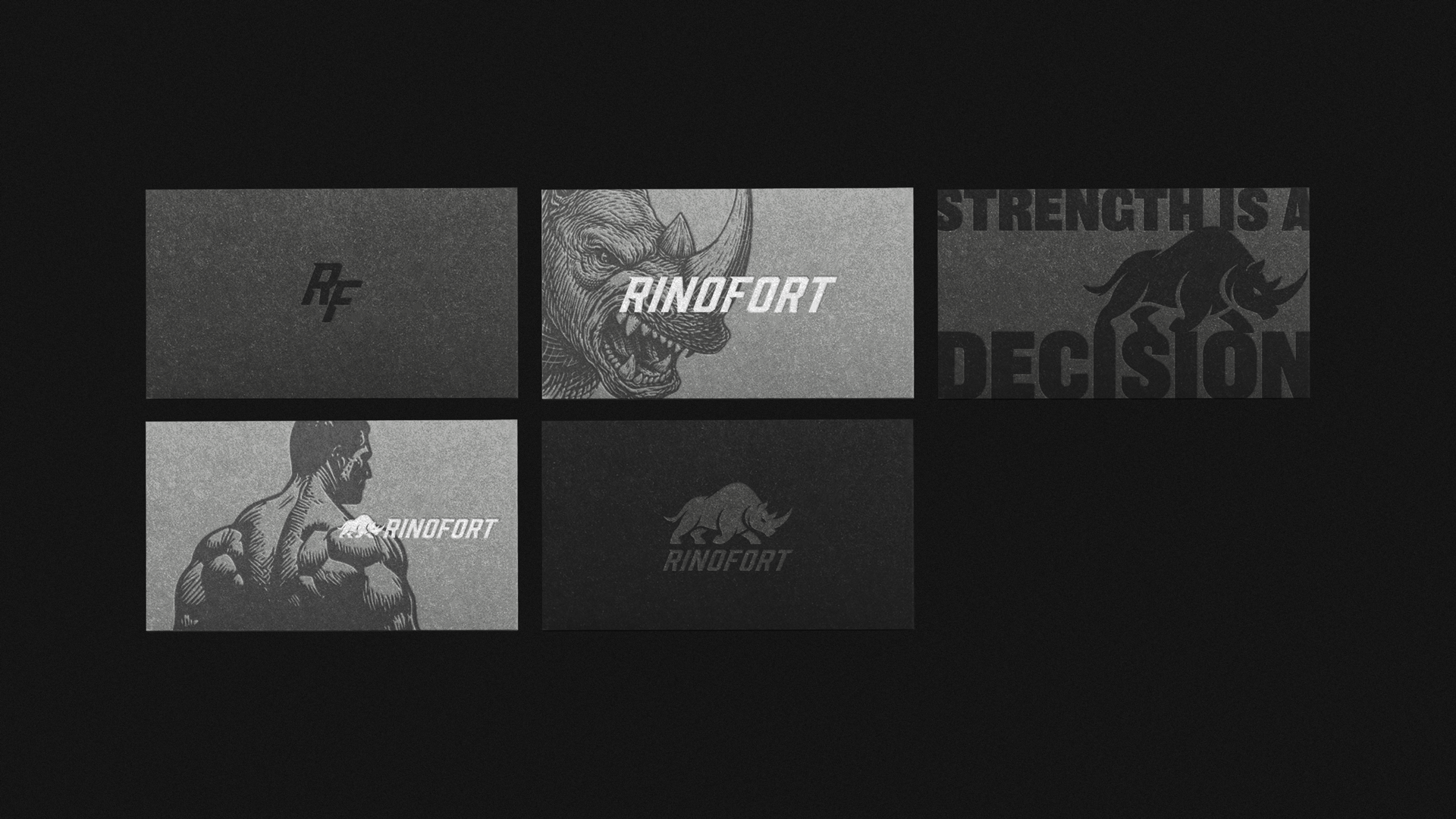
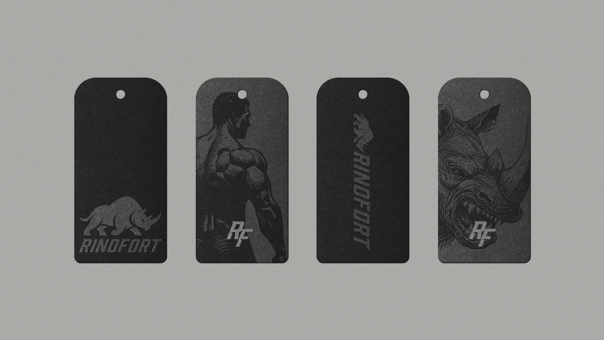
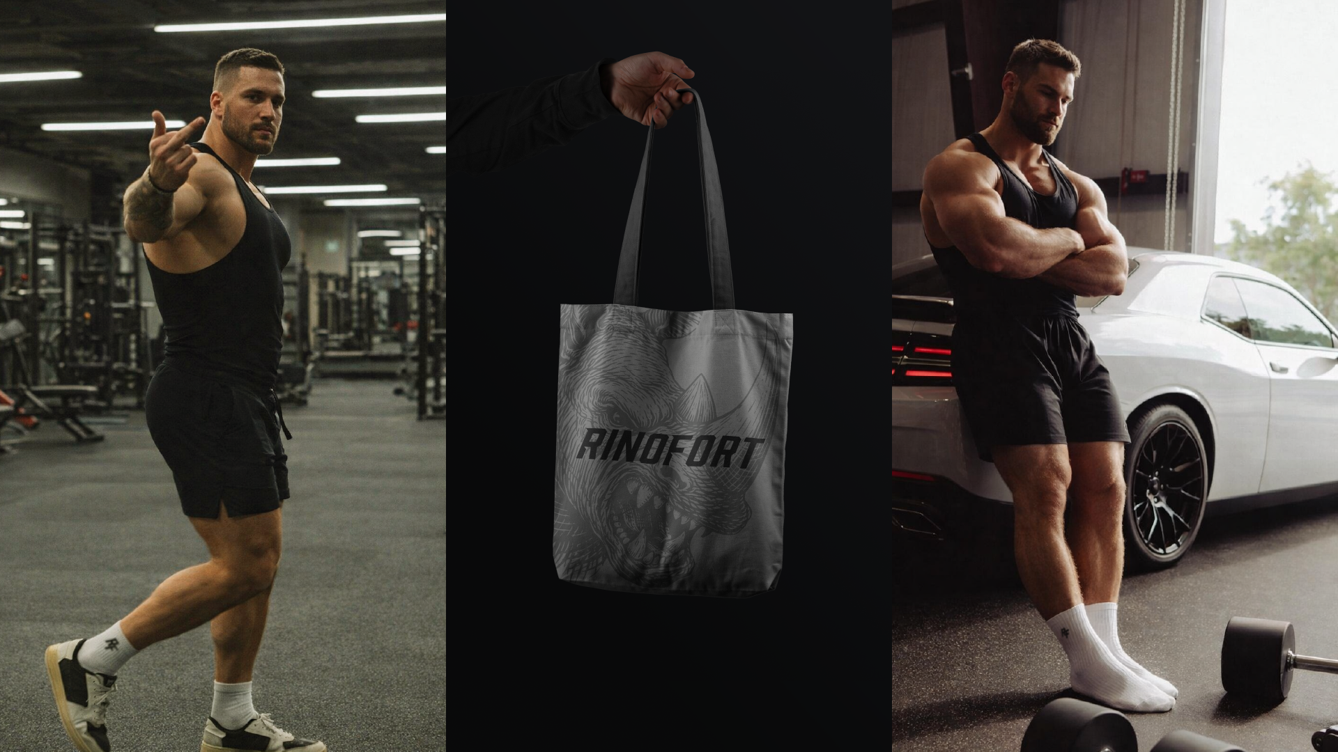
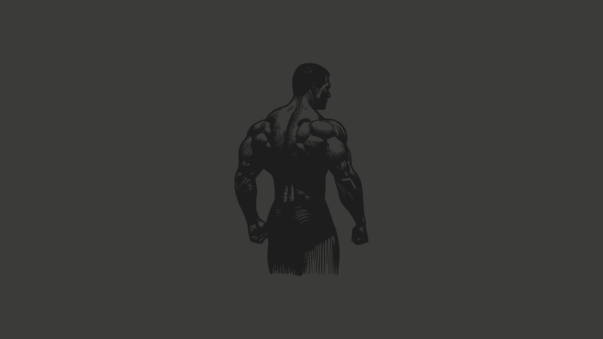
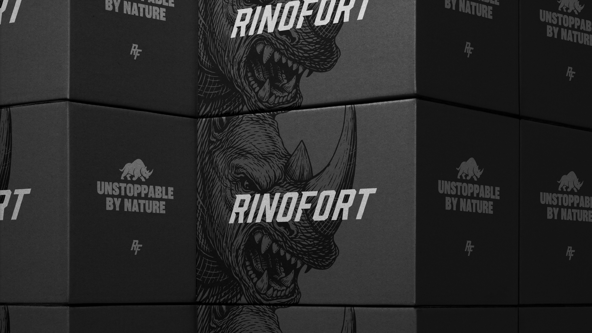
The Rhino as Symbol
To deepen the brand’s character, we introduced the rhino as RINOFORT’s symbolic core.
The rhino represents more than brute strength. It stands for resilience, instinct, confidence, and unstoppable movement. It is powerful by nature, grounded in force, and impossible to ignore. That made it the perfect metaphor for a brand created for strong men who move with certainty.
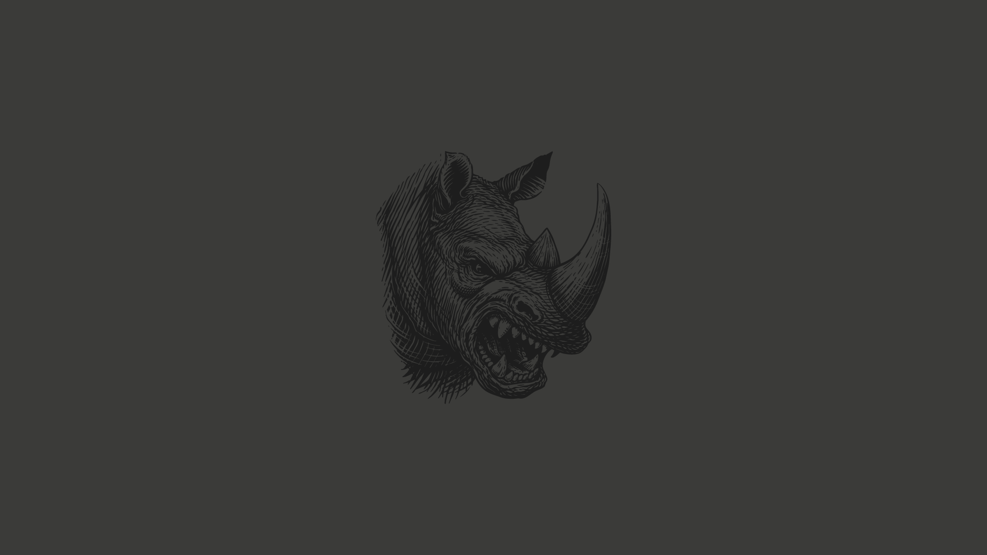
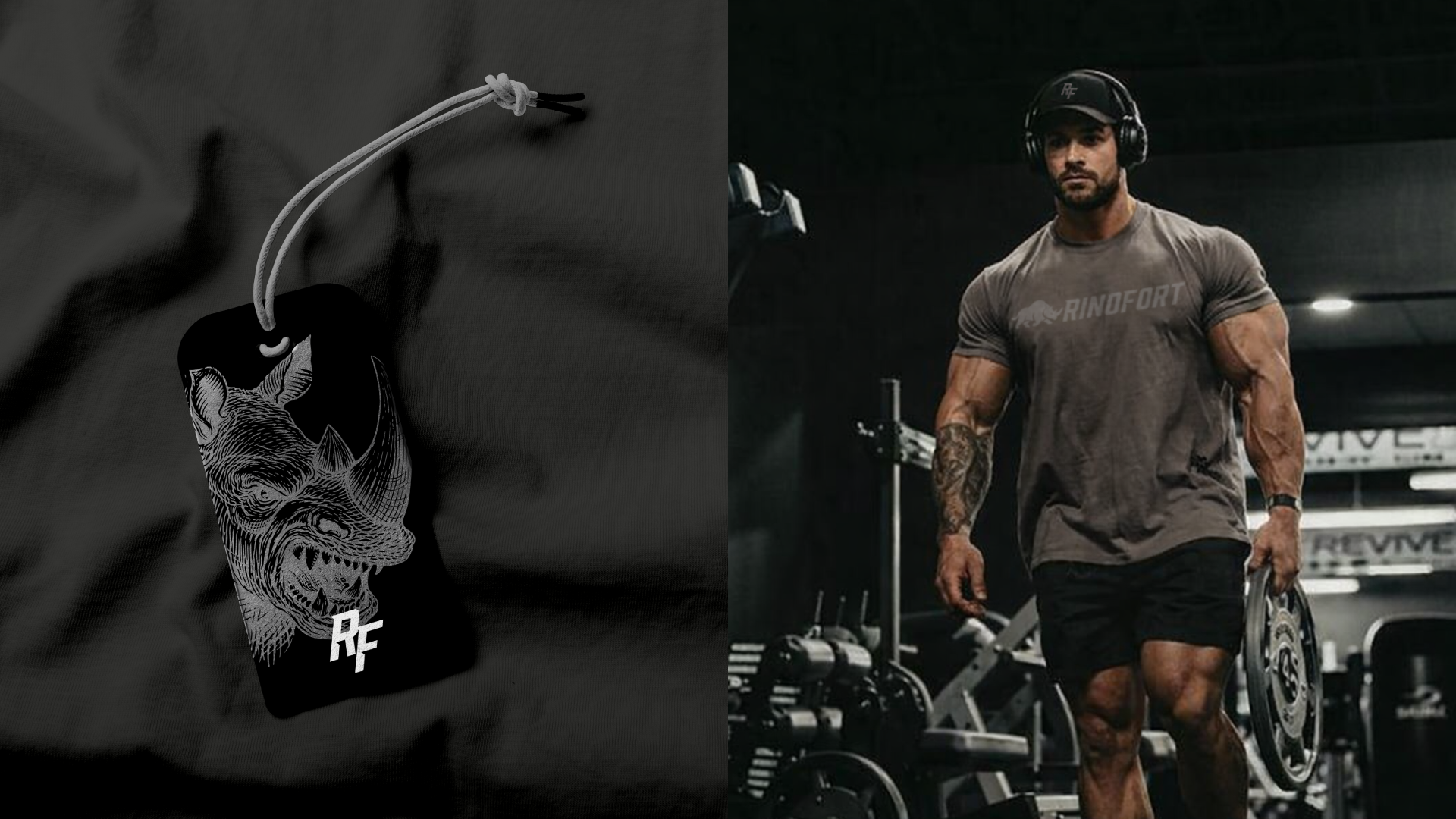
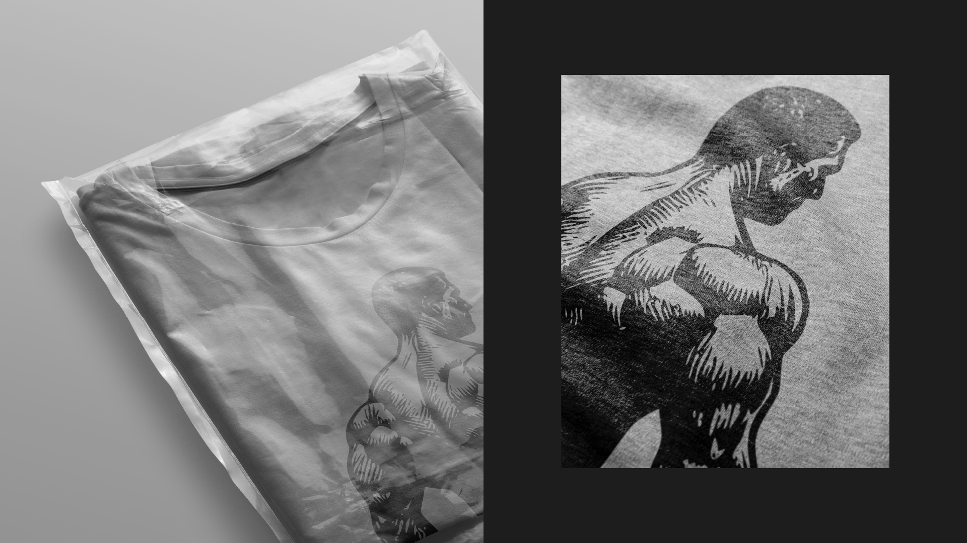
We explored this symbol in two ways: a minimal rhino icon for broader system use, and a more detailed rhino head illustration full of tension and personality. Together, they expand the brand’s range, allowing RINOFORT to move between clean modern branding and more expressive, high-intensity campaign language.
Verbal Identity
To reinforce the mindset behind the brand, we developed a set of bold, motivational taglines that reflect its attitude:
Unstoppable by Nature
Strength Is a Decision
Built to Dominate
These lines help position RINOFORT beyond clothing. They frame the brand as a mentality, one rooted in discipline, action, and self-command.
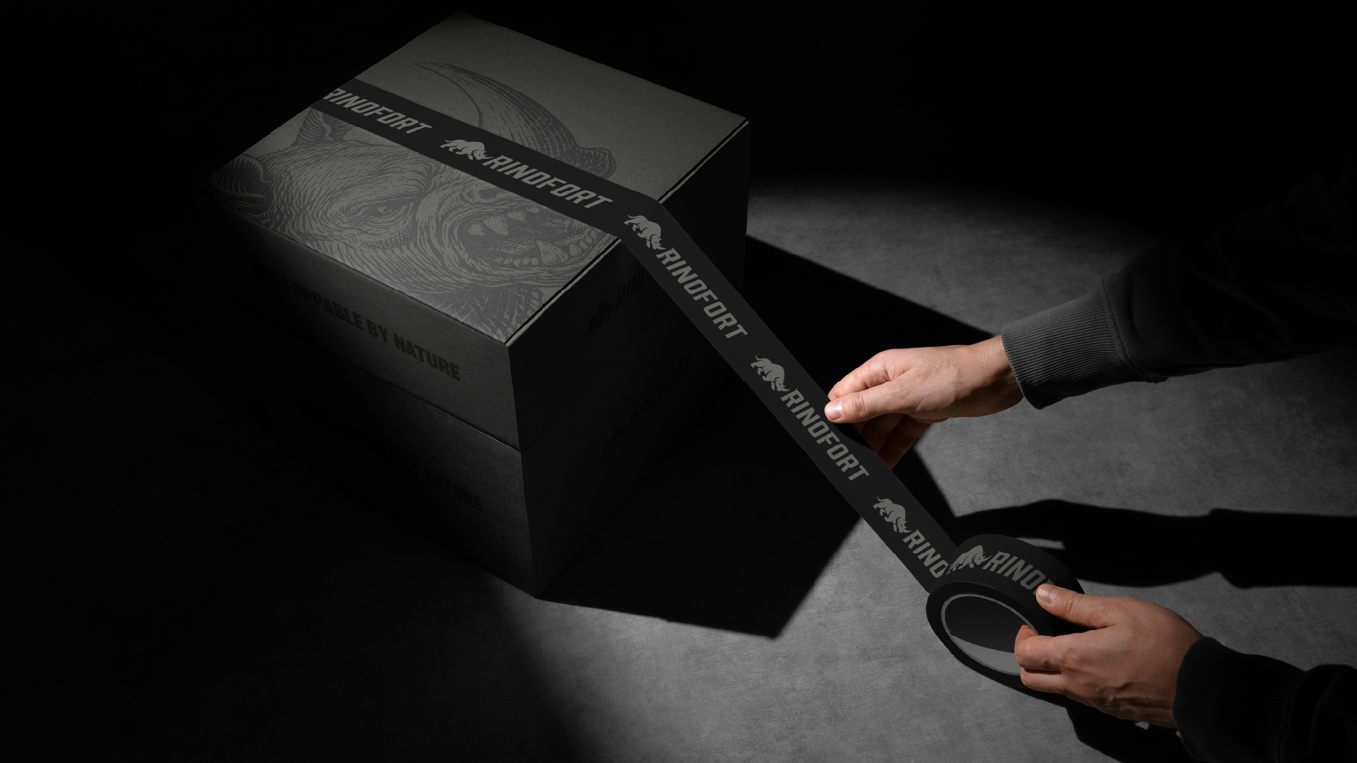
The Outcome
The result is a high-impact identity system that feels powerful, wearable, and highly scalable.
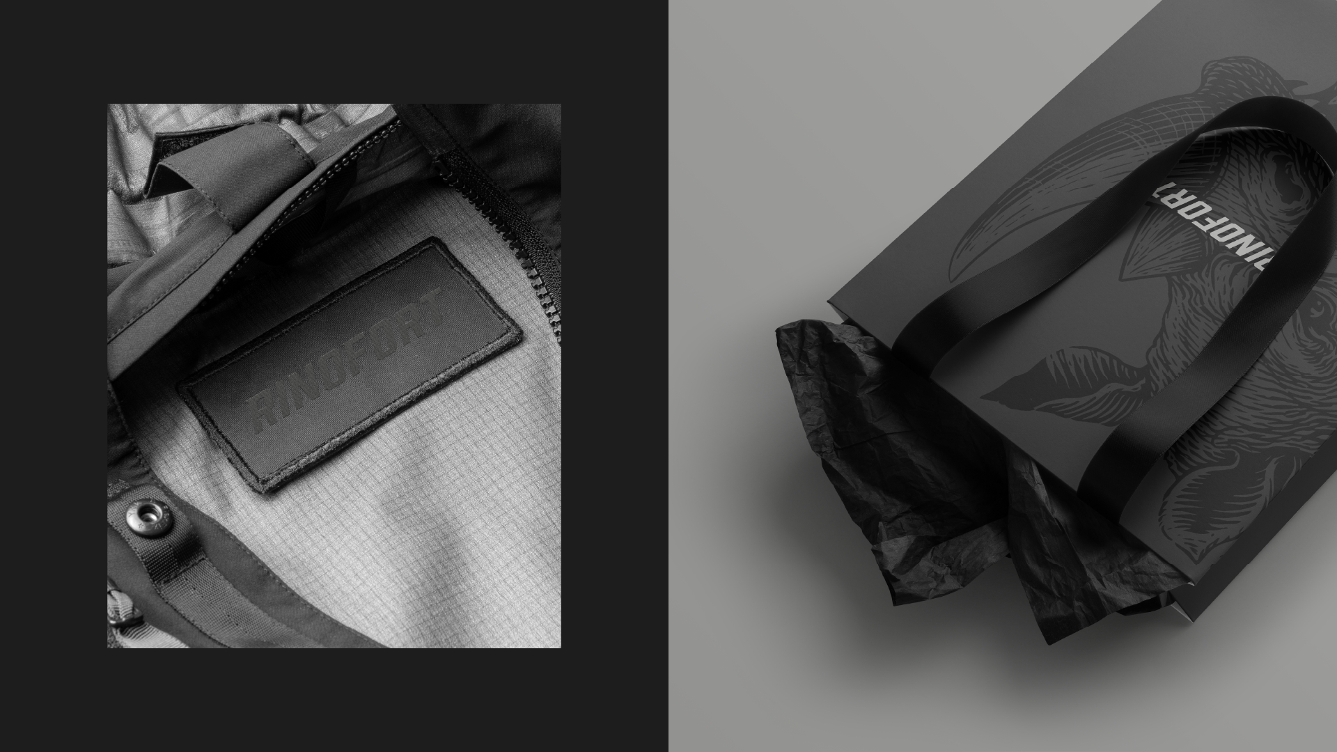
From apparel graphics and woven labels to packaging and digital communication, RINOFORT’s branding is built to hold presence in every environment. The monochromatic palette, strong forms, and aggressive visual tone create a world that feels masculine, modern, and unmistakably focused.
RINOFORT is not just a fitness clothing brand. It is a visual expression of force, resilience, and intent.
A brand designed for men who do not wait for permission.
A brand built to move forward.
A brand that is, by nature, unstoppable.

.
.