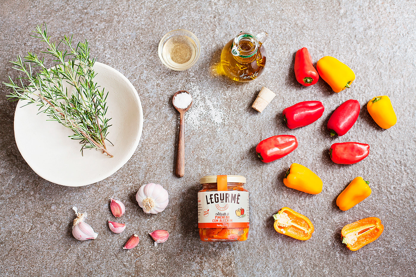
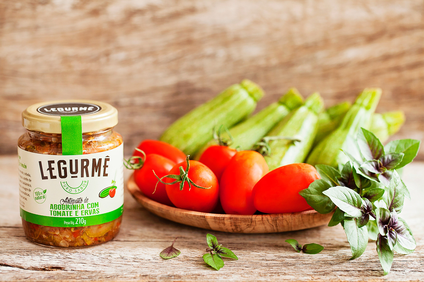
LEGURMÊ
NAMING + BRAND POSITIONING + BRAND DESIGN + LOGO DESIGN+ PACKAGING DESIGN + BRAND GUIDELINES

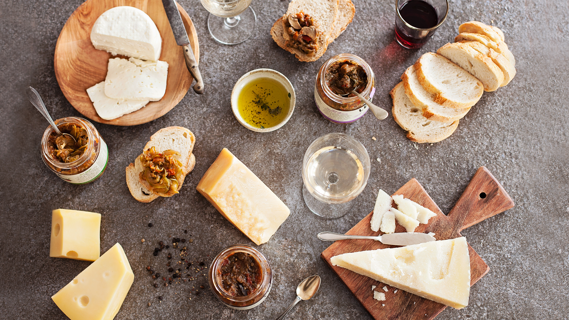
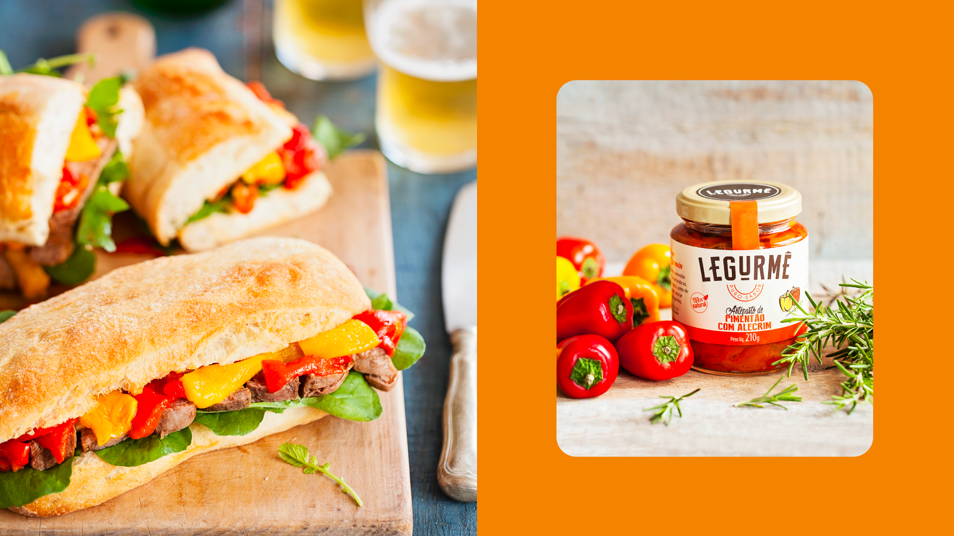
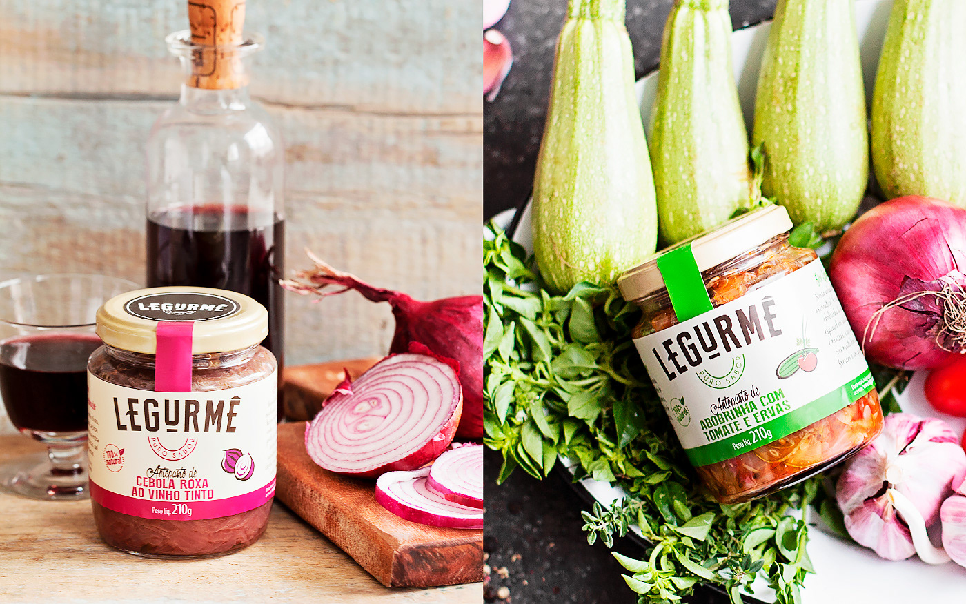
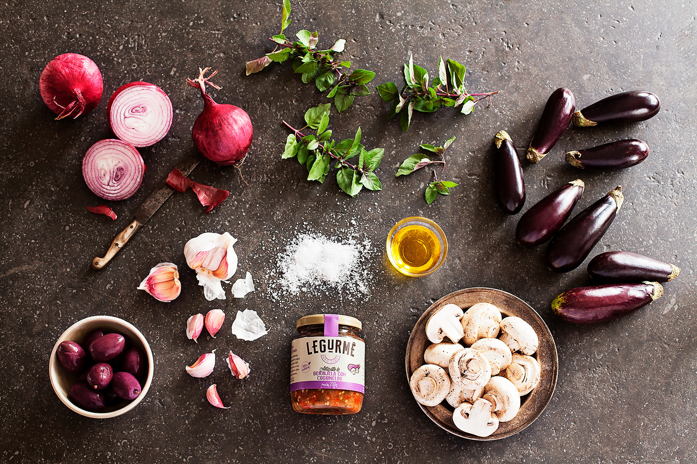
Legurmê is more than just a brand, it's a lifestyle. A convenient and healthy option for a busy everyday life, Legurmê's products are made with organic ingredients from local producers and ready to consume. The challenge was to develop a brand that would inspire modern cuisine, be positioned as premium, and carve out a place for itself in the natural food market.
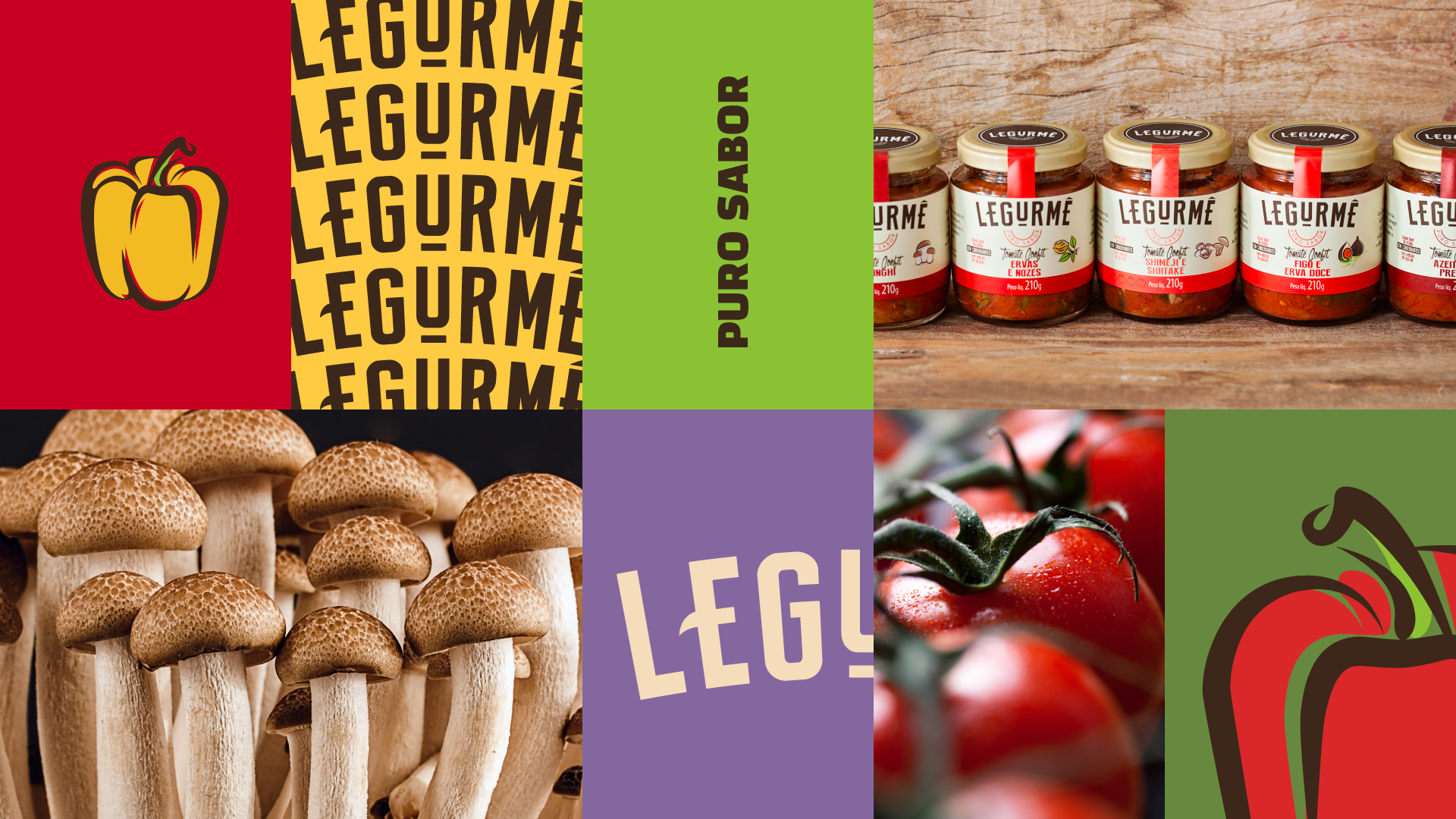
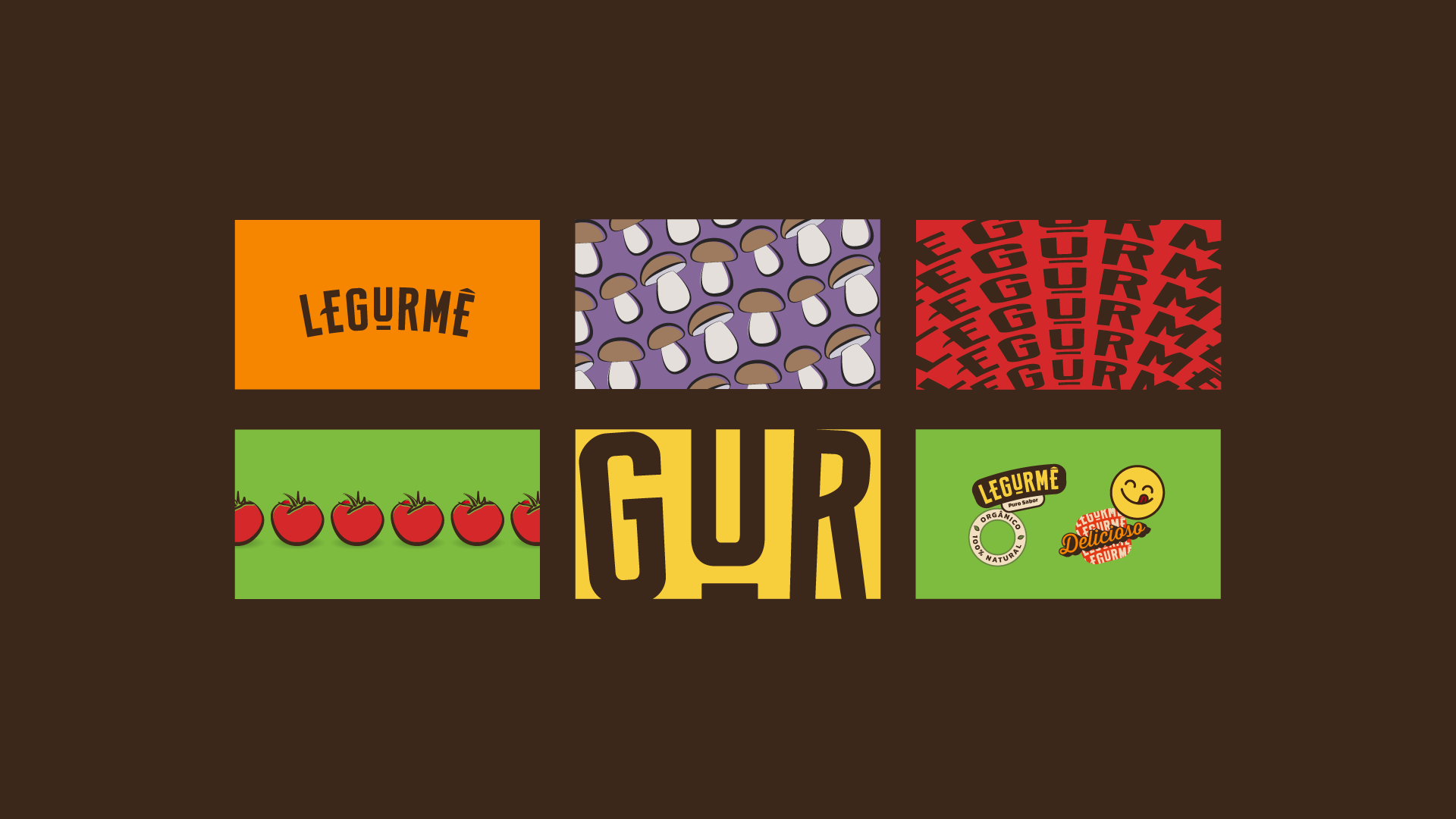
The first step was the name: Legurmê, a combination of "legumes," the Portuguese word for vegetables, and "gourmet," a cultural ideal associated with the culinary arts of good food. This name perfectly captures the essence of the brand, which is all about quality, taste, and convenience.
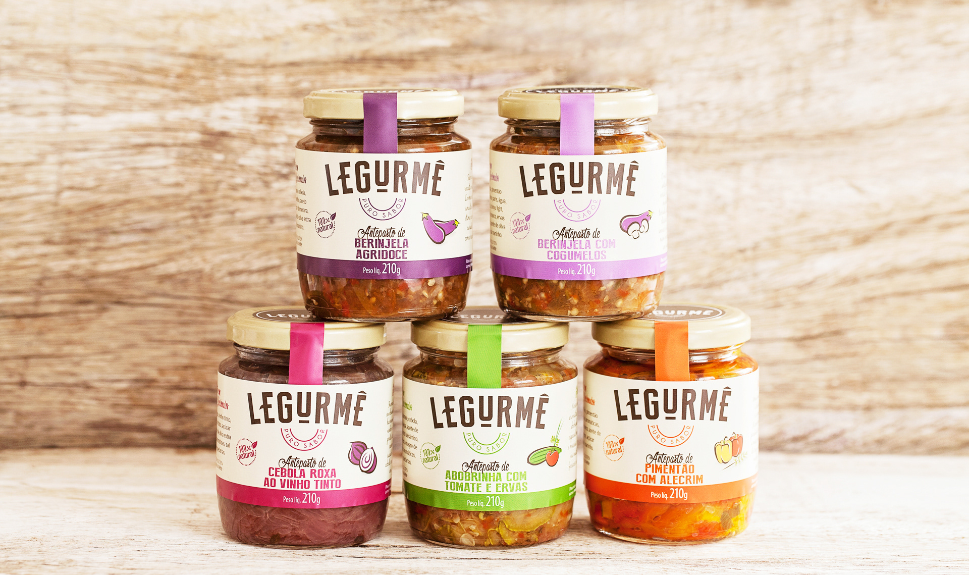
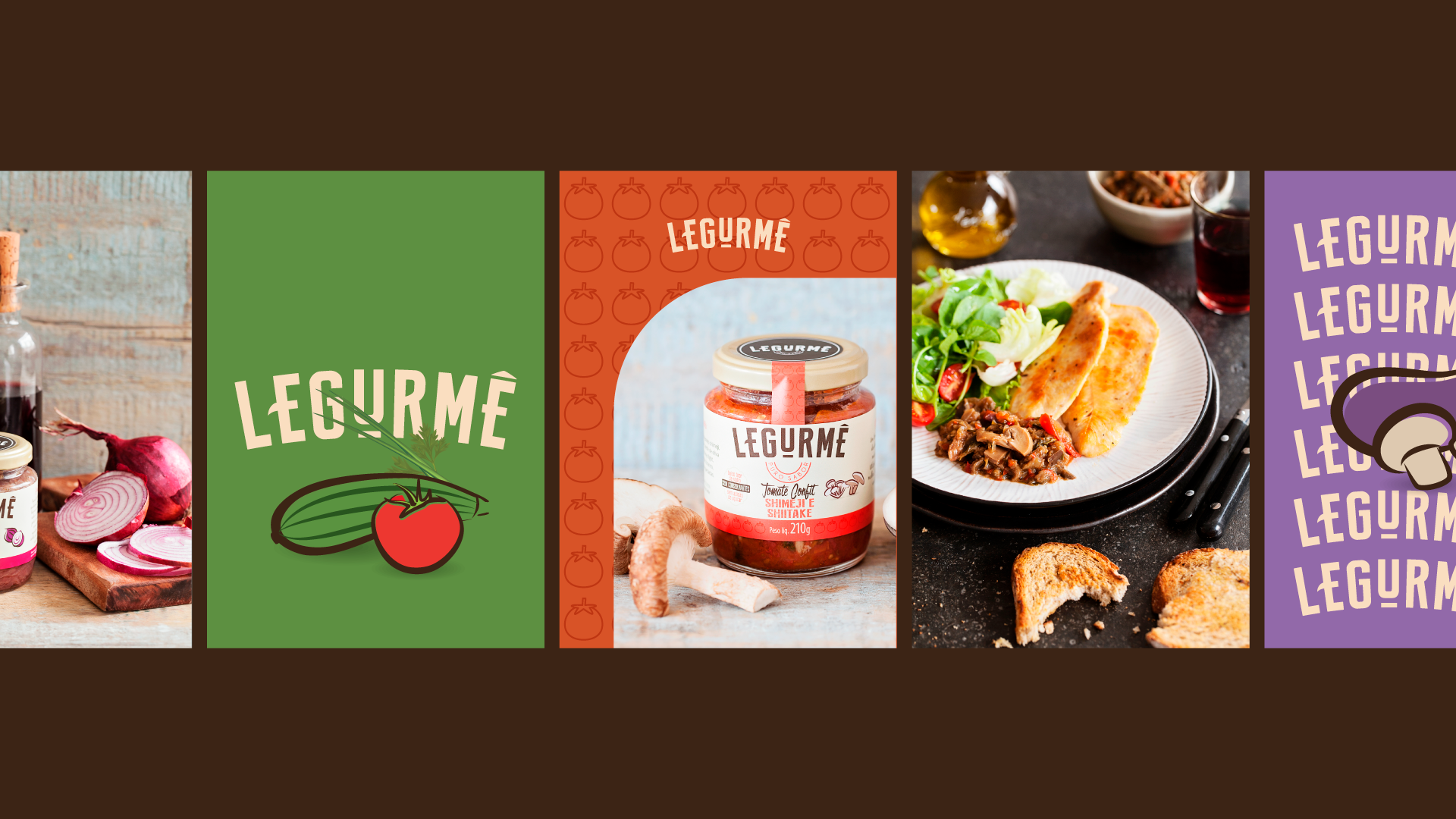
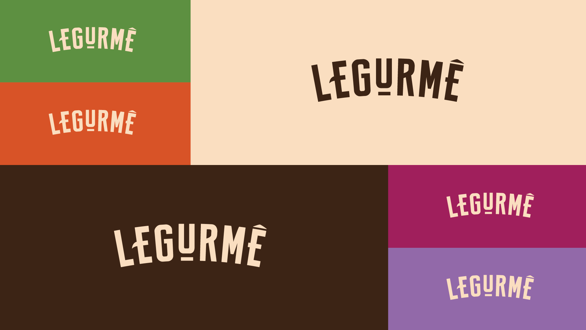
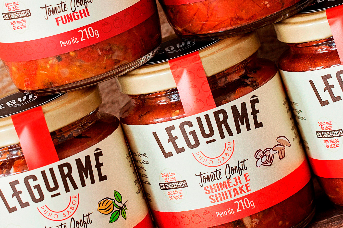
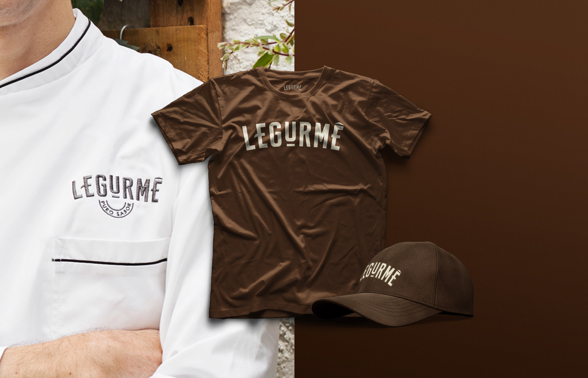
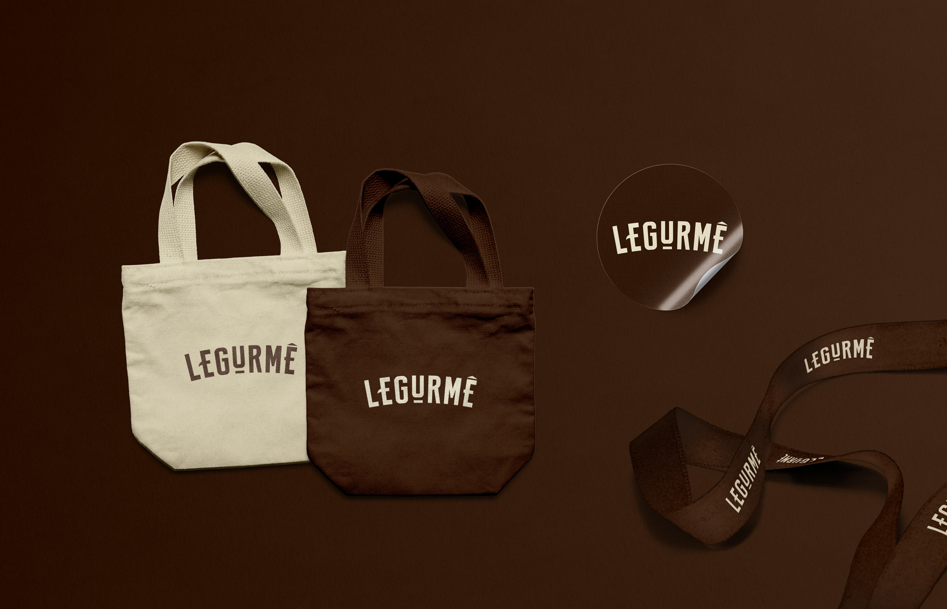
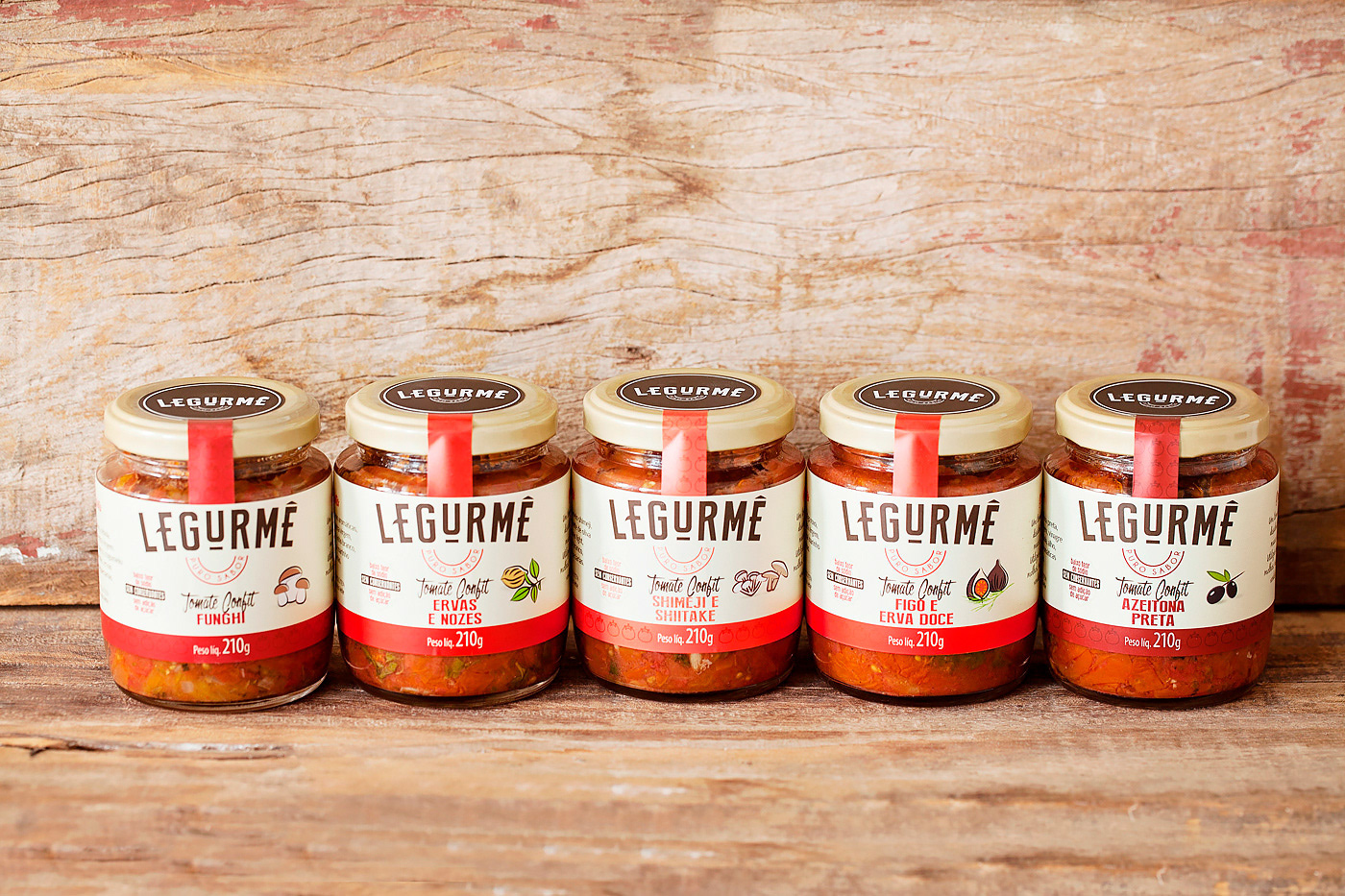
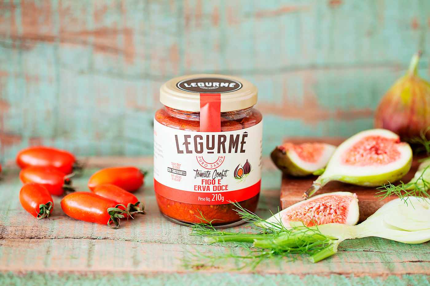
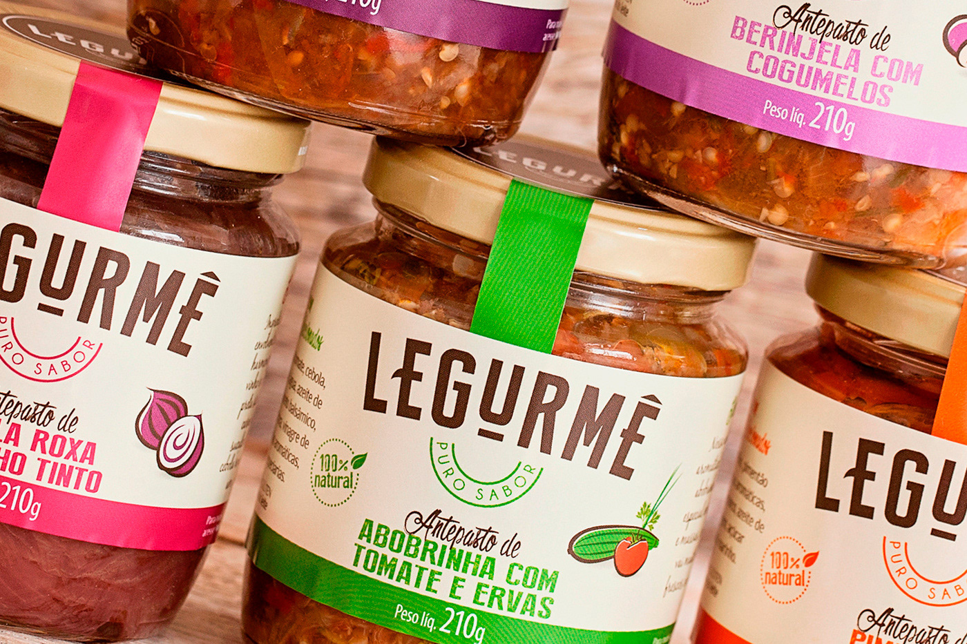
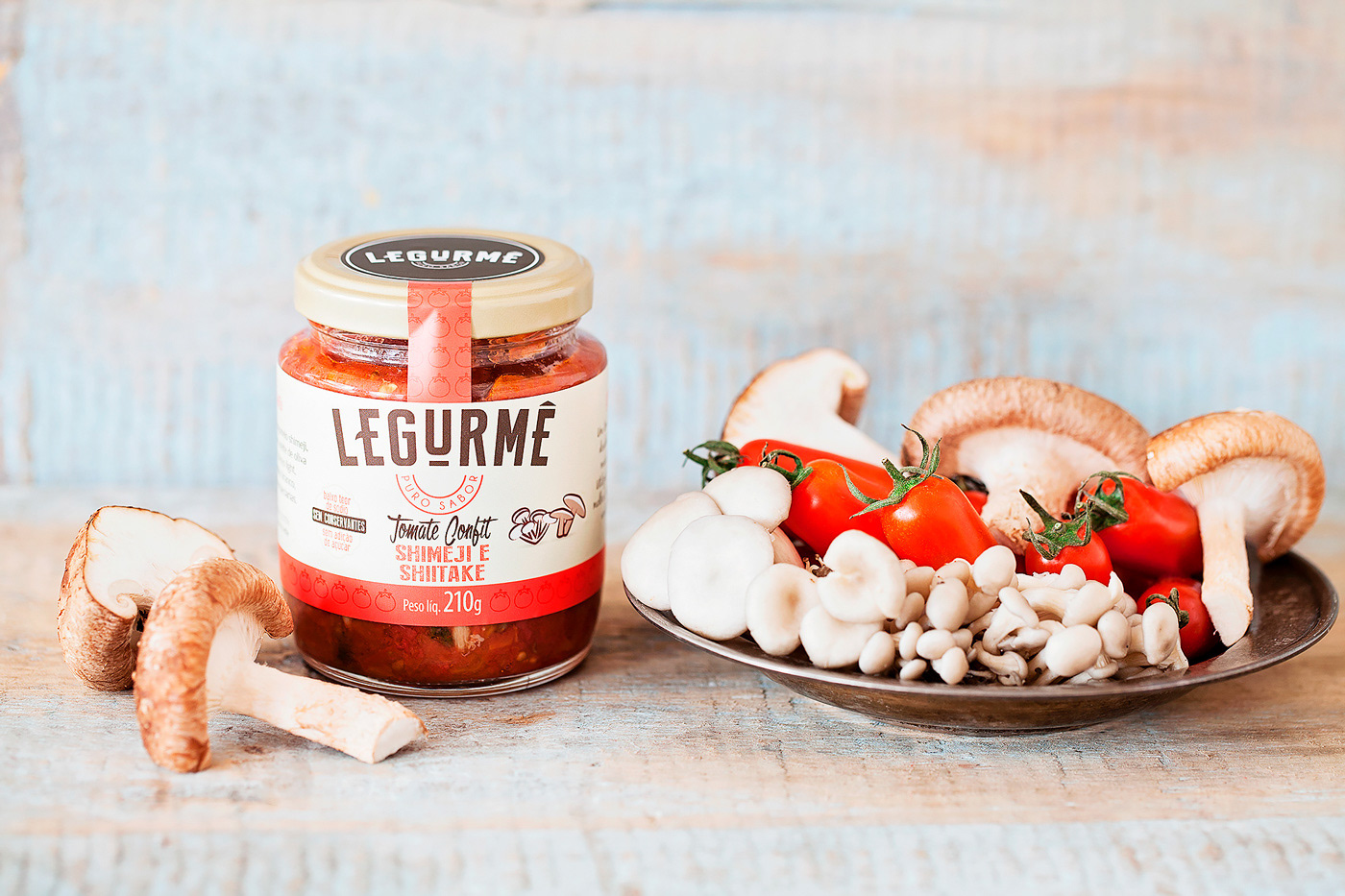
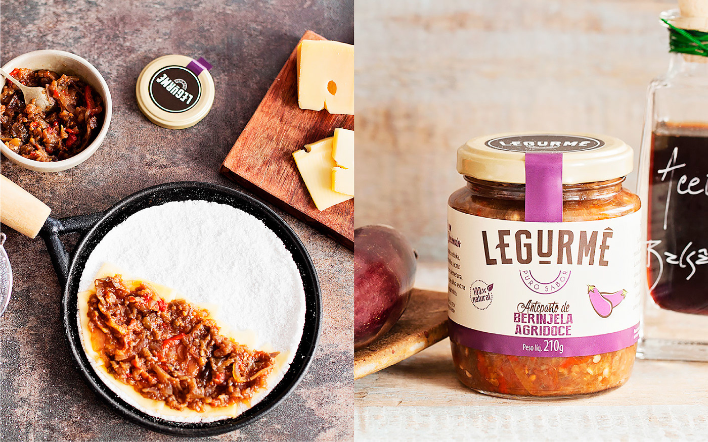
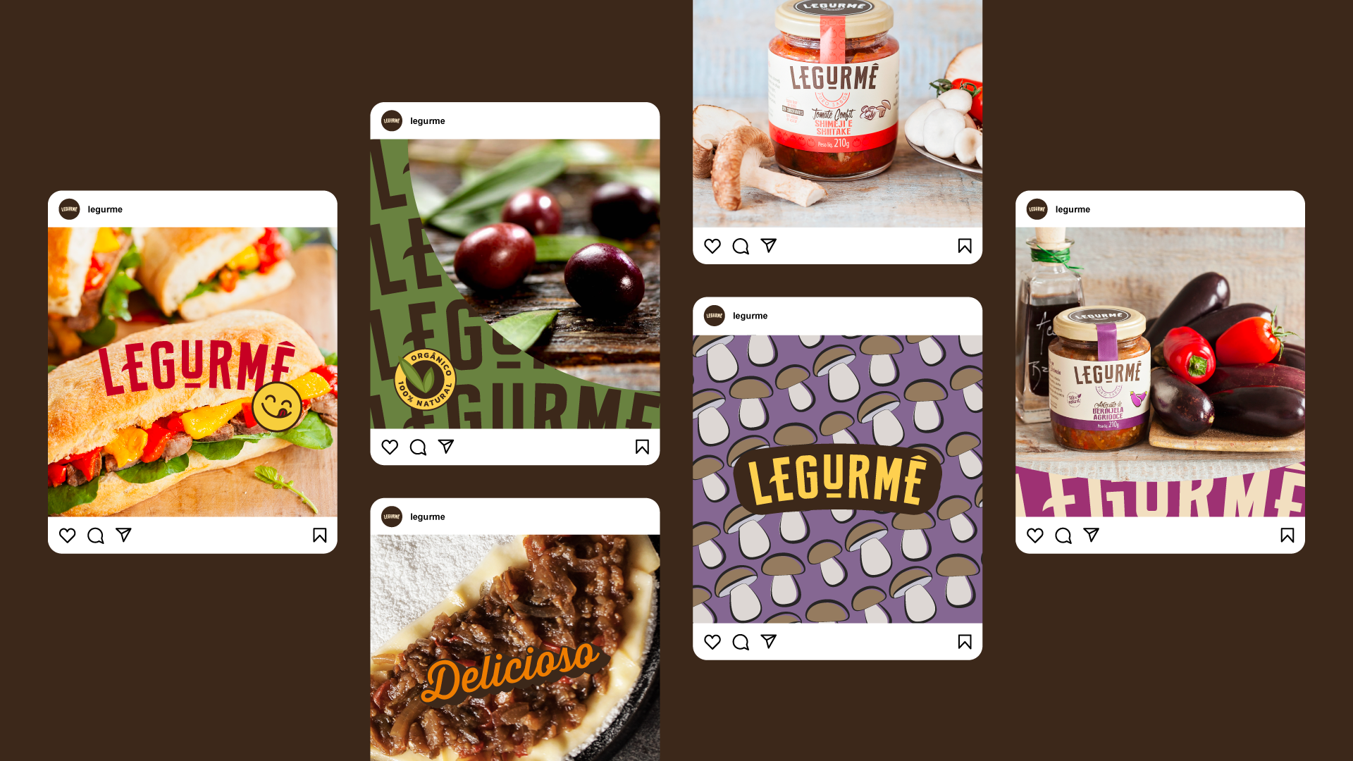
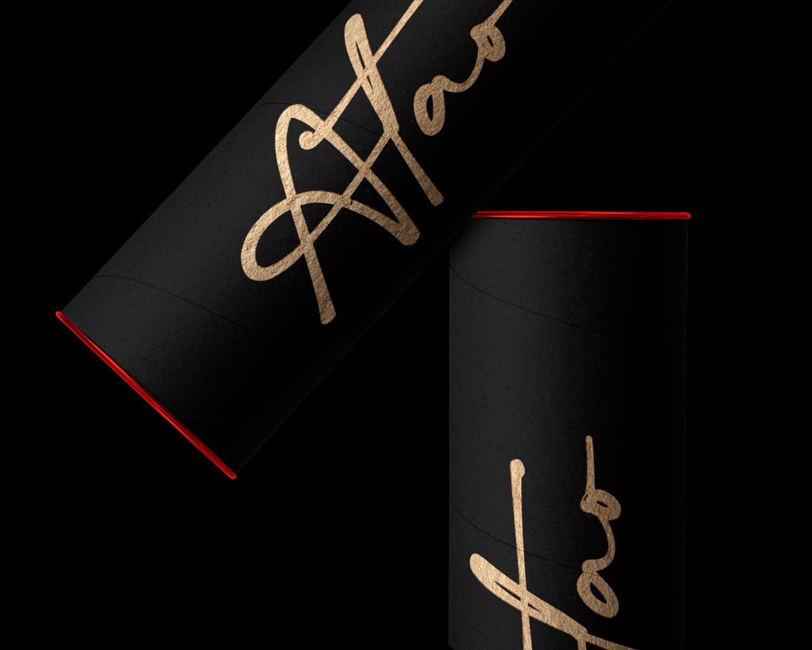
From there, we created a remarkable logo that allows the brand to expand into different applications and products. The logo features a bold and modern design, with a unique combination of colors that represent the freshness and vibrancy of the ingredients. The brand identity is a mix of cursive and sans serif fonts, vibrant colors, and illustrations that distinguish the various product flavors.
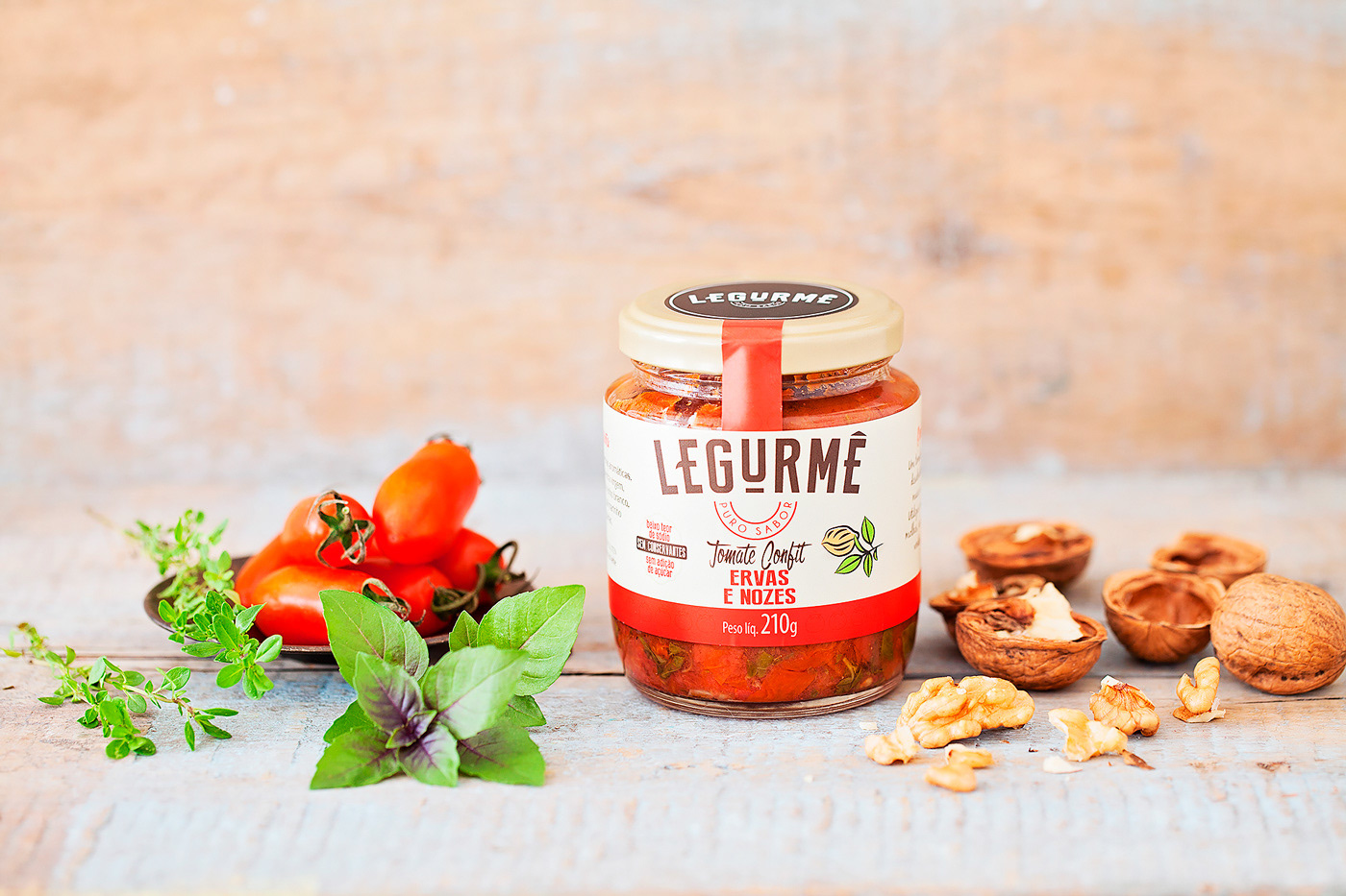
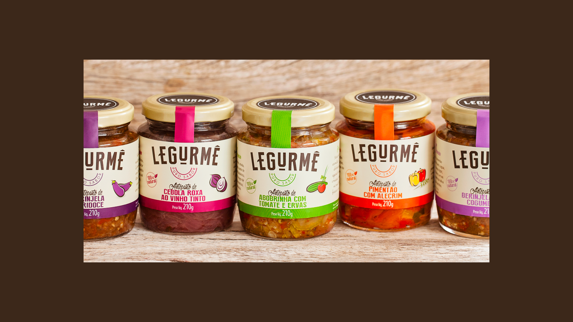
We took great care in designing the packaging, making sure it was not only functional but also aesthetically pleasing. The result is a strong brand and products that look as delicious as they taste. Legurmê is more than just food, it's a lifestyle choice that empowers you to live your best life.