ATAO by Polkura WinerY
BRAND POSITIONING + BRAND DESIGN + LOGO DESIGN+ PACKAGING DESIGN + BRAND GUIDELINES
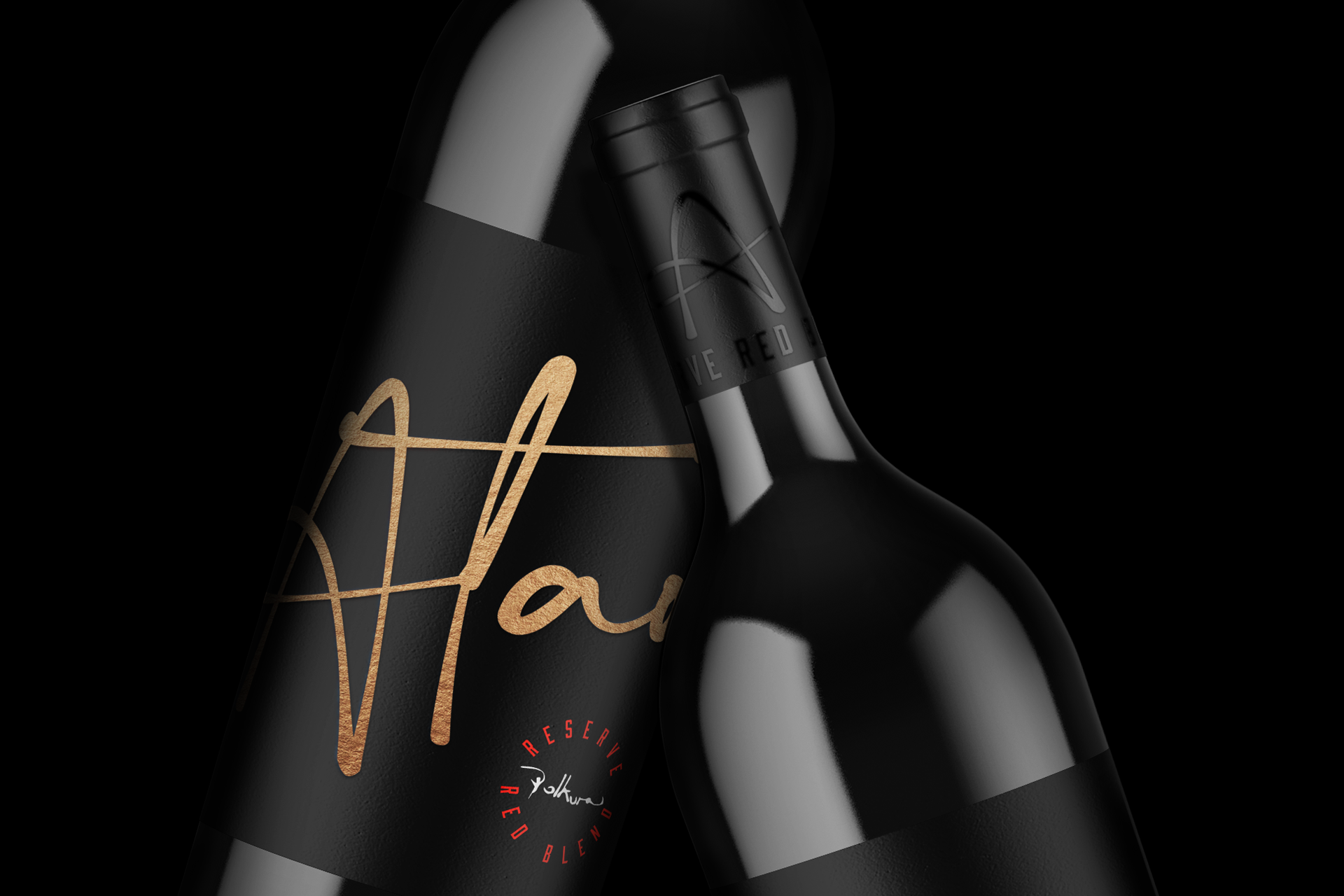
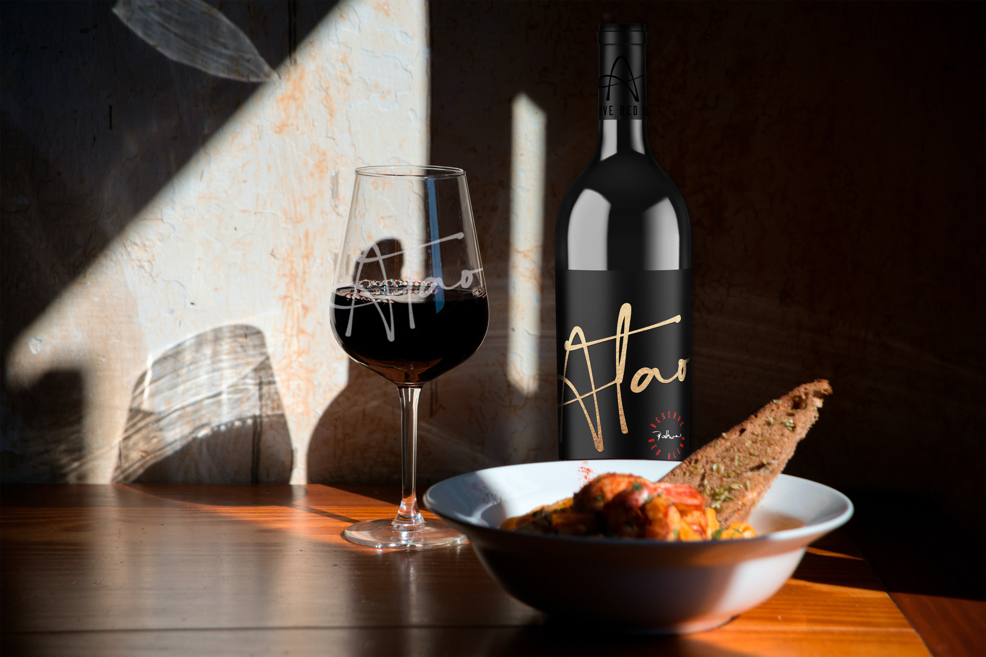
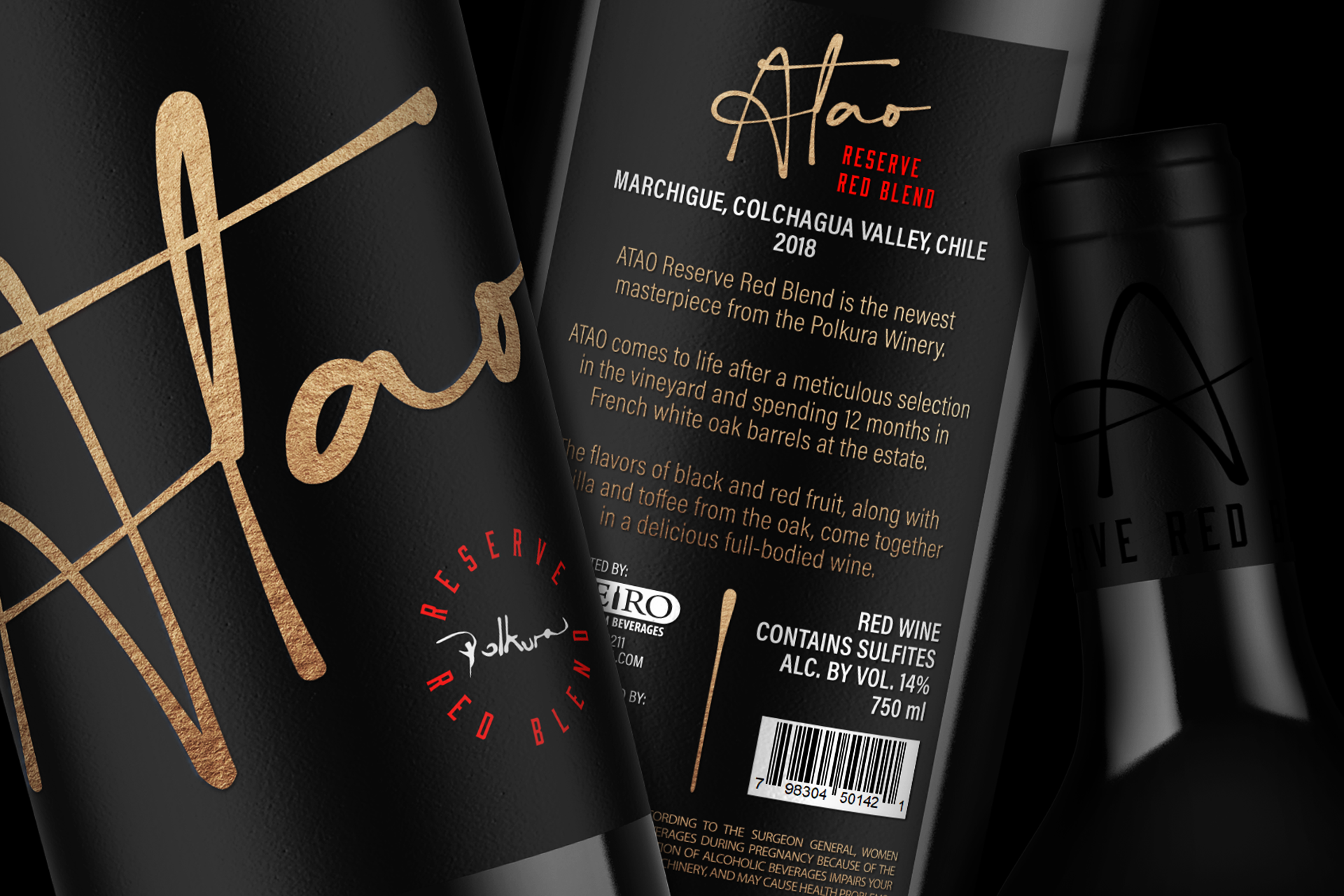
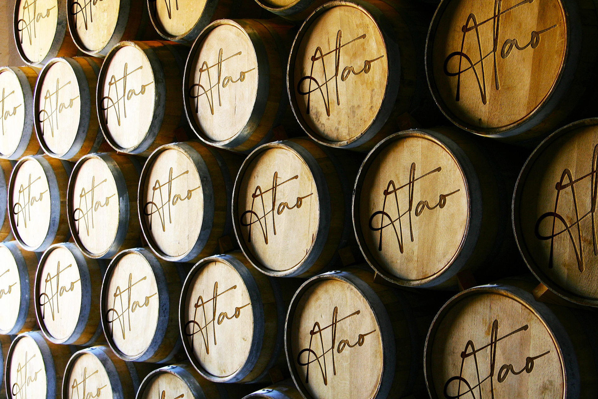
Atao Reserve Red Blend is the latest addition to the exquisite collection of wines from Polkura Winery in Colchagua Valley, Chile. Carefully selected grapes from the vineyard, combined with 12 months of aging in French white oak barrels, result in a full-bodied wine with a delicious blend of black and red fruits, vanilla, and toffee.
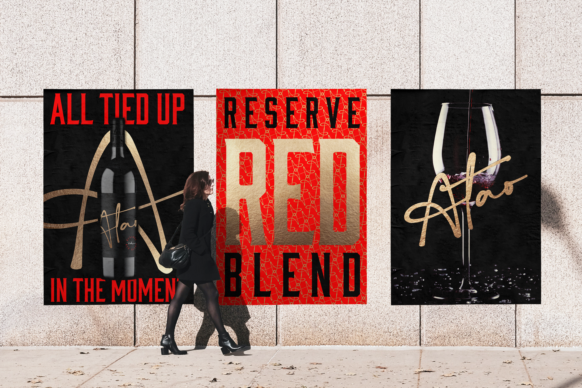
The brief for this project was to create an attention-grabbing brand identity for this premium red wine that would stand out on the shelf and attract customers in the first 6 seconds. The market is saturated with high-quality wines, making it challenging for new products to differentiate themselves from the rest.
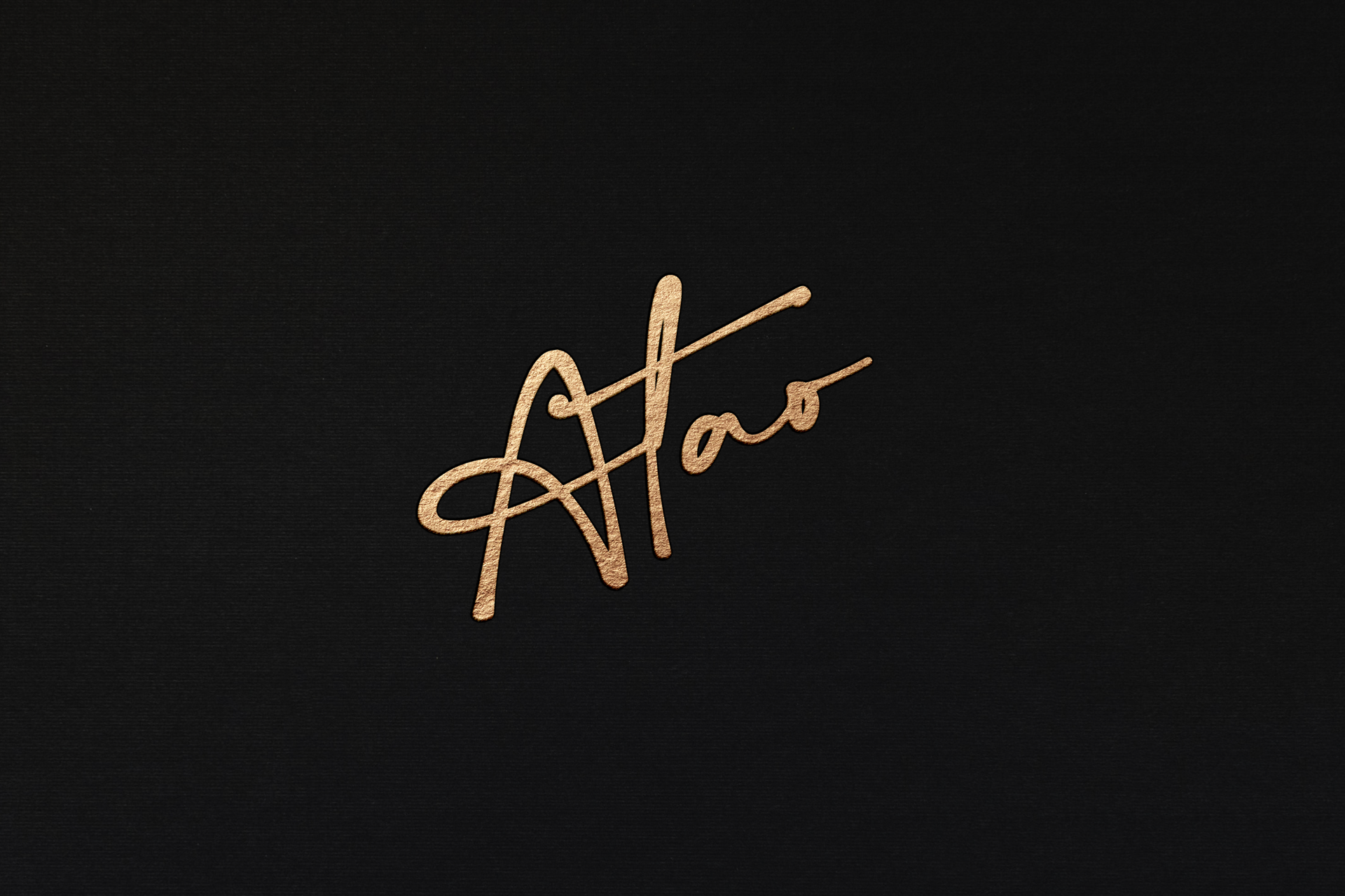
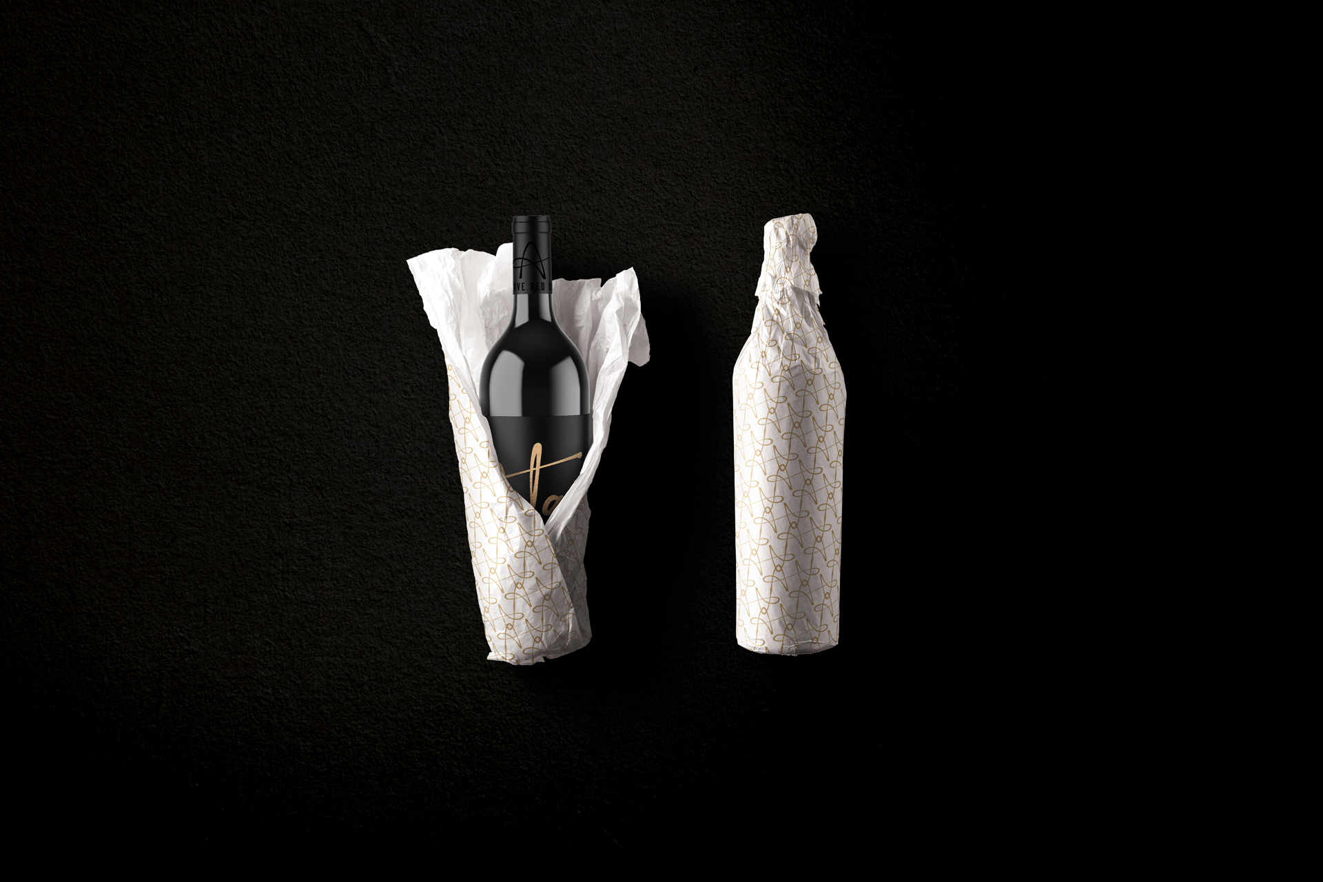
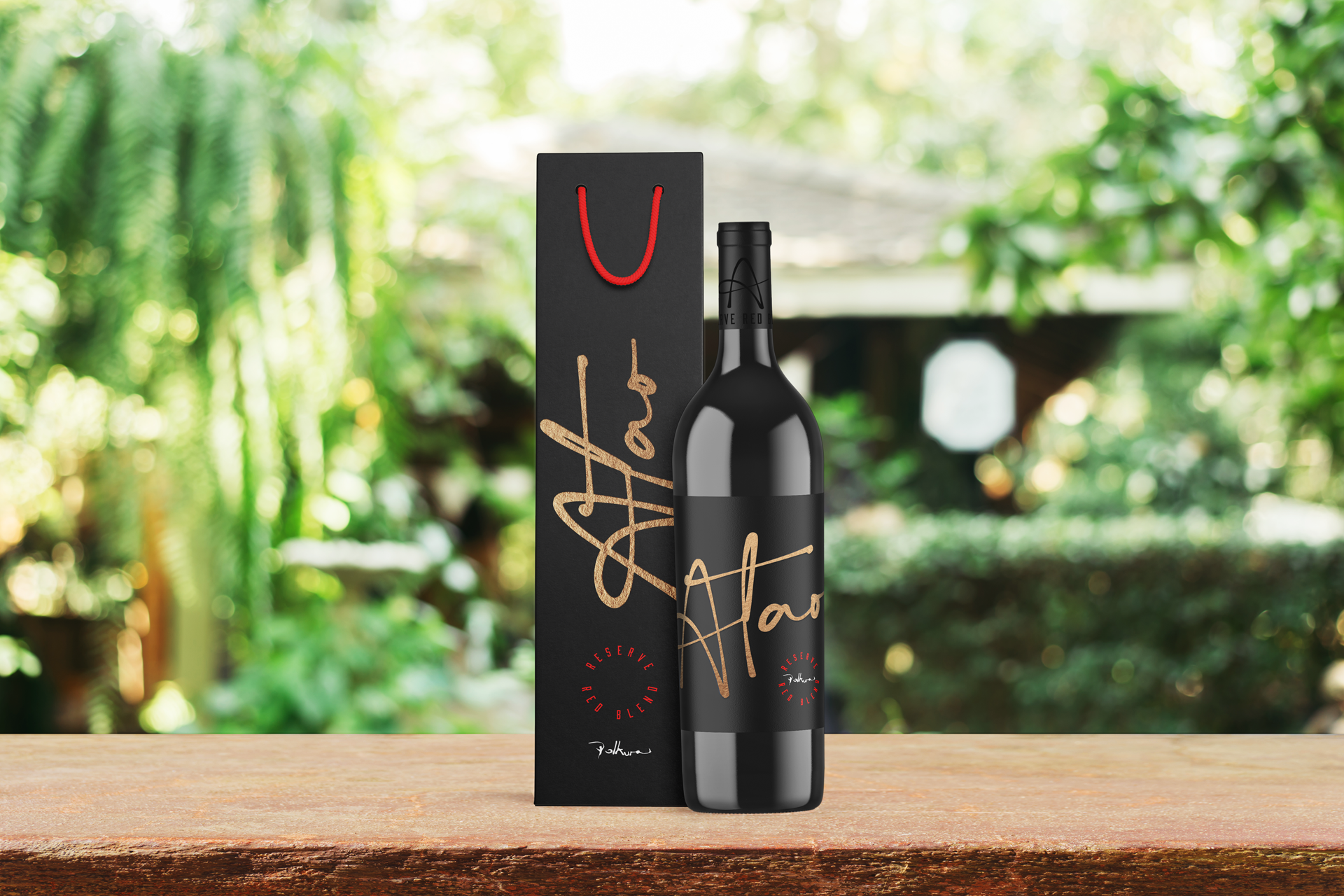
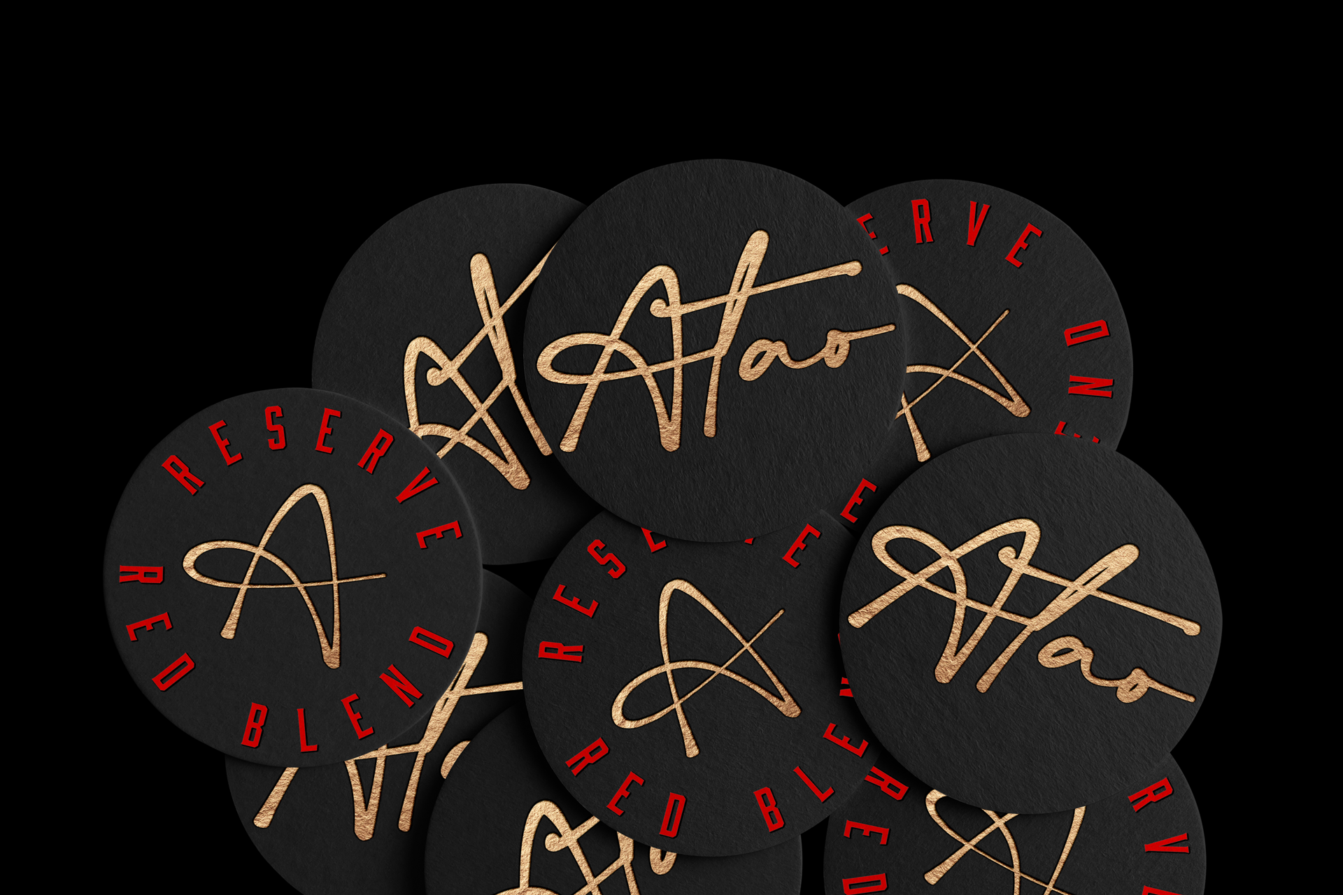
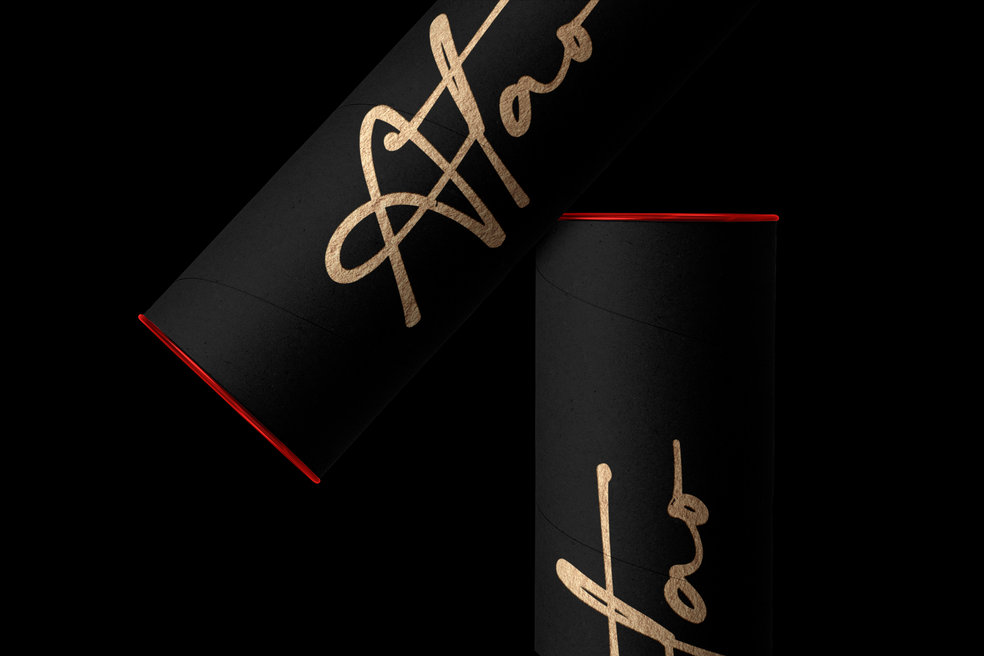
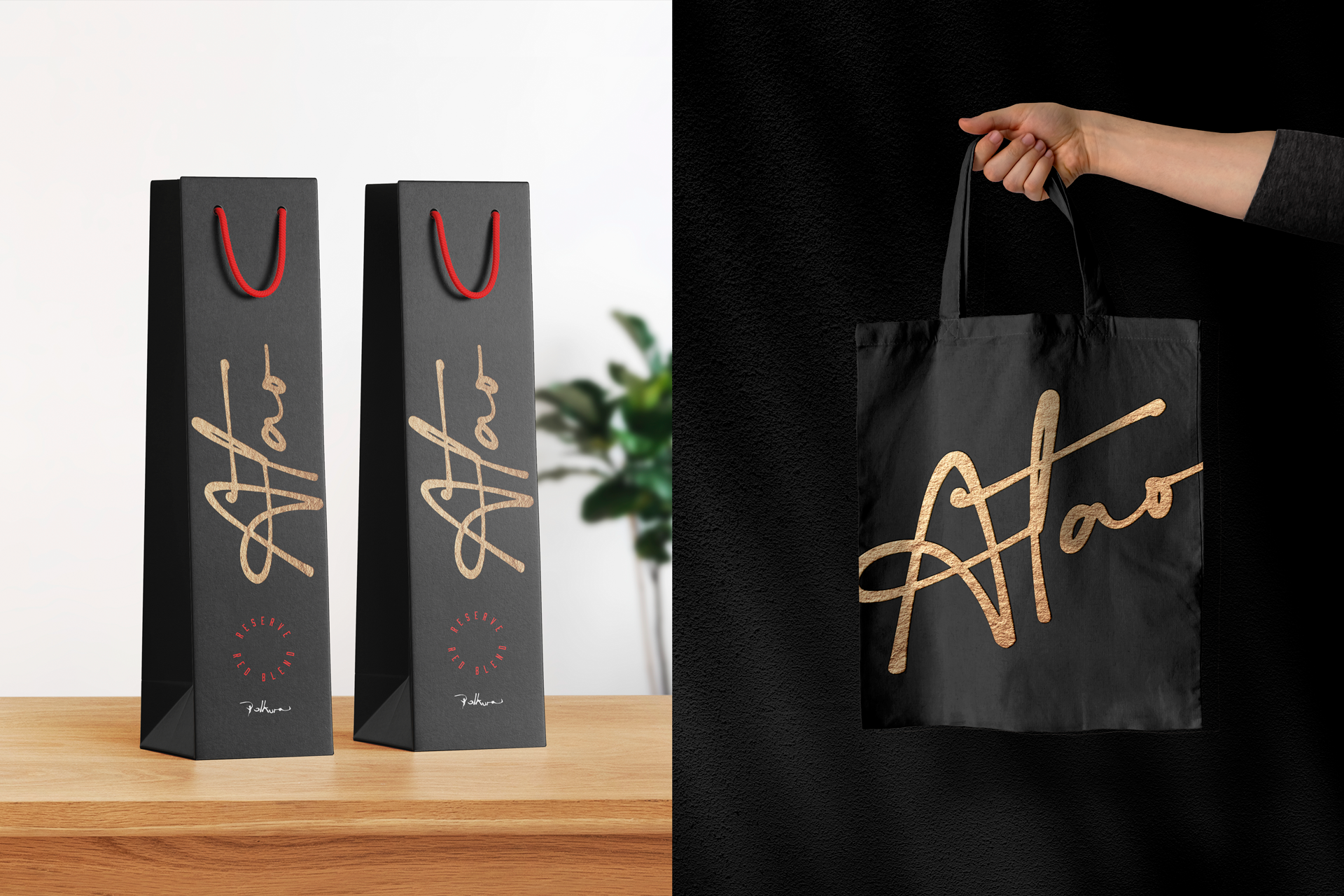
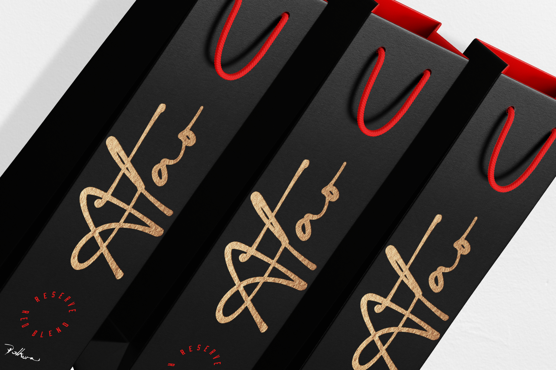
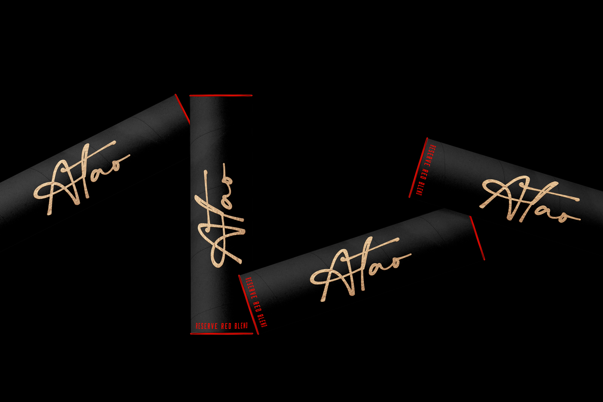
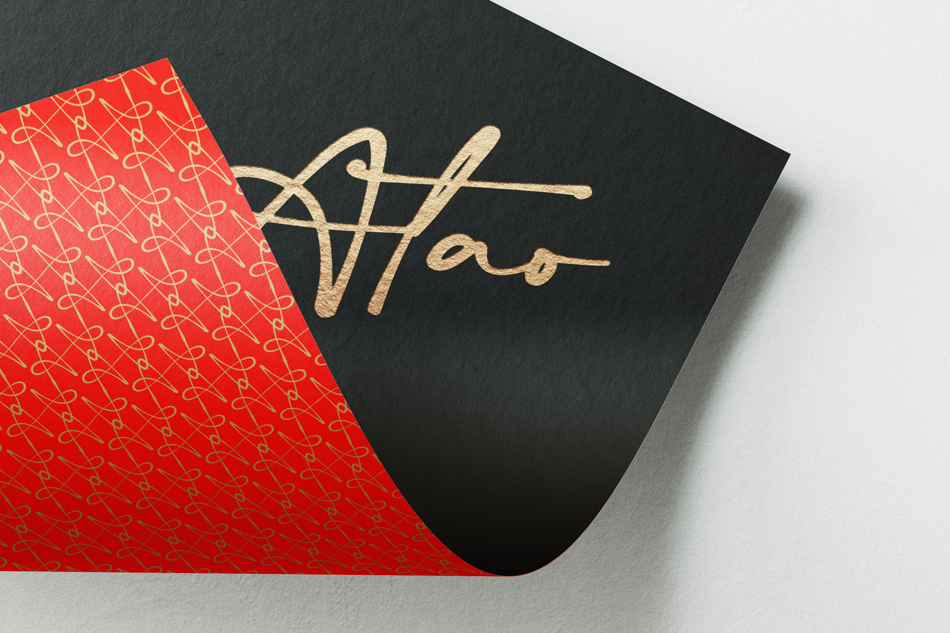
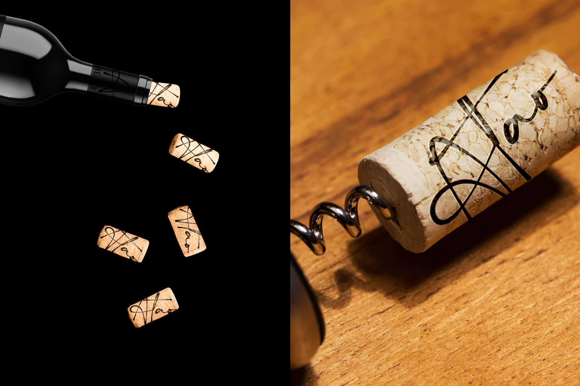
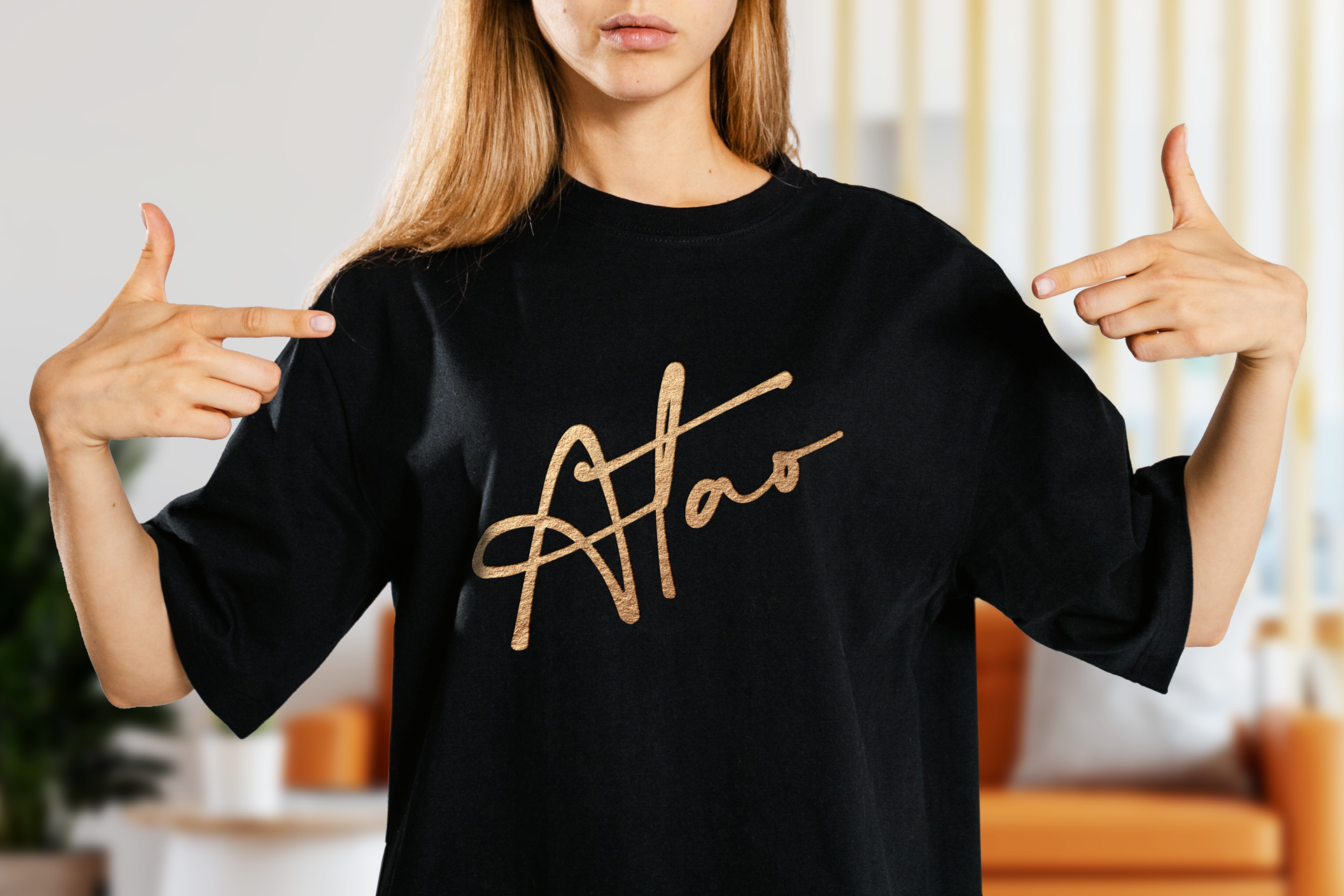
The solution was to design a unique, handmade font for the logo with the letters interwoven, representing the meaning behind the brand name "Atao". The packaging tells the story of the wine, with inviting colors and an elegant design that captures the attention of potential customers.
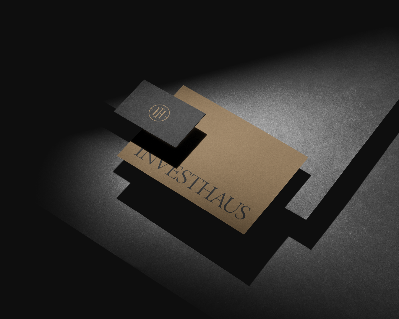
The brand exudes nobility, trust, and authenticity, with a concise and determined brand universe that reflects the wine's tasteful and authentic identity. The gold against the black background creates a visually striking appearance, making it stand out on the shelf.
The result is an authentic and tasteful brand identity that sparks the curiosity of wine lovers and entices them to try Atao Reserve Red Blend.