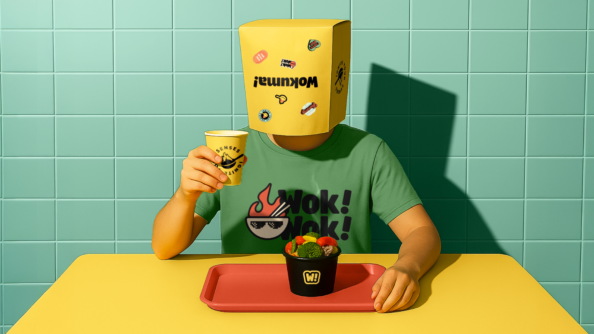
Wokuma!
BRAND POSITIONING + BRAND NAMING + BRAND DESIGN + LOGO DESIGN + PACKAGING DESIGN + BRAND GUIDELINES
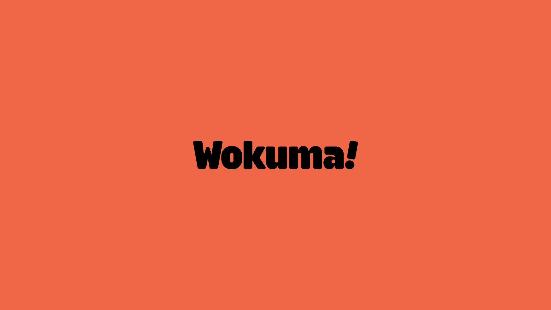
Wokuma!
Asian Fusion, Redefined
A bold, fast-moving brand identity designed to energize
Zurich’s food scene, and scale far beyond.

Wokuma! is a fast-casual Asian fusion restaurant based in Zurich, Switzerland.
Founded by a visionary entrepreneur with a passion for modern, high-quality Asian cuisine, Wokuma! blends tradition and innovation to deliver bold flavors, speed, and style, all within an upbeat, urban atmosphere. From the start, the client had plans to expand beyond Zurich and build a scalable, iconic brand.


Challenges We Faced
With Zurich’s culinary scene becoming increasingly saturated, Wokuma! needed more than just a good logo, they needed a full brand experience that would capture attention, spark curiosity, and stand out in a competitive fast-food landscape.


Key challenges included:
• Create a distinctive name that would resonate across cultures and be easy to remember
• Build a visual and verbal identity that expressed energy, youthfulness, and modernity without compromising quality
• Design a scalable system, one that could easily be rolled out to new locations, packaging, uniforms, and digital experiences
• Craft a brand personality bold enough to turn a first-time visitor into a loyal fan


Our Solution
We approached Wokuma! as more than a restaurant,
we treated it like a brand born to move.

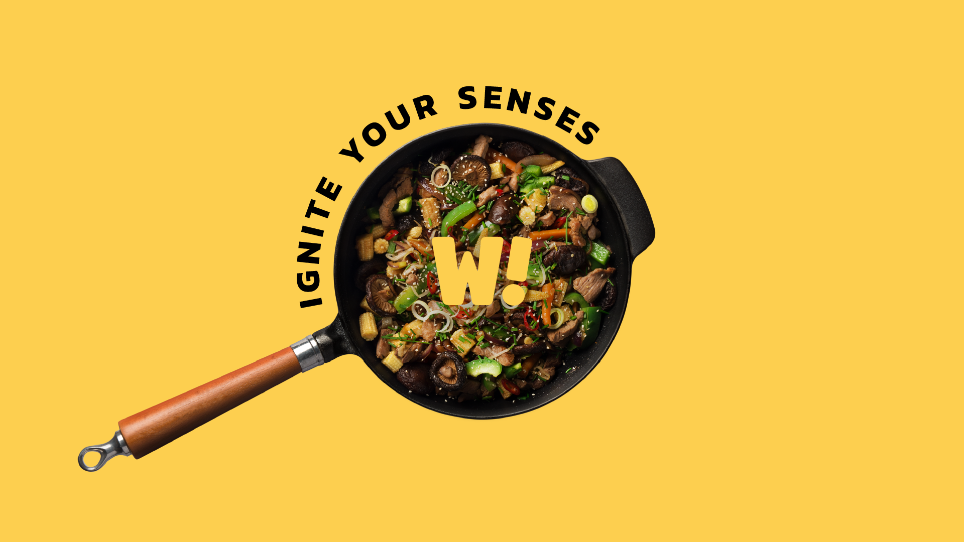
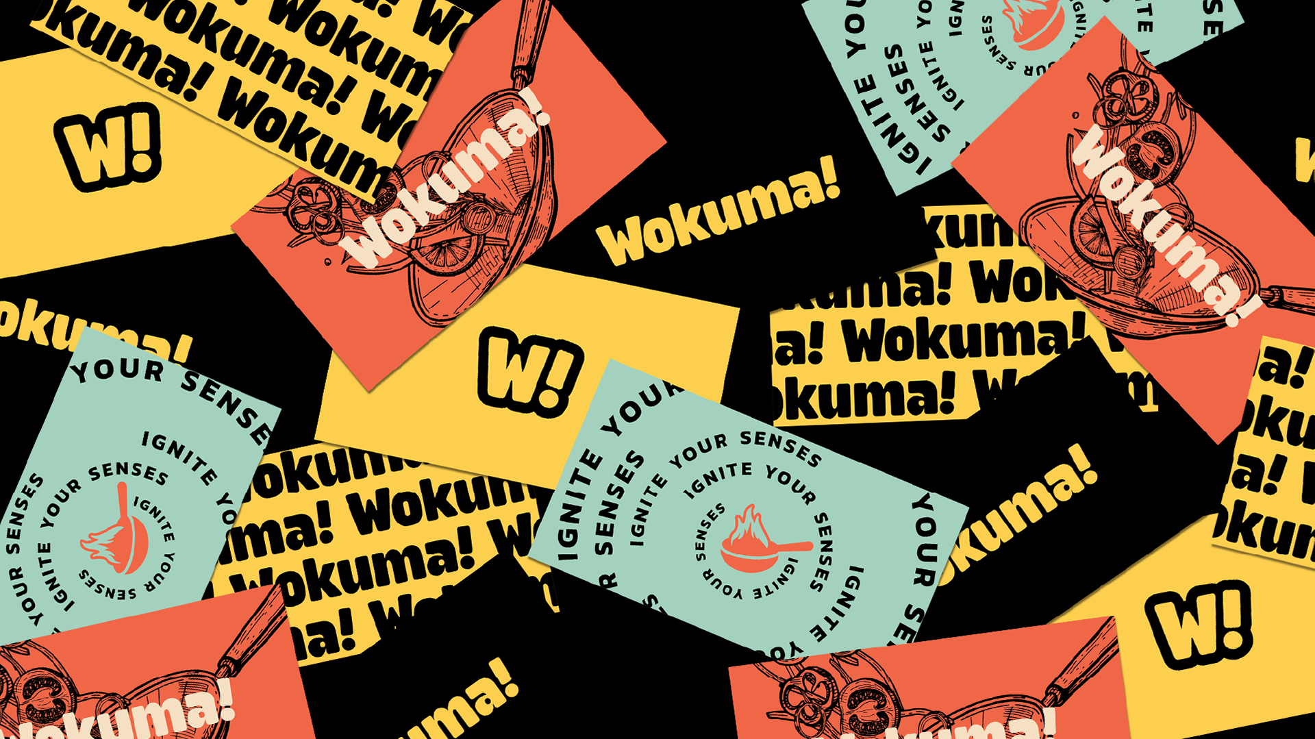
Naming the Brand
The name Wokuma! is a fusion of “wok”, the iconic high-heat cooking method central to Asian cuisine, and “umami”, the fifth basic taste.
Umami (旨味) is a Japanese word meaning “delicious savory taste”, a deep, meaty flavor found in ingredients like soy sauce, mushrooms, and fermented foods. It’s the core of what makes Asian fusion food feel rich and satisfying.
The result is a name that feels flavorful, fast, and full of personality, ending on a rhythmic punch that gives it a sense of motion and attitude.
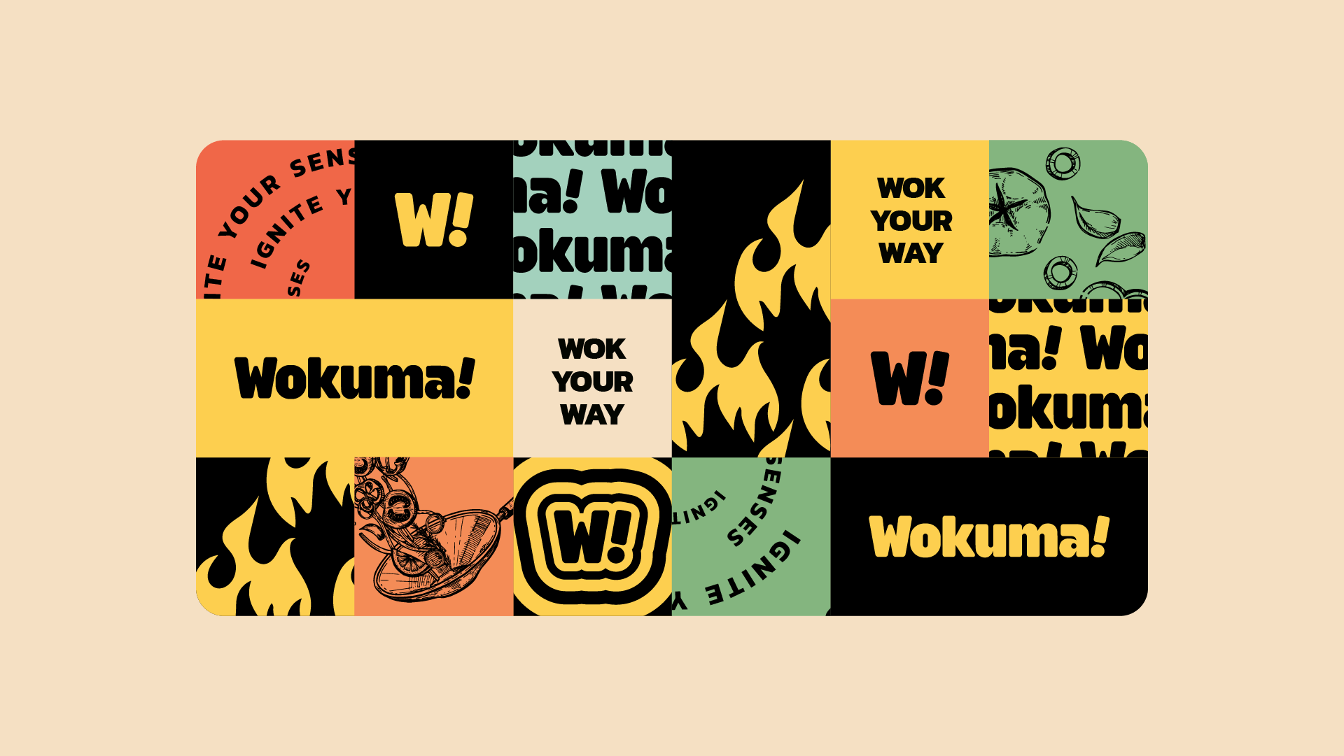
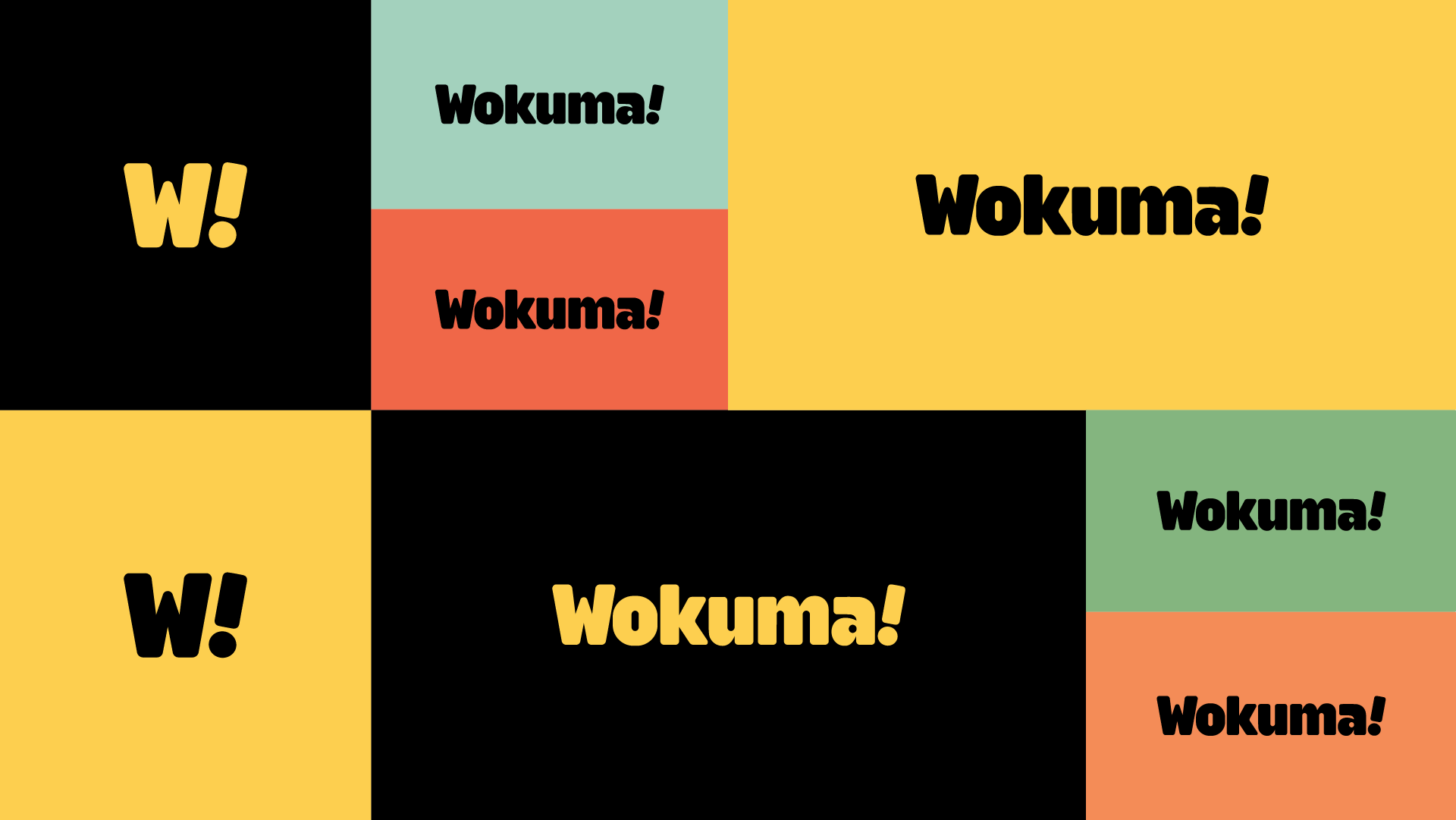

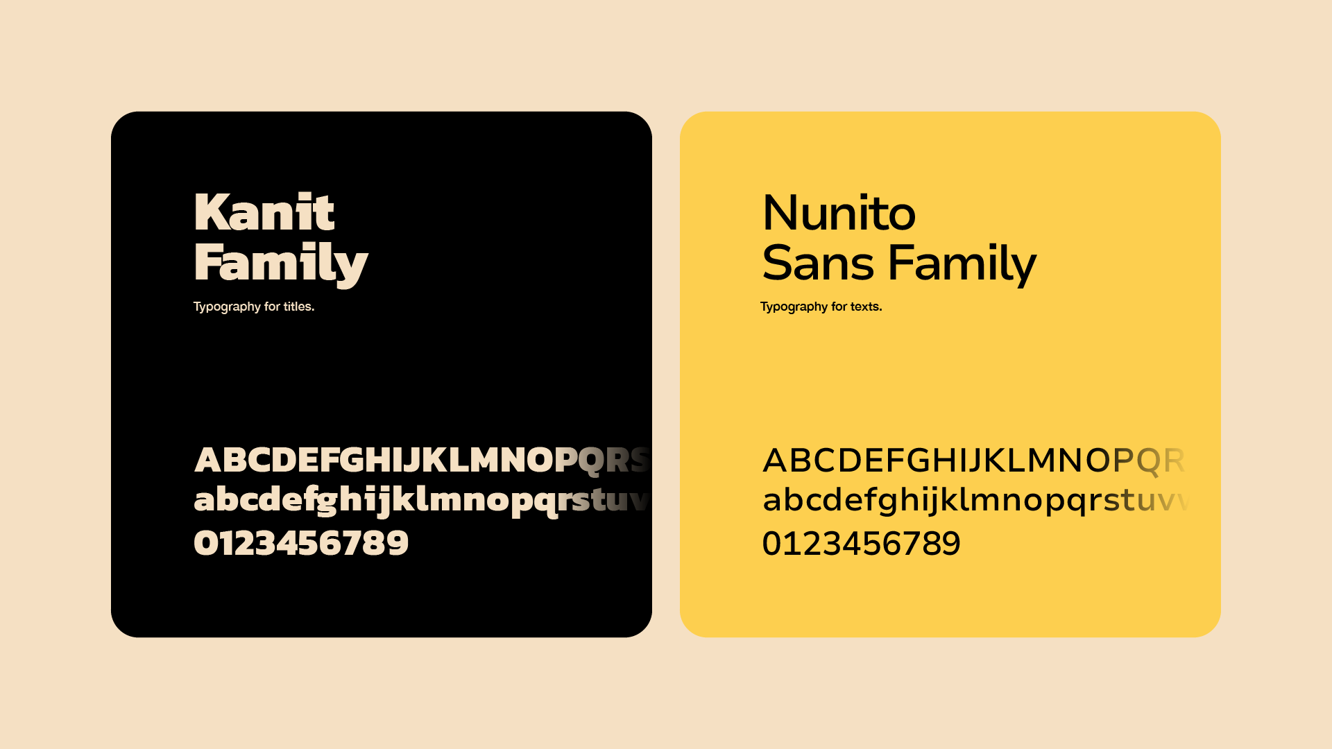
Building the Identity
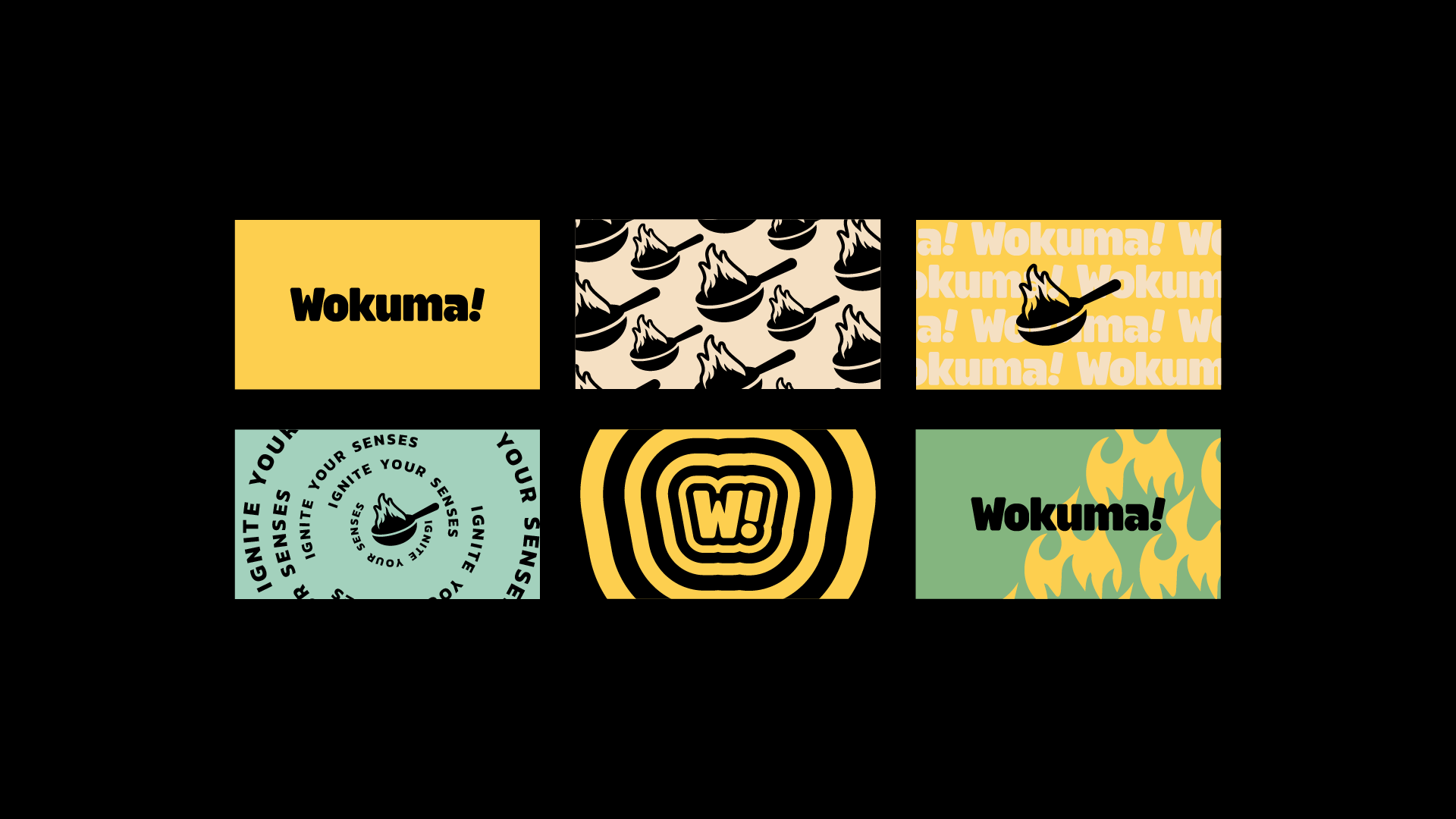
We created a bold, expressive brand identity system
that reflects Wokuma!’s energy and flavor-forward spirit.


Key Moves:
• Brand Strategy: Positioned Wokuma! as a fast, modern, unapologetically flavorful brand built for the next generation of food lovers
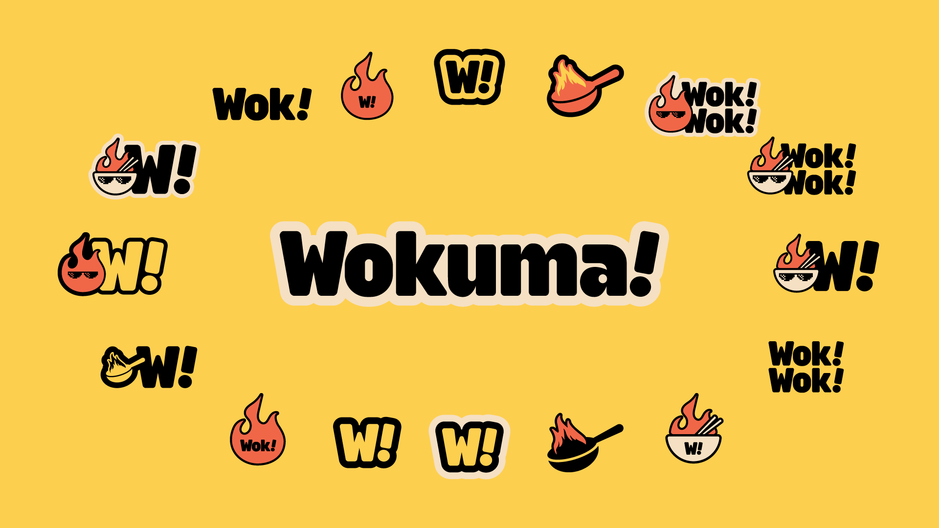
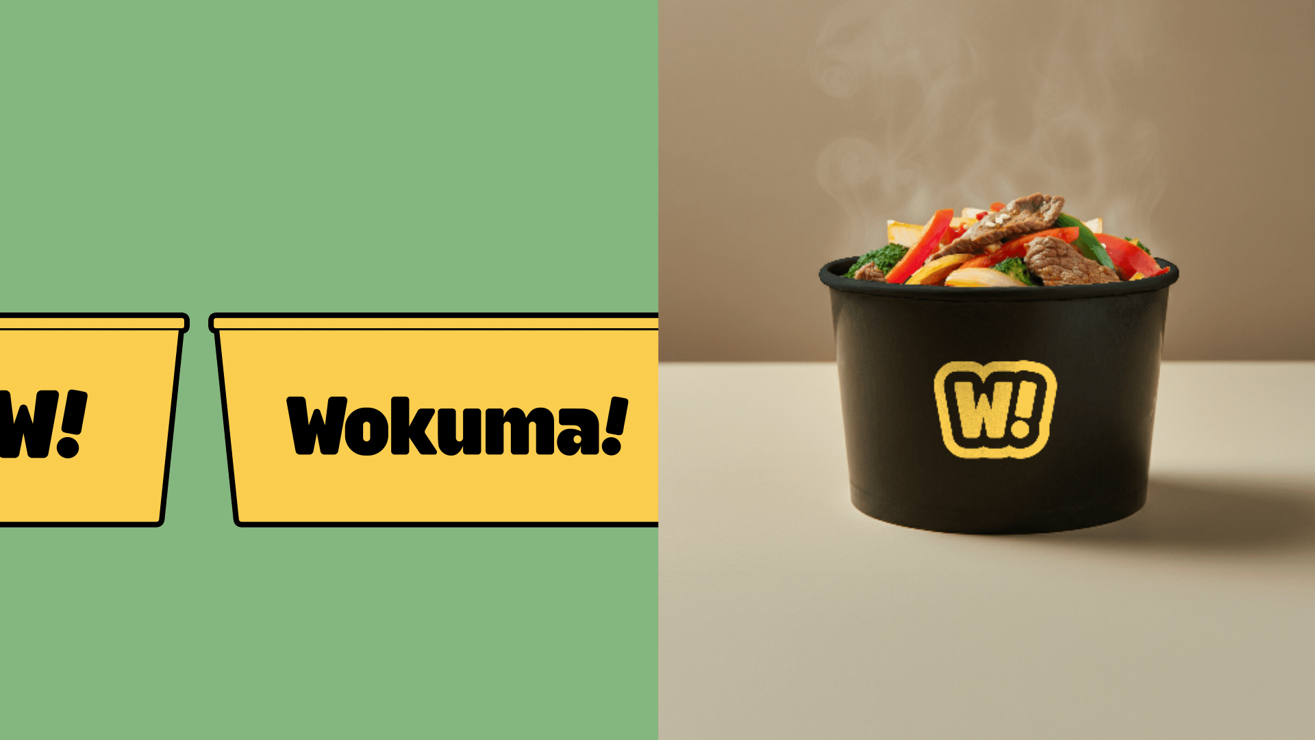
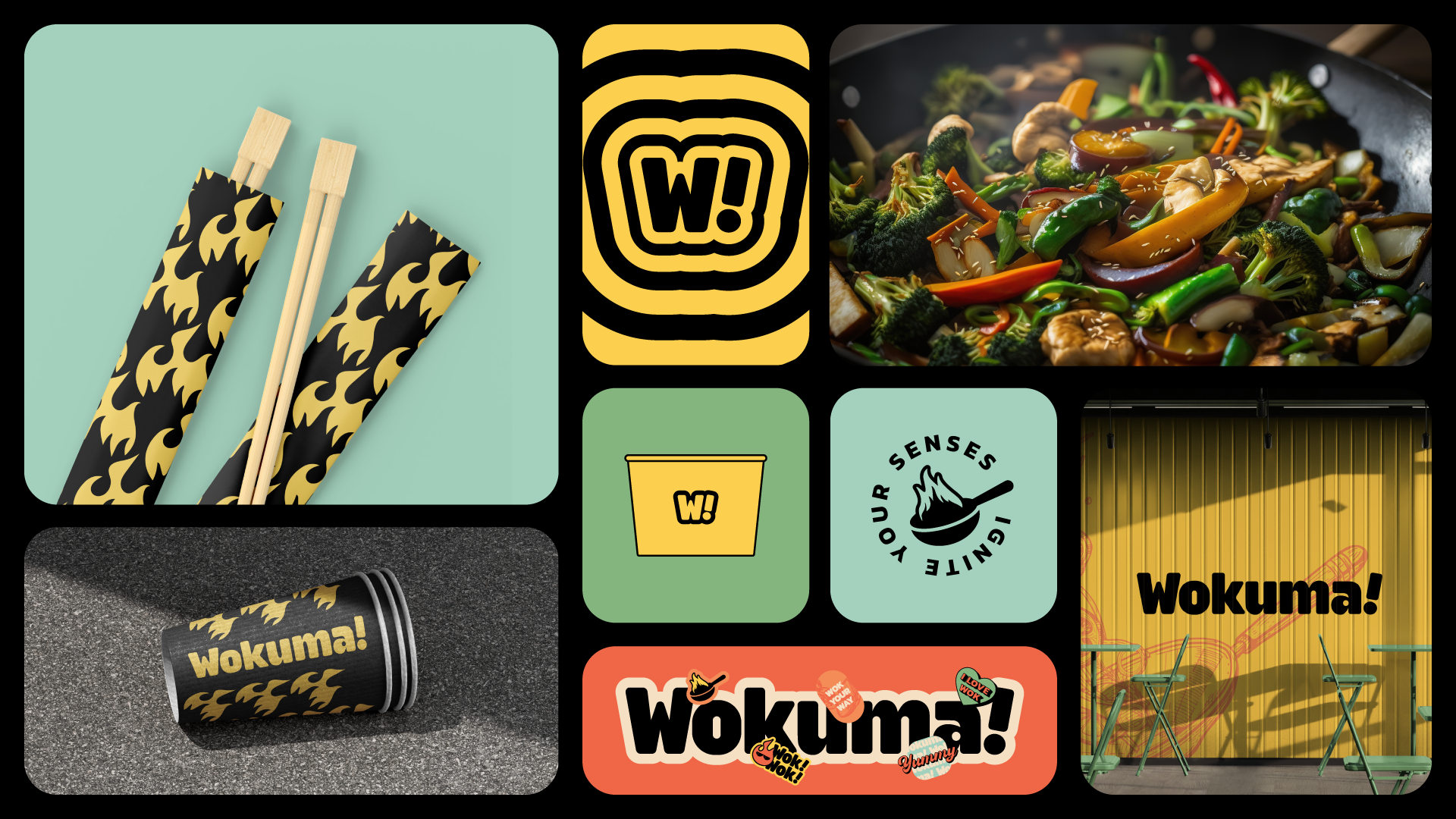
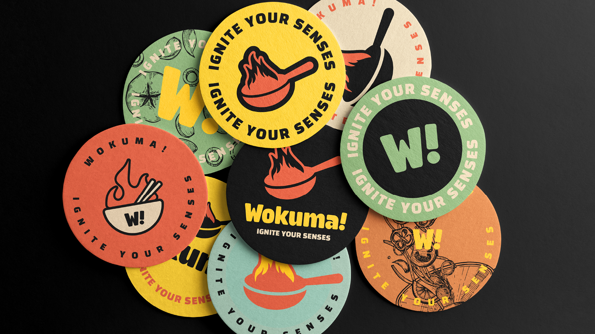
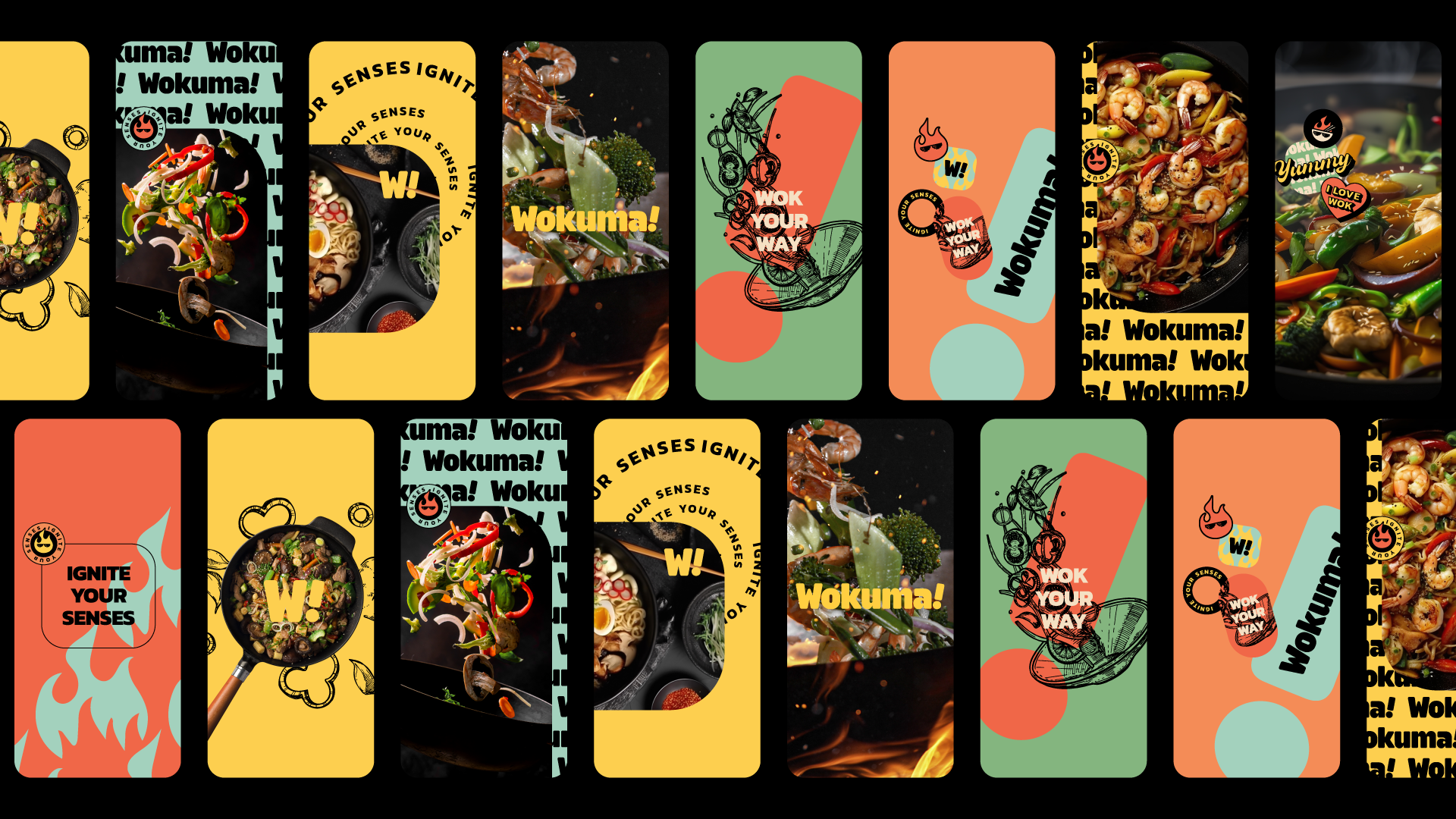
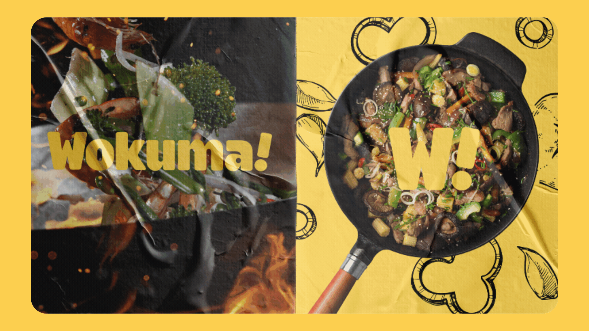
• Visual Identity: Custom logotype with kinetic motion graphics, bold shapes, and vibrant colors designed to pop on every surface, from storefront to sauce packet
• Verbal Identity: Fun, confident copywriting with short, punchy headlines like “Let’s Wok!” and “Full speed, full flavor”
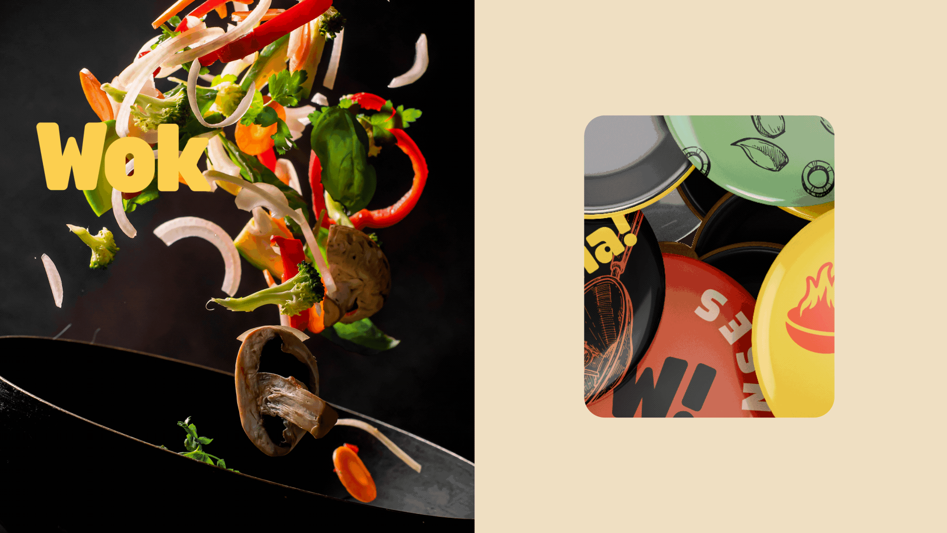
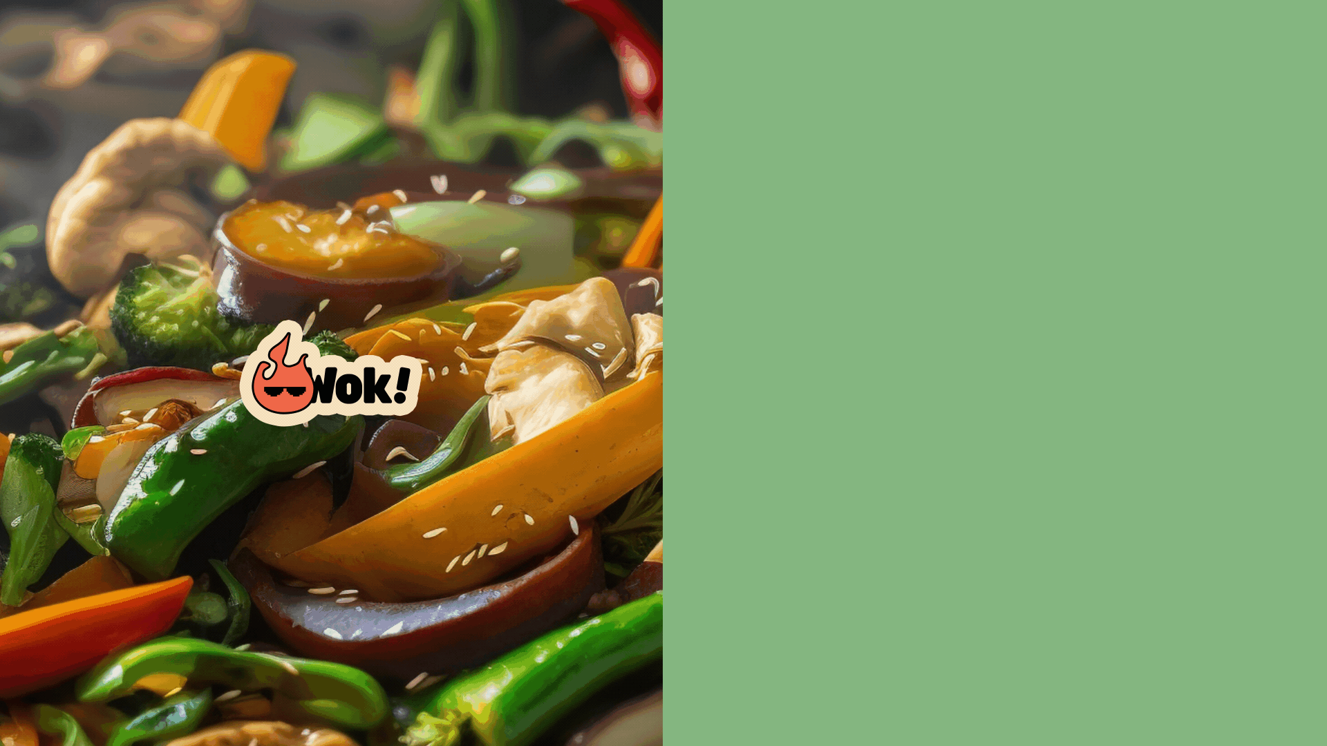
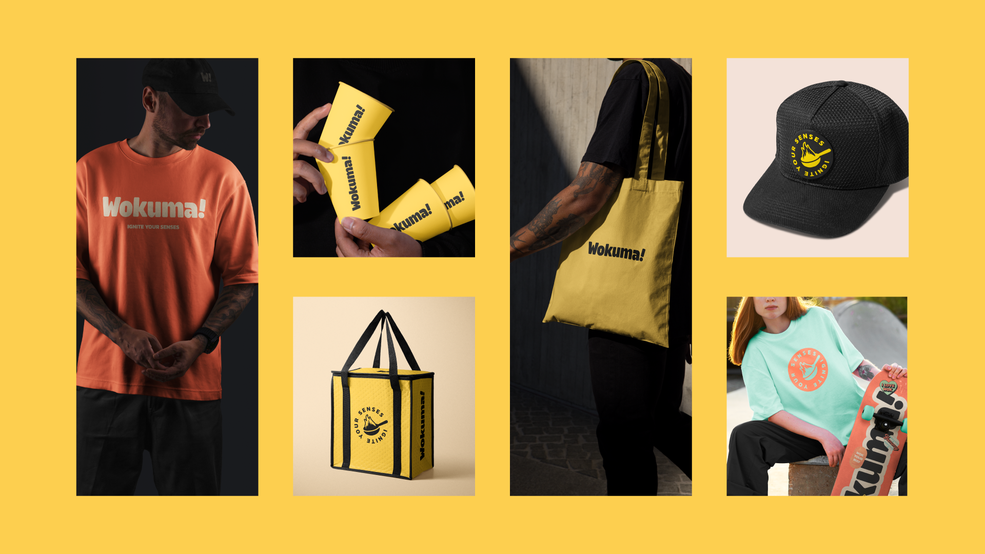
• Packaging Design: Every item was an extension of the brand, compact, colorful, and made to elevate even a quick takeout moment
• Uniforms & Interiors: Created brand guidelines that seamlessly extend into physical spaces, keeping the energy alive across every customer interaction
• Digital Presence: Designed with scalability in mind, ready to translate across web, app, and social


The Outcome
Wokuma is now fully equipped with a bold, strategic brand identity that’s ready to make an impact the moment doors open. From signage to packaging to digital presence, every brand touchpoint is designed to create a fast, flavorful, and memorable experience.


Beyond the first location, Wokuma! is now poised for growth. With a scalable identity system and a clear brand voice, it’s ready to expand across new markets, new menus, and new channels, always delivering the umami-packed energy that makes it unforgettable.


Wokuma! isn’t just a place to eat, it’s a brand that moves.