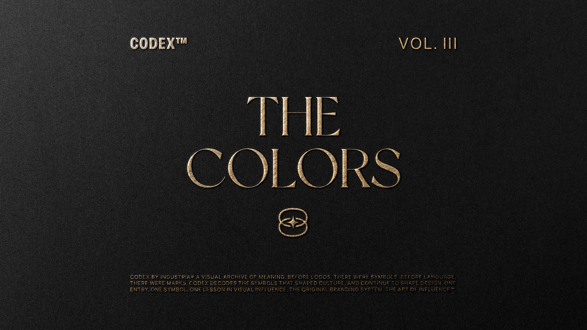
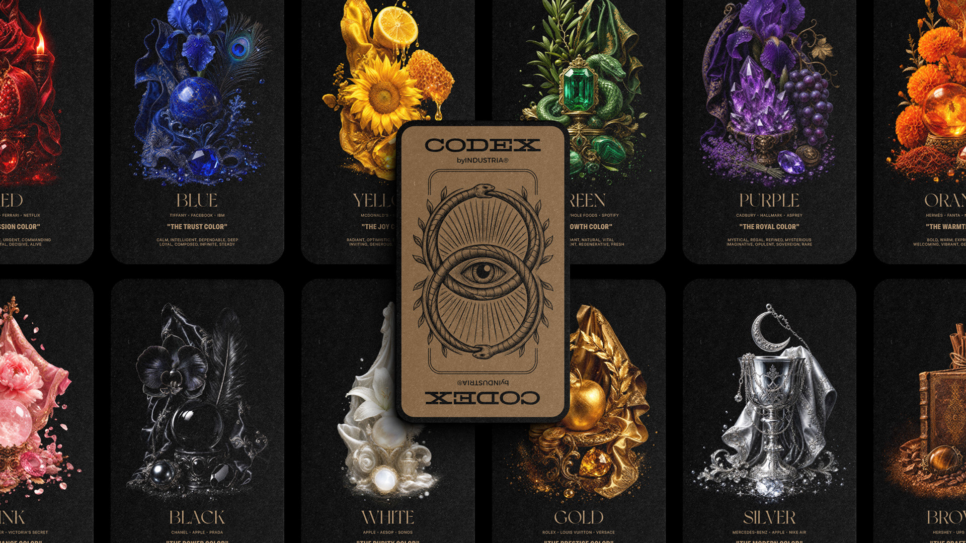
The COLORS
Color is the First Decision a Brand Makes
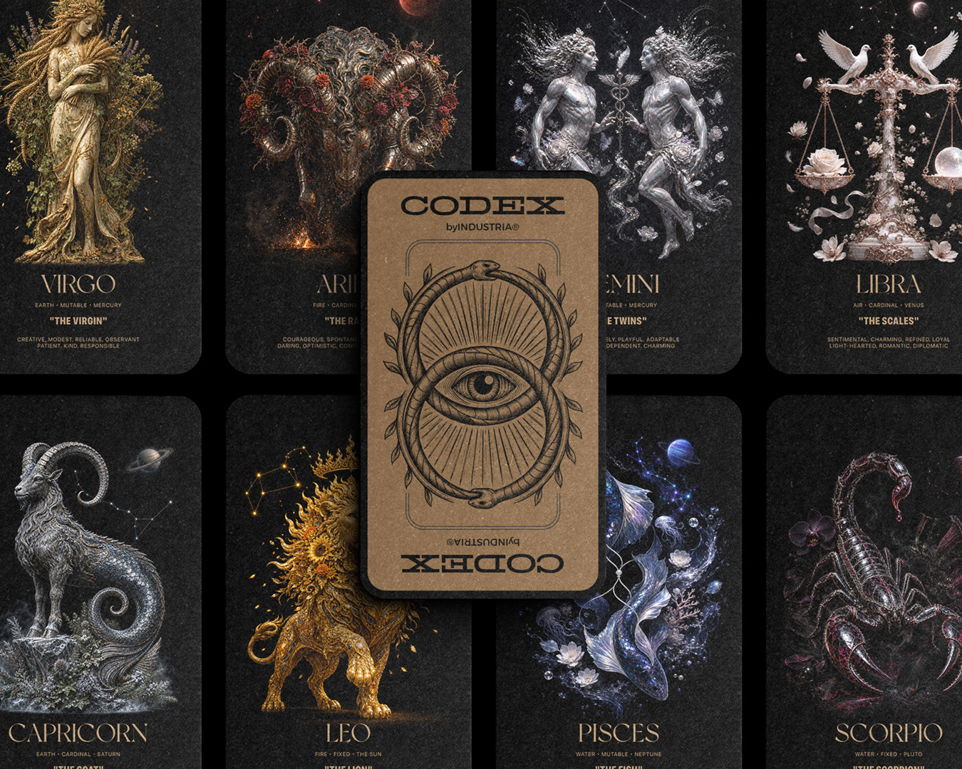
CODEX™ Vol. III — THE COLORS is an editorial study of how twelve colors built the most enduring brands in the world.
Most branding conversations begin with a logo. They should begin with a color.
Color is the first decision the eye makes about a brand, and the eye decides in milliseconds. Before the logo registers. Before the name is read. Before the story is heard. The brain catalogues color faster than it catalogues anything else in the visual field, which is why the brands that have endured the longest tend to share one trait: they own their color.
That ownership is not accidental. Red belongs to Coca-Cola because Coca-Cola spent a century becoming red. Orange belongs to Hermès because Hermès built an entire luxury house around it. Tiffany owns a specific blue, Pantone 1837, protected by trademark since 1998. A color, claimed consistently and confidently, becomes the brand itself.
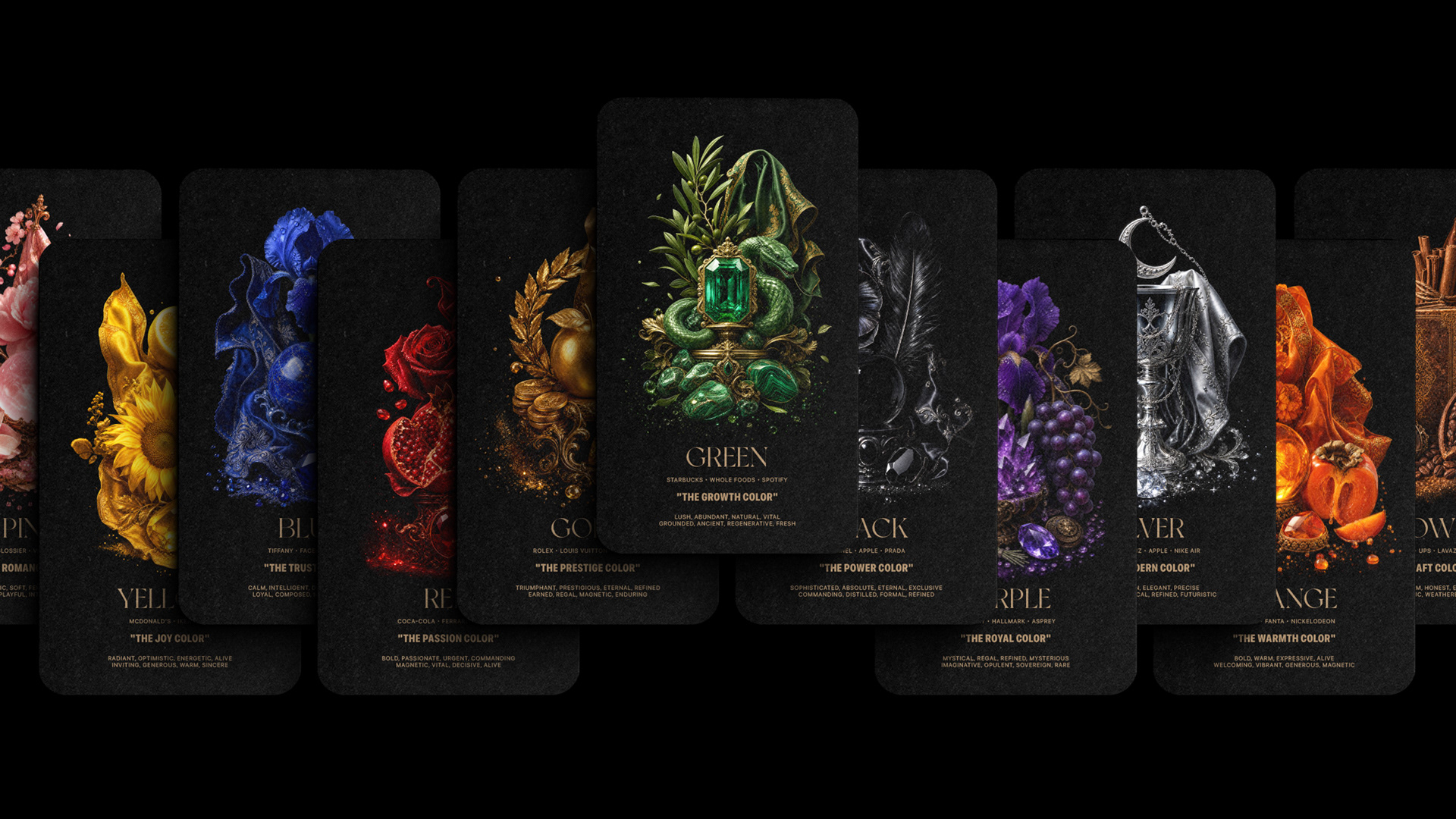
CODEX™ Vol. III — THE COLORS is a study of that claim. Twelve cards, twelve colors, twelve languages every brand speaks whether they know it or not. This is what each one means, who owns it, and why.
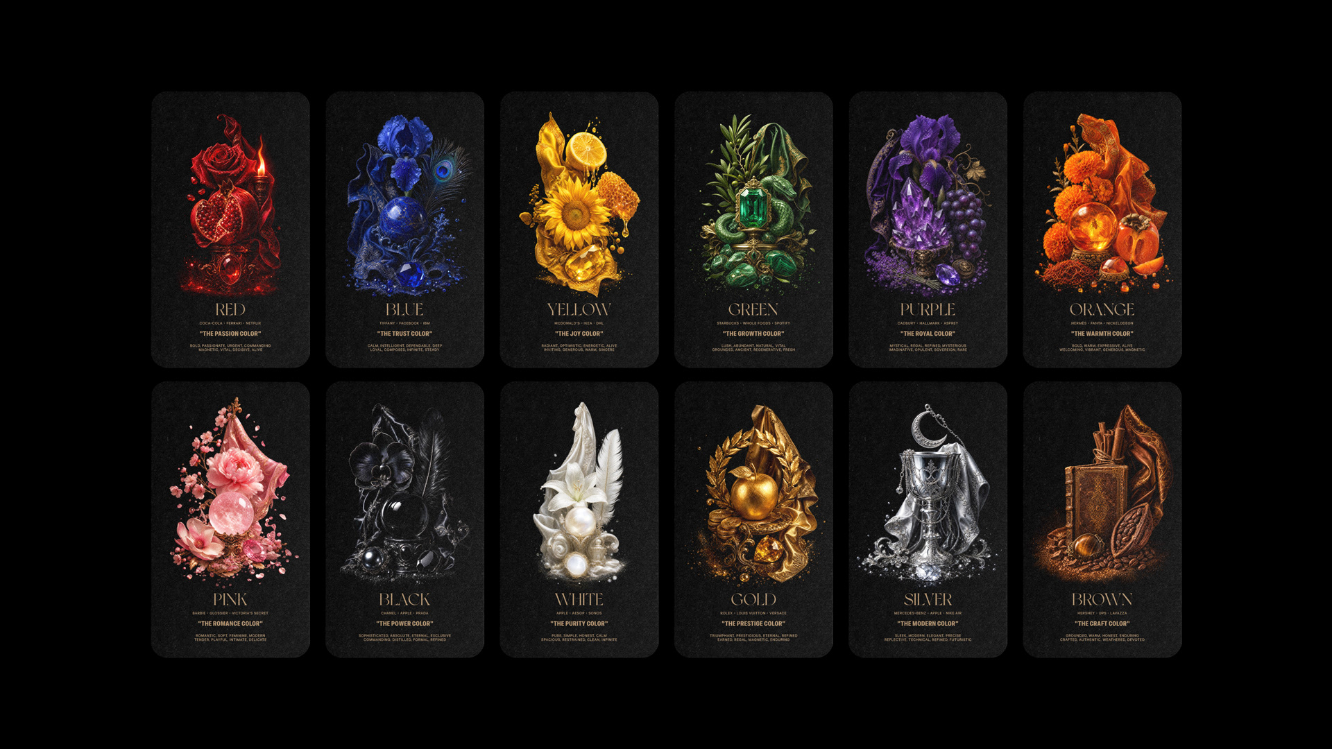
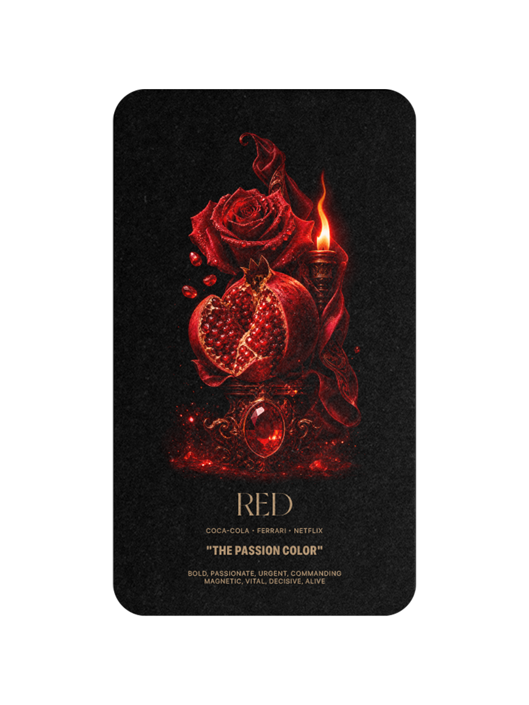
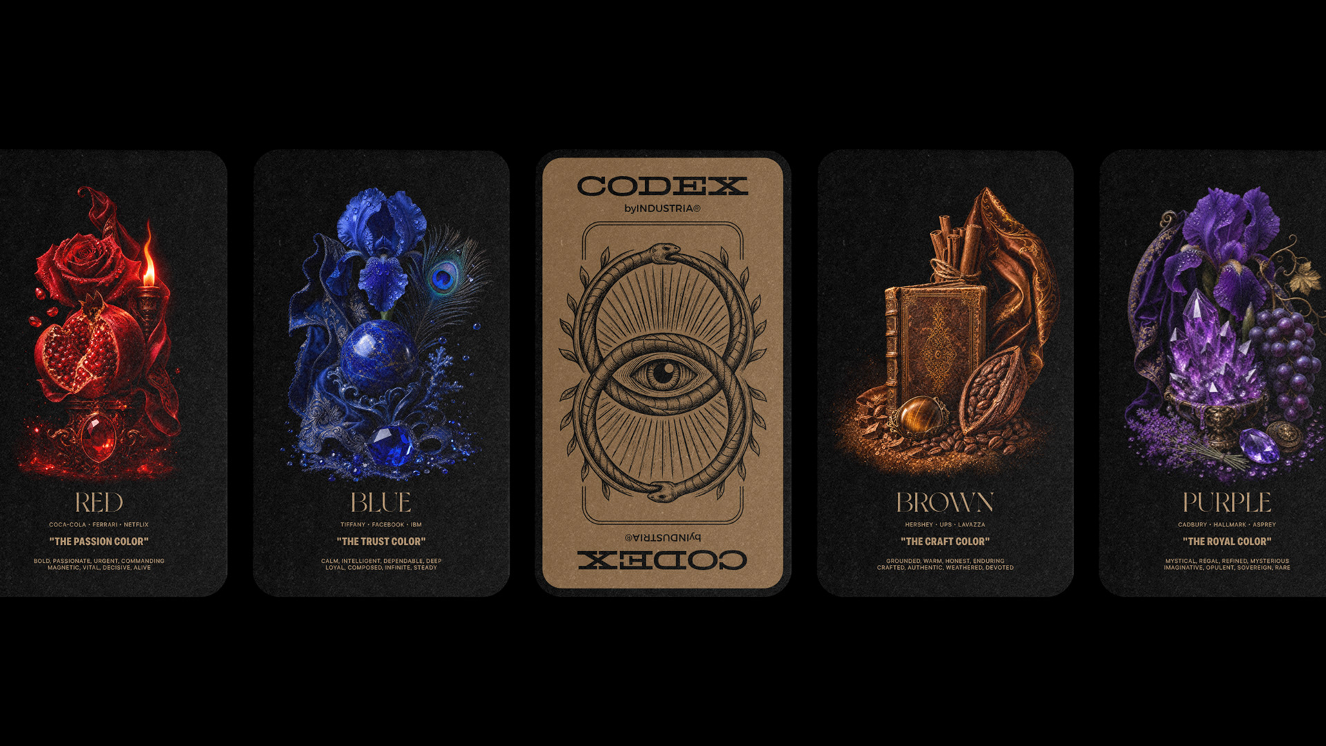
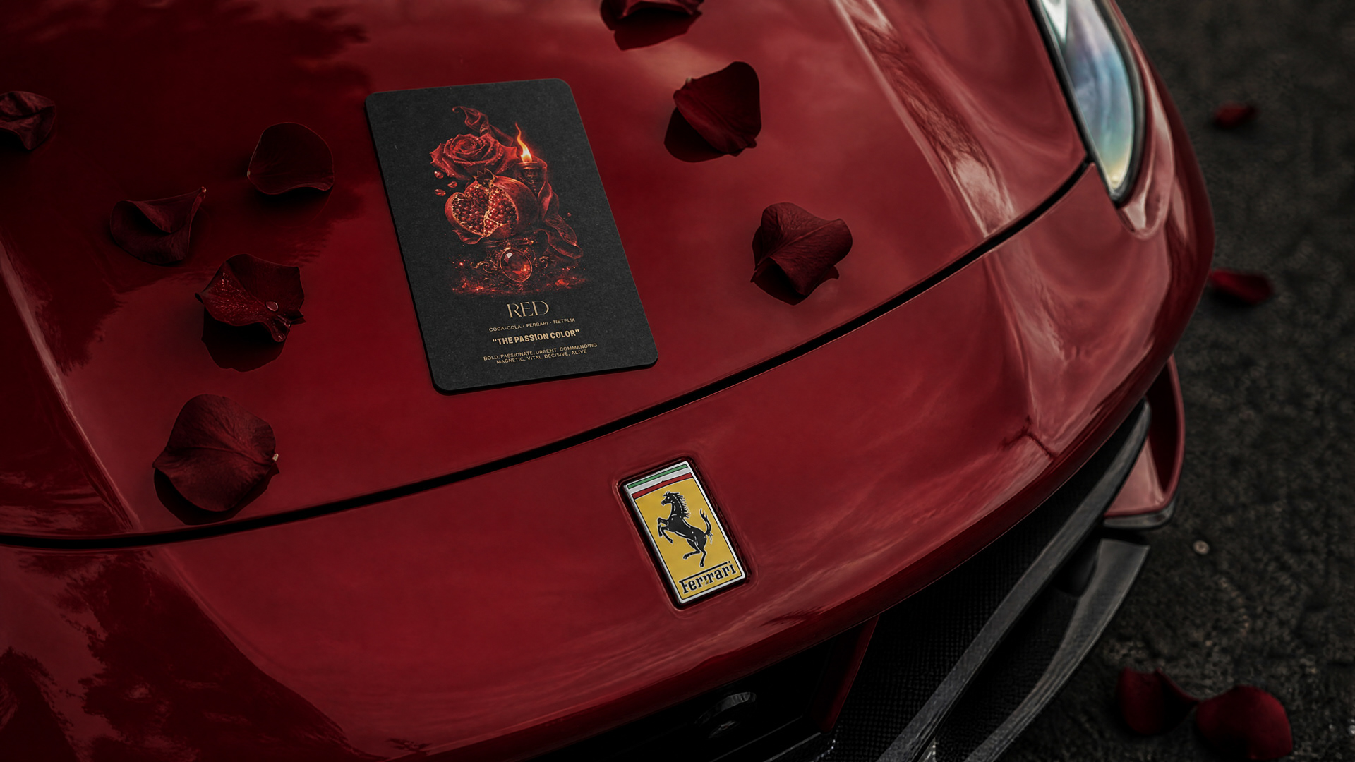
RED
The Passion Color
Red is the first color the human eye learns to see and the last it forgets. It is the color of blood, fire, danger, and desire, every signal the body has ever used to warn or pursue. Coca-Cola has been red since 1886, the year the original syrup was first sold at a soda fountain in Atlanta. Ferrari's Rosso Corsa was the national racing color of Italy, written into early international rules in the 1920s and never repainted. Netflix took red because it is the color of urgency, the color of the button that says press play now. Red does not decorate a brand. It announces one.
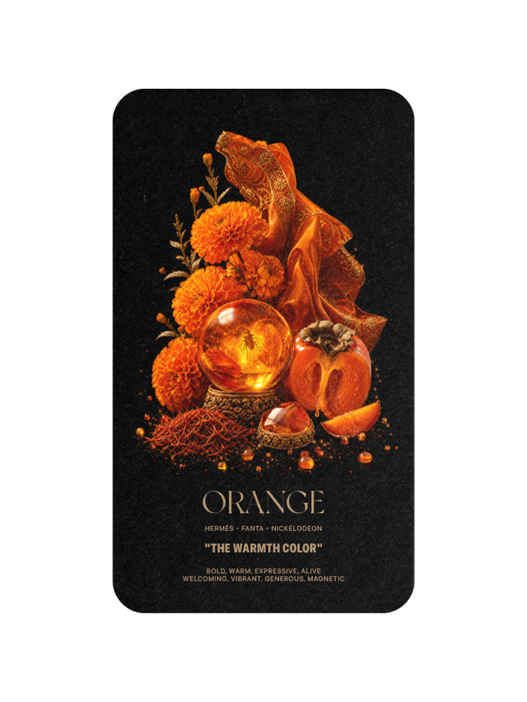
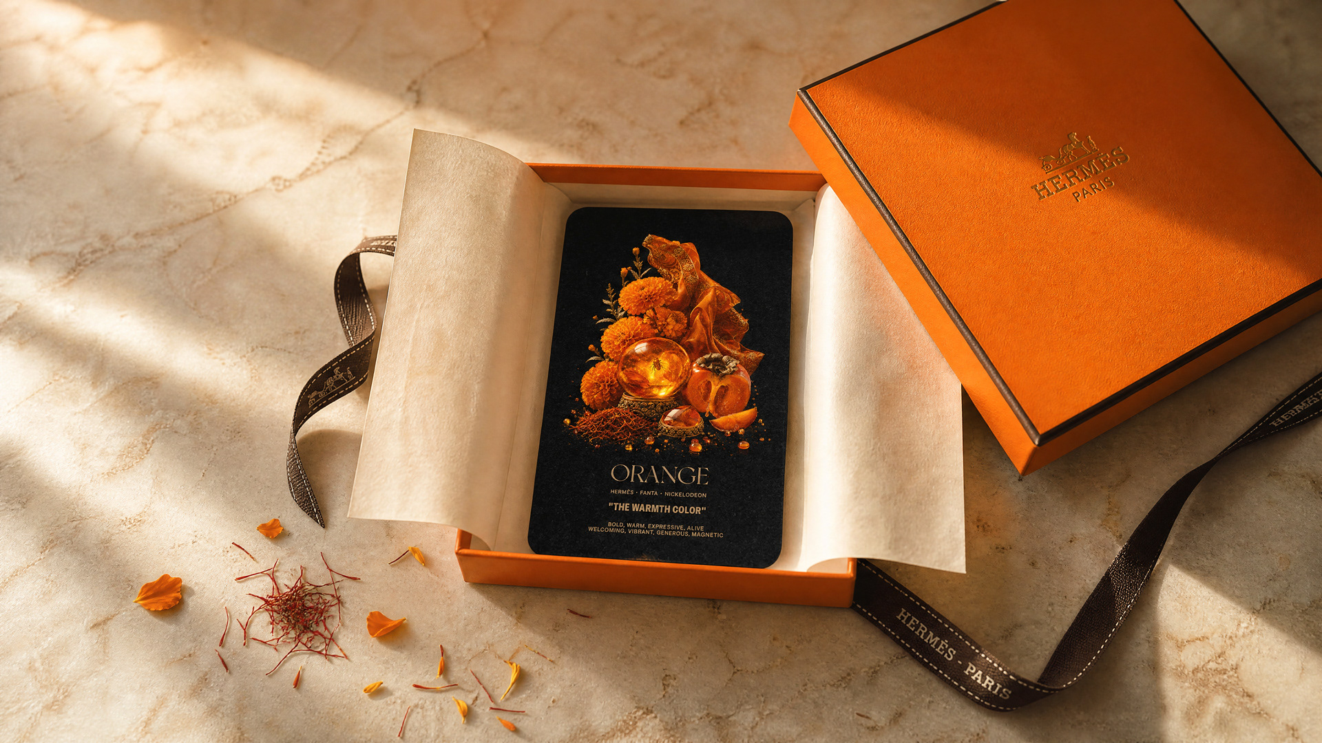
ORANGE
The Warmth Color
Orange sits exactly between red's urgency and yellow's joy, which is why it reads as welcome. Hermès claimed orange almost by accident. During the Second World War, paperboard was rationed, and orange was the only stock the maison could source for its boxes. Eighty years later, it is a trademark. Orange is warmth without intensity, brightness without aggression. The brands that own it — Hermès, Fanta, Nickelodeon, Penguin Books — are inviting you in.
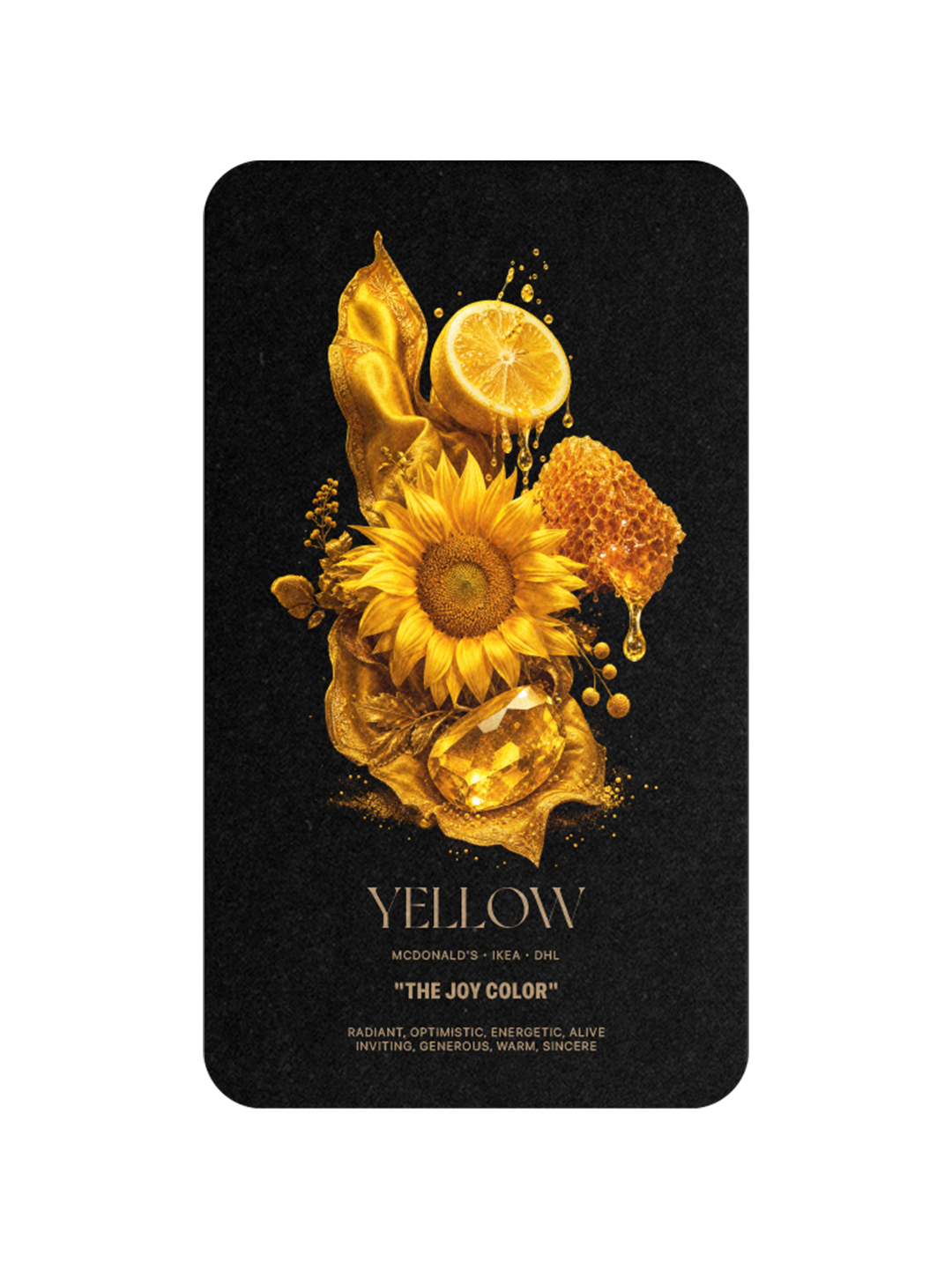
YELLOW
The Joy Color
Yellow is the color the human eye reads fastest. It has one of the longest visible wavelengths in daylight, which is why McDonald's golden arches are legible from a highway, why DHL chose yellow for global delivery, why school buses are yellow, why warning signs are yellow. The brands that own yellow own visibility. IKEA, McDonald's, DHL, Post-it. Yellow is engineered for attention.
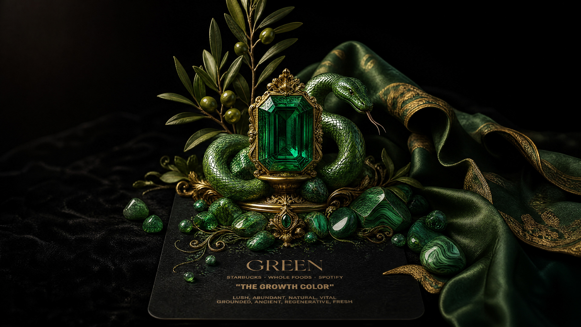
GREEN
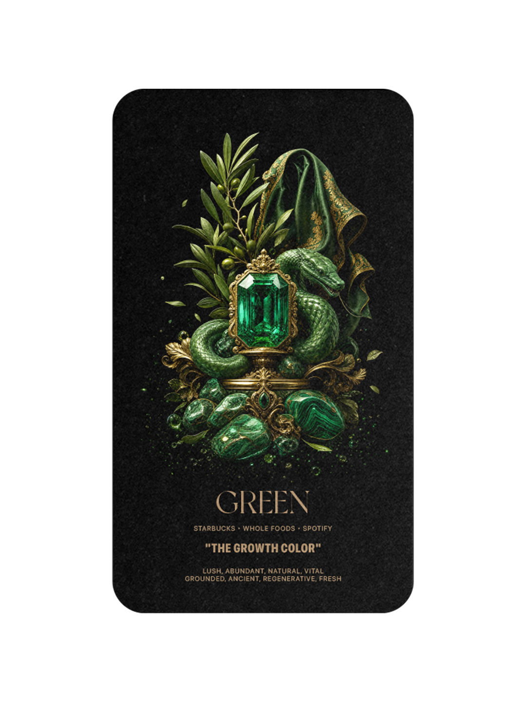
The Growth Color
Green is the color of growth in every culture that has ever named one. Starbucks is green because Howard Schultz wanted to evoke the sea and the maritime history of Seattle's first port. Whole Foods is green because food is green. Spotify is green because music is alive. Green carries the deepest natural association of any color in the system. It is the color of things that grow. Brands that own green are claiming the right to keep growing.
BLUE
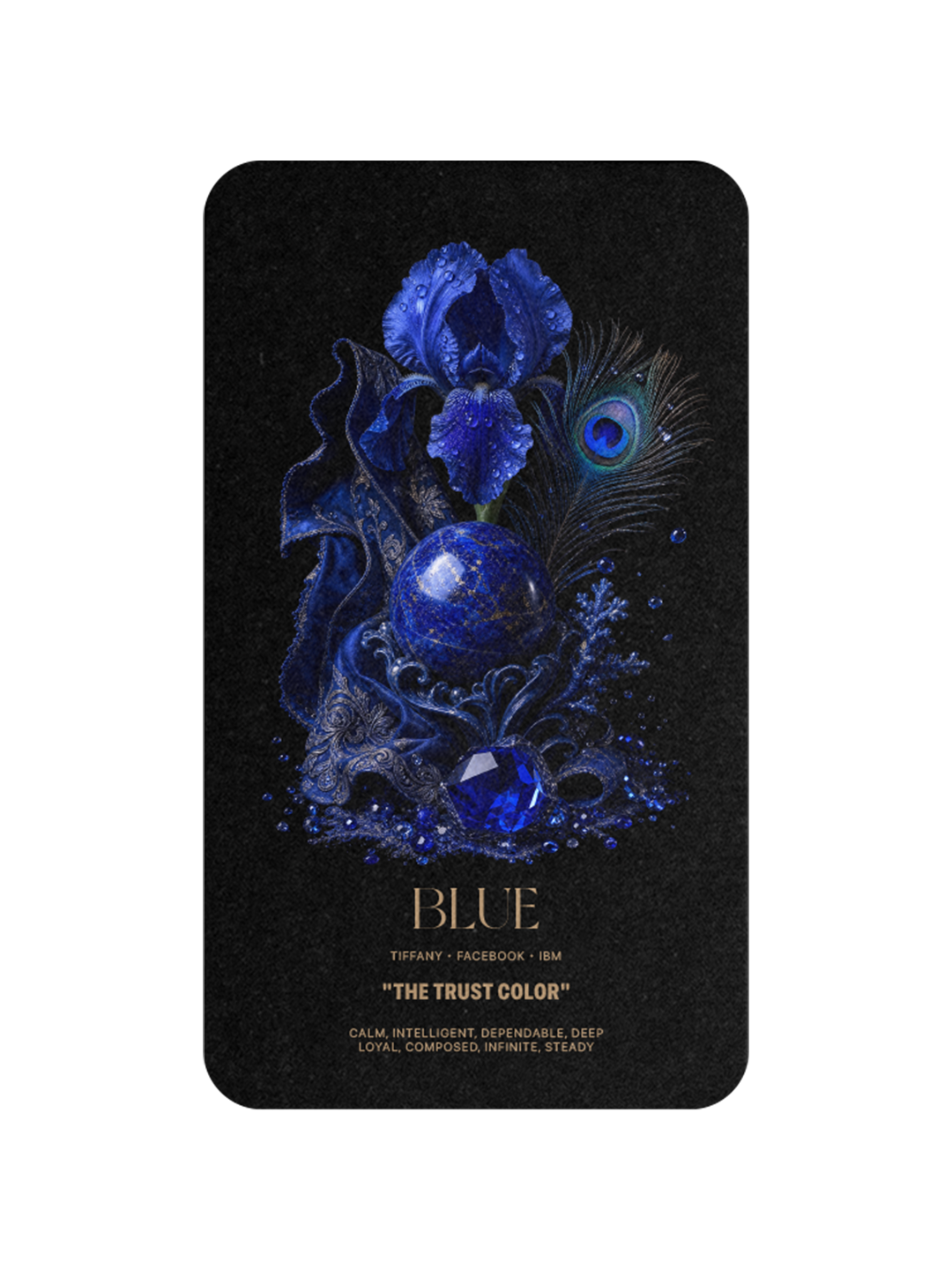
The Trust Color
Blue is the most universally loved color in the world. Every survey, every culture, every era arrives at the same answer. Blue is the sky and the sea and the eyes you trust on the face across from you. Tiffany owns 1837 Blue, named for the year the company was founded. Facebook chose blue because Mark Zuckerberg is red-green colorblind and blue is the color he sees most clearly. IBM, Visa, Boeing, LinkedIn. Blue says: trust me. Most people do.
PURPLE
The Royal Color
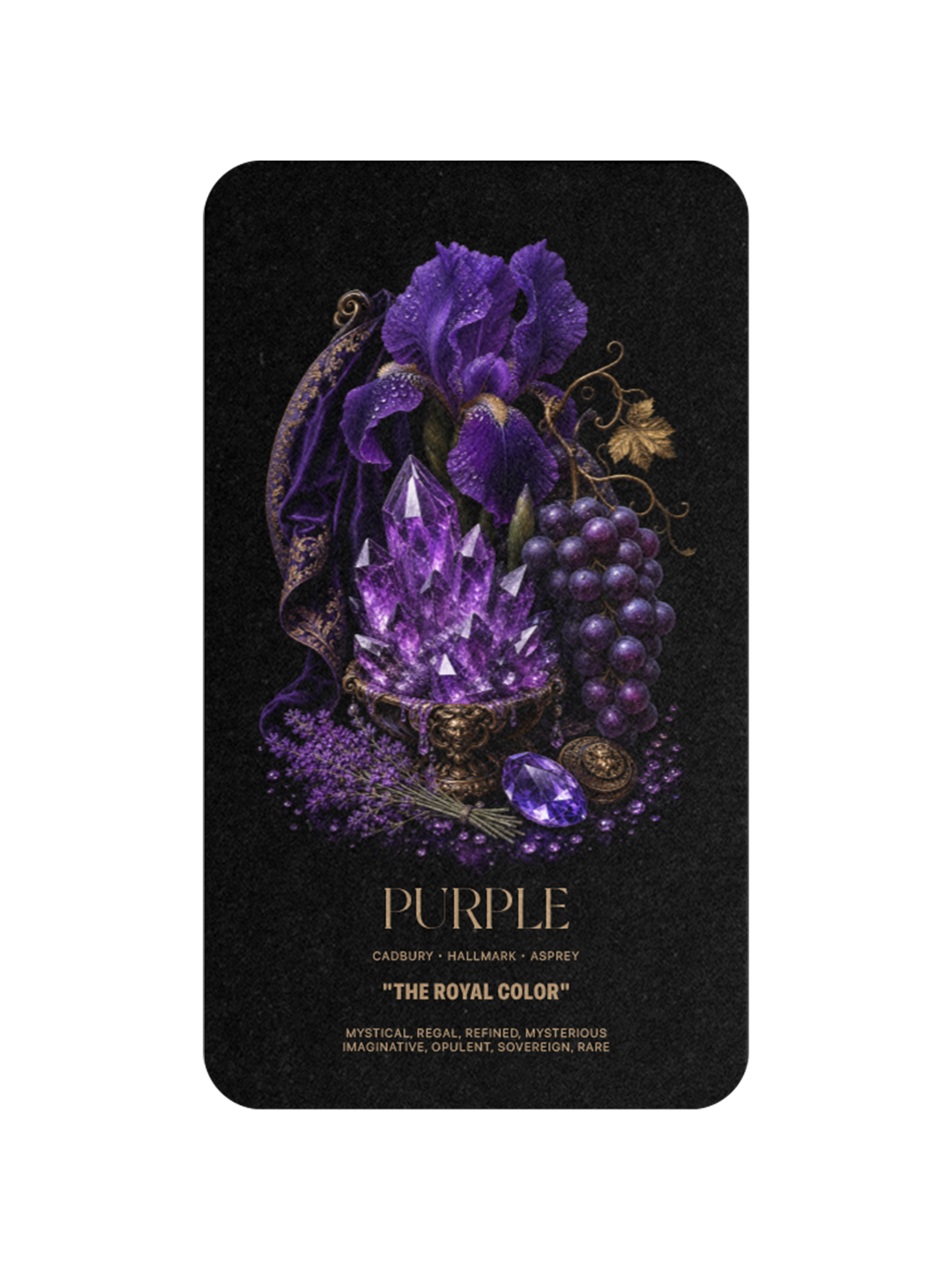
Purple was once the rarest color on earth. Tyrian purple, the dye prized by ancient emperors, came from the murex sea snail, and it took roughly ten thousand snails to produce a single gram. Only royalty could afford it. Cadbury was granted exclusive rights to its specific shade of purple in 1914 as a tribute to Queen Victoria. Hallmark and Asprey followed. Purple still carries the residue of rarity. It is the color of brands that can afford to claim it.
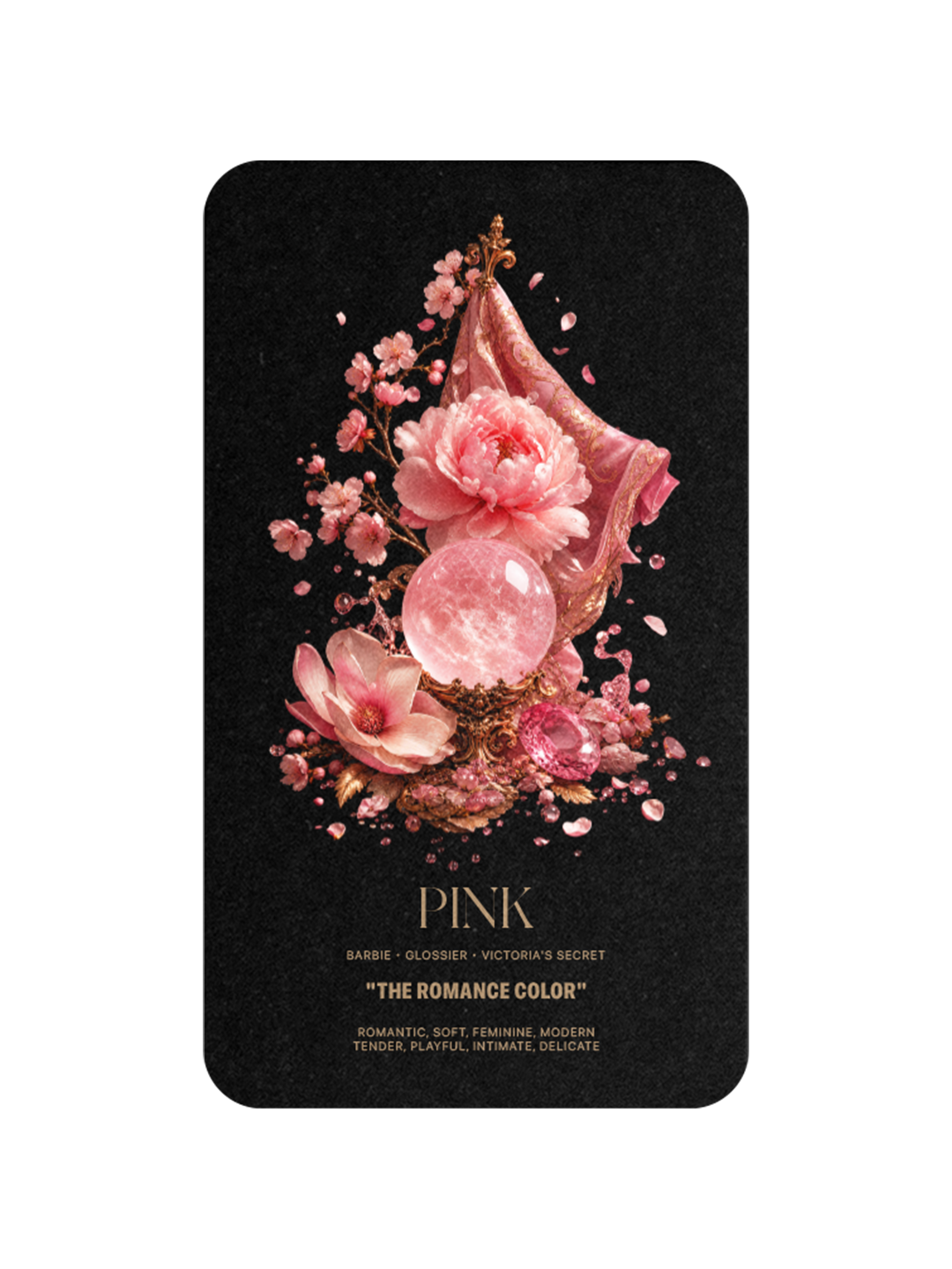
PINK
The Romance Color
Pink is the most reframed color in modern branding. Once dismissed as decorative, pink has been reclaimed and redefined by Barbie, Glossier, T-Mobile, and Victoria's Secret as the color of confidence, intimacy, and ownership of softness. The brands that own pink today own a tension: romance turned into strategy. Pink is no longer a default. It is a position.
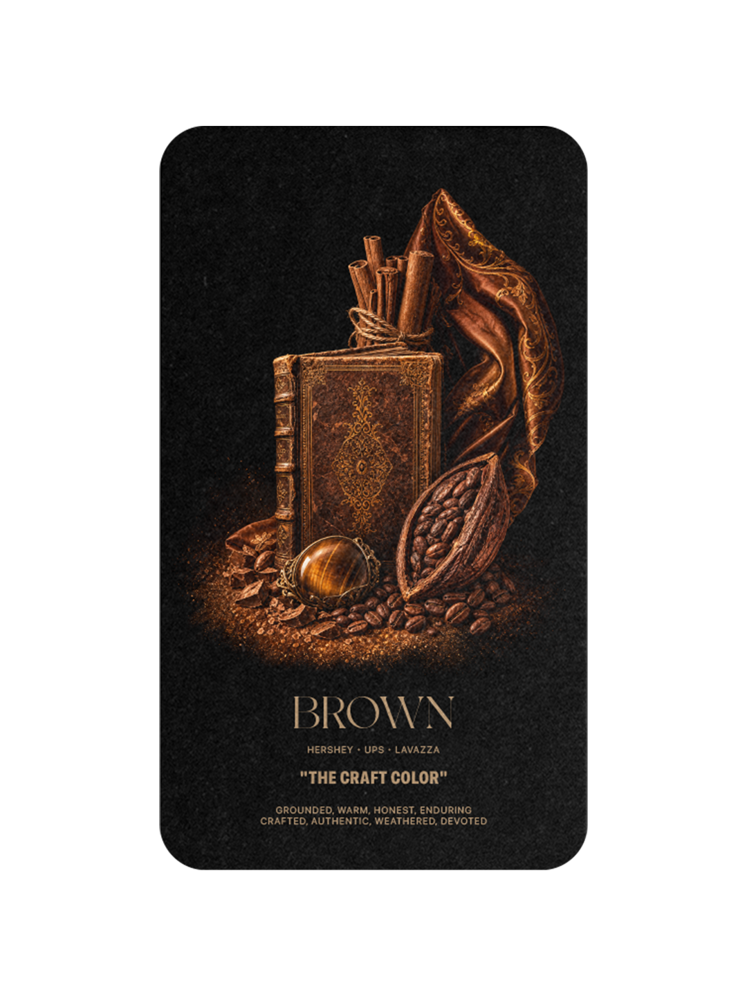
BROWN
The Craft Color
Brown is the most underrated color in branding. UPS chose brown in 1916 because it hid road dirt on early delivery vehicles. A century later, brown is the color of trust in delivery, the leather of luxury craft, the wood of saddles, the cocoa of Hershey, the espresso of Lavazza. Brown is the color of brands that work with their hands. Brown lasts.
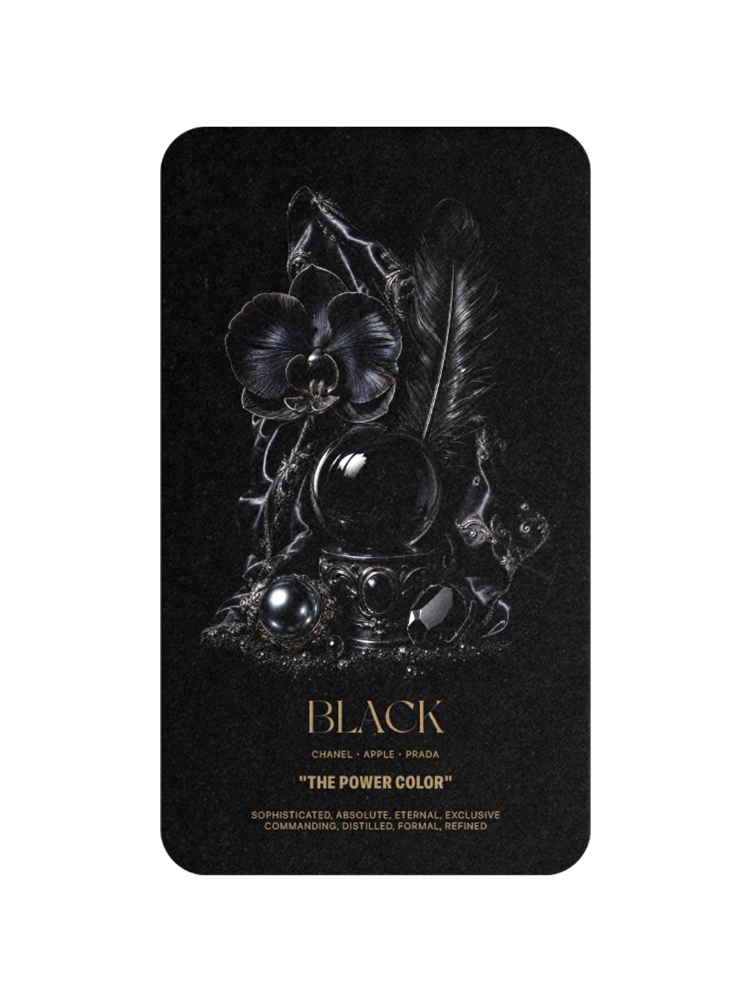
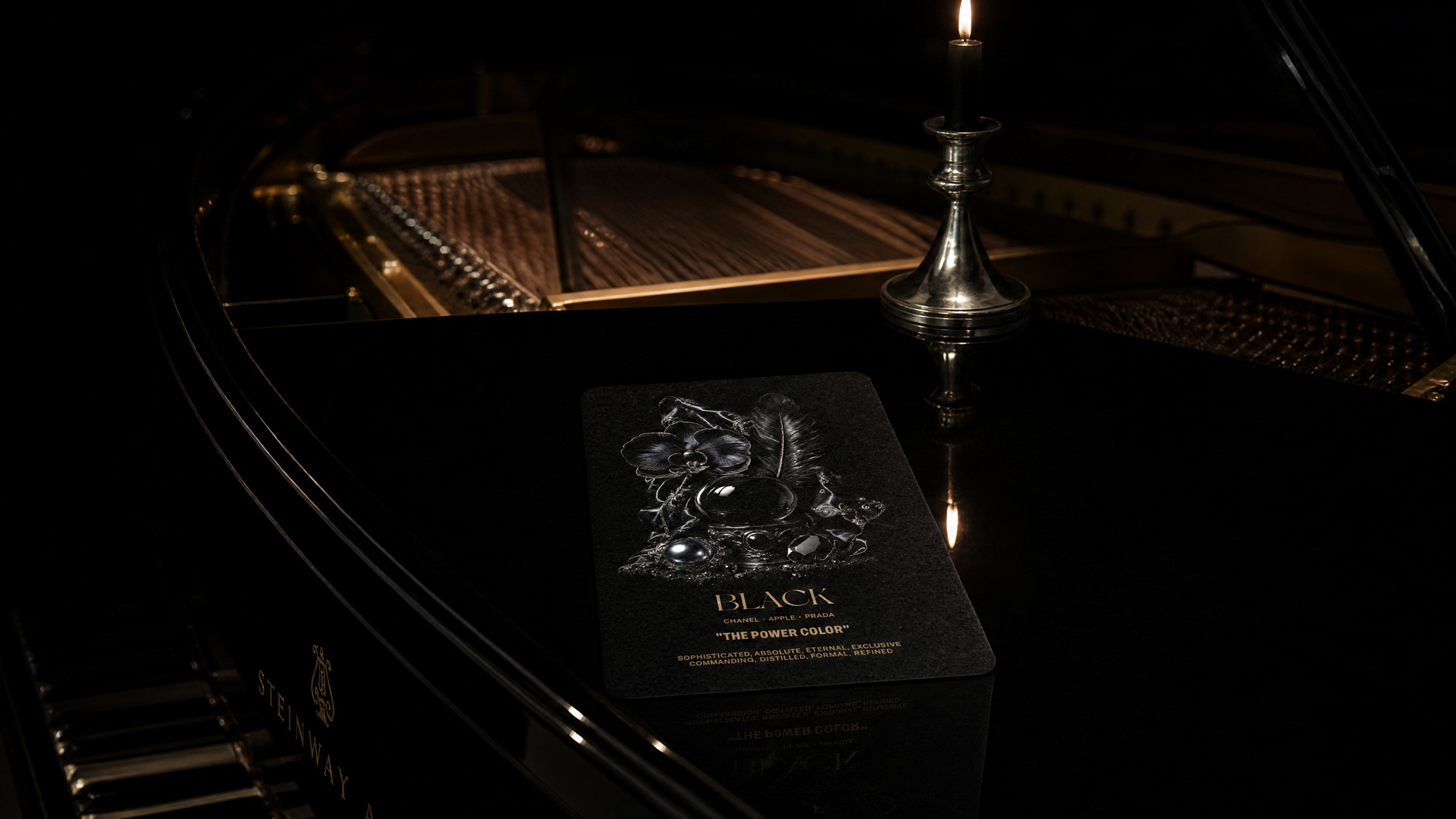
BLACK
The Power Color
Black is the color of authority, exclusivity, and absence. Coco Chanel introduced the little black dress in 1926 and gave black its modern meaning: sophistication so complete it requires nothing else. Steve Jobs returned to Apple in 1997 and reduced the entire brand to black, white, and silver. Prada built a luxury empire on black nylon. Black is the color brands wear when they have nothing left to prove.
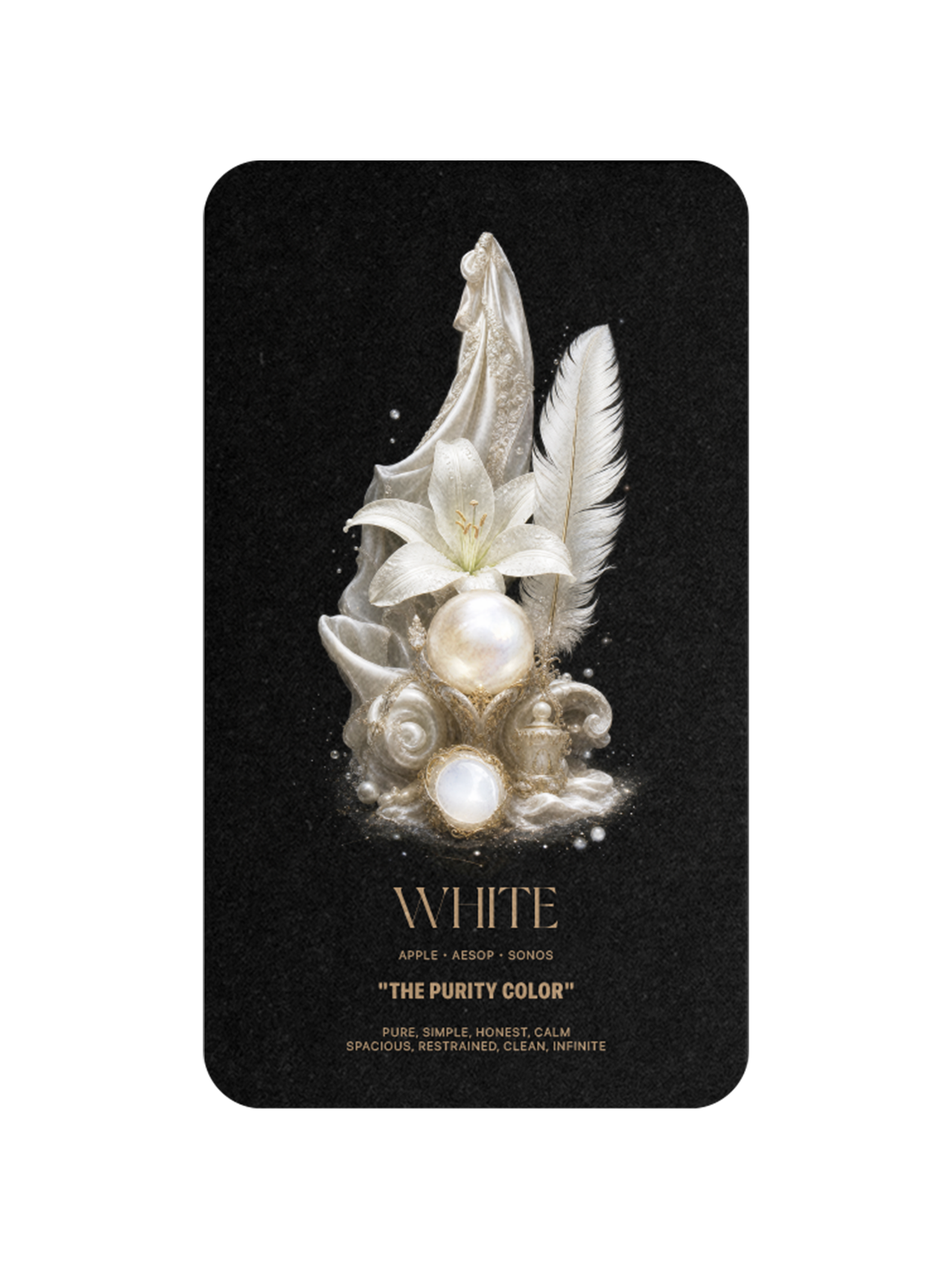
WHITE
The Purity Color
White is the color of restraint. Apple's white earbuds in 2001 were the first time empty space became a brand. Aesop's white interiors are minimalist temples. Sonos chose white to feel like architecture, not technology. White is the absence of clutter, the discipline of subtraction. The brand that owns white owns space itself.
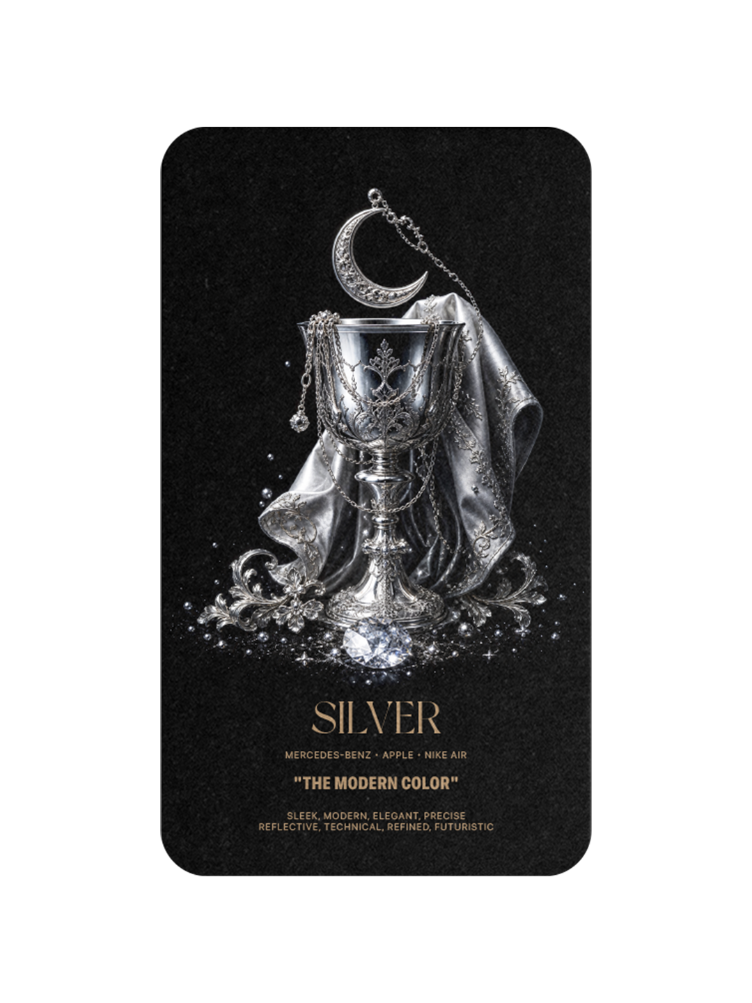
SILVER
The Modern Color
Silver is the color of the future. The Mercedes-Benz Silver Arrows of the 1930s became legends because they were raced unpainted, the metal lighter and faster than every competitor. Apple's silver MacBook became the universal visual signal of modern work. Nike Air made silver the color of innovation in performance. Silver is the color that says: we are ahead.
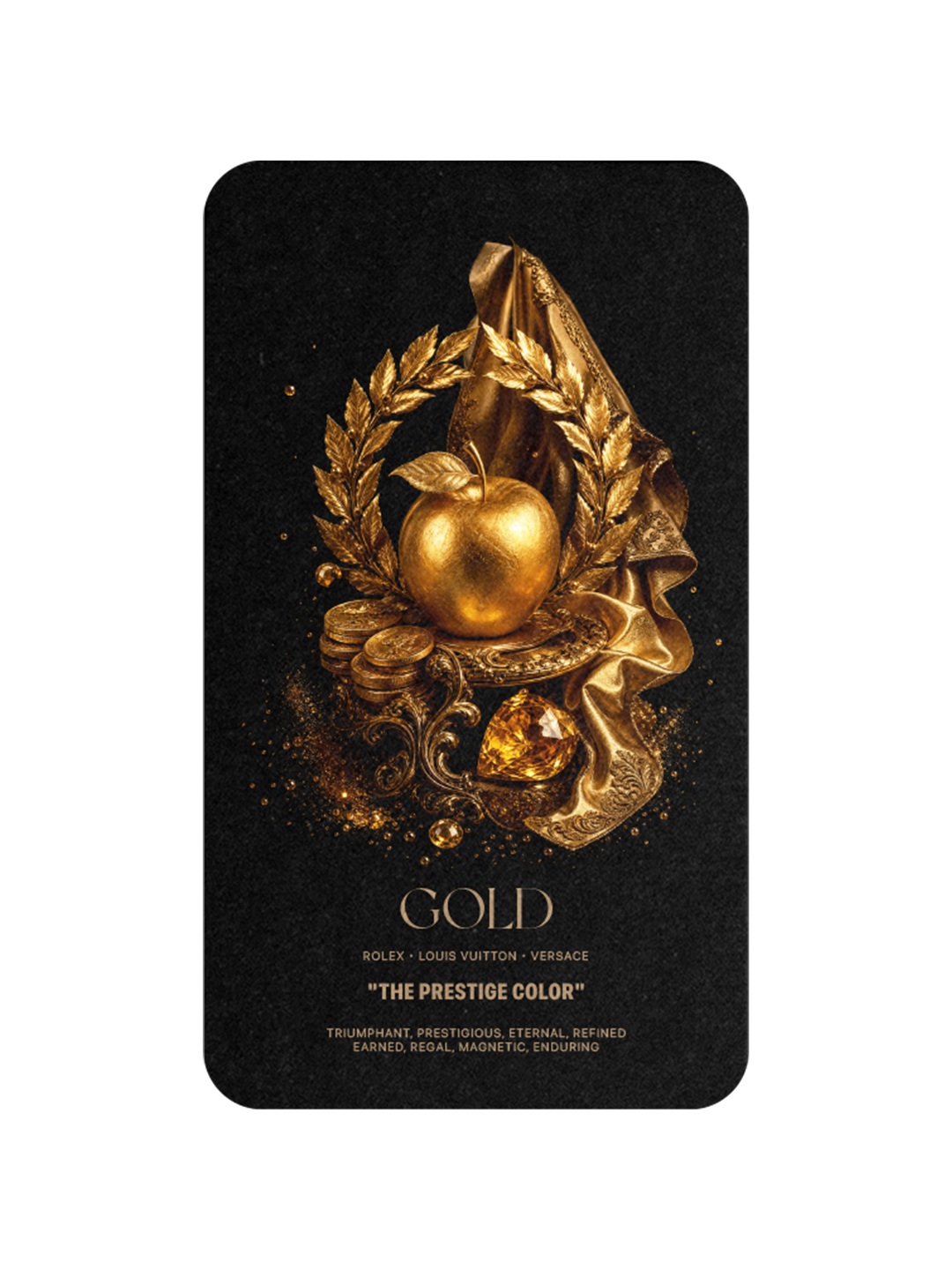
GOLD
The Prestige Color
Gold is the color of the most lasting things. Unlike every other color in the system, gold does not tarnish, which is why it has been the color of value for five thousand years. Rolex, Louis Vuitton, Versace, Cartier, Dom Pérignon. Gold isn't simply prestige. Gold is prestige that has been earned and that endures. It is the color of legacy.
The Strategic Lesson
The brands that have lasted the longest share one discipline. They refused to dilute their color. They protected it the way other brands protect their logos, because the color was the logo, before there was a logo. Coca-Cola red, Tiffany blue, Hermès orange, Cadbury purple, Ferrari Rosso Corsa, Chanel black, Rolex gold. Twelve colors, claimed by hundreds of brands, owned by only a handful in each.
The lesson for any brand being built today is simple. The color is not the last decision. It is the first one. And once it is chosen, it must be defended with discipline for as long as the brand intends to last.
Some brands choose a color. The greatest brands become one.
CODEX™ Vol. III — THE COLORS
Twelve cards. Twelve languages. One archive.
Directed and designed by Eduardo Andrade.
A CODEX™ project by INDUSTRIA® Branding Co.
A CODEX™ project by INDUSTRIA® Branding Co.