

The GEOMETRIES
Geometry is the Structure Beneath Every Brand
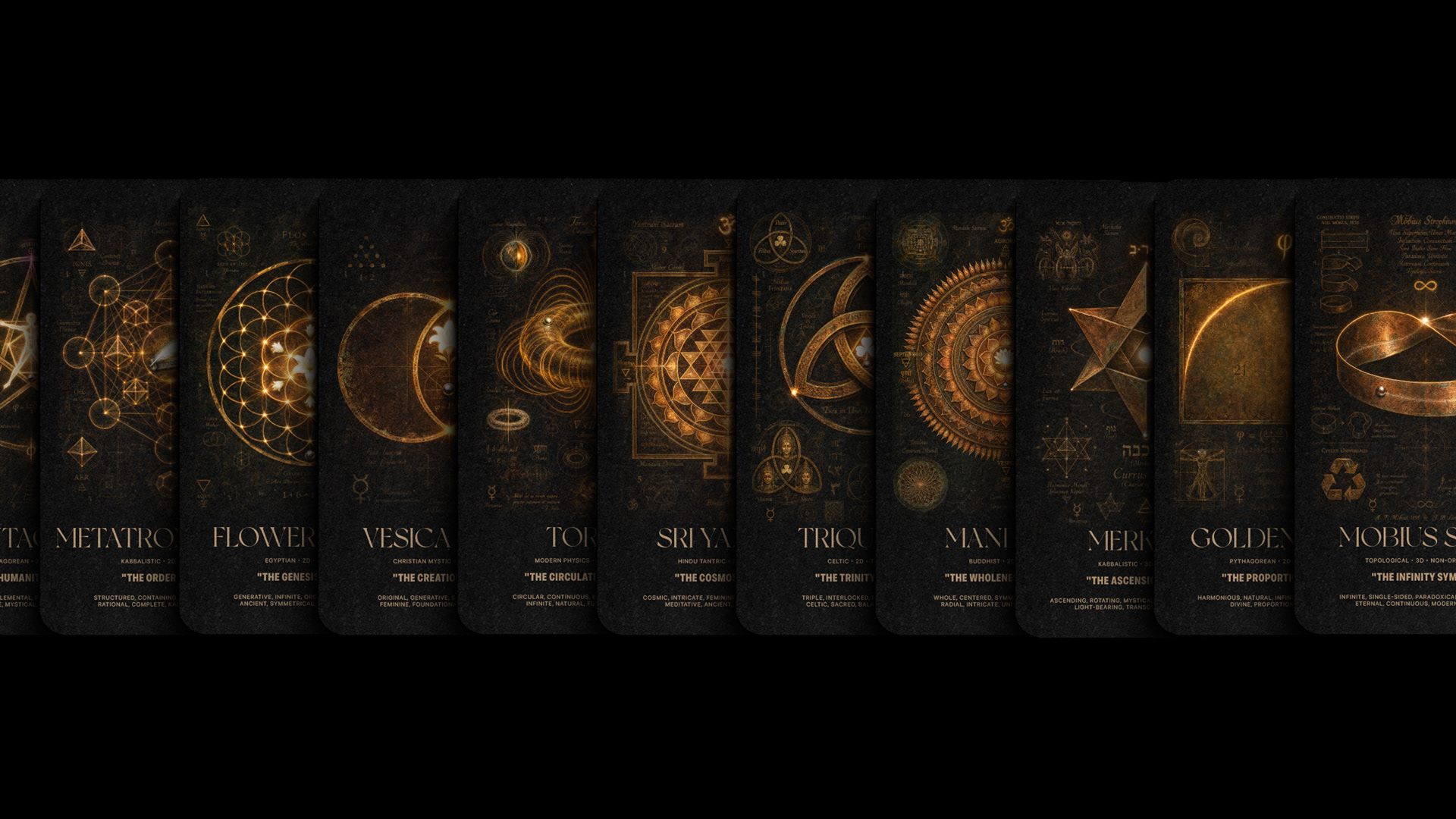
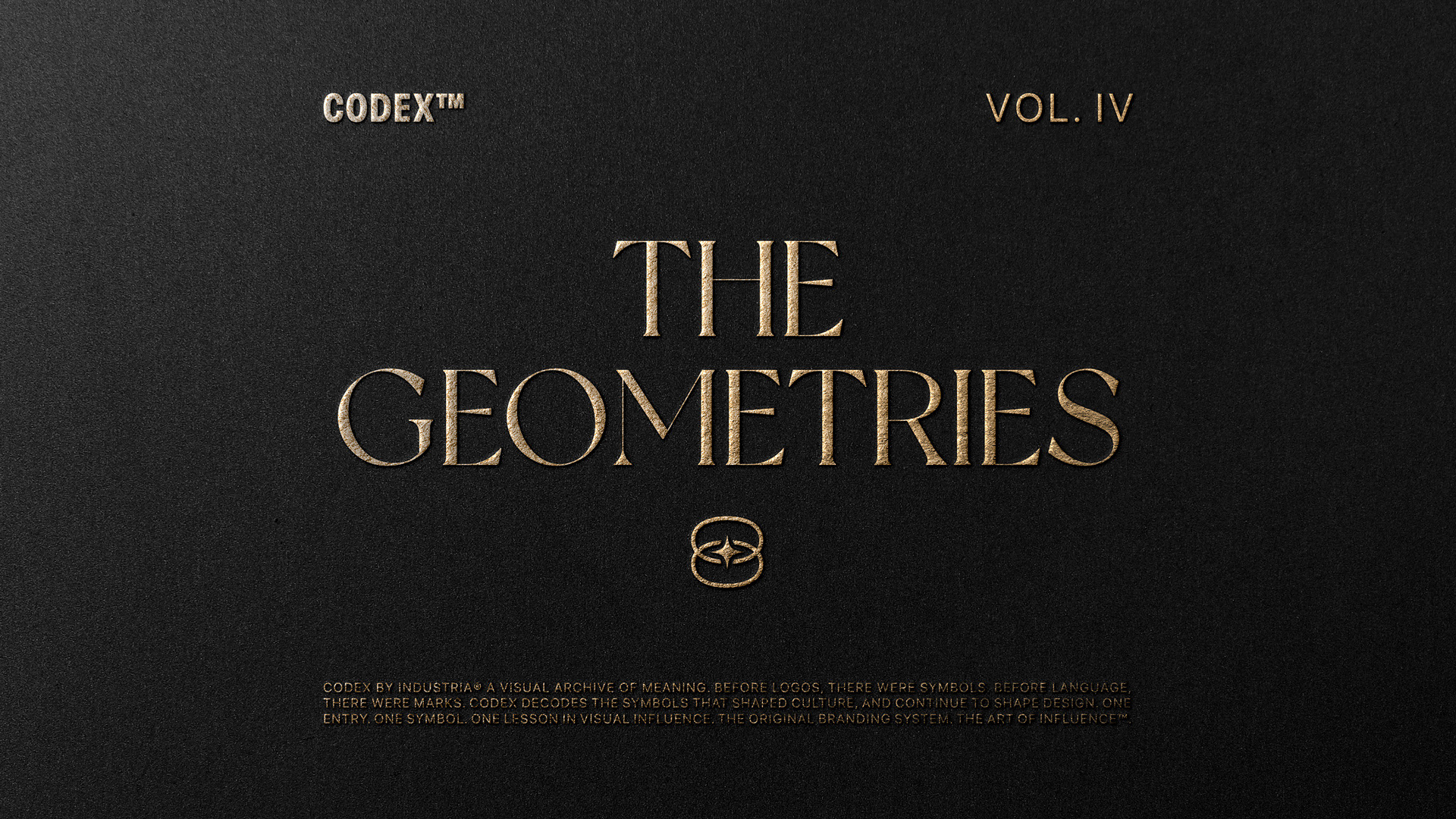
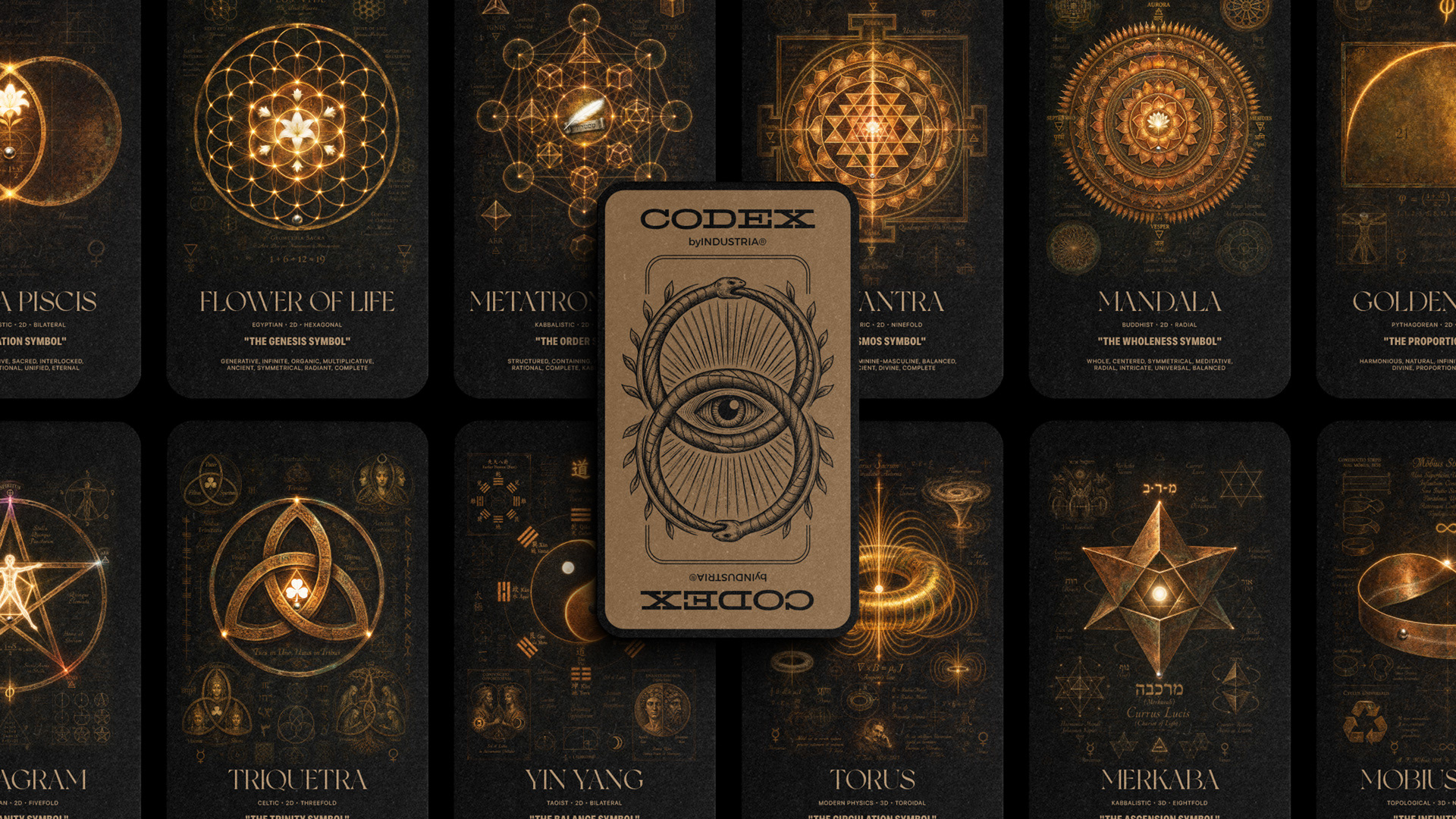
CODEX™ Vol. IV — THE GEOMETRIES is an editorial study of how twelve sacred figures built the most enduring brands in the world.
Most branding conversations begin with a logo. They should begin with a shape.
Geometry is the first structure the mind makes before it makes anything else. Before the color, before the word, before the image. When a person sees a circle, they do not read it. They recognise it. When they see a triangle, they do not decode it. They remember it. Geometry works below the layer of language, which is why the brands that have endured the longest tend to share one trait. They did not invent their shapes. They inherited them.
That inheritance is not accidental. Apple's original mark was drawn from the golden ratio. Twitter's 2012 bird was built on the same Fibonacci spiral. Toyota's three overlapping ovals are the vesica piscis, resurfaced as a mid-century industrial mark. Every logo the modern world has cared about is drawn from a shape older than the company that owns it.
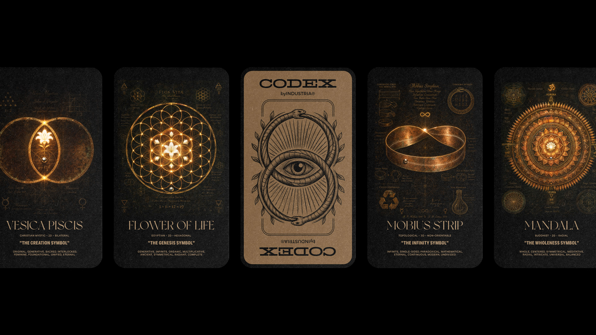
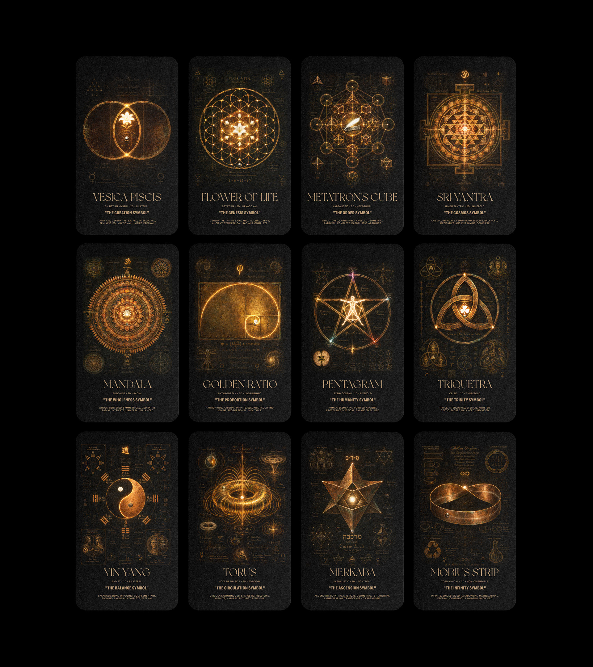
CODEX™ Vol. IV — THE GEOMETRIES is a study of that inheritance. Twelve cards, twelve geometries, twelve figures every brand is already using whether it knows it or not. This is what each one means, who has claimed it, and why.

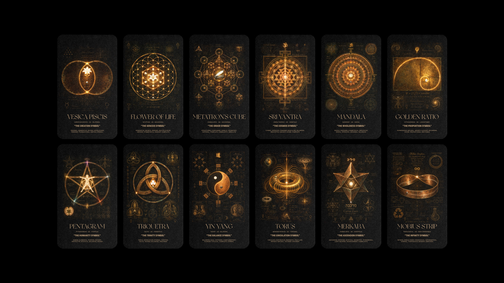
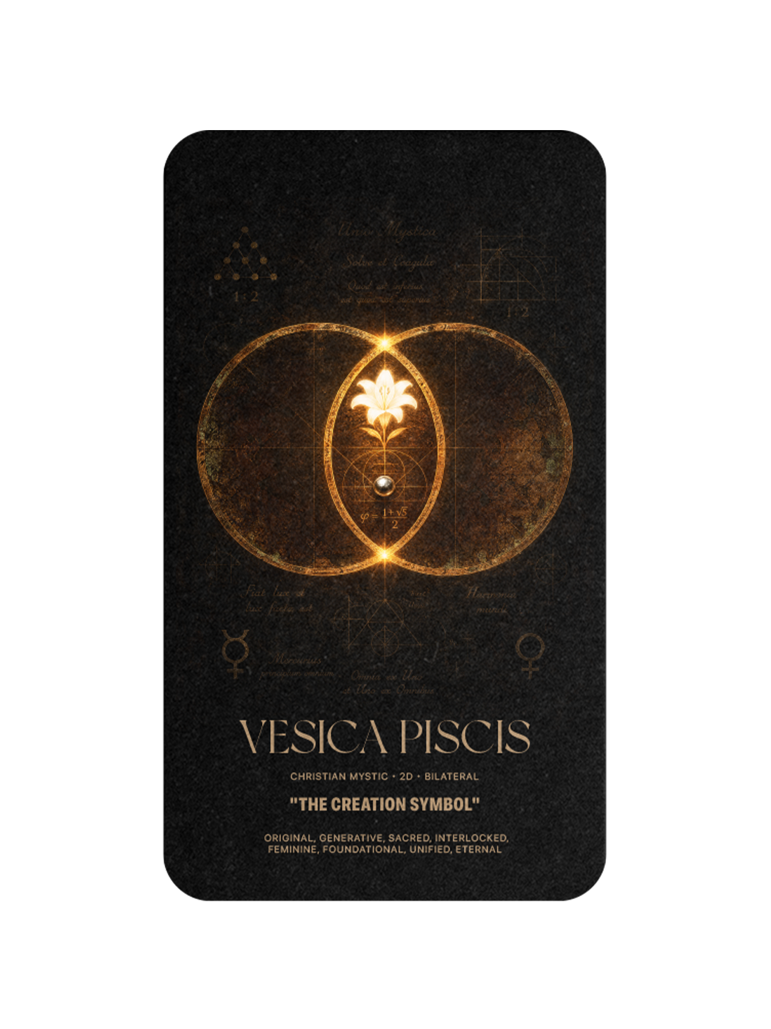
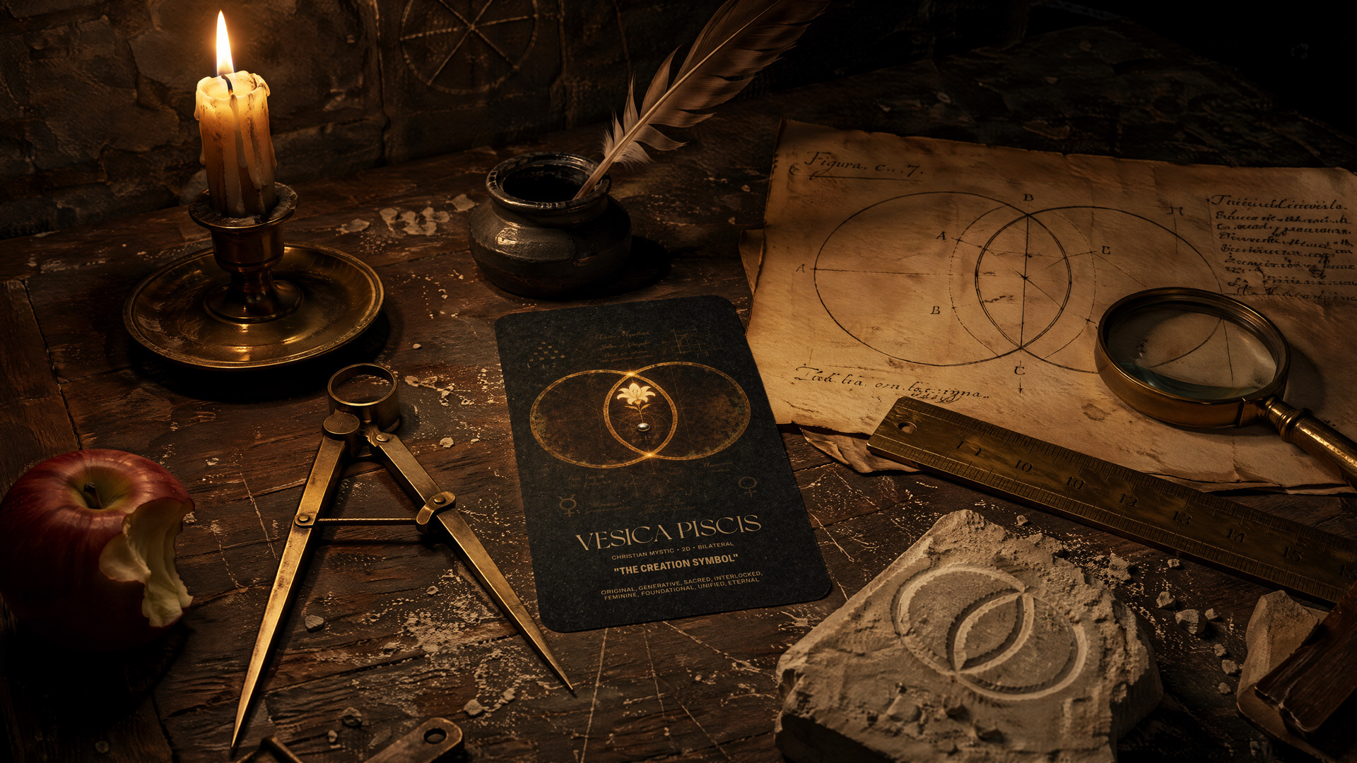
The vesica piscis is the moment two become one. Two circles overlap and produce a third space, an almond-shaped opening that Christian mystics called the mandorla and Pythagorean geometers called the beginning of every shape that followed. Toyota's three overlapping ovals, adopted in 1989, are a vesica piscis in industrial form. MasterCard's two intersecting circles, in use since 1968, are the same figure in a different palette. Every brand mark drawn from overlapping circles inherits its logic. The vesica piscis does not decorate a brand. It generates one.
GOLDEN RATIO
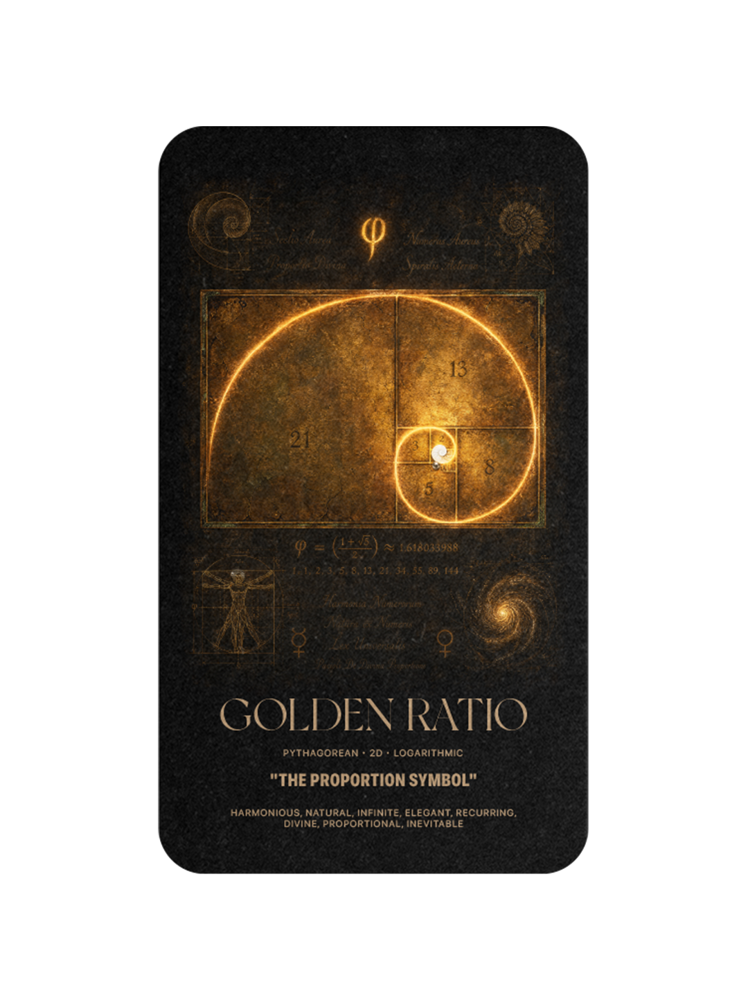
The Proportion Symbol
The golden ratio, 1.618, appears in the spiral of a nautilus shell, the arrangement of sunflower seeds, the proportions of the Parthenon, and the composition of Leonardo's Vitruvian Man. Apple's original mark, drawn by Rob Janoff in 1977, was built on it. Twitter's 2012 bird, redrawn by Doug Bowman's team, was constructed from the same Fibonacci spiral. Pepsi's 2008 redesign was documented in a design brief as a golden-ratio study. The golden ratio does not make a brand beautiful. It makes it inevitable.
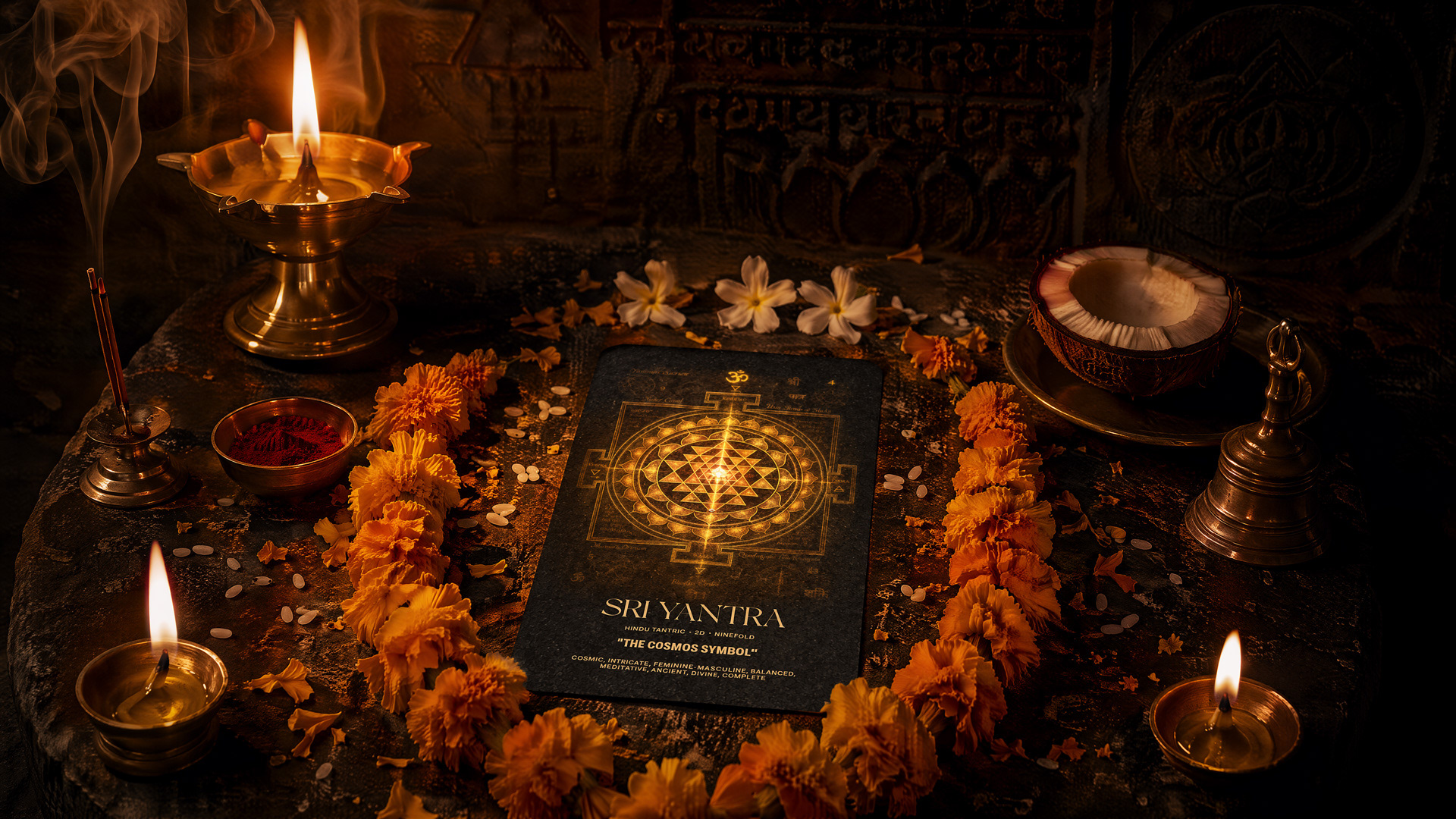
SRI YANTRA
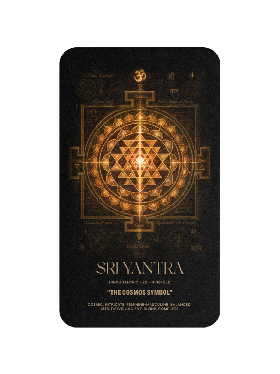
The Cosmos Symbol
The Sri Yantra is nine interlocking triangles, four pointing up and five pointing down, arranged around a central point called the bindu. It is the oldest known Tantric diagram, meditated upon in India for at least fifteen hundred years. Its geometry describes the entire cosmos folded into a single figure. The Star of David sits inside a Sri Yantra without knowing it. Every mark that arranges opposing triangles around a central point inherits its logic. The Sri Yantra is what a brand becomes when it wants to hold the whole world at once.
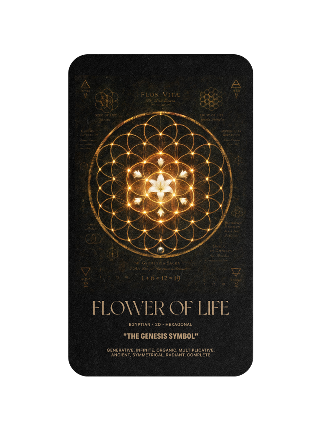
FLOWER OF LIFE
The Genesis Symbol
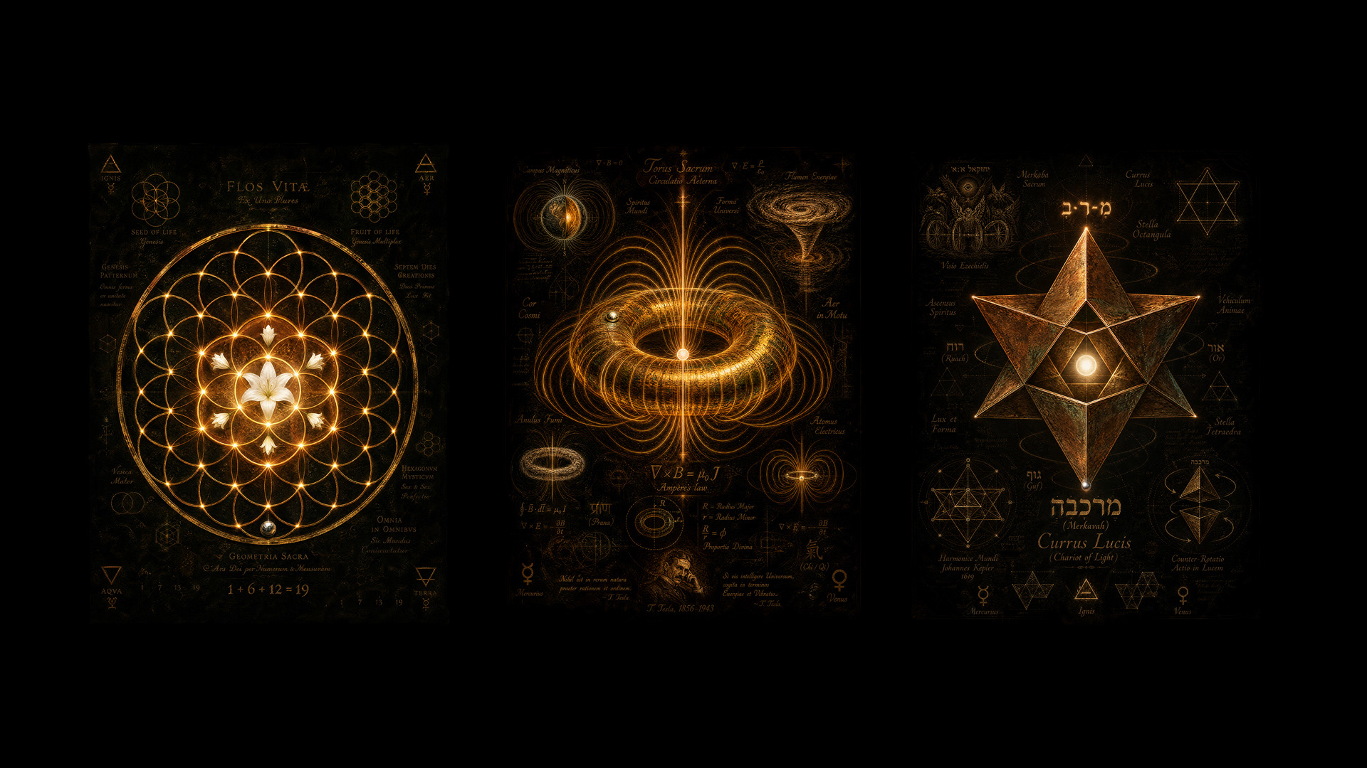
The Flower of Life is nineteen circles arranged in a hexagonal grid, and it appears carved into the walls of the Osirion at Abydos in Egypt, painted on the roof beams of medieval churches, and etched onto Leonardo da Vinci's manuscripts. Every regular polygon that has ever been drawn can be constructed from it. Audi's four interlocked rings, adopted in 1932, sit inside its lattice. The five rings of the Olympic Games, drawn by Pierre de Coubertin in 1913, follow its overlap. The Flower of Life is the geometric grammar the world's oldest mark-makers already knew.
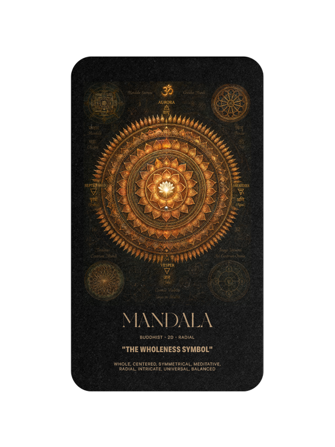
MANDALA
The Wholeness Symbol
The mandala is the geometry of centered infinity. It has been painted by Buddhist monks in Tibet, laid in tile across mosques in Isfahan, embroidered onto Chinese silk, and stamped into Aztec calendars, always with the same principle: everything organised around a single point. Carl Jung called it the archetype of the self. Chanel's interlocked Cs, drawn by Coco Chanel herself in 1925, resolve into a mandala. Every brand mark that returns the eye to its center inherits its discipline. The mandala is what a brand becomes when it decides to be complete.
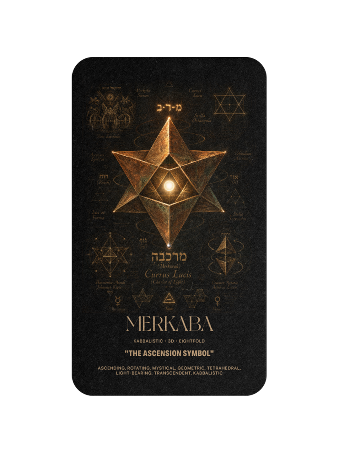
MERKABA
The Ascension Symbol
The Merkaba is a star tetrahedron, two three-sided pyramids interlocked in opposite orientation. It appears in Egyptian mystery texts, Kabbalistic scripture, and the geometry of the Star of David. It describes ascension, the geometry of a self moving beyond itself. Delta Air Lines' widget, adopted in 1959, is a stellated triangle inherited from this figure. Every brand mark built from interlocking triangles carries its logic. The Merkaba is what a brand becomes when it wants to signal that it rises.
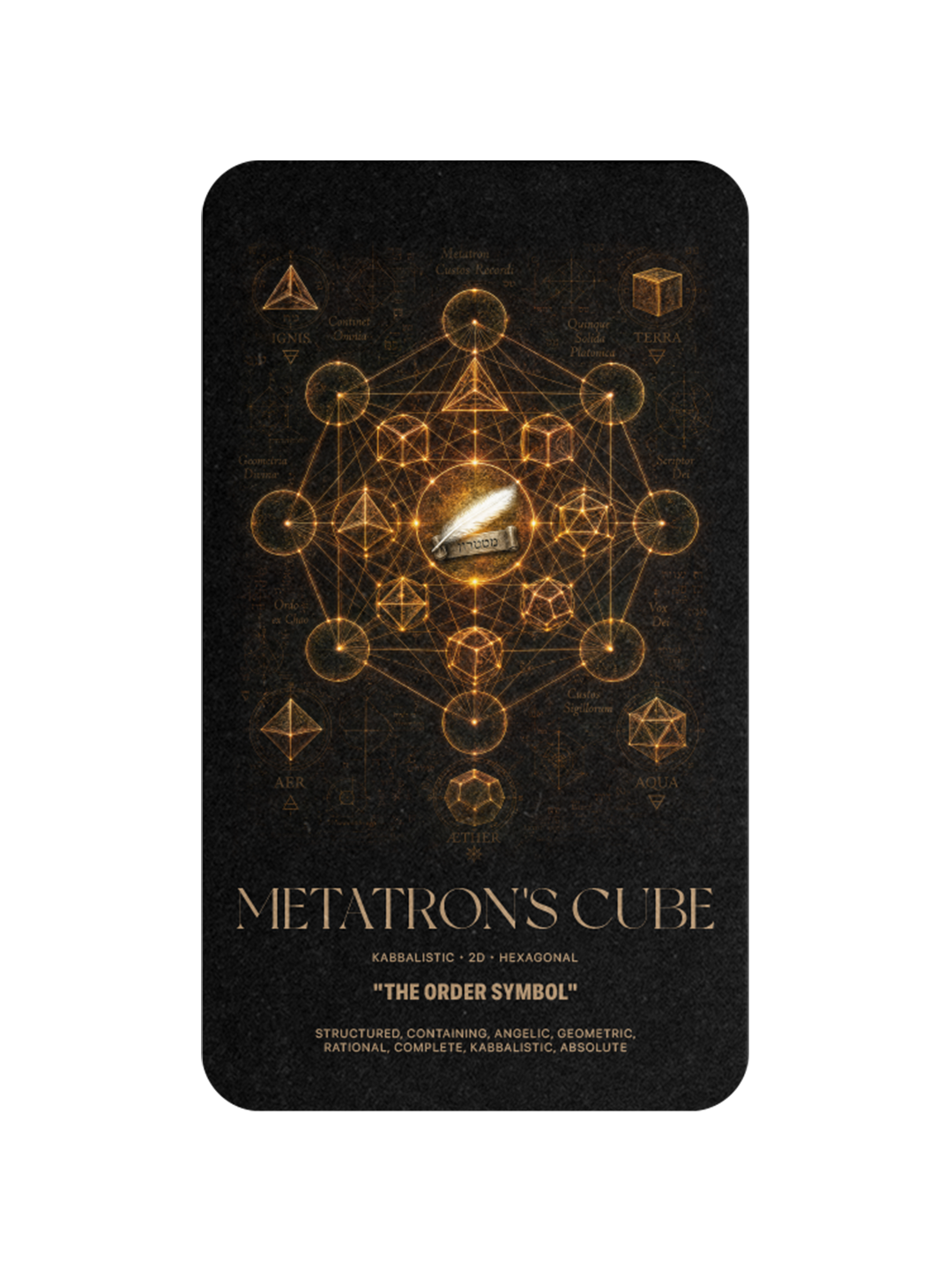
METATRON'S CUBE
The Order Symbol
Metatron's Cube contains all five Platonic solids inside thirteen connected circles. It is the Kabbalistic geometry of pure order, the figure medieval mystics used to describe how the universe holds itself together. Its logic appears wherever a mark needs to signal architecture and authority. Renault's diamond, drawn in 1925 and refined by Victor Vasarely in 1972, is built on its triangulated symmetry. Mitsubishi's three diamonds, unchanged since 1870, inherit the same discipline. Metatron's Cube is what a brand looks like when it wants to say: we are organised.
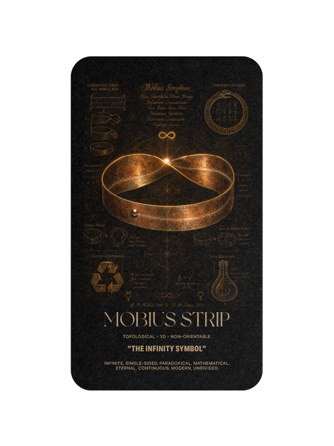
MÖBIUS STRIP
The Infinity Symbol
The Möbius strip was discovered in 1858 by August Ferdinand Möbius and Johann Benedict Listing working independently, and it is the youngest geometry in the archive. It is a surface with only one side and one edge, an infinity produced from a single turn. Gary Anderson drew the universal recycling symbol as a literal Möbius strip in 1970, and it has since become one of the most recognised marks on Earth. Every brand mark that folds into itself and re-emerges inherits it. The Möbius strip is the geometry of things that never quite end.
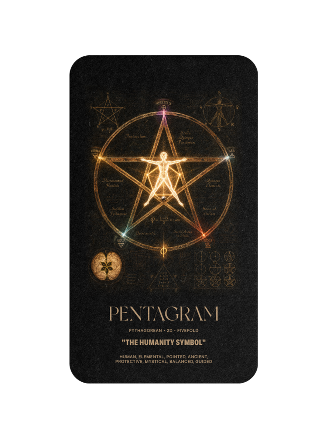
The Humanity Symbol
The pentagram is a five-pointed star inscribed in a circle, and its five points map to the human body: head, arms, legs. Pythagorean scholars used it as a secret sign of recognition. Chrysler carried it as a mark for eighty-seven years, from 1928 until the brand's dissolution. The United States military stamps it on every uniform, every tank, every ship. Every brand that has ever used a five-pointed star, from Texaco to Heineken to Macy's, inherits its proportion. The pentagram is what a brand looks like when it wants to say: this is human.
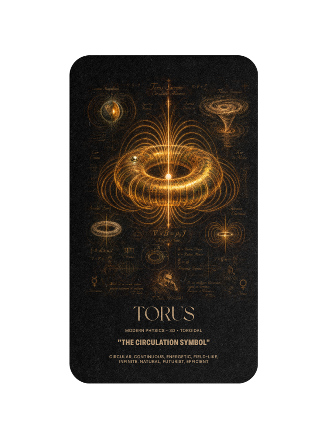
TORUS
The Circulation Symbol
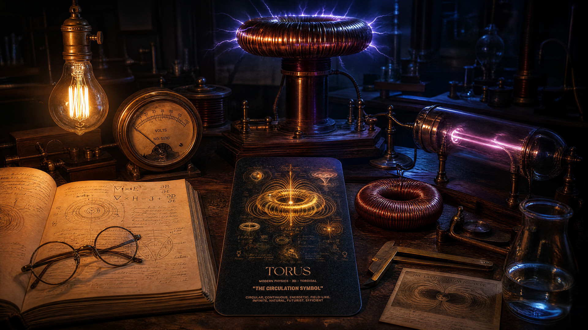
The torus is the geometry of self-sustaining energy: a doughnut-shaped field where every particle flows out from the center and back into it. Magnetic fields form tori. Smoke rings are tori. The heart's electromagnetic field is a torus. In branding, the torus appears wherever a mark loops back into itself and completes its own circuit. It is the geometry that describes what a brand does when it works: sustains, cycles, returns. The torus is what a brand becomes when it stops requiring external fuel.
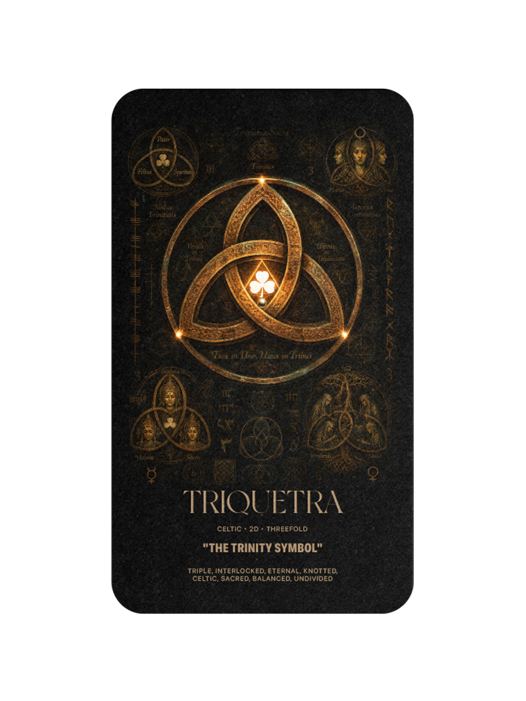
TRIQUETRA
The Trinity Symbol
The triquetra is three interlocked arcs forming a single continuous knot. It is Celtic, Christian, and Norse, all at once, and it has been carved on standing stones in Ireland since before writing arrived on the island. The trinity it describes is not exclusively religious. It is the structural elegance of three things bound so tightly they cannot be separated. Woolmark, drawn by Franco Grignani in 1963, is a triquetra in modern form. Every mark that arranges three elements in continuous rotation carries its logic. The triquetra is the geometry of things that hold together because they cannot come apart.
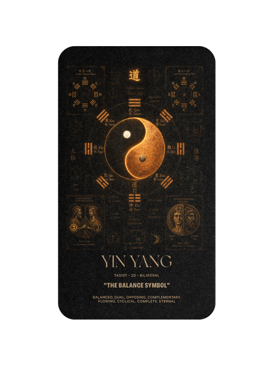
YIN YANG
The Balance Symbol
The yin yang, or taijitu, is a circle divided into two teardrops that contain each other. It emerged in Taoist philosophy around the fourth century BCE and has stayed unchanged for two thousand five hundred years. Its logic is that every force contains its opposite. BMW's roundel, adopted in 1917, divides its circle into balanced halves that read as a spinning propeller and a taijitu at once. Every brand mark that resolves positive and negative space into a single figure inherits its logic. The yin yang does not describe balance. It performs it.
The Strategic Lesson
The brands that endure share one discipline. They did not invent their shapes. They inherited them from a small library of figures the world has been drawing for four thousand years, and they built themselves inside those figures until the geometry became the brand. Apple's golden ratio. Toyota's vesica piscis. Twitter's Fibonacci spiral. Woolmark's triquetra. Chrysler's pentagram. Delta's Merkaba widget. Twelve figures, claimed by thousands of brands, owned by only a handful in each.
The lesson for any brand being built today is simple. The shape is not the last decision. It is the first one. And the shape is not invented. It is recovered.
The greatest brands do not invent their shapes. They rediscover them.
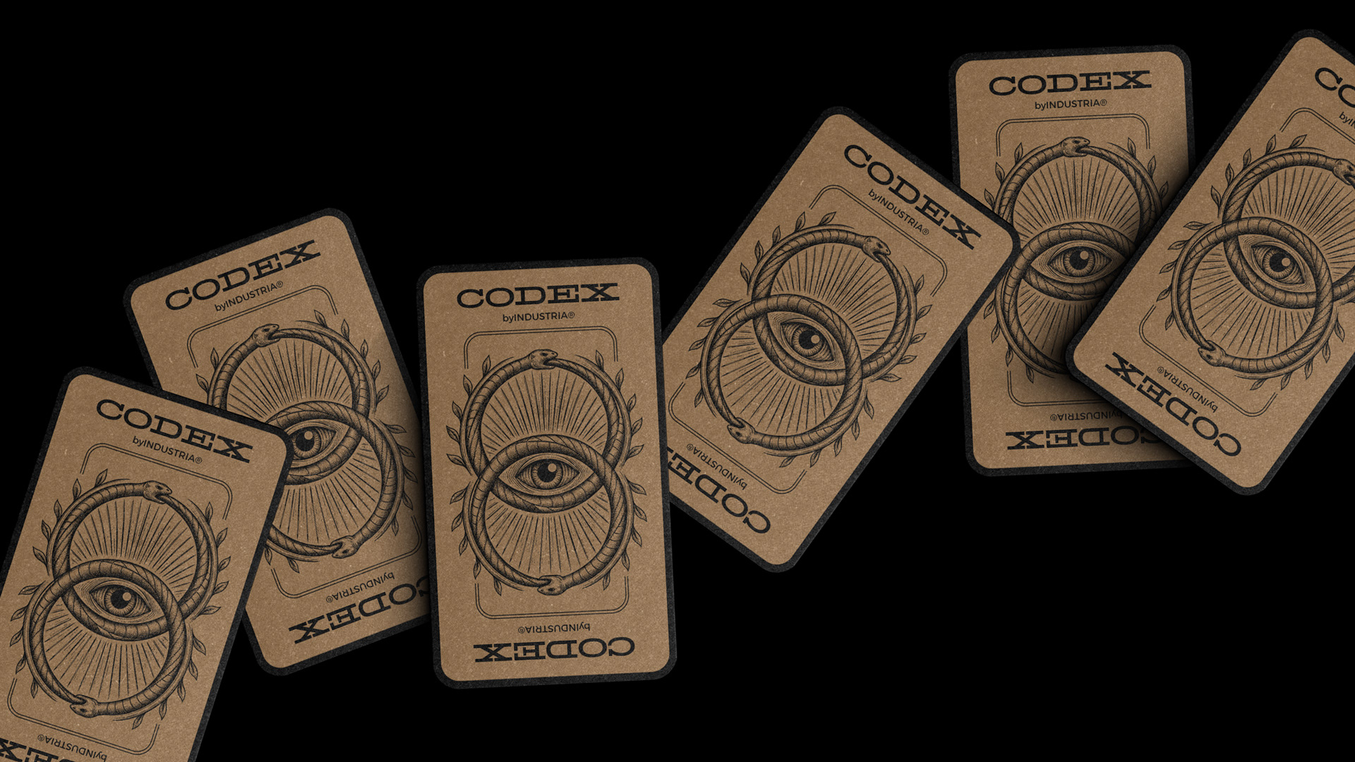

CODEX™ Vol. IV — THE GEOMETRIES
Twelve cards. Twelve traditions. One archive.
Directed and designed by Eduardo Andrade.
A CODEX™ project by INDUSTRIA® Branding Co.
A CODEX™ project by INDUSTRIA® Branding Co.