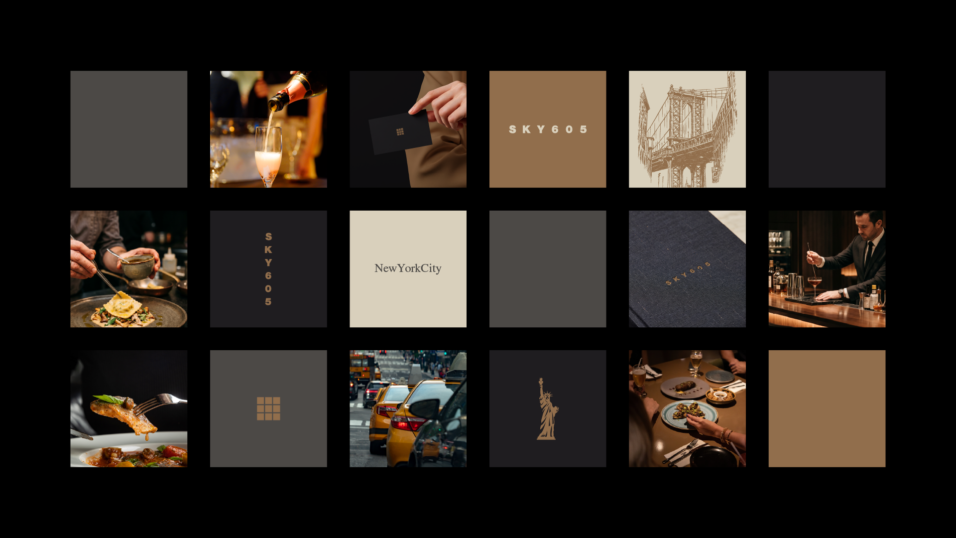
SKY605NYC
BRAND POSITIONING + BRAND NAMING + BRAND DESIGN + LOGO DESIGN + BRAND GUIDELINES
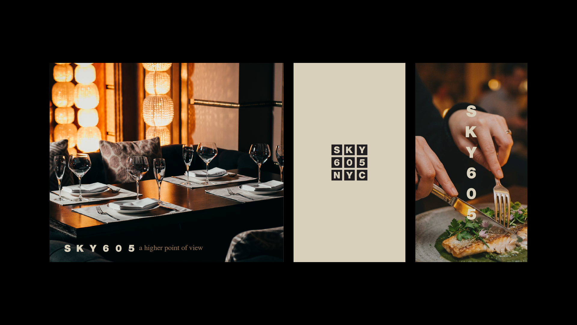
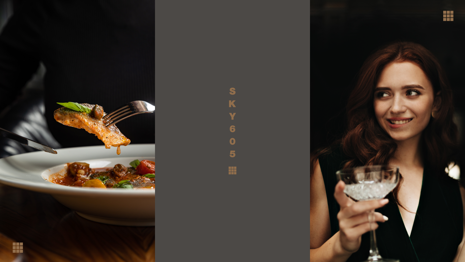
SKY605
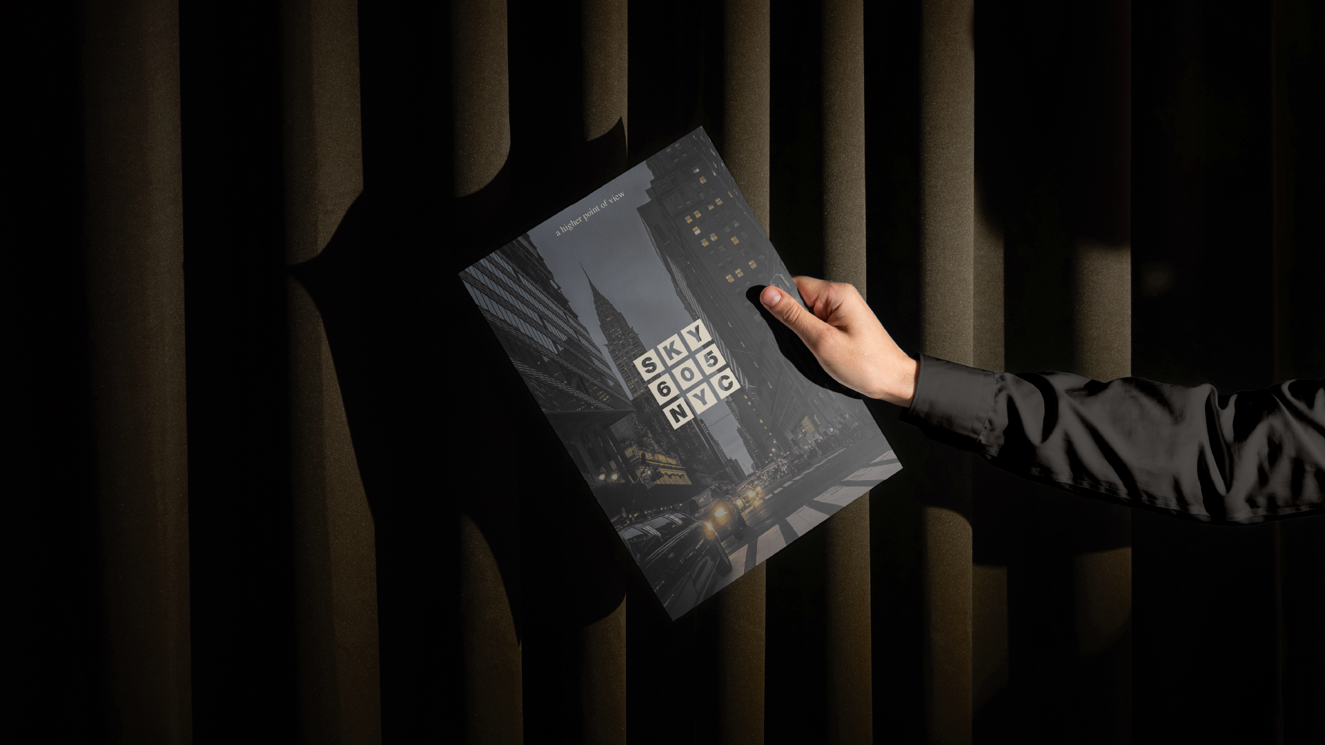
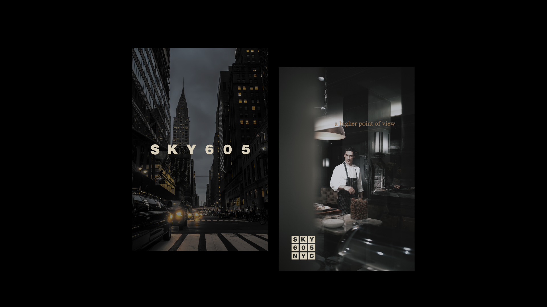
A Higher Point of View
About the Client
Perched 605 feet above the ground, SKY605 is not just a restaurant, it is an experience shaped by elevation, perspective, and presence.
Located in the heart of New York City, SKY605 brings together refined gastronomy and breathtaking skyline views. Led by Chef Andrew Grayen, the menu is bold, flavour-forward, and rooted in the essence of gathering, where food becomes a shared moment between people.
The challenge was clear: translate this elevated experience into a brand that feels as intentional, sophisticated, and memorable as the view itself.

The Challenge
SKY605 exists in a city saturated with world-class dining experiences.
To stand out, the brand needed to go beyond aesthetics. It had to capture:
- The emotional impact of height and perspective
- The intimacy of a shared table
- The contrast between the vastness of the city and the precision of fine dining
The identity could not rely on clichés of luxury. It needed to feel quietly confident, architectural, and timeless, much like the space it represents.
The Concept
We approached SKY605 as a study of perspective.
At its core, the brand is built on a simple but powerful idea:
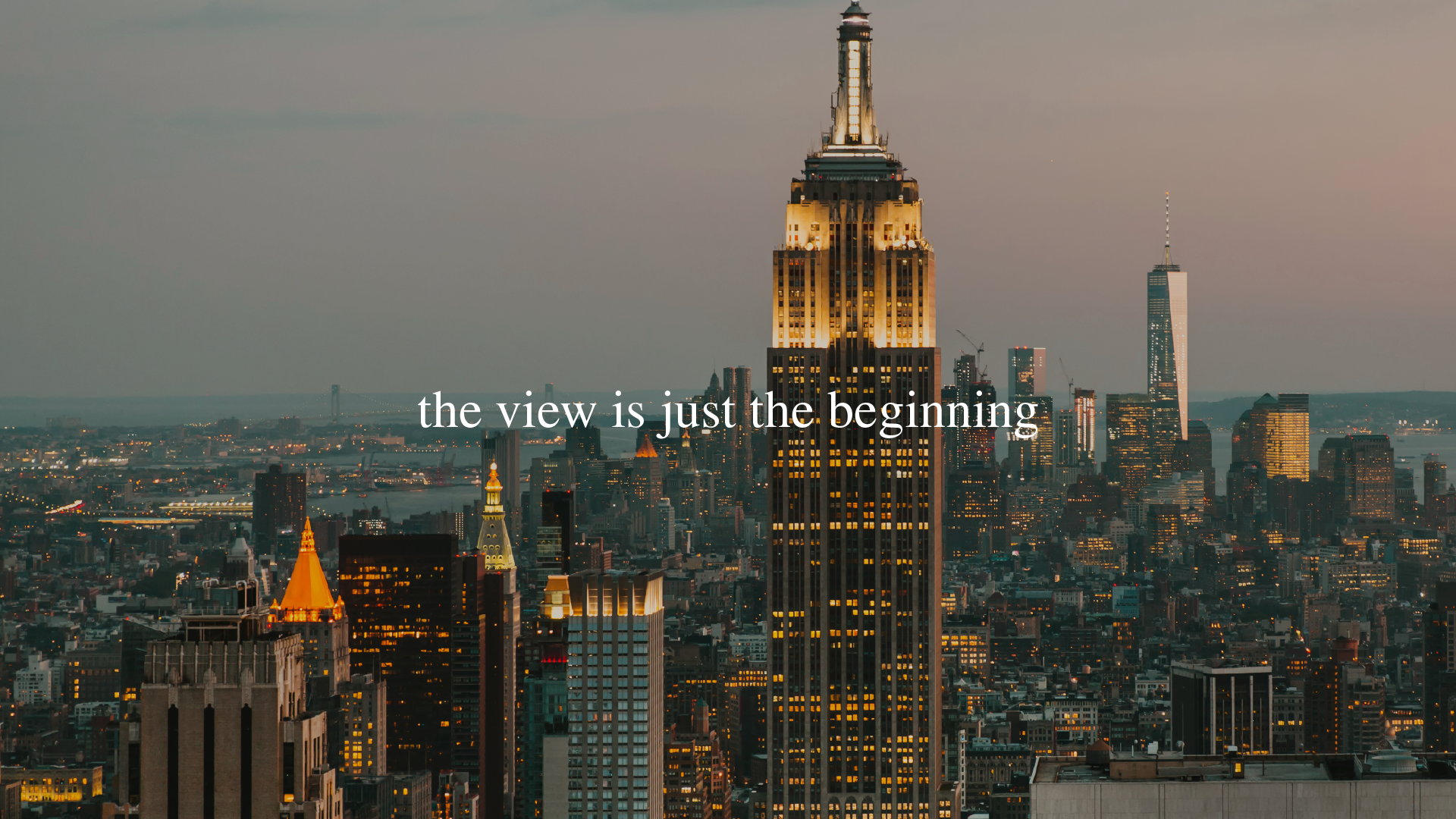
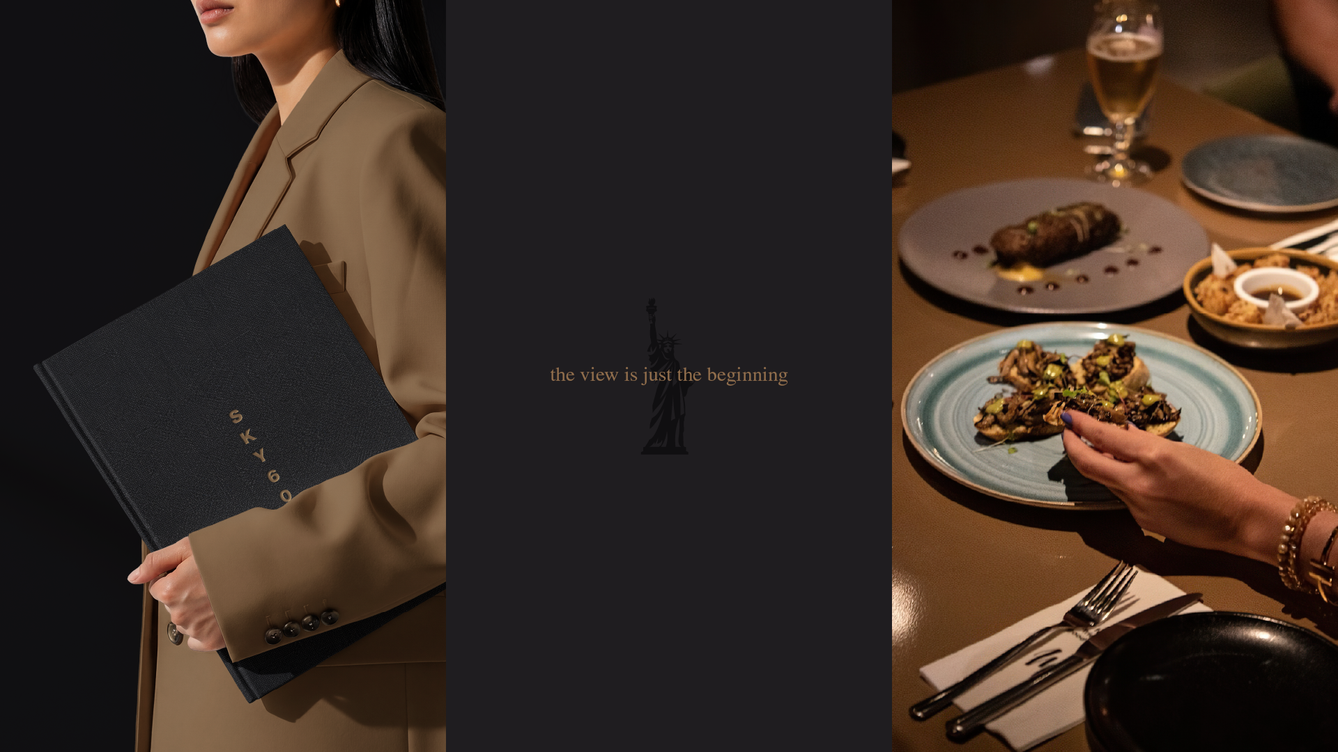
The view is just the beginning.
The elevation is what draws you in, but the experience is what stays with you.
This thinking guided both the visual and conceptual direction, positioning SKY605 as more than a destination, but as a shift in how you see, feel, and experience the moment.
The Solution
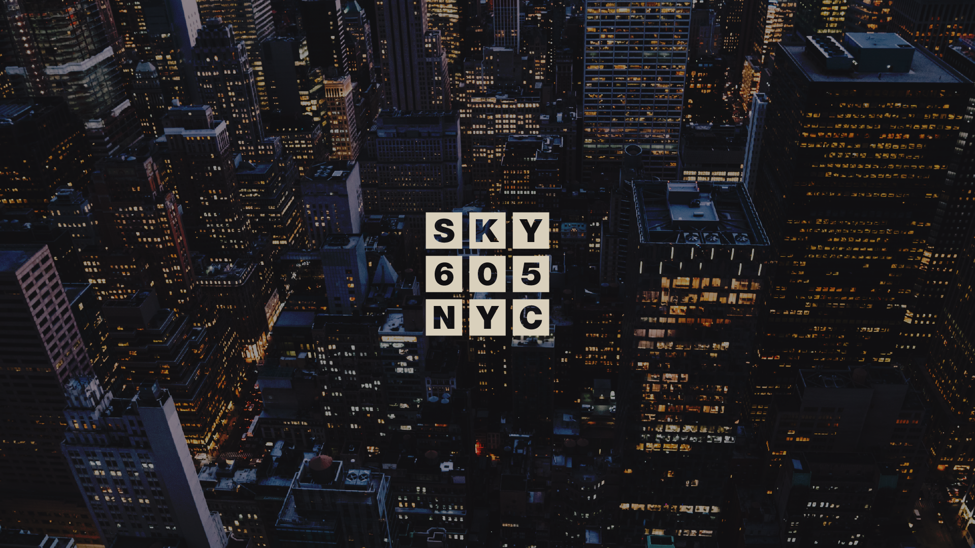
A Window Into the Experience
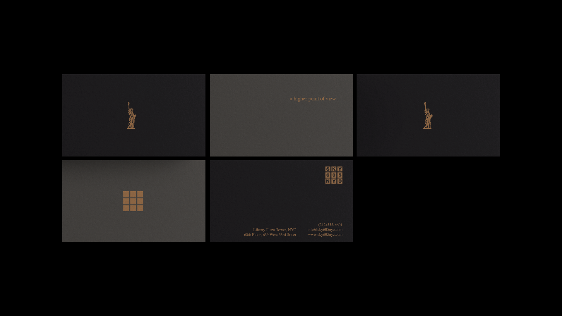
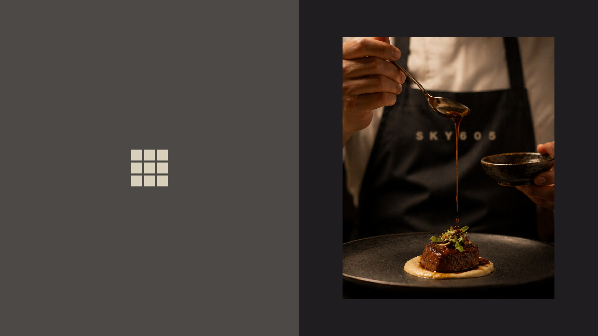
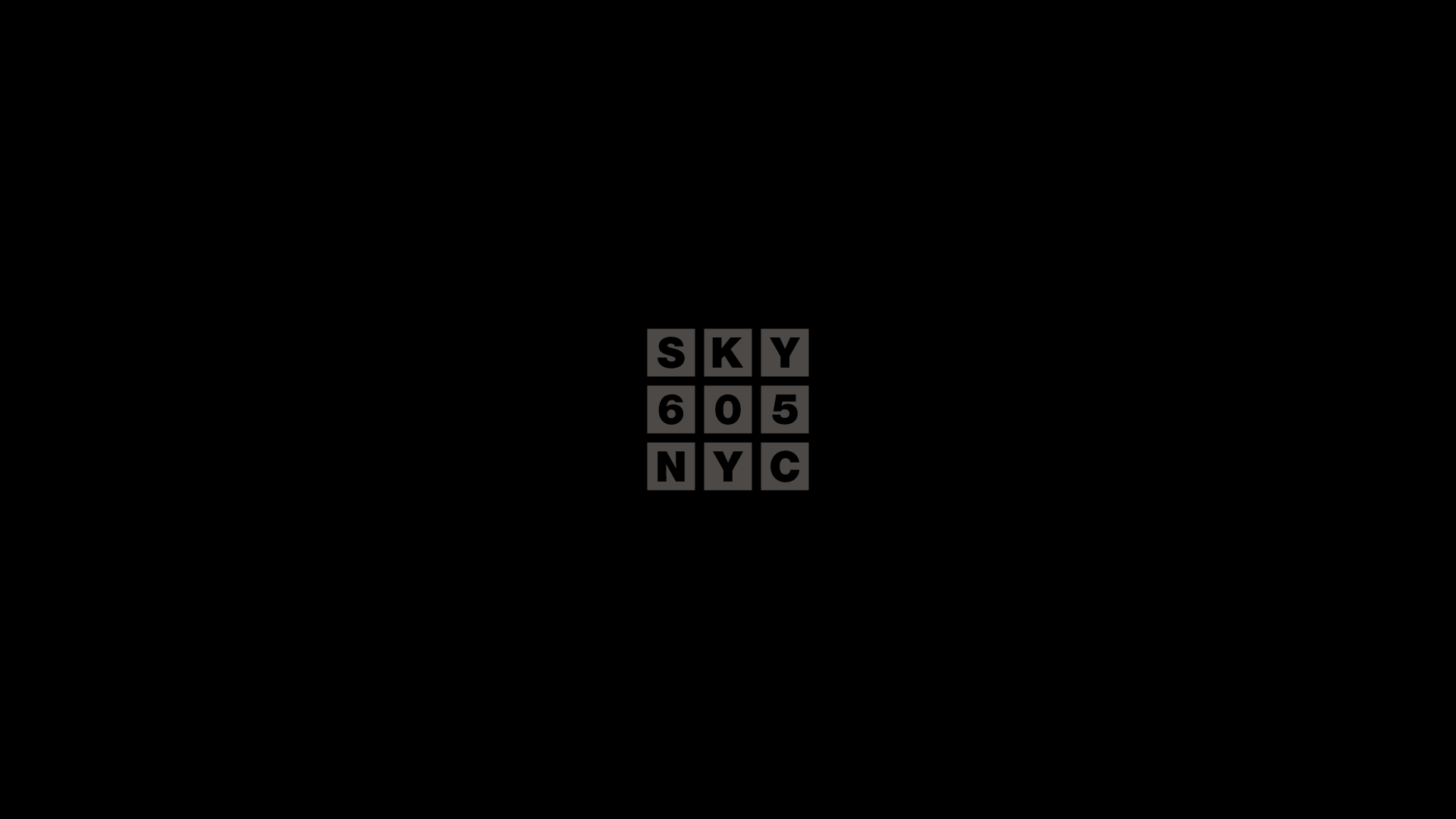
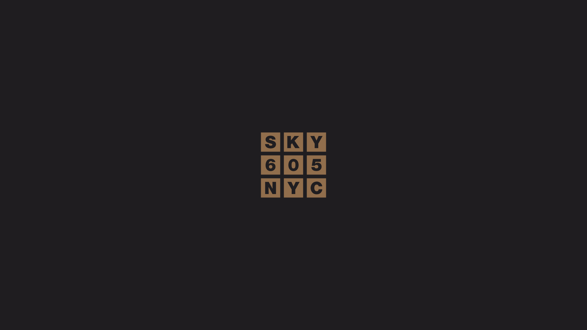
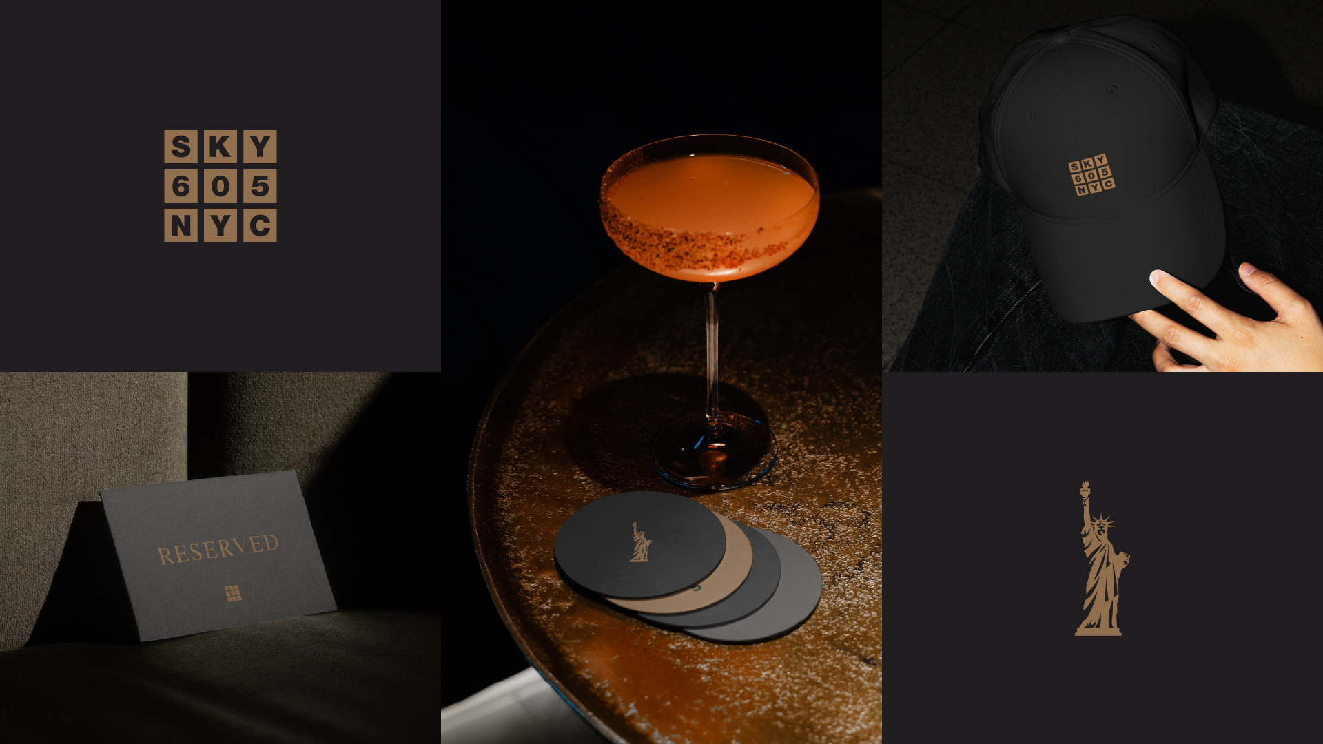
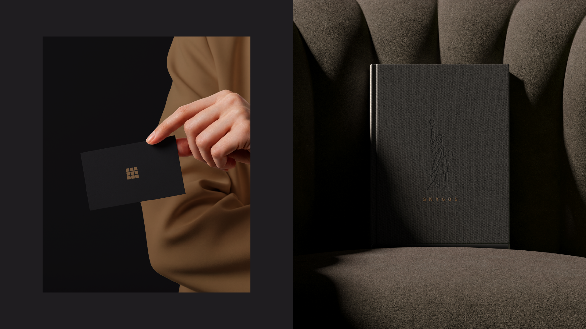
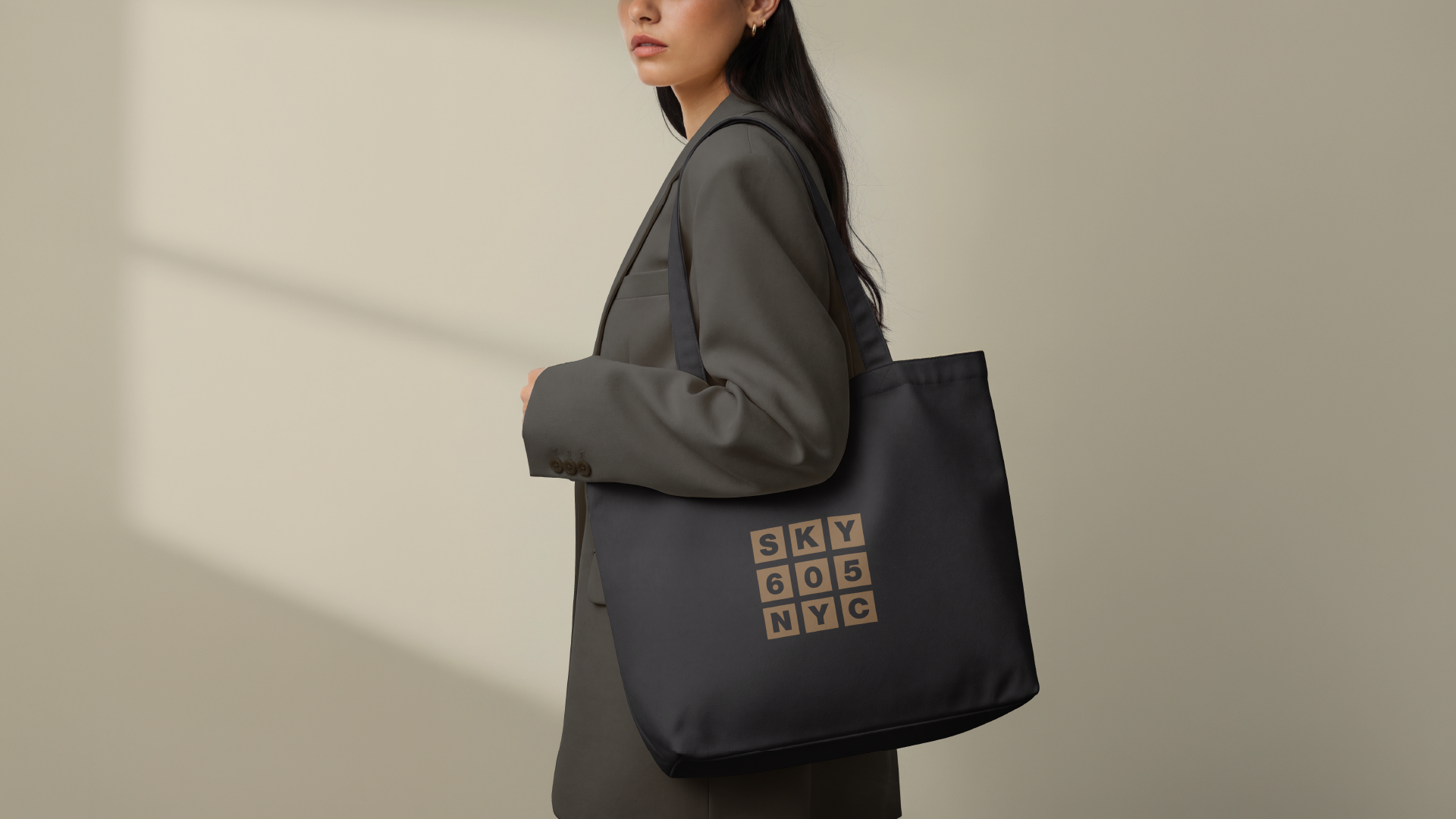
The logo system takes direct inspiration from the building itself.
Nine smaller squares form a larger grid, referencing the architectural rhythm of windows, frames that define how we see the world from above. This modular structure becomes a flexible identity element, capable of expanding across different applications while maintaining a strong, recognizable core.
It is not just a mark.
It is a system of perspective.
It is a system of perspective.
A Refined Visual Language
The identity embraces restraint.
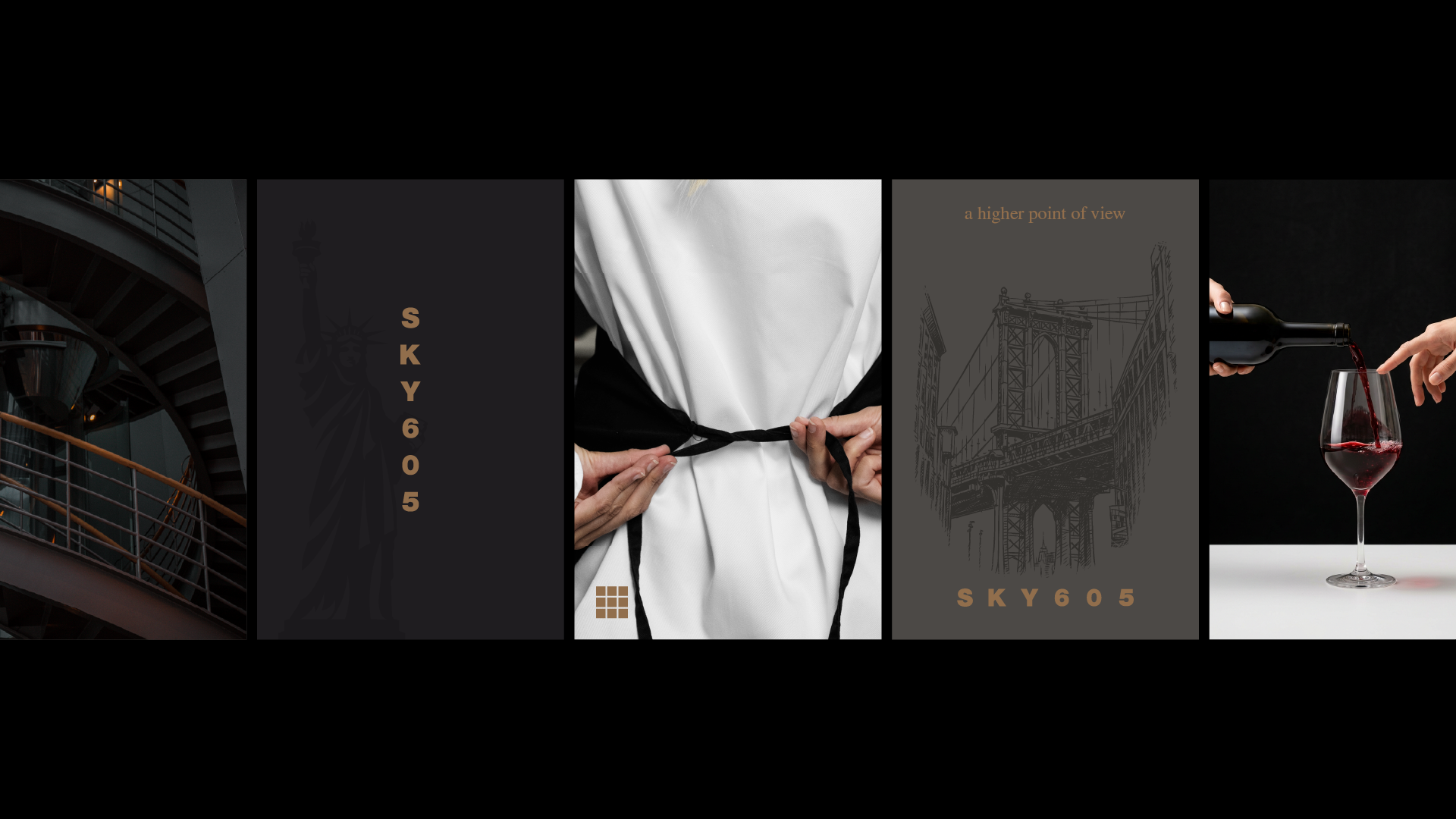
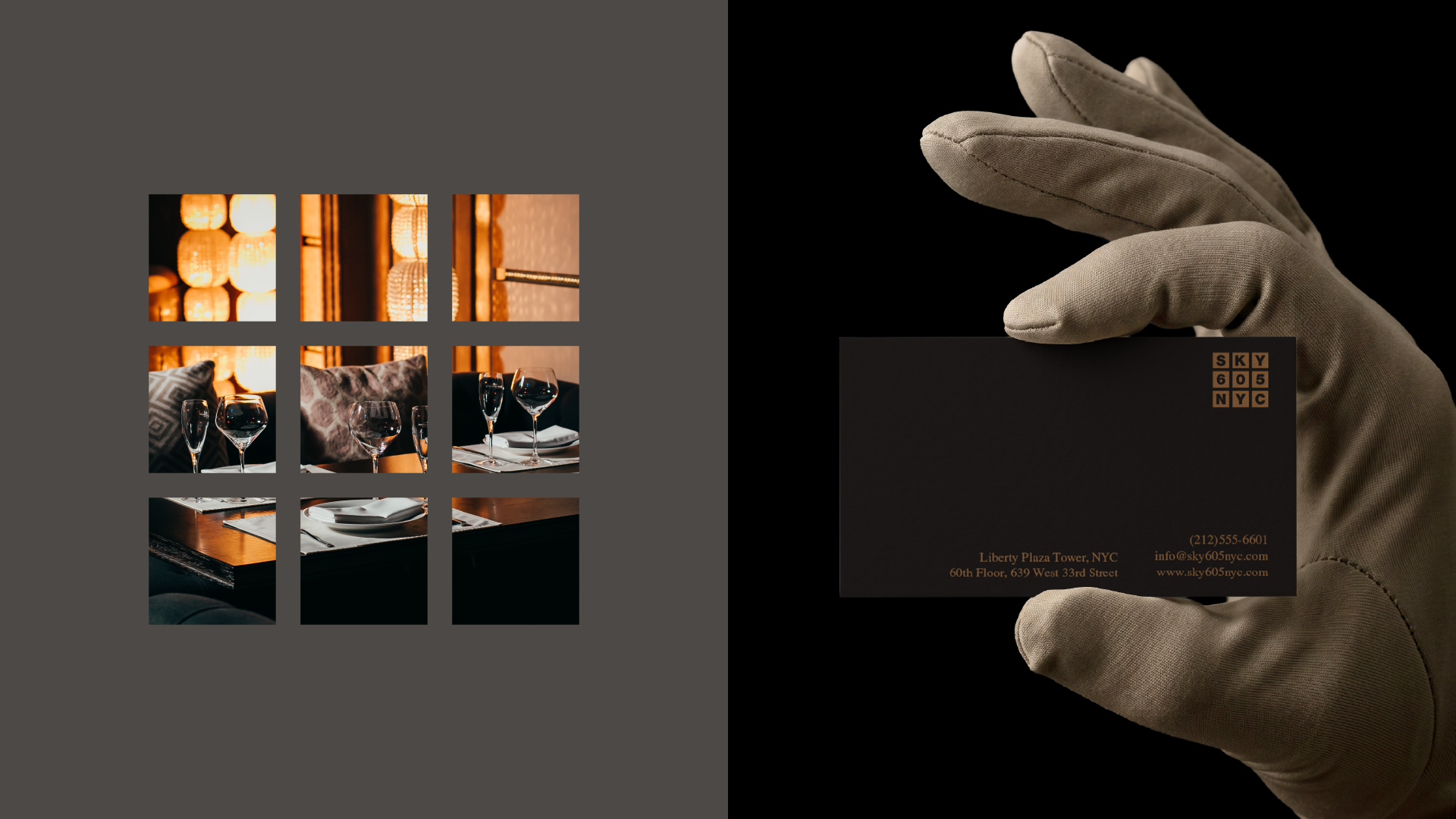
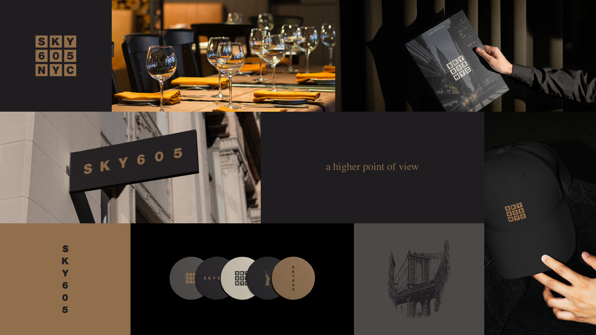
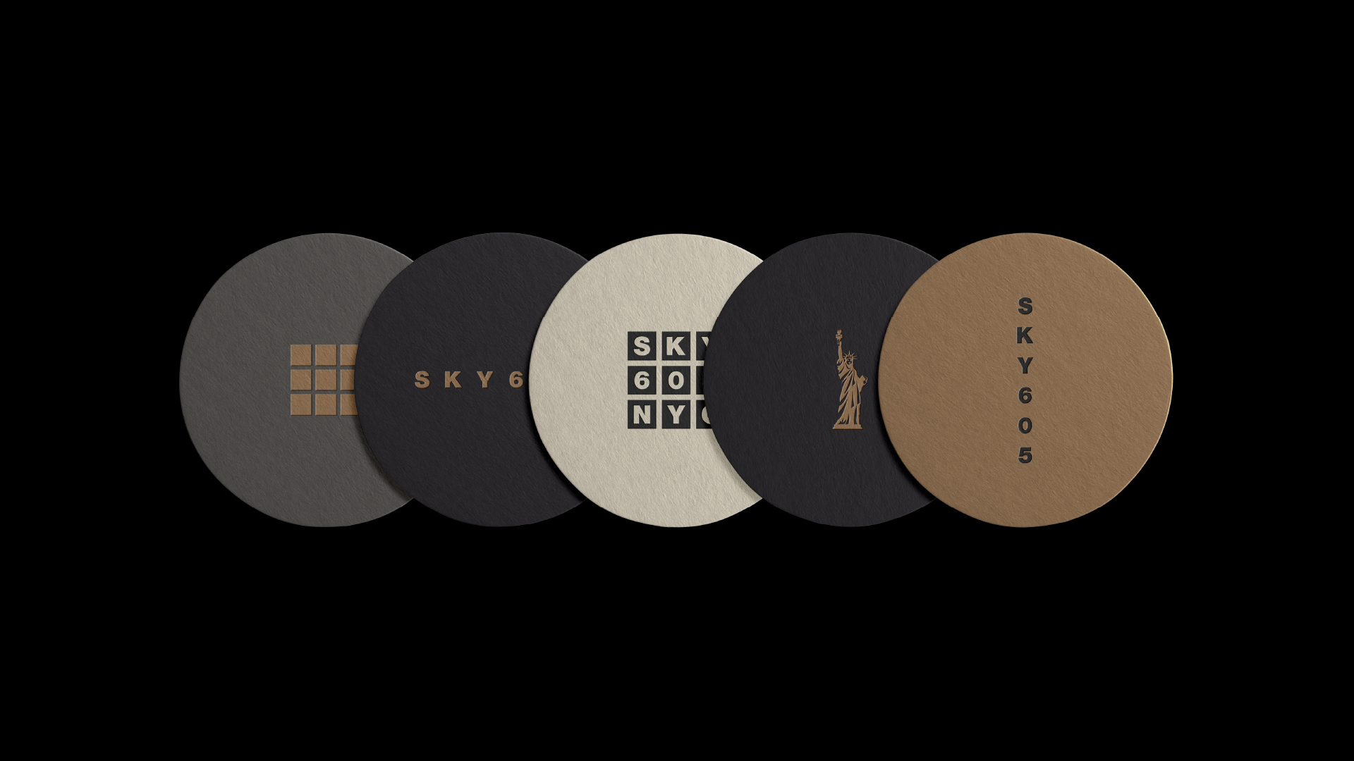
A carefully curated palette of deep charcoals, warm browns, and soft neutrals creates a sense of understated luxury. These tones reflect both the interior atmosphere and the transition from city lights to intimate dining.
Typography is clean, precise, and modern. Designed for clarity, it allows the brand to move effortlessly across menus, print materials, and digital touchpoints without losing its presence.
Every element is reduced to its essence.
Nothing is decorative. Everything is intentional.
Nothing is decorative. Everything is intentional.
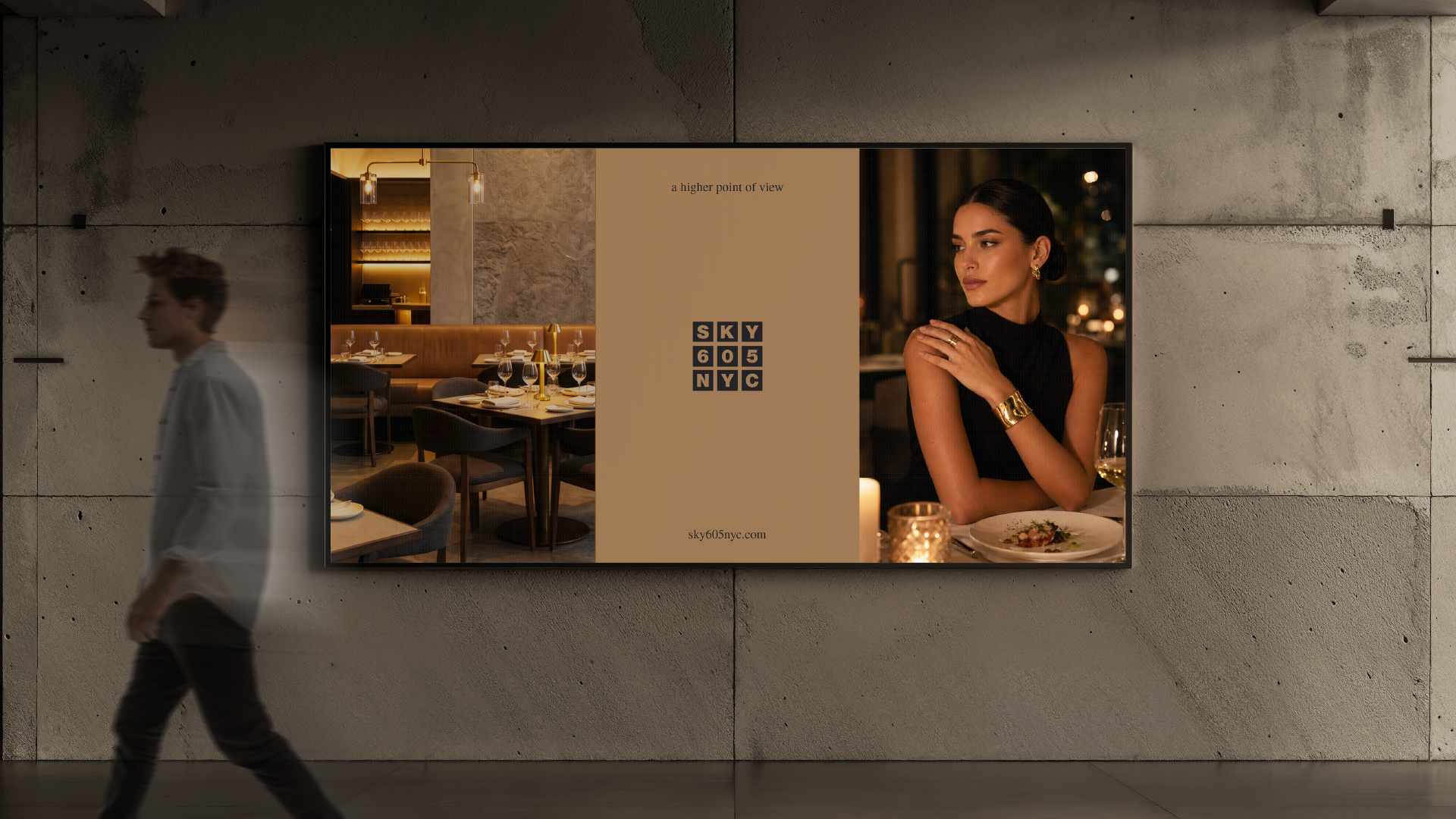
A System Designed to Elevate
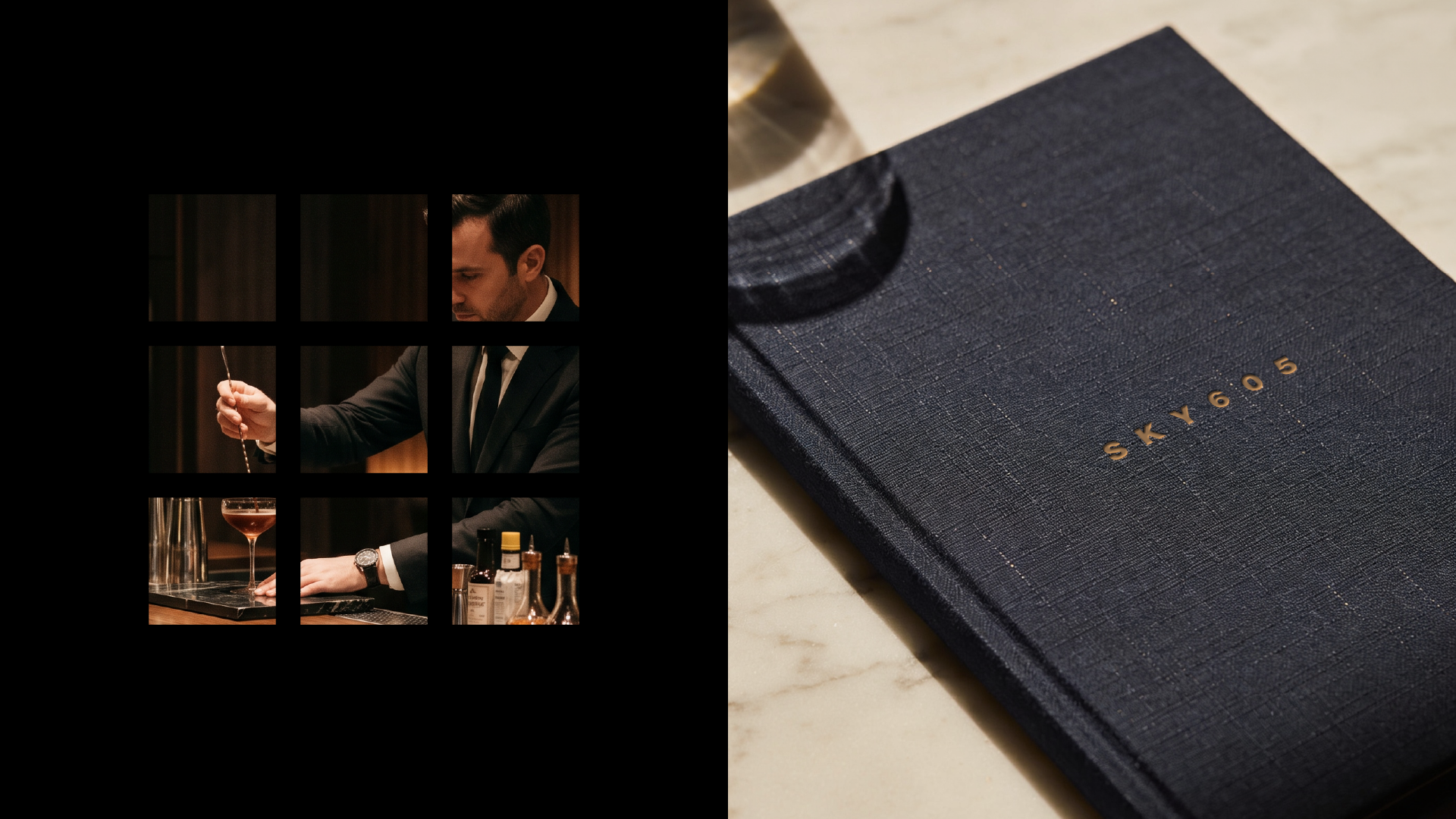
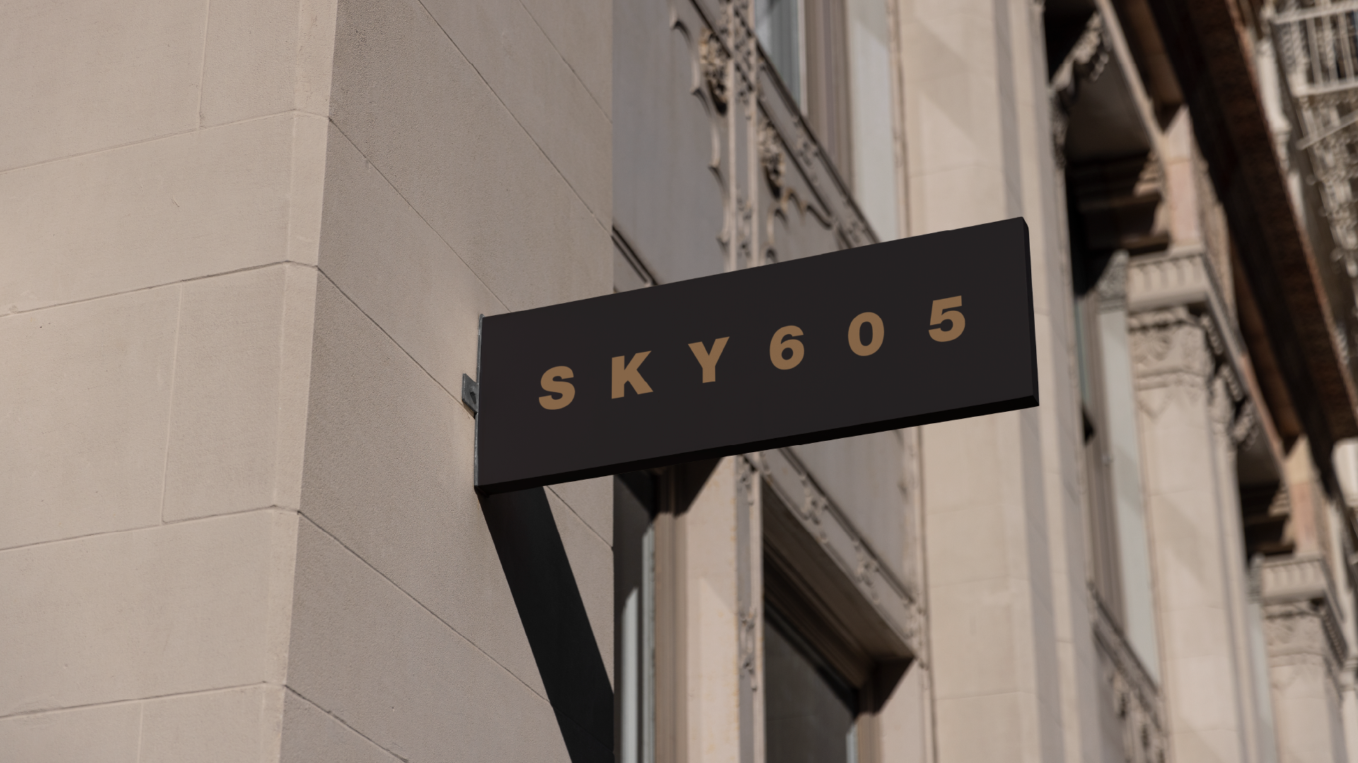
From coasters to menus, from business cards to spatial applications, the identity system was built to scale.
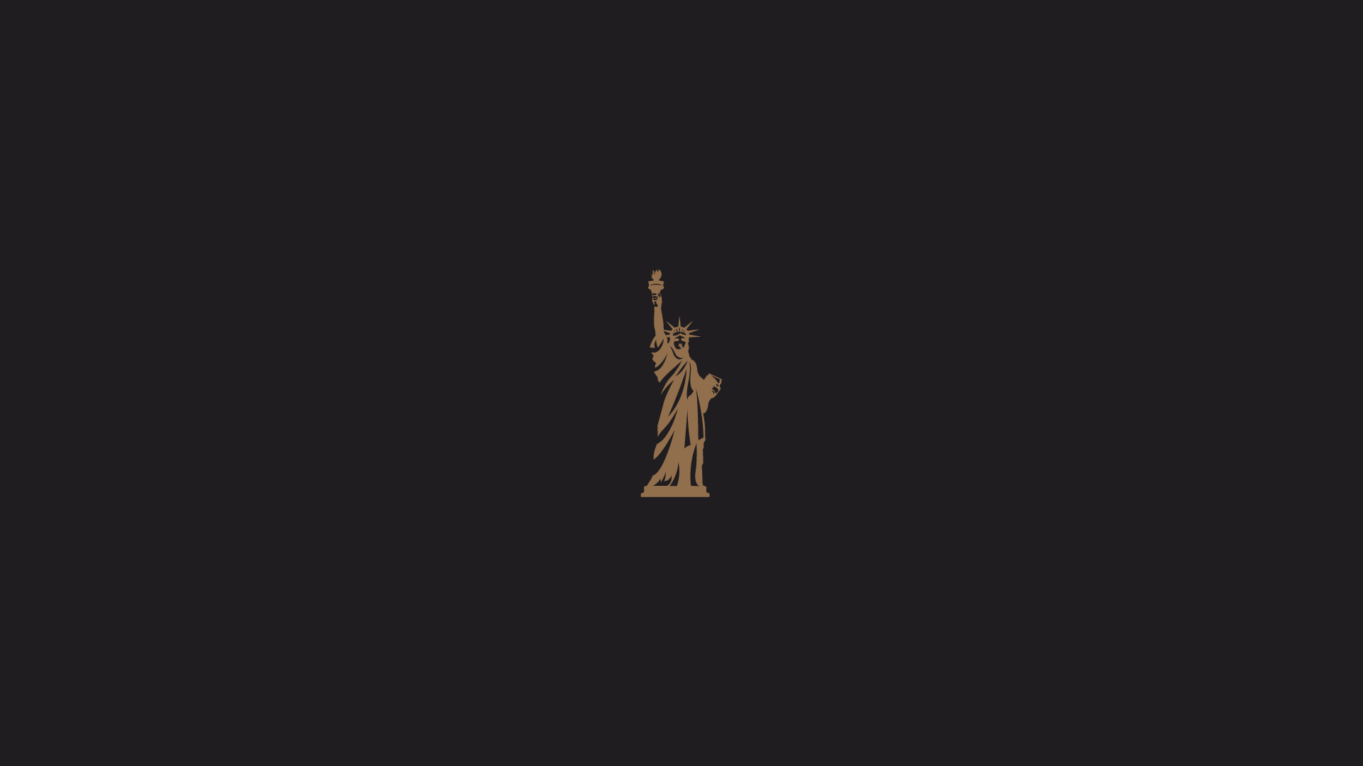
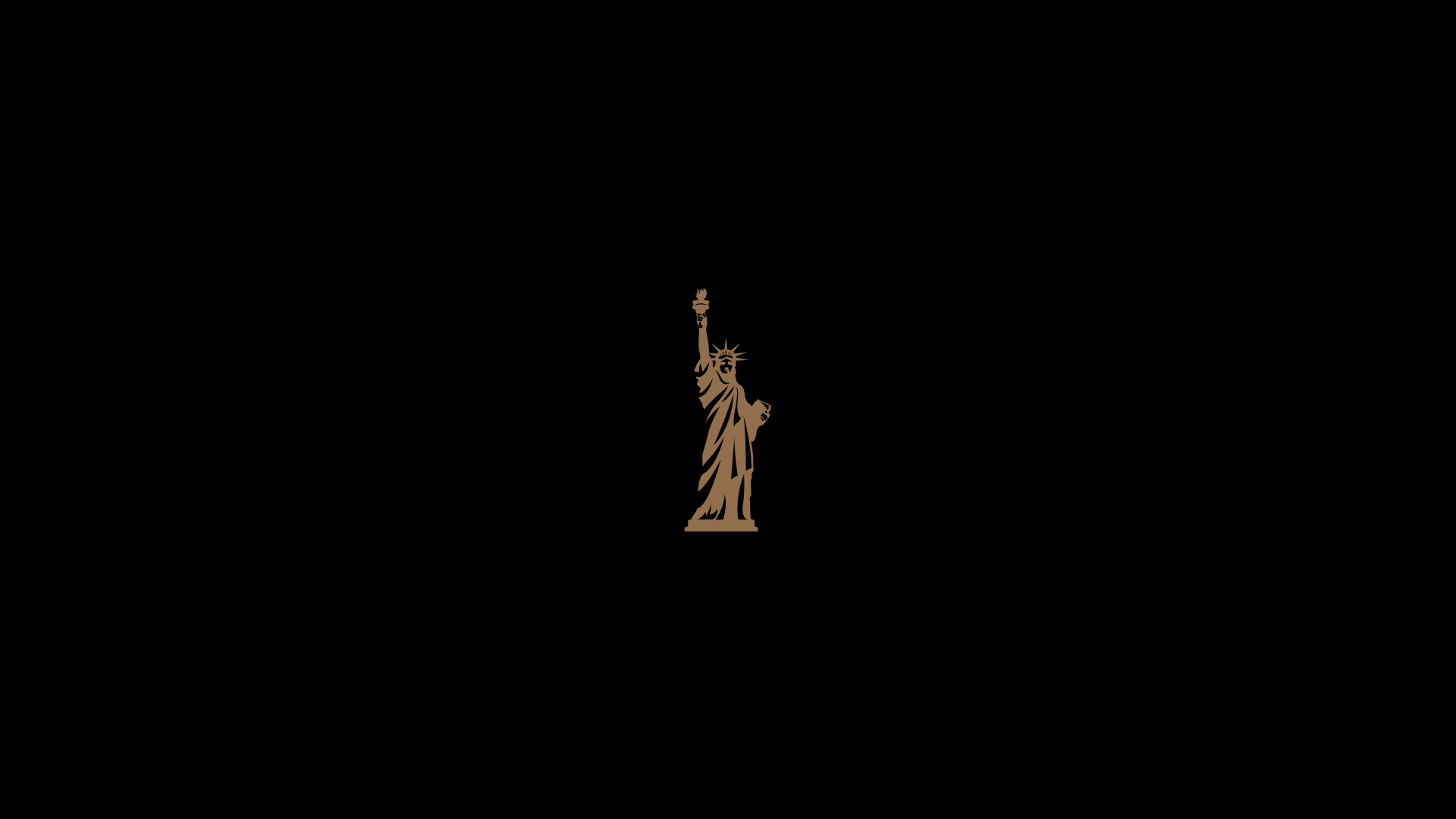
The grid becomes a recurring motif. The Statue of Liberty icon reinforces a sense of place. Subtle details in materials and finishes enhance the tactile experience, aligning with the restaurant’s attention to craft and quality.
The result is a cohesive system where every touchpoint feels connected, considered, and elevated.
The Outcome
SKY605 emerges as a brand defined by clarity, elegance, and perspective.
It doesn’t compete through noise.
It stands through presence.
It stands through presence.
By translating architecture into identity and experience into design, the brand captures what makes SKY605 unique:
Not just the height,
but how it changes the way you see.
but how it changes the way you see.

Closing Thought
At 605 feet, everything looks different.
And that is precisely the point.
A higher point of view.