WILLOW®
BRAND POSITIONING + BRAND DESIGN + LOGO DESIGN + PACKAGING DESIGN + BRAND GUIDELINES
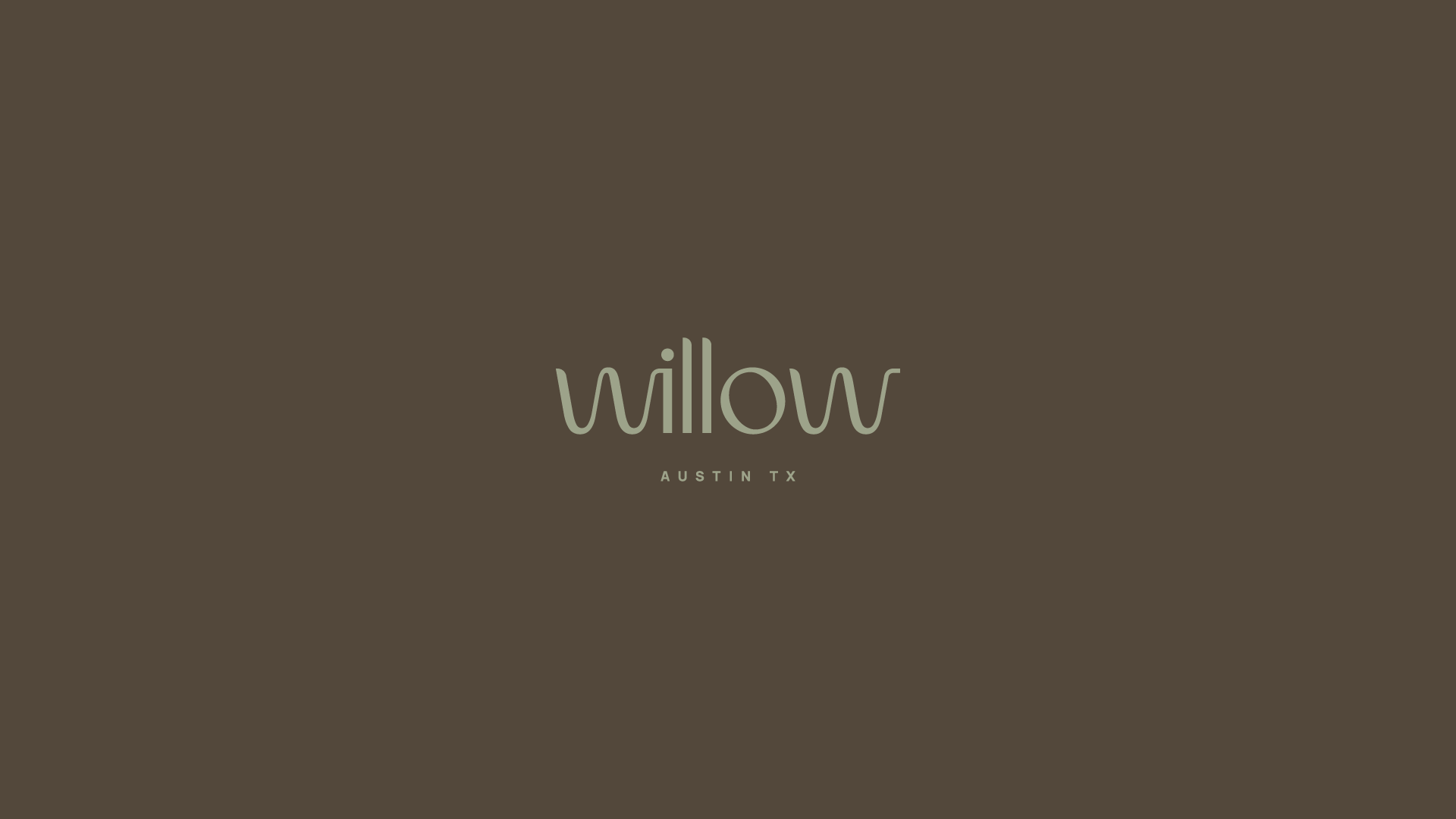
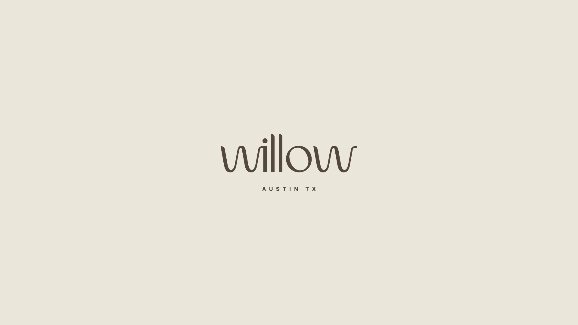
Willow
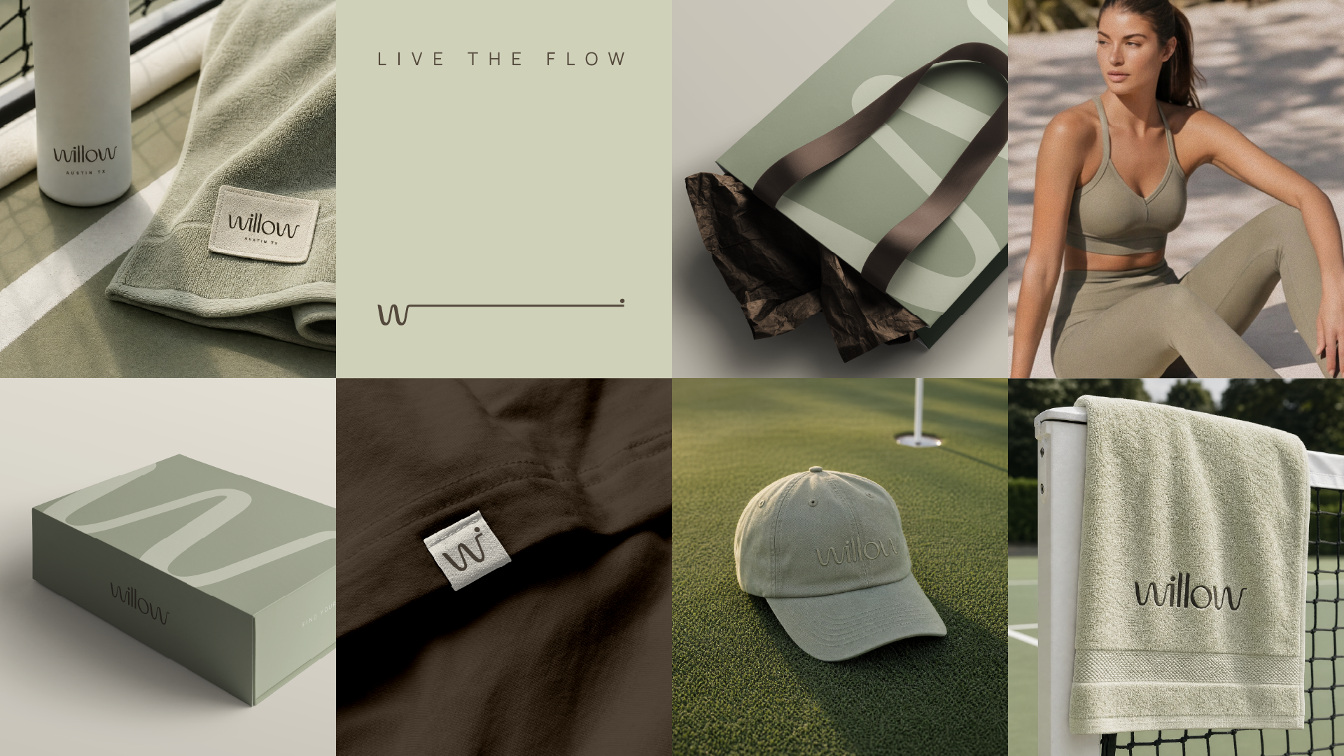
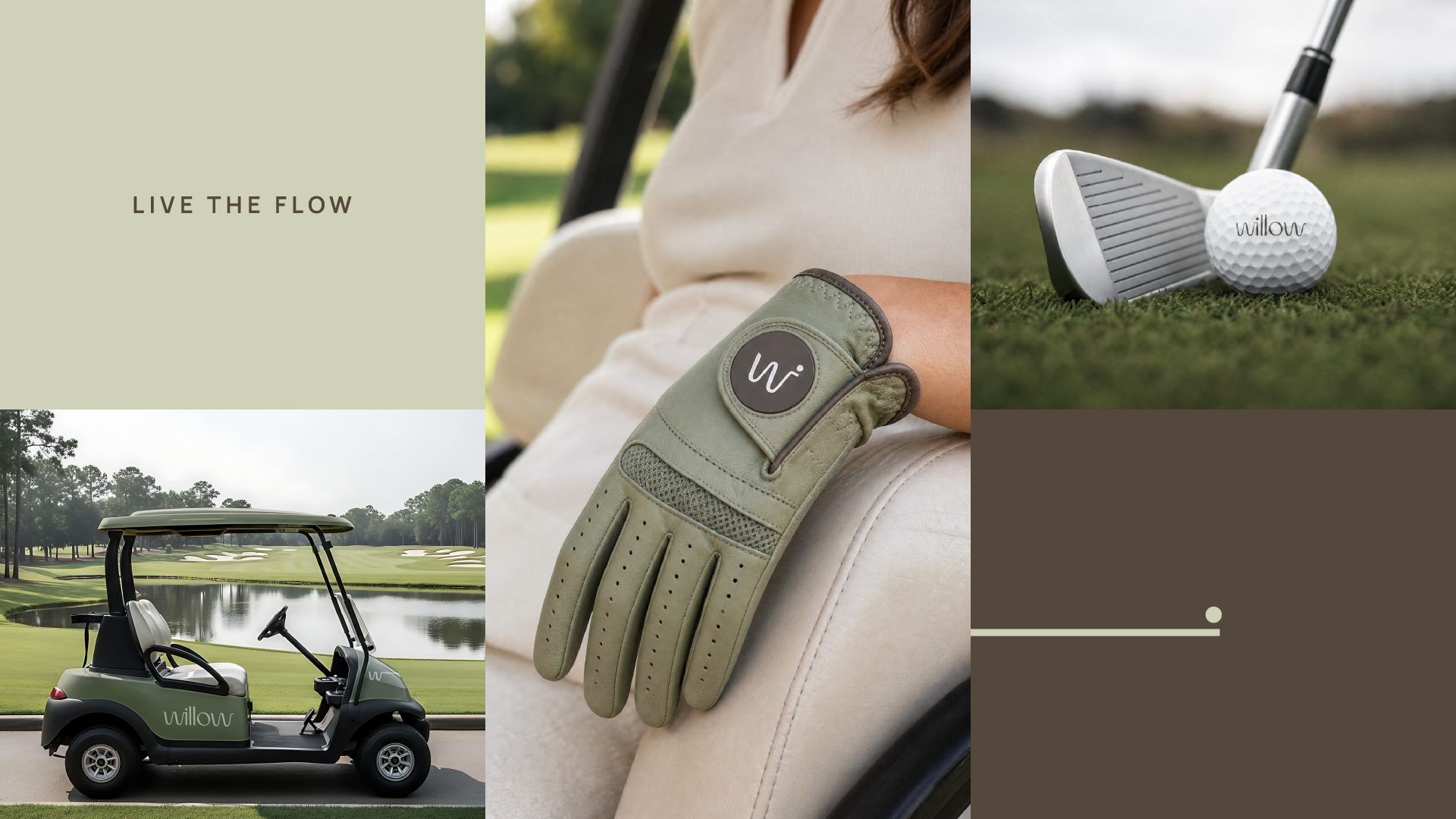
Live the Flow
Brand Identity · Athleisure · Austin, TX By INDUSTRIA® Branding Co.
About the Client
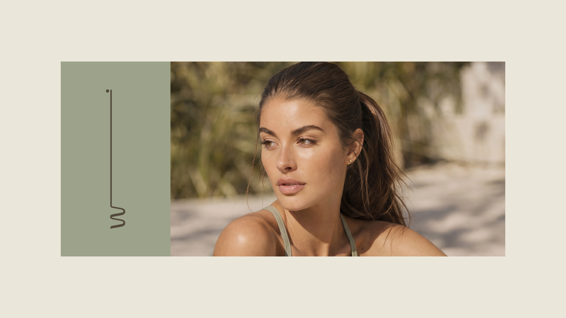
Willow is a women's lifestyle brand born in Austin, Texas, built around the joy of outdoor play. Golf and pickleball are the starting point — not the limit. Willow makes elevated, minimalist apparel for women who move between worlds in a single afternoon: the court, the clubhouse, the happy hour, the meeting. Clothing made to keep up with a life that doesn't change outfits to change rooms.
The name comes from the willow trees that line the fairway. Graceful, grounded, always in gentle motion.
The Challenge
The women's athleisure space is crowded and loud. Lululemon, Alo, Vuori, Free People Movement — a category full of capable brands and even louder voices. Most speak the same language: harder, faster, stronger.
Willow wasn't built for that conversation.
Its audience doesn't separate sport from life. They play, then they linger. They compete, then they connect. The challenge was to build a brand with the polish to stand beside the category's best, and the restraint to say something none of them were saying — that the point was never the workout. It was the flow.
The Concept
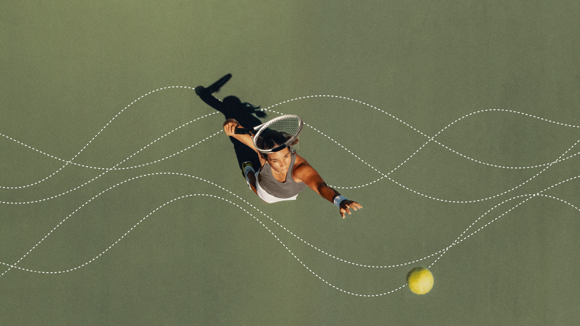
Flow.
The rhythm of a swing. The arc of a ball. The ease of moving from one part of the day to the next without breaking stride. And the willow itself — branches that bend without resistance, rooted and free at once.
We made flow the organizing idea of the entire brand. One word that holds the sport, the lifestyle, and the feeling. Not a tagline added at the end, but the logic everything else grows from.
Live the Flow.
The Solution
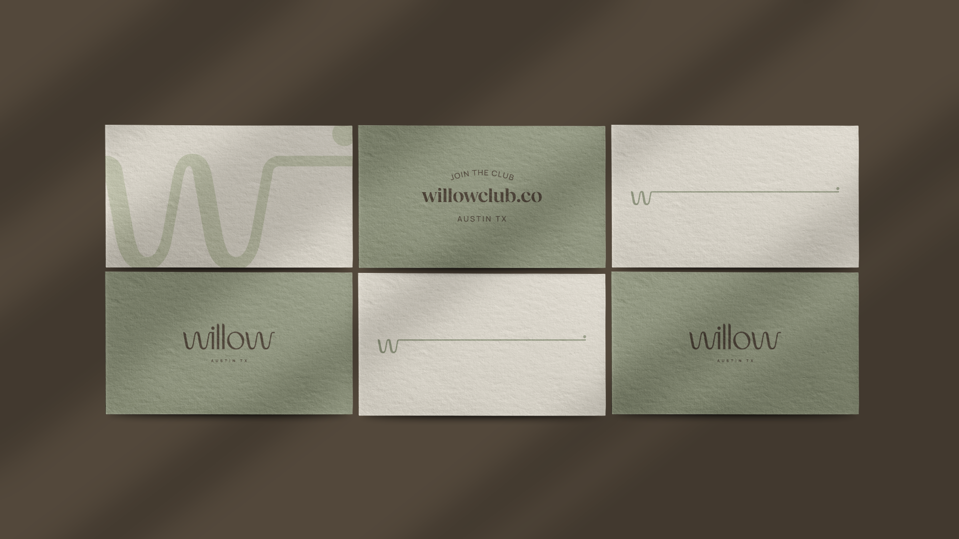
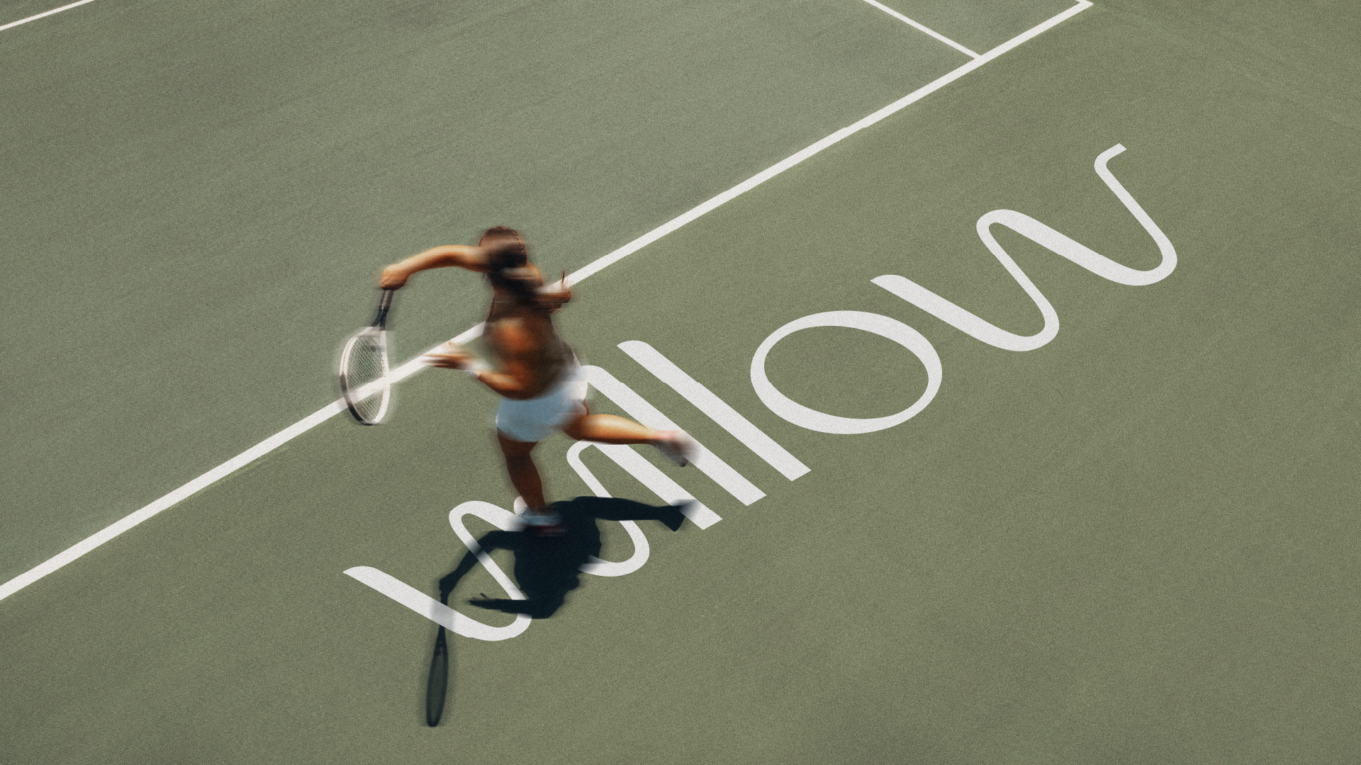
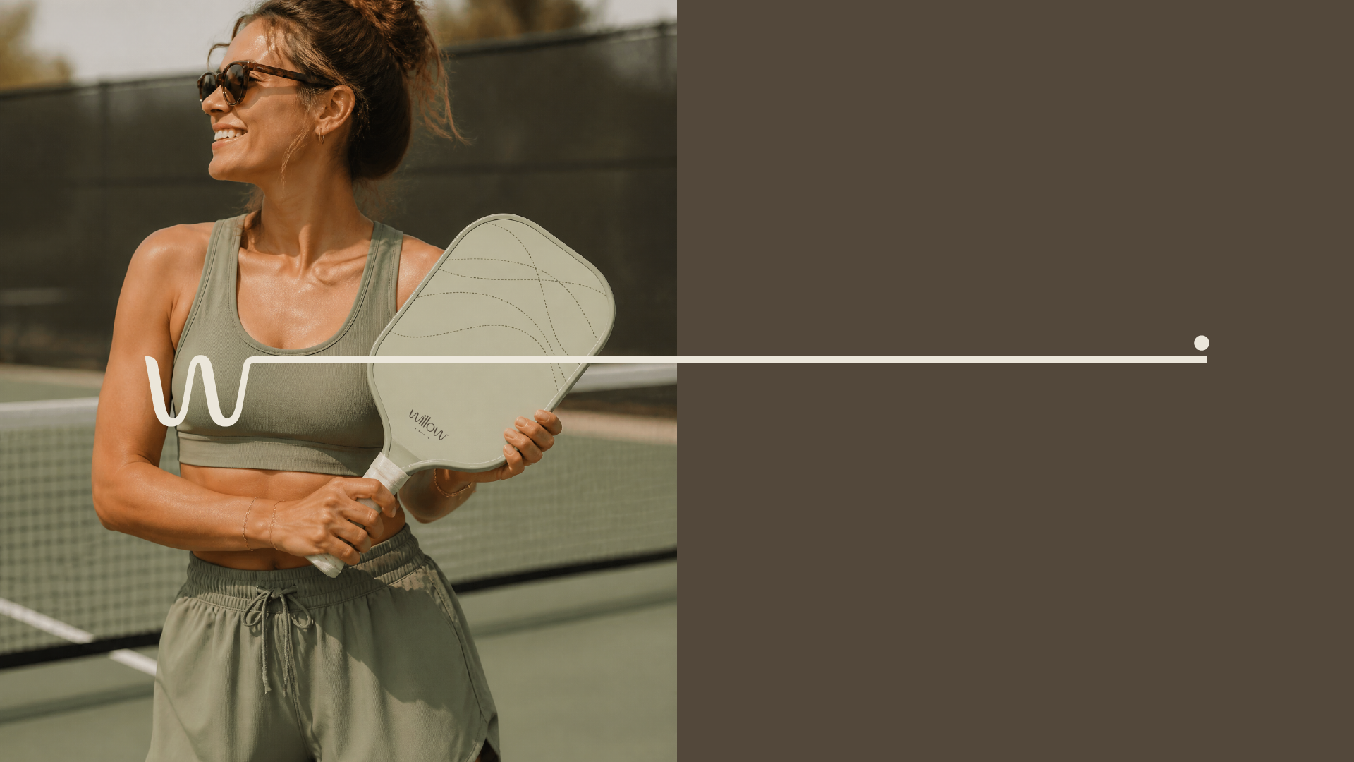
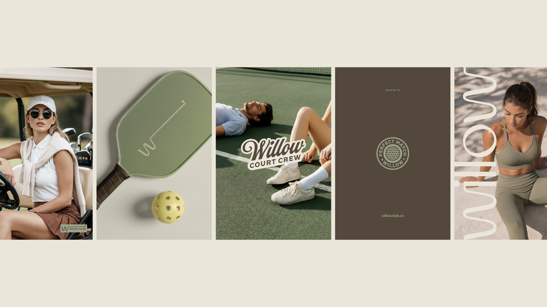
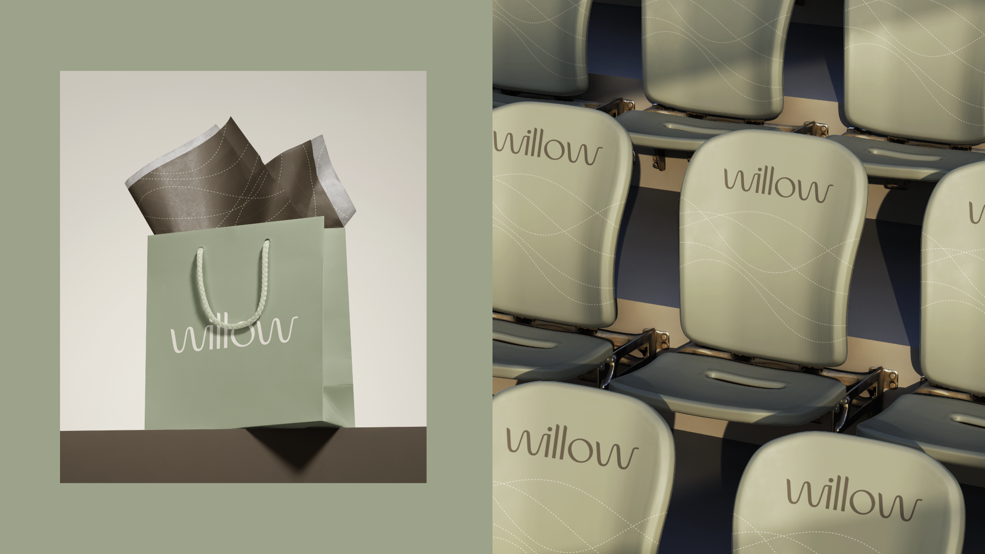
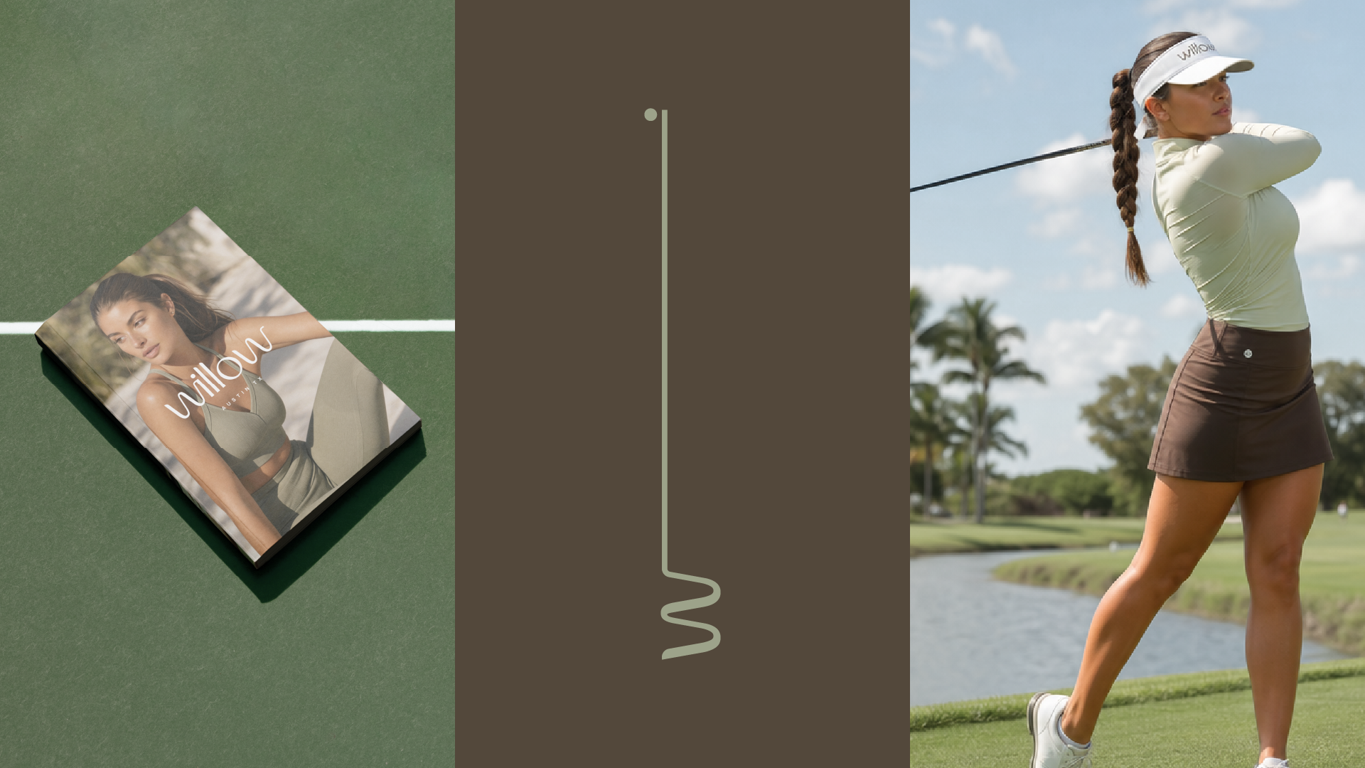
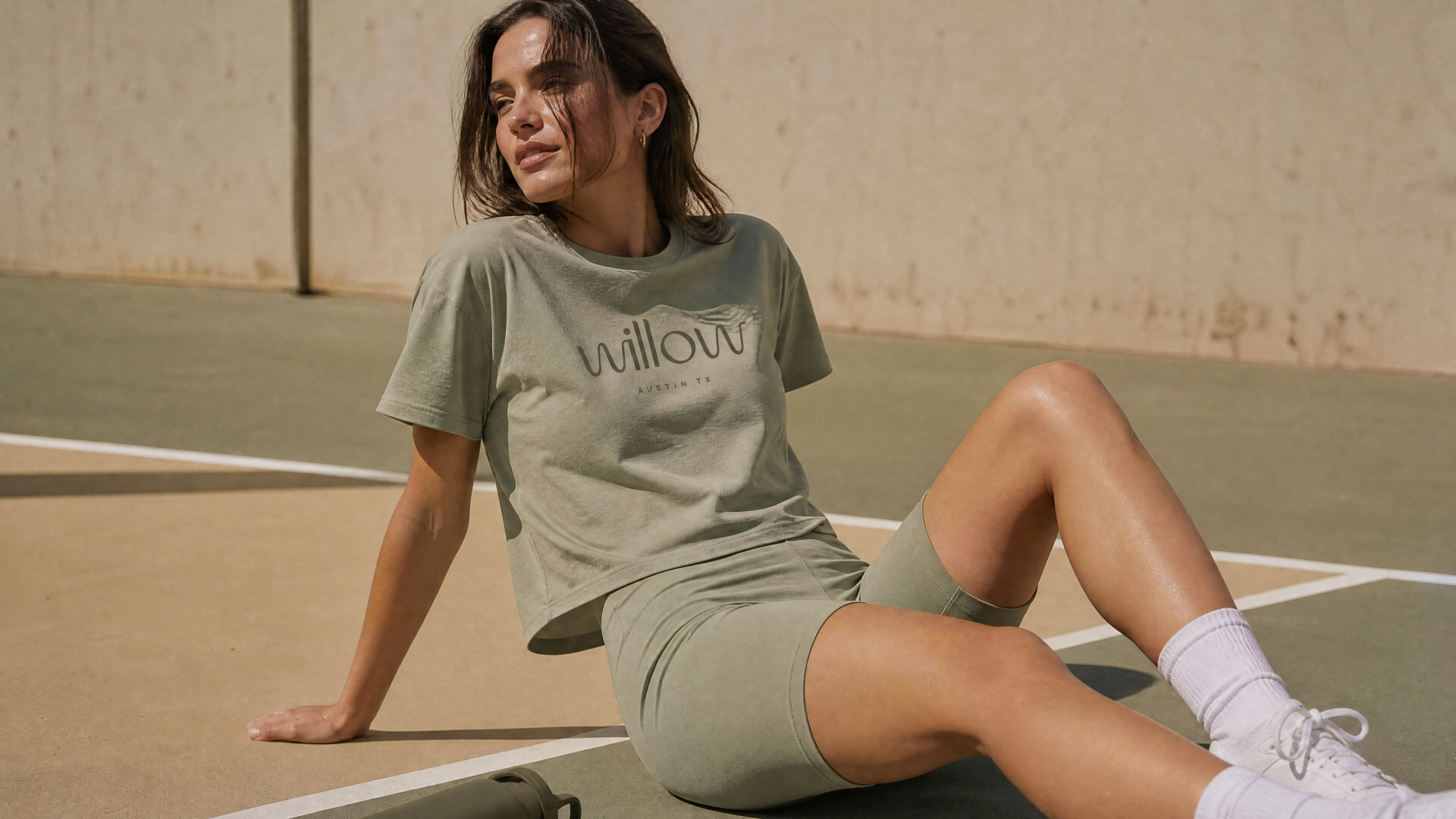
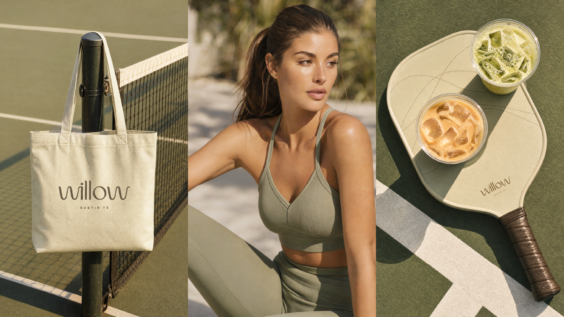
Logotype. The wordmark is drawn as a single, unbroken line — the letters of willow rising and falling like branches in the wind, or the trace of a ball in motion. It reads as stillness and movement at once. Soft, confident, unmistakably feminine without a single decorative flourish.
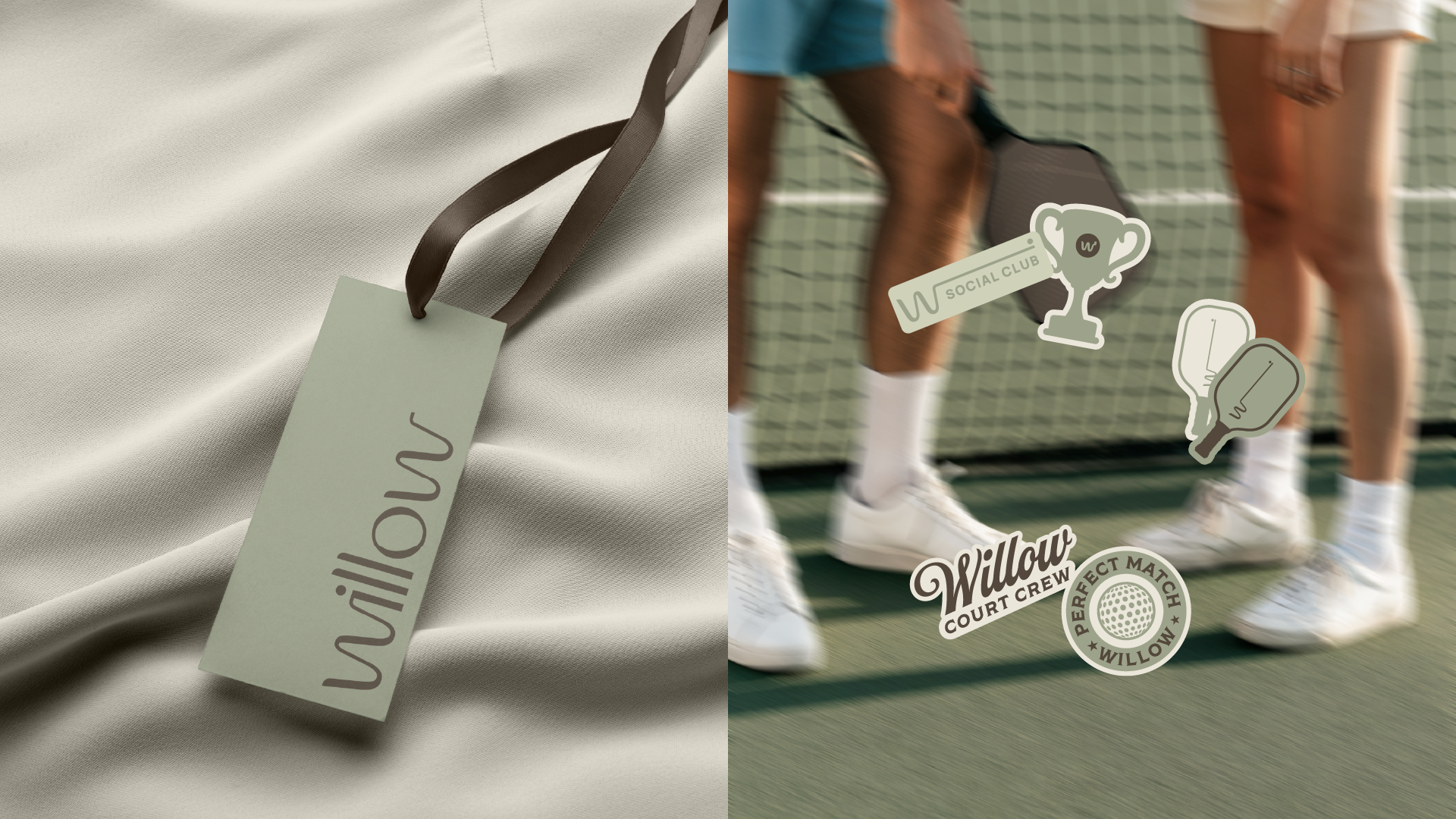
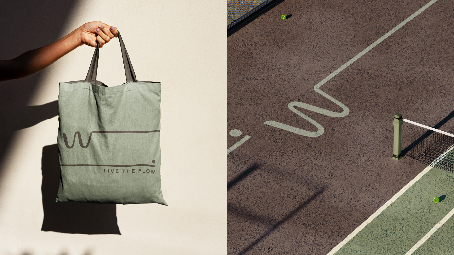
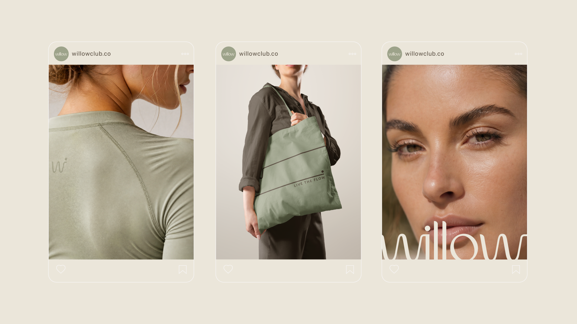
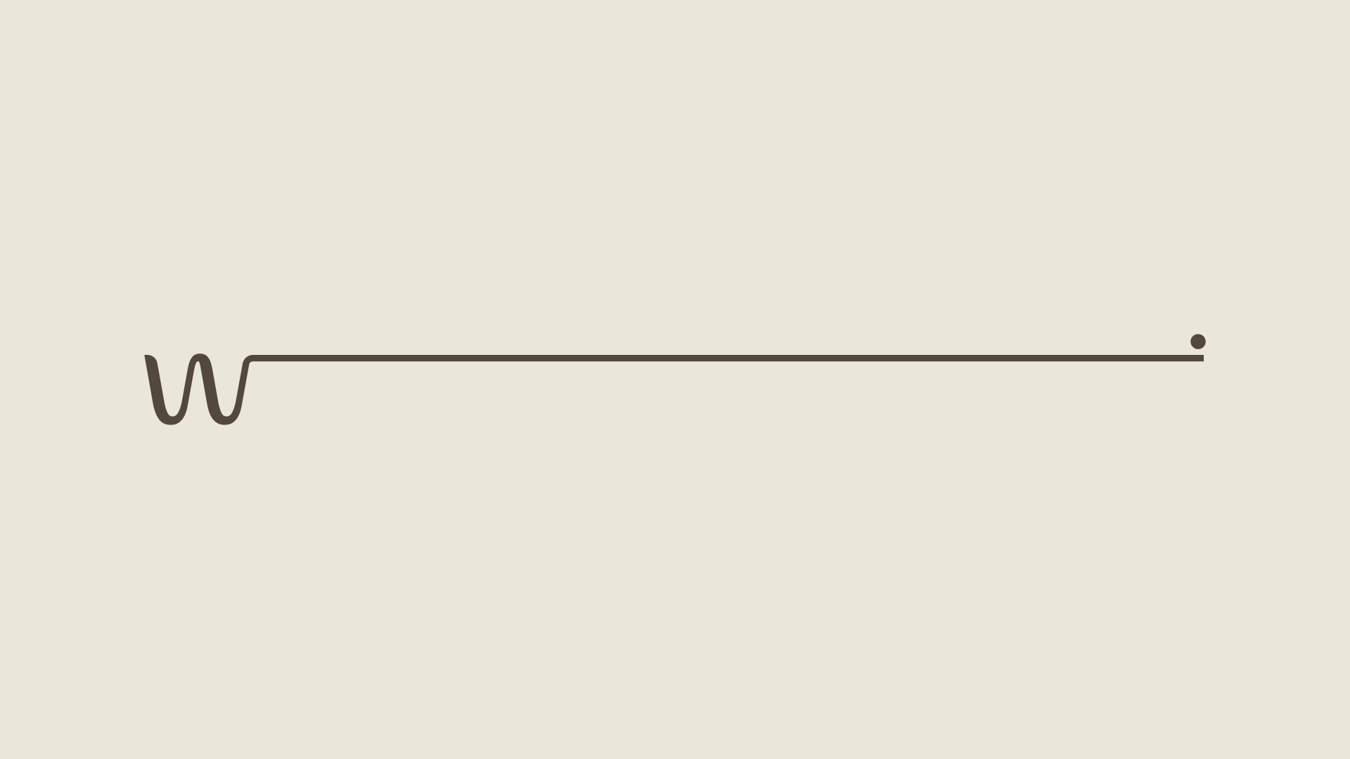
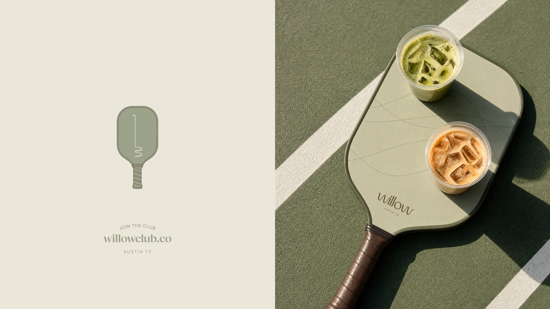
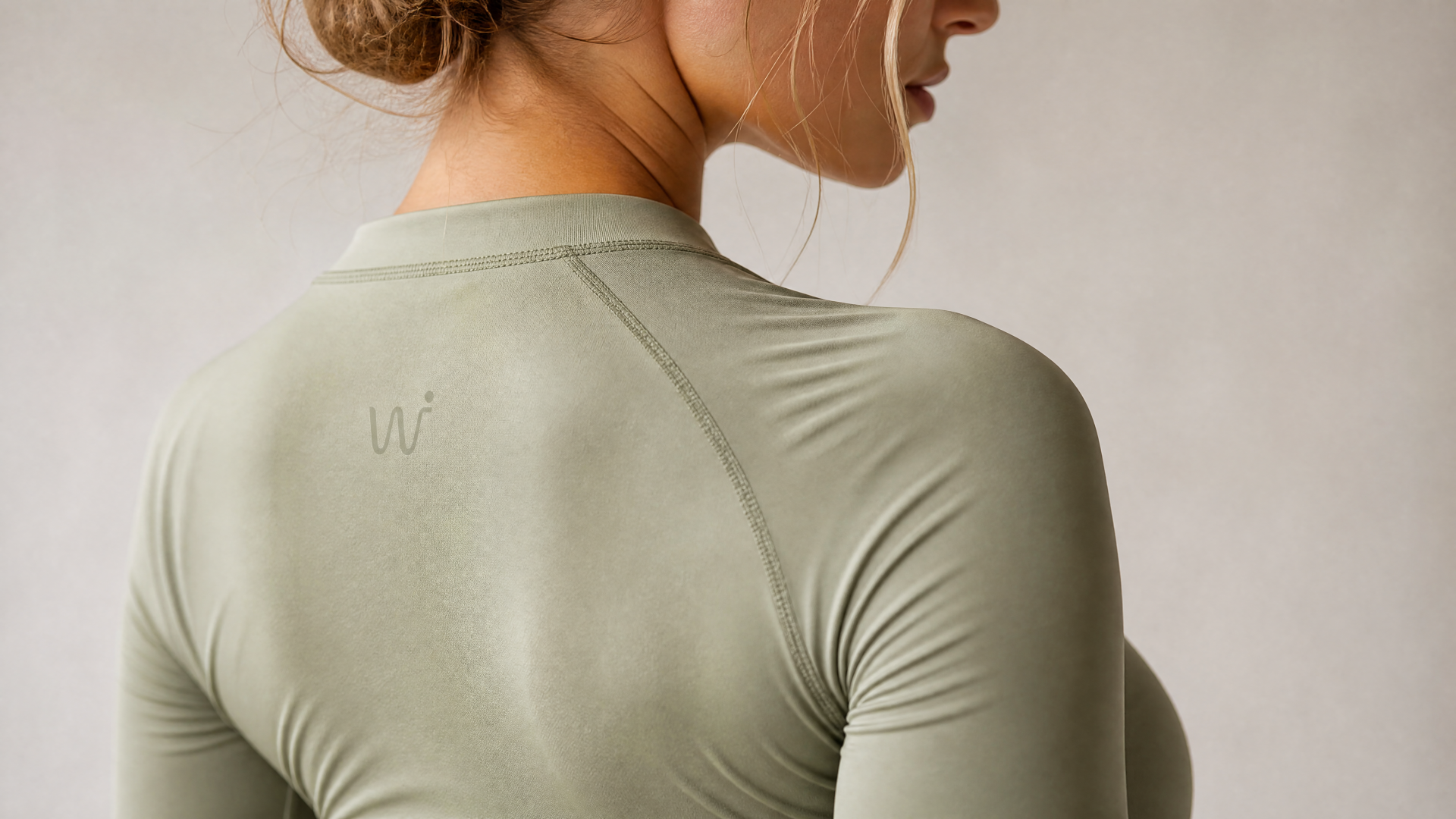
Monogram. From the wordmark we drew the mark: one continuous stroke that begins as a w and extends into a long, quiet line ending in a single point. Read one way, it's a putting stroke meeting the ball. Read another, it's the horizon — the calm after play. It became the brand's signature gesture, equally at home embroidered on the back of a garment, painted across a court, or pressed into a business card.
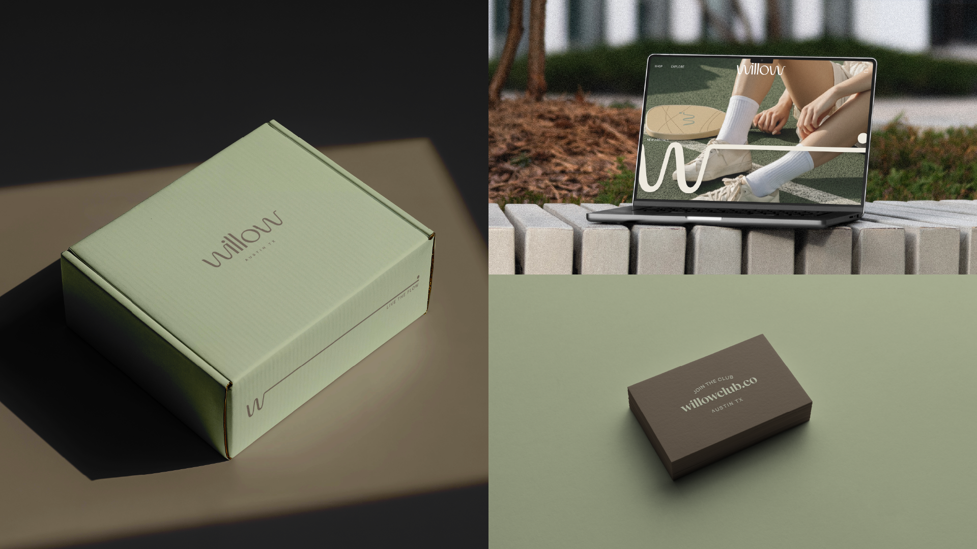
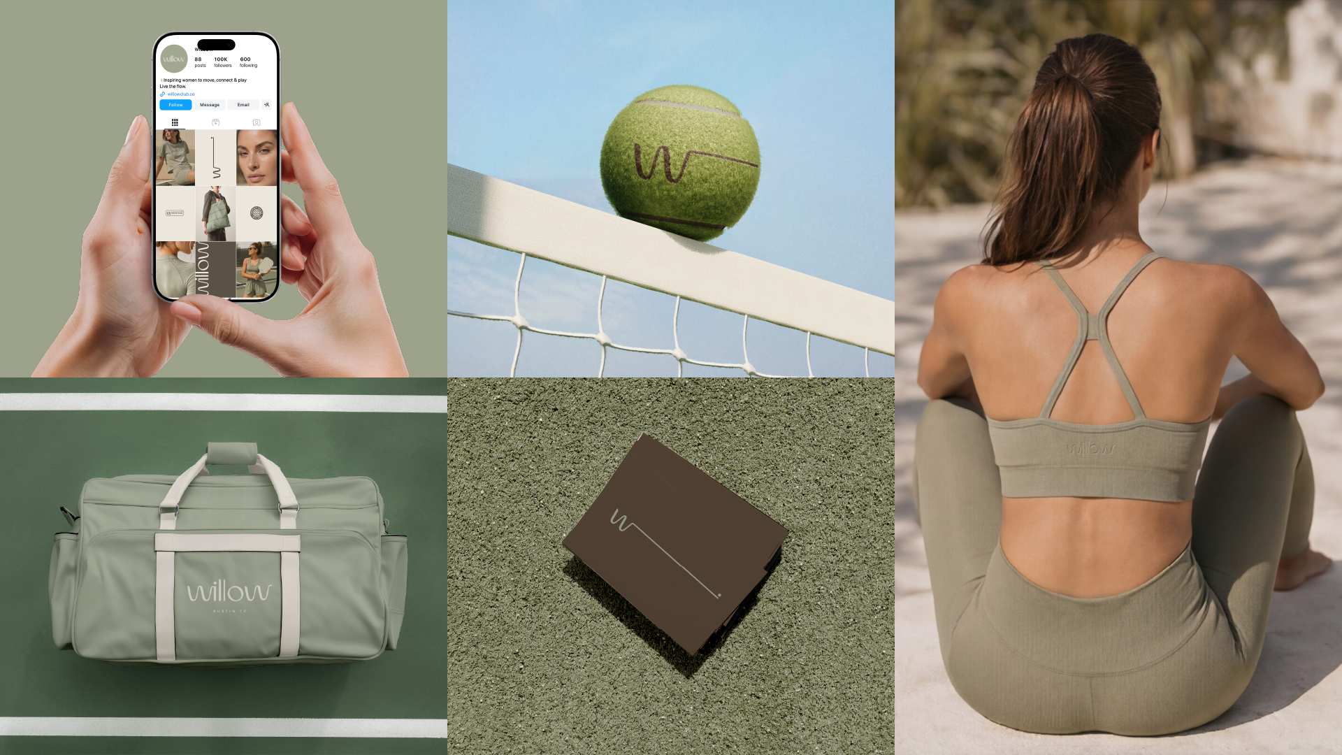
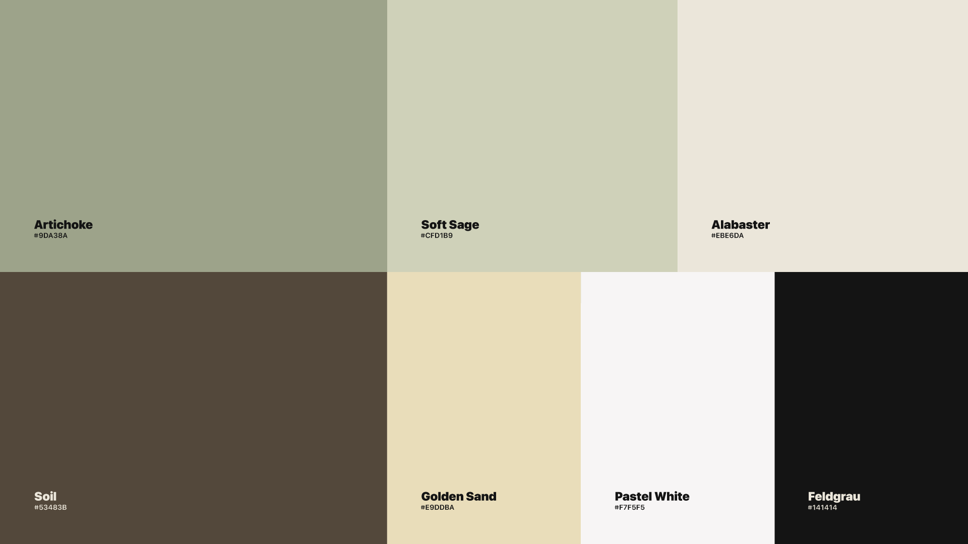
Color. The palette is drawn from the landscape of the game. Artichoke and Soft Sage for the fairway, Soil for the earth beneath it, Golden Sand and Alabaster for warmth and light. Quiet, natural tones that feel considered without effort — and photograph as beautifully on a paddle as on a matcha at the bar.
Typography. A precise grotesque balances the softness of the logotype, so the system always reads as intentional, never sweet.
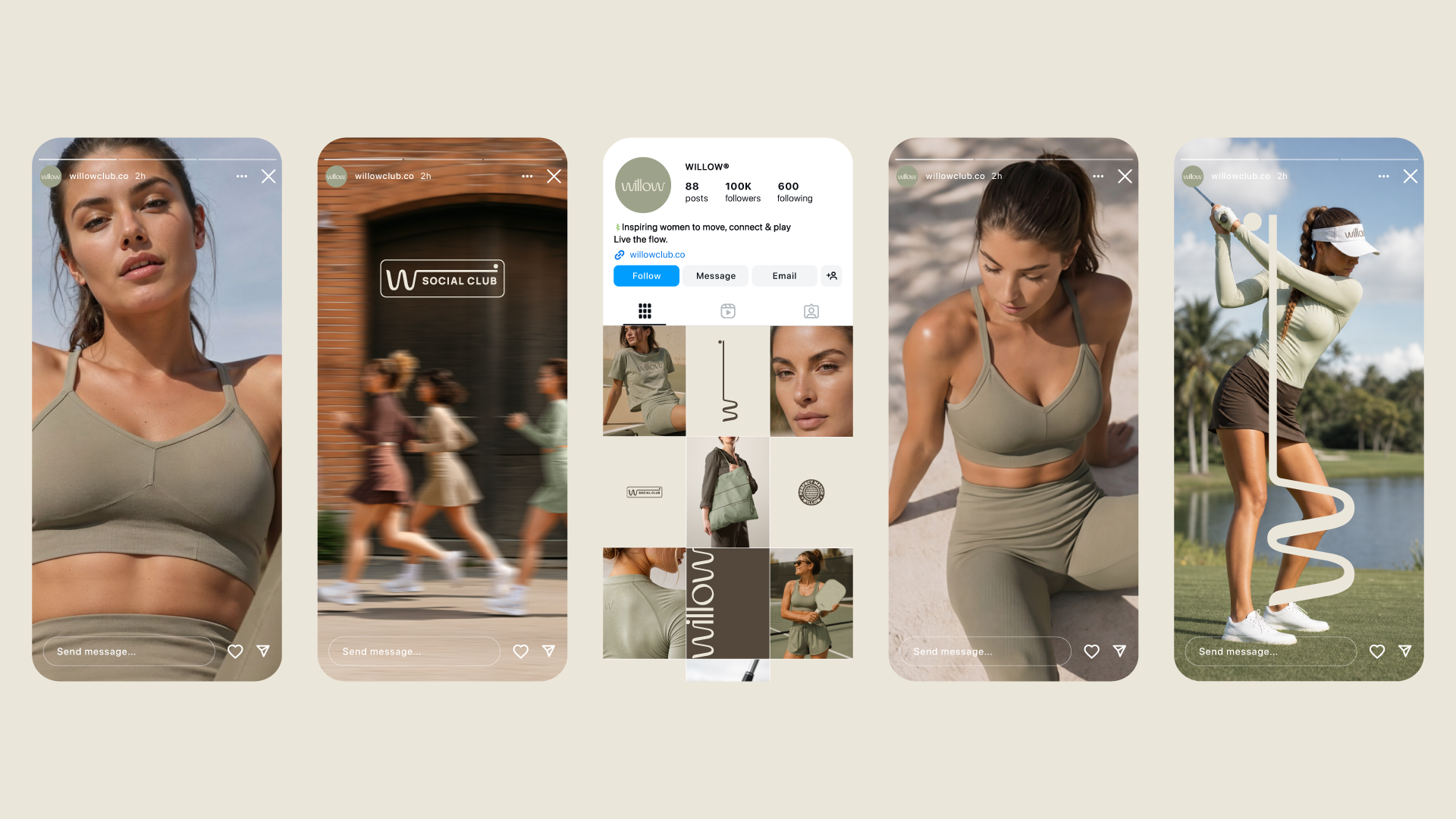
System. The identity was built to travel. It moves across apparel and paddles, tote bags and towels, caps and water bottles, letterpress cards and mailer boxes, a sticker set for the Willow Court Crew, and a social presence — willowclub.co— that invites women to move, connect, and play. Every touchpoint carries the same line, the same calm, the same flow.
The Outcome
Willow no longer looks like activewear. It looks like a lifestyle — one that begins on the court and continues wherever the day leads.
The brand carries itself with the ease of its own name: graceful, grounded, always moving. It belongs beside the category's best, yet sounds like none of them, because it was never selling exertion. It was offering a way to move through the world.
The willow doesn't fight the wind.
It flows with it.