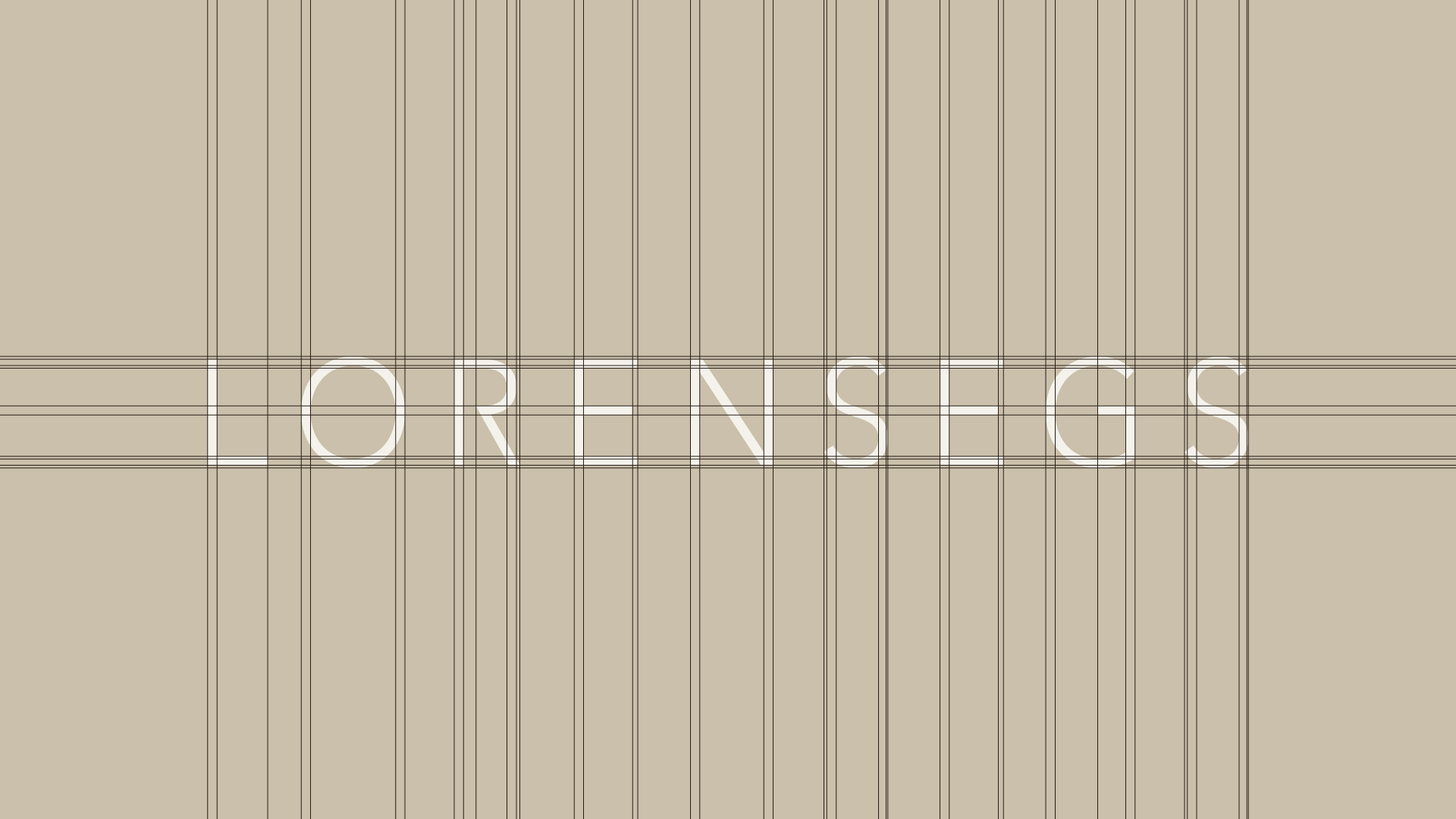
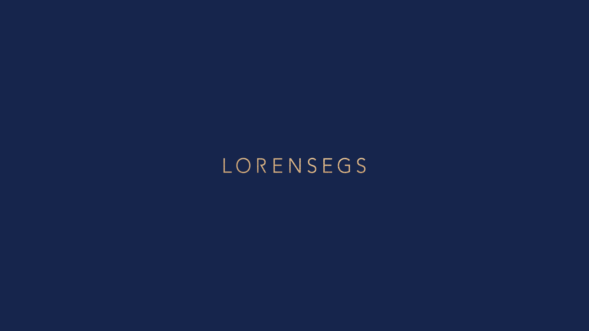
LORENSEGS
BRAND POSITIONING + BRAND DESIGN + LOGO DESIGN + BRAND GUIDELINES
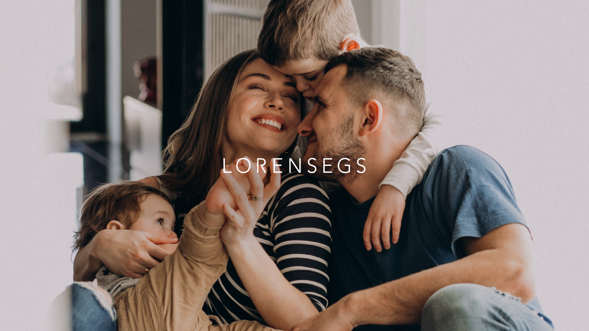
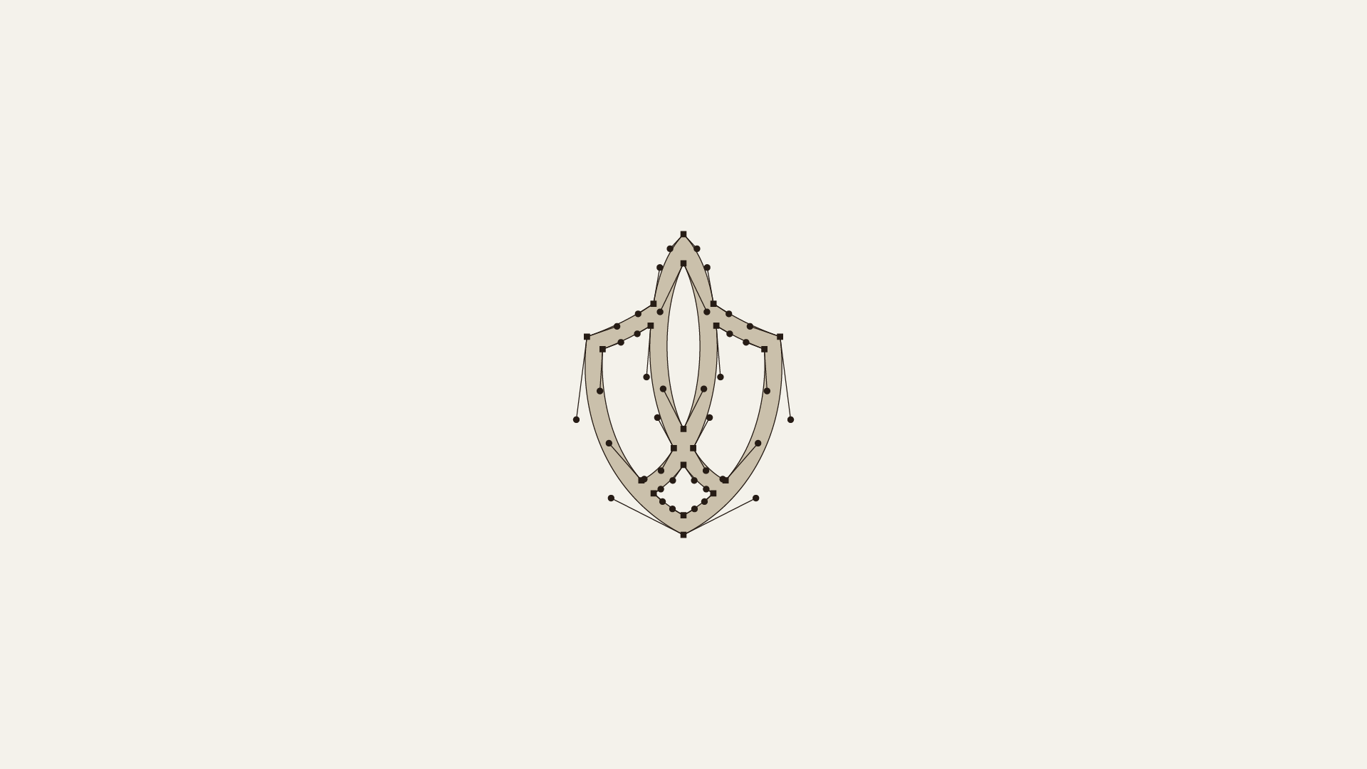
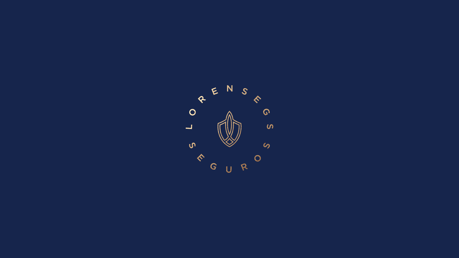
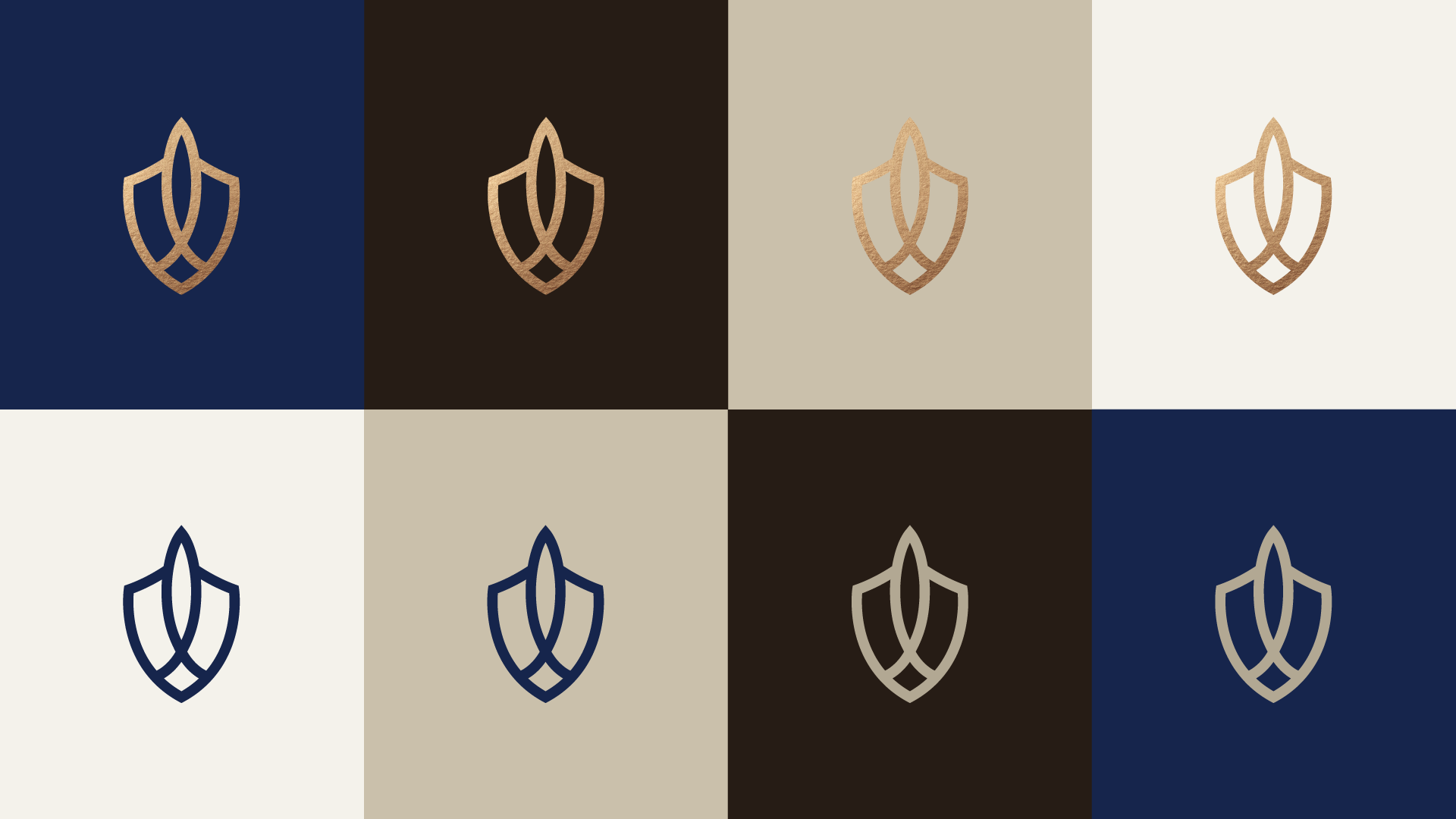
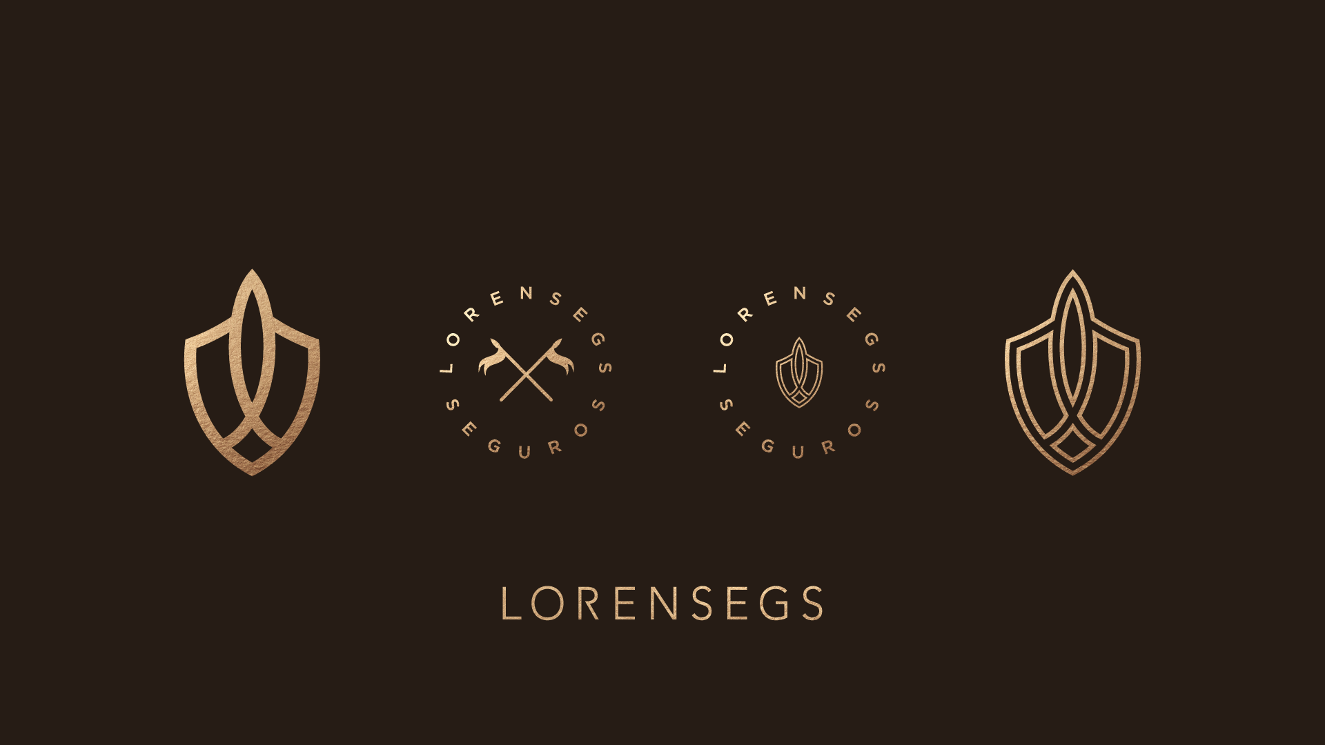
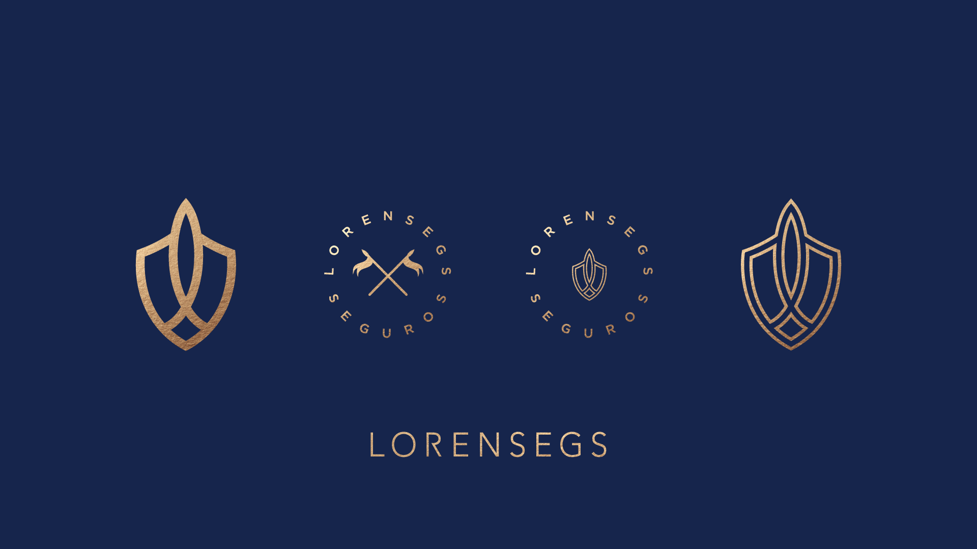
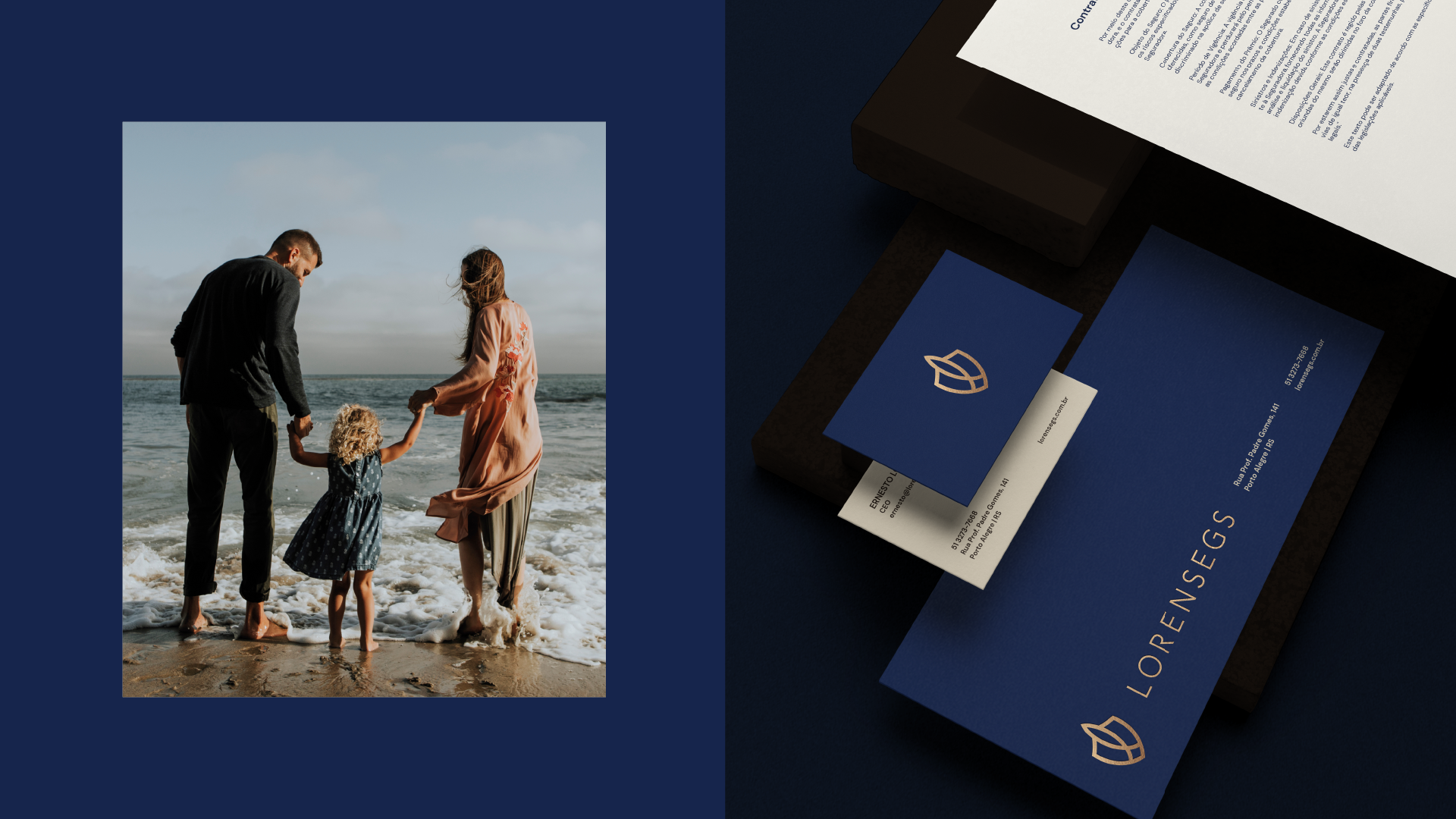
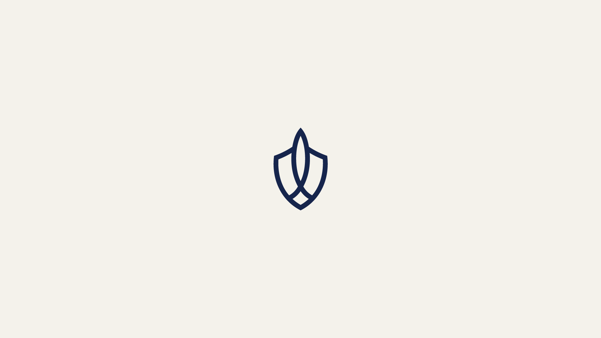
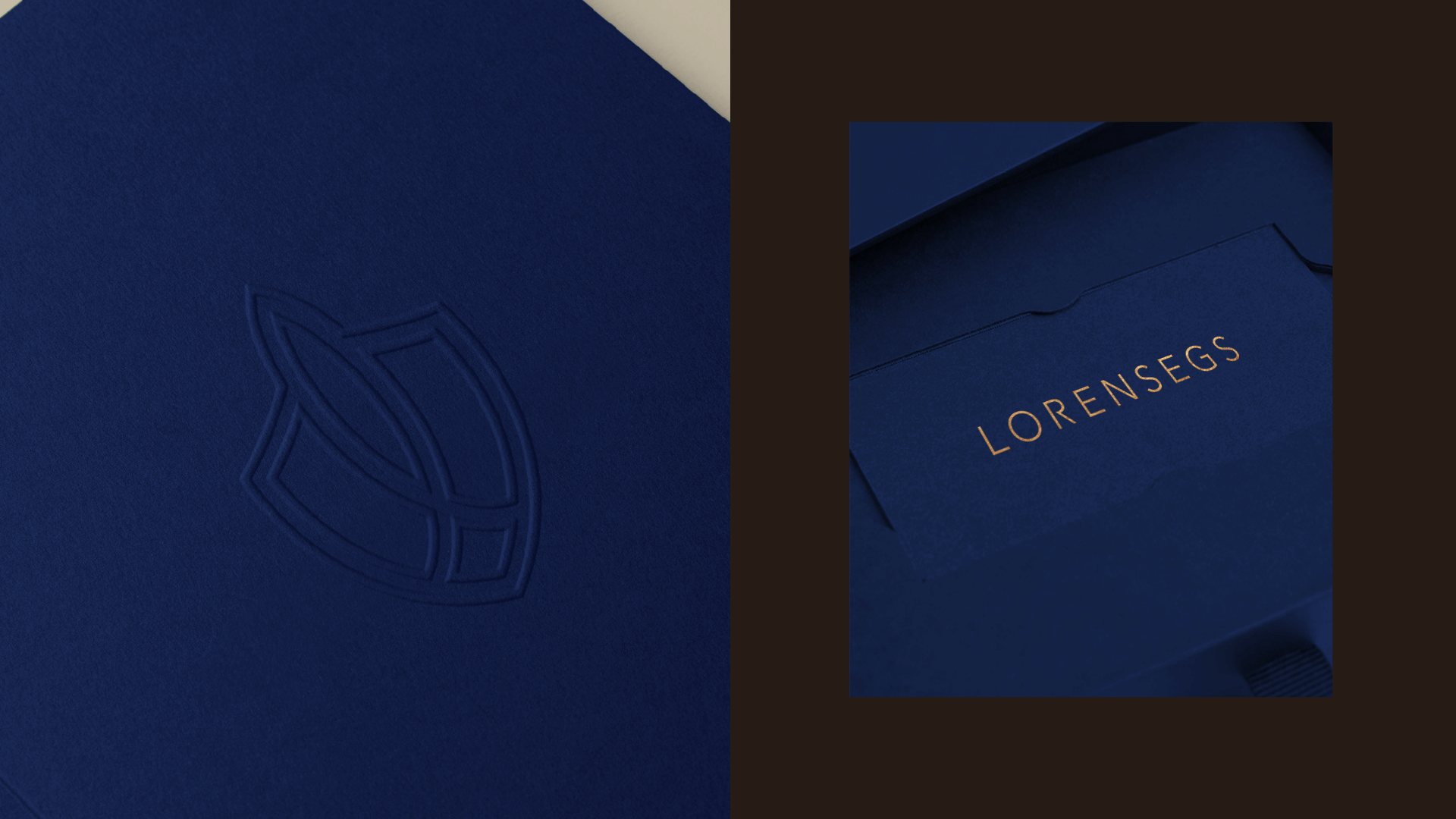
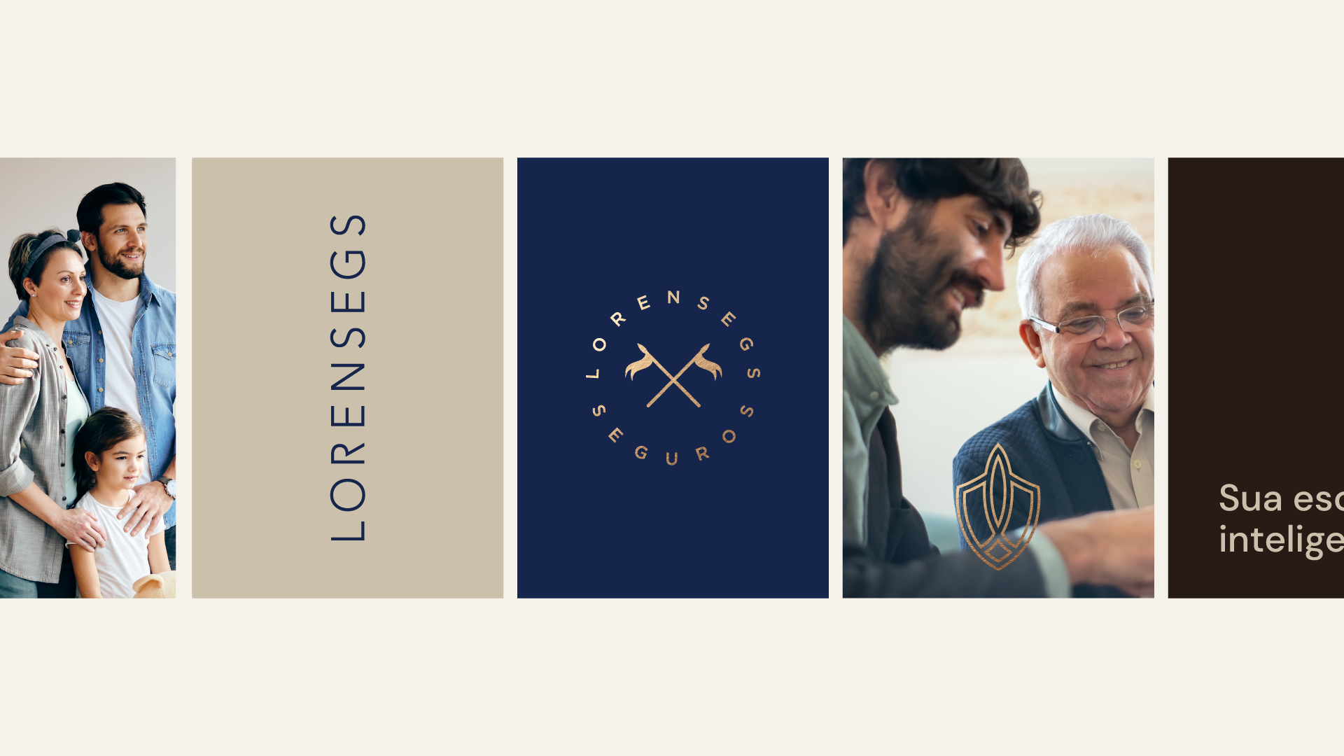
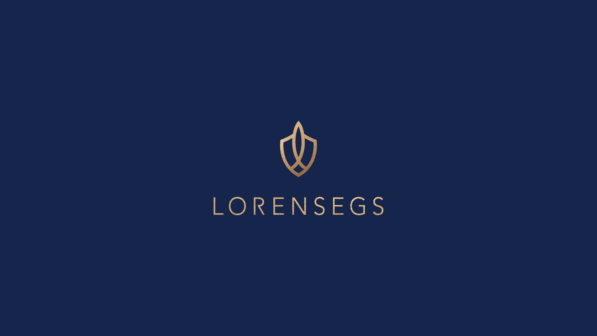
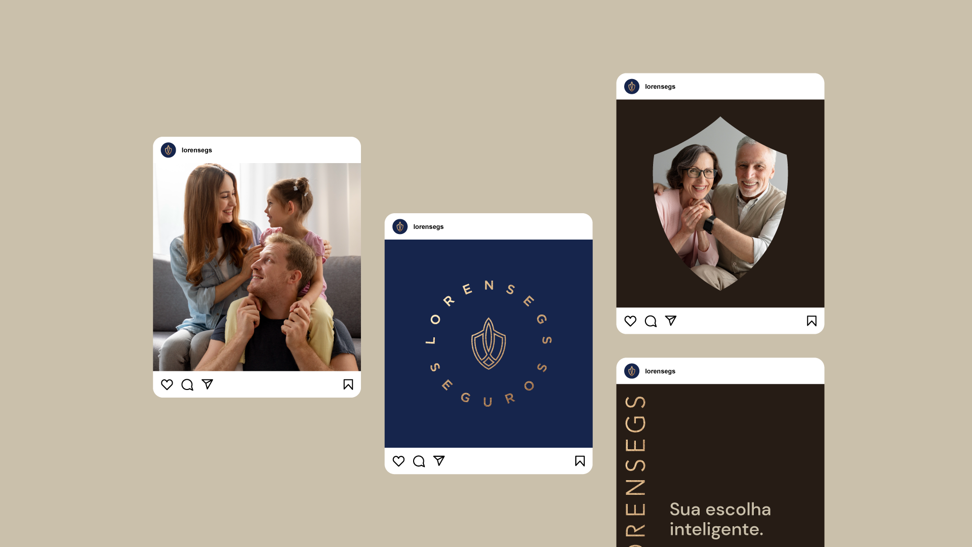
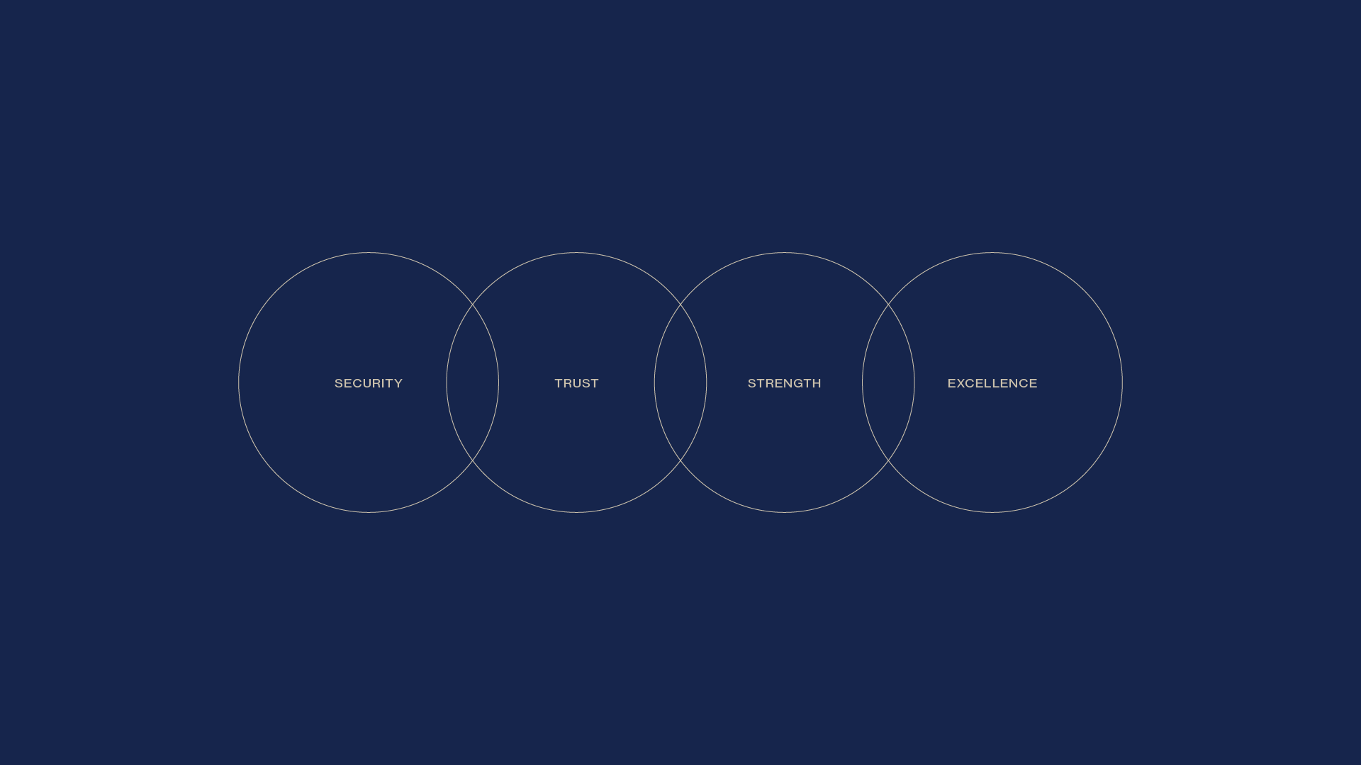
Lorensegs stands tall as a leading insurance company, safeguarding the aspirations and dreams of its clients across Brazil. Rooted in values of security, trust, strength, and excellence, Lorensegs is committed to providing unparalleled protection and peace of mind to its customers. At the heart of Lorensegs' identity lies a powerful symbol: the shield. This emblem embodies the company's unwavering dedication to safeguarding its clients' interests, while the lowercase "L" at its core signifies Lorensegs' commitment to leading the charge in the insurance industry.
Challenges
In navigating the competitive landscape of the insurance sector, Lorensegs faced a myriad of challenges in establishing a distinct and compelling brand identity. Foremost among these challenges was the need to effectively communicate the company's core values of security, trust, strength, and excellence to its target audience. Additionally, Lorensegs sought to differentiate itself from competitors while instilling a sense of reliability and stability in the minds of potential customers. Balancing the elements of authority, professionalism, and approachability posed a nuanced challenge in crafting a brand identity that resonated with clients.
Solution
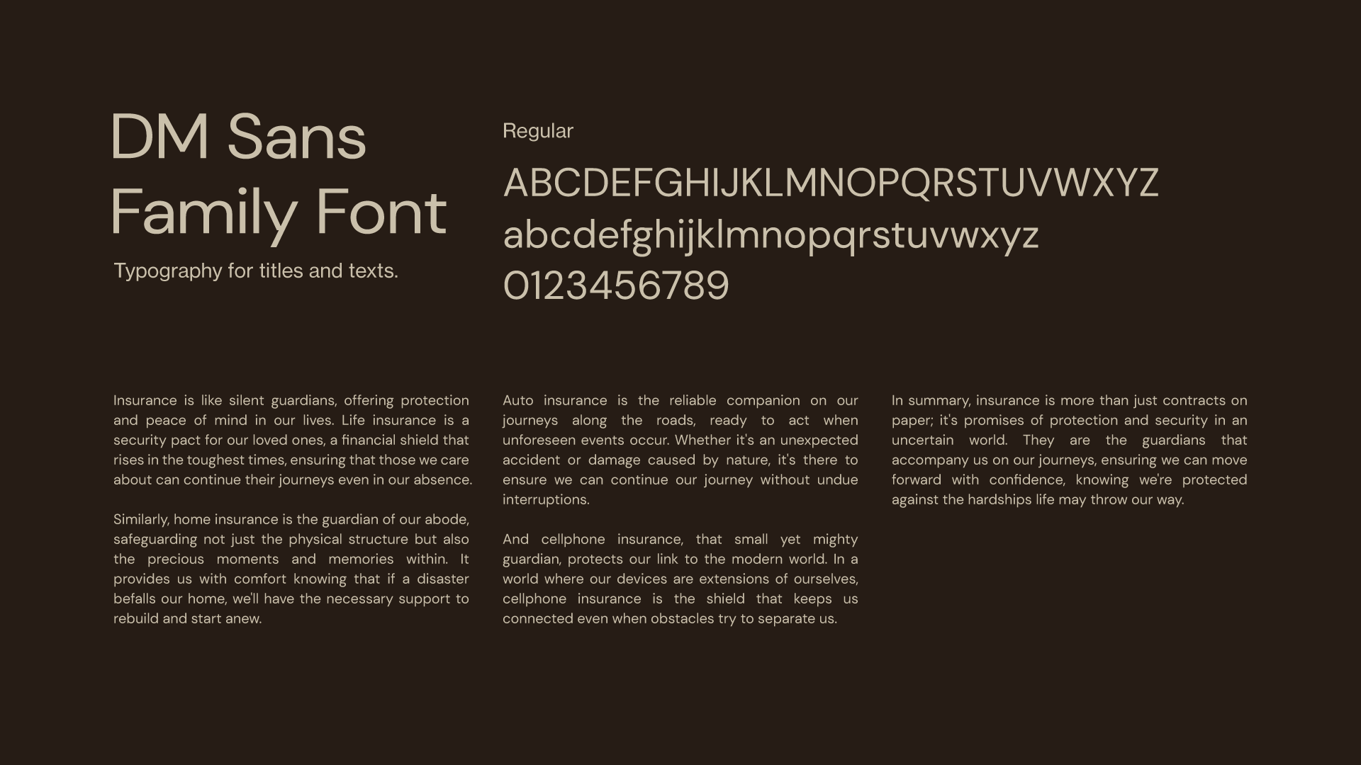
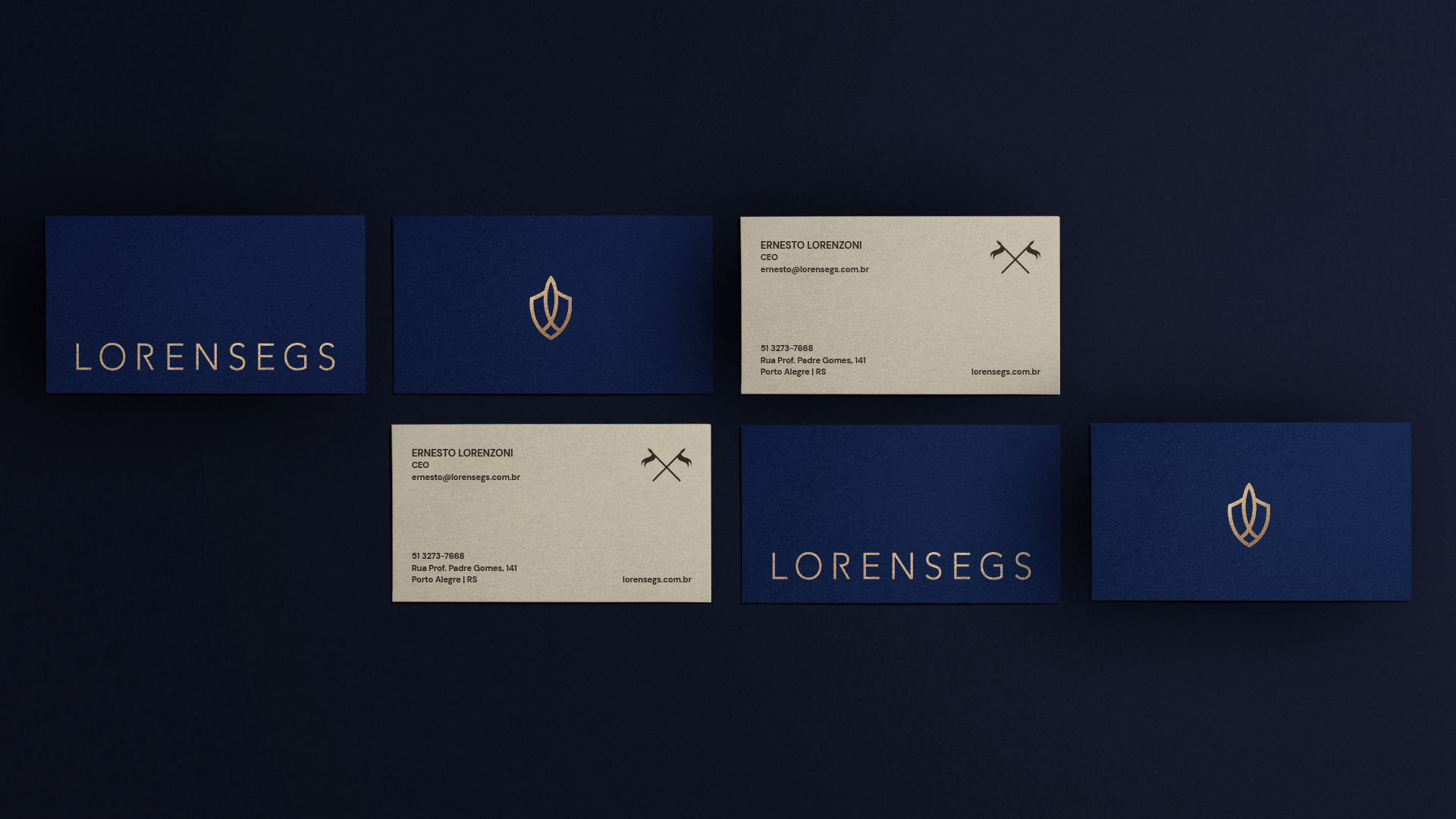
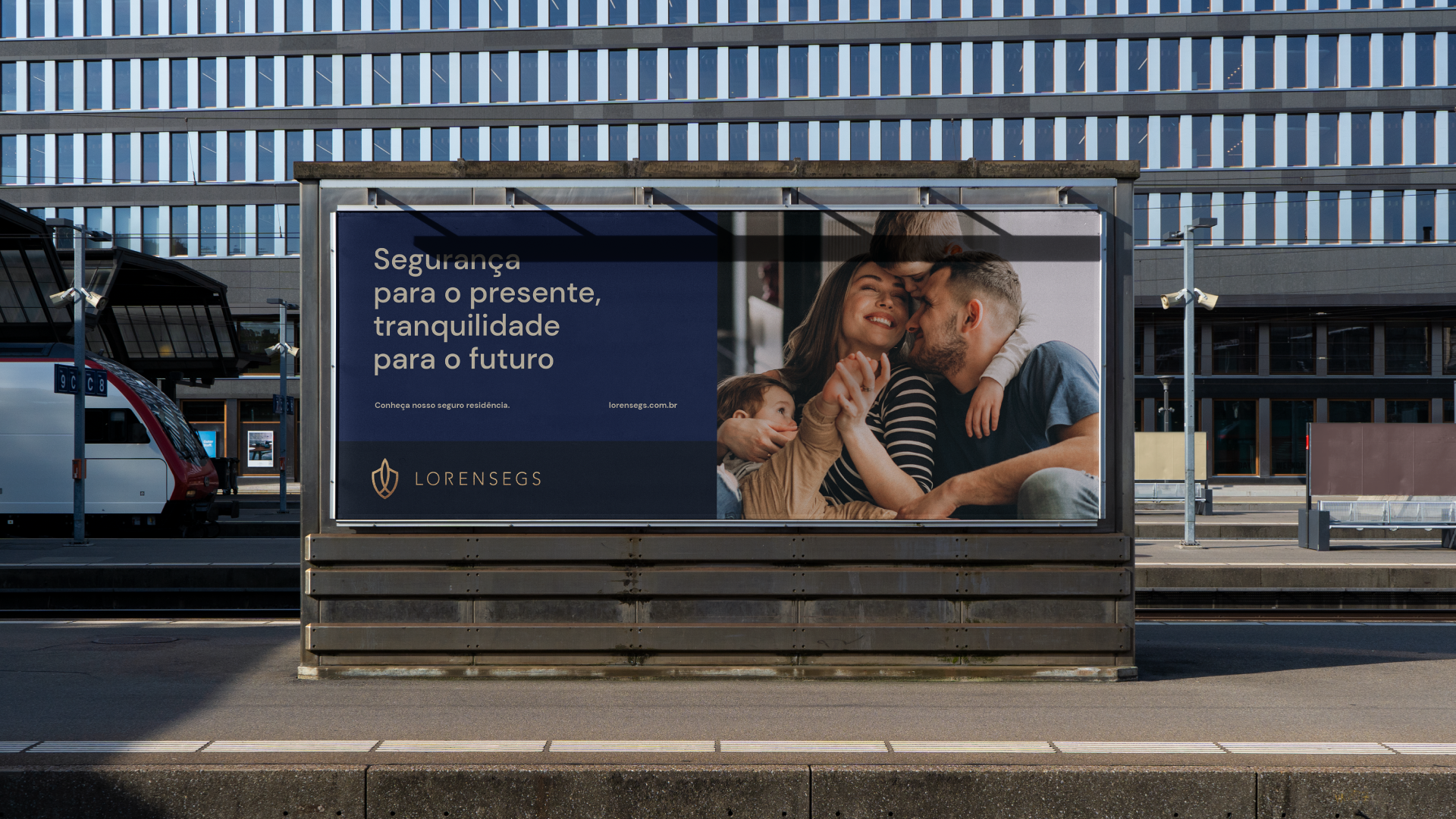
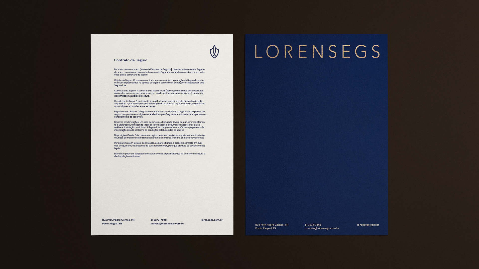
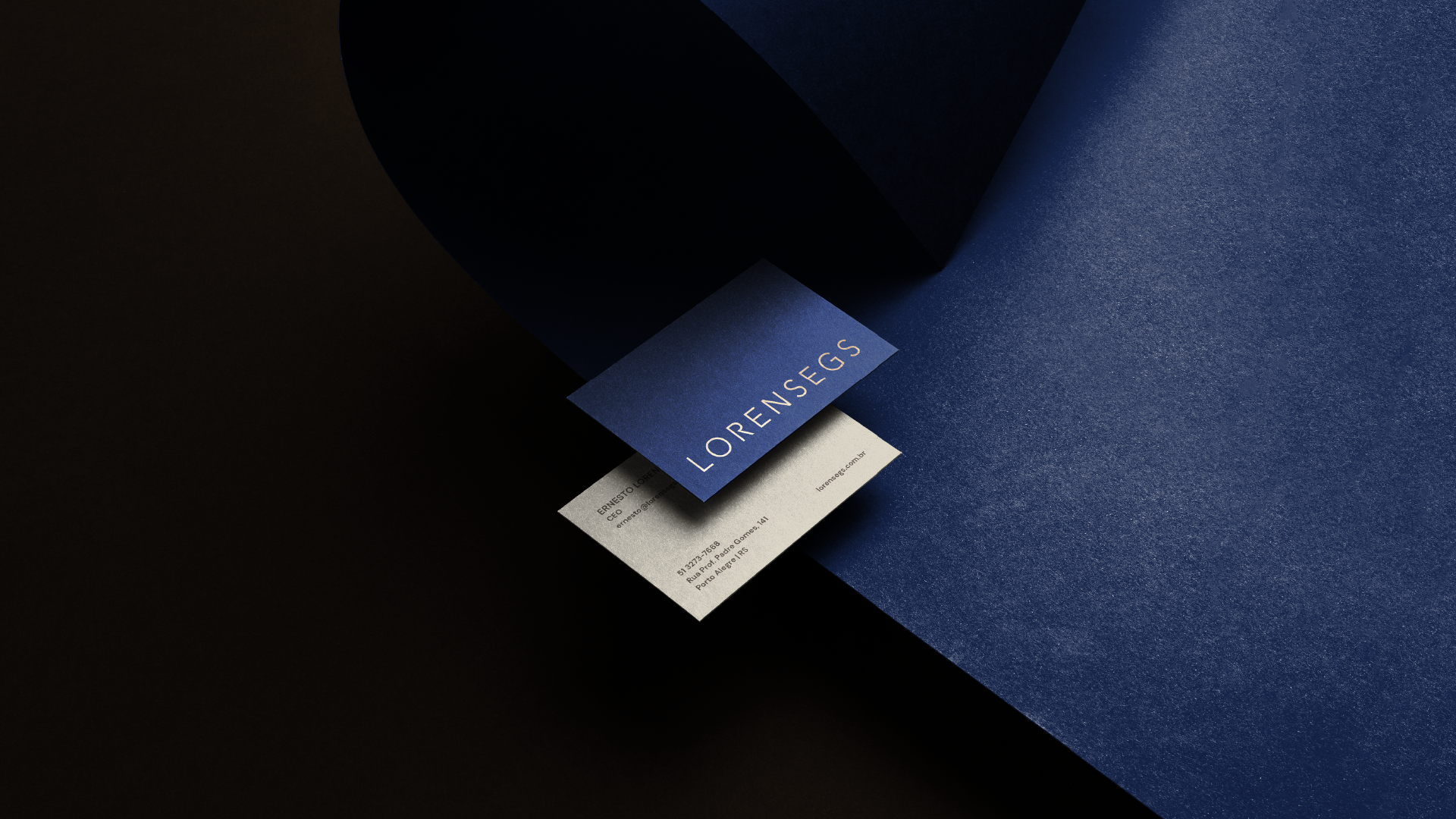
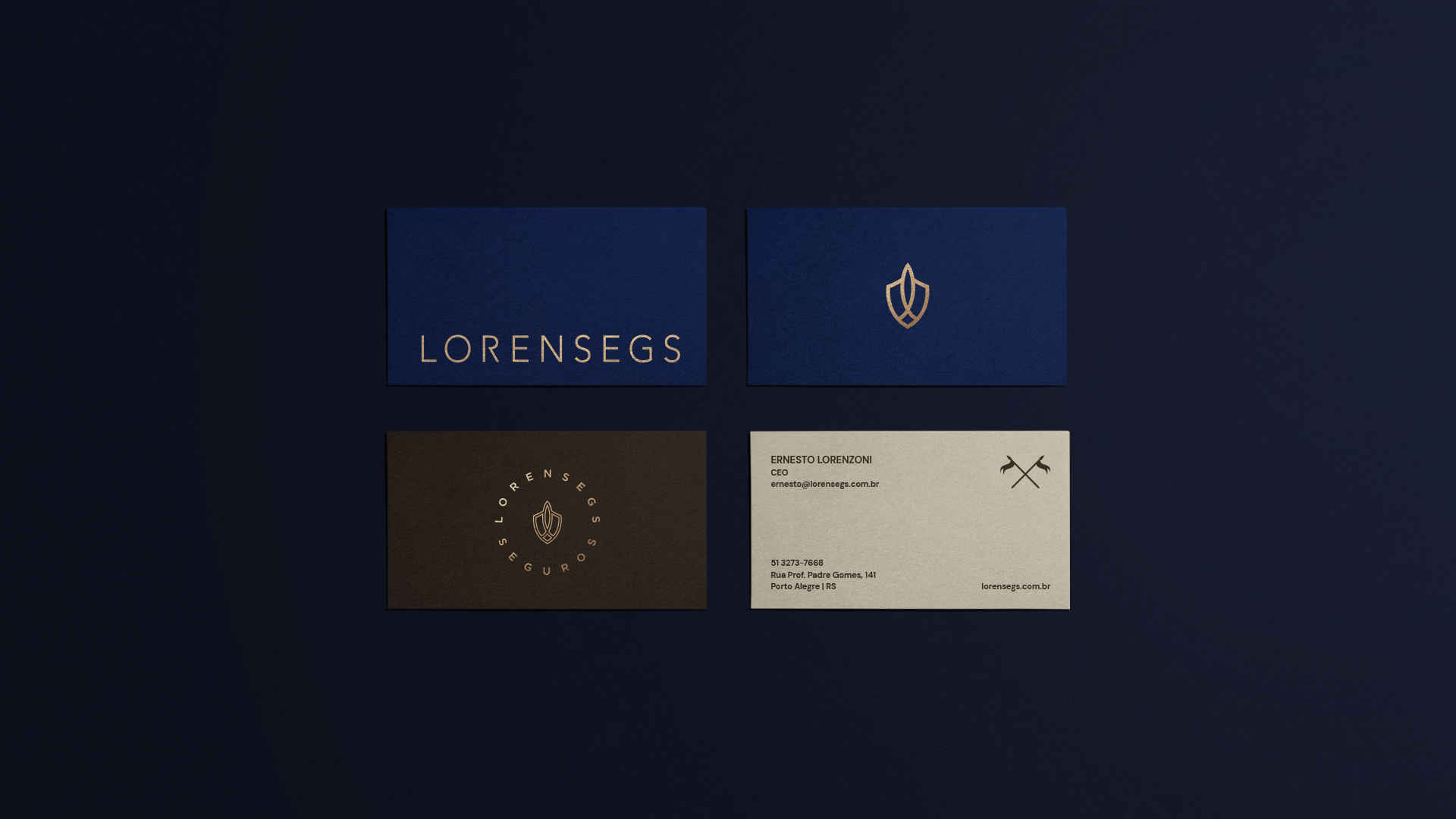
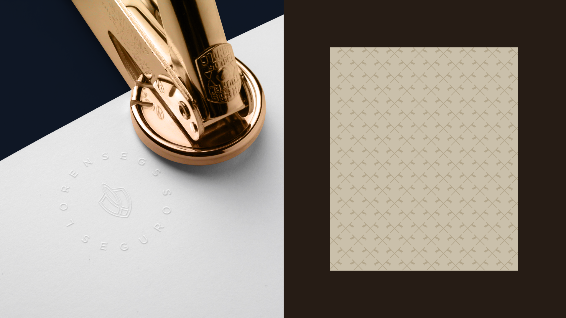
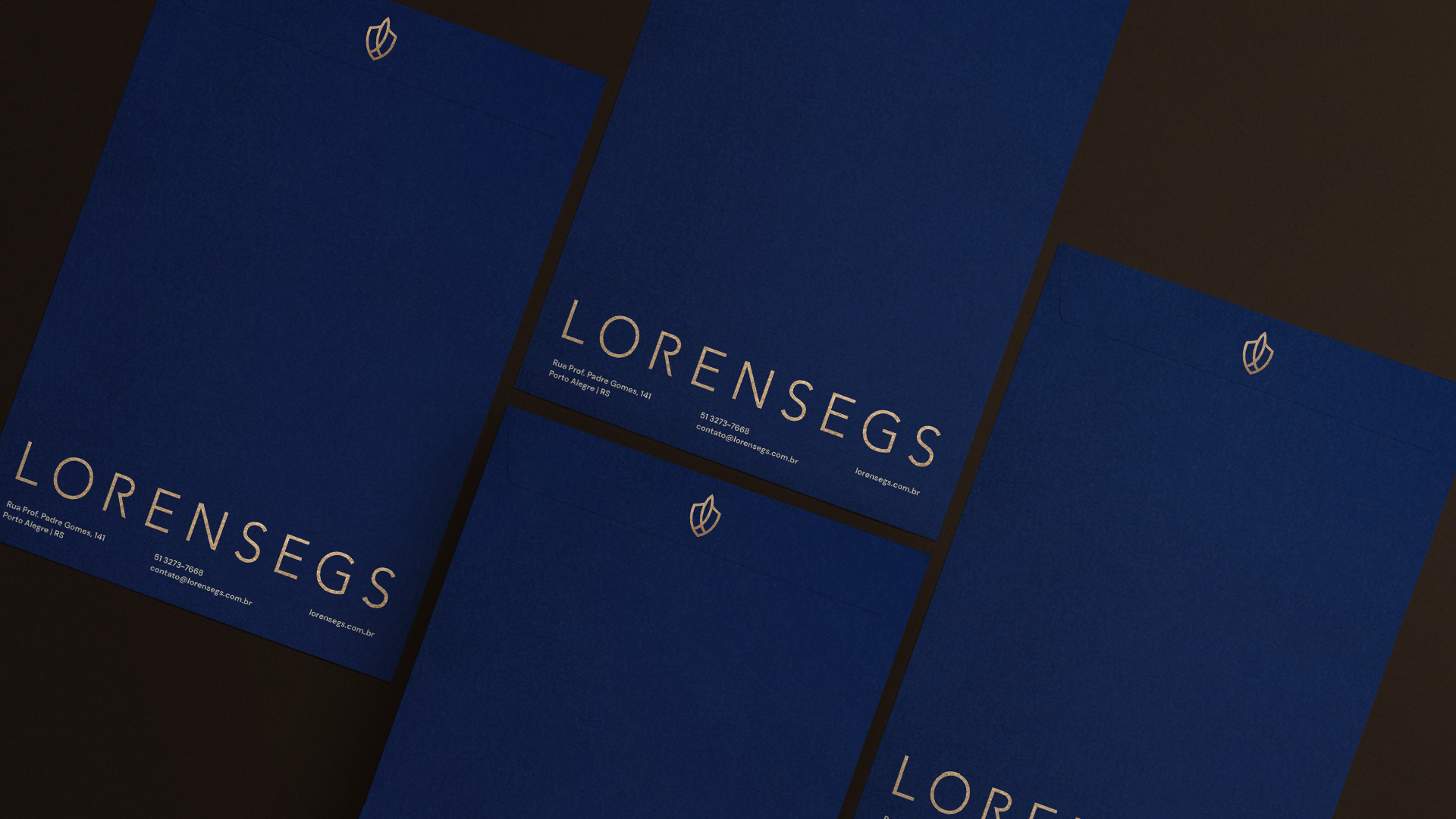
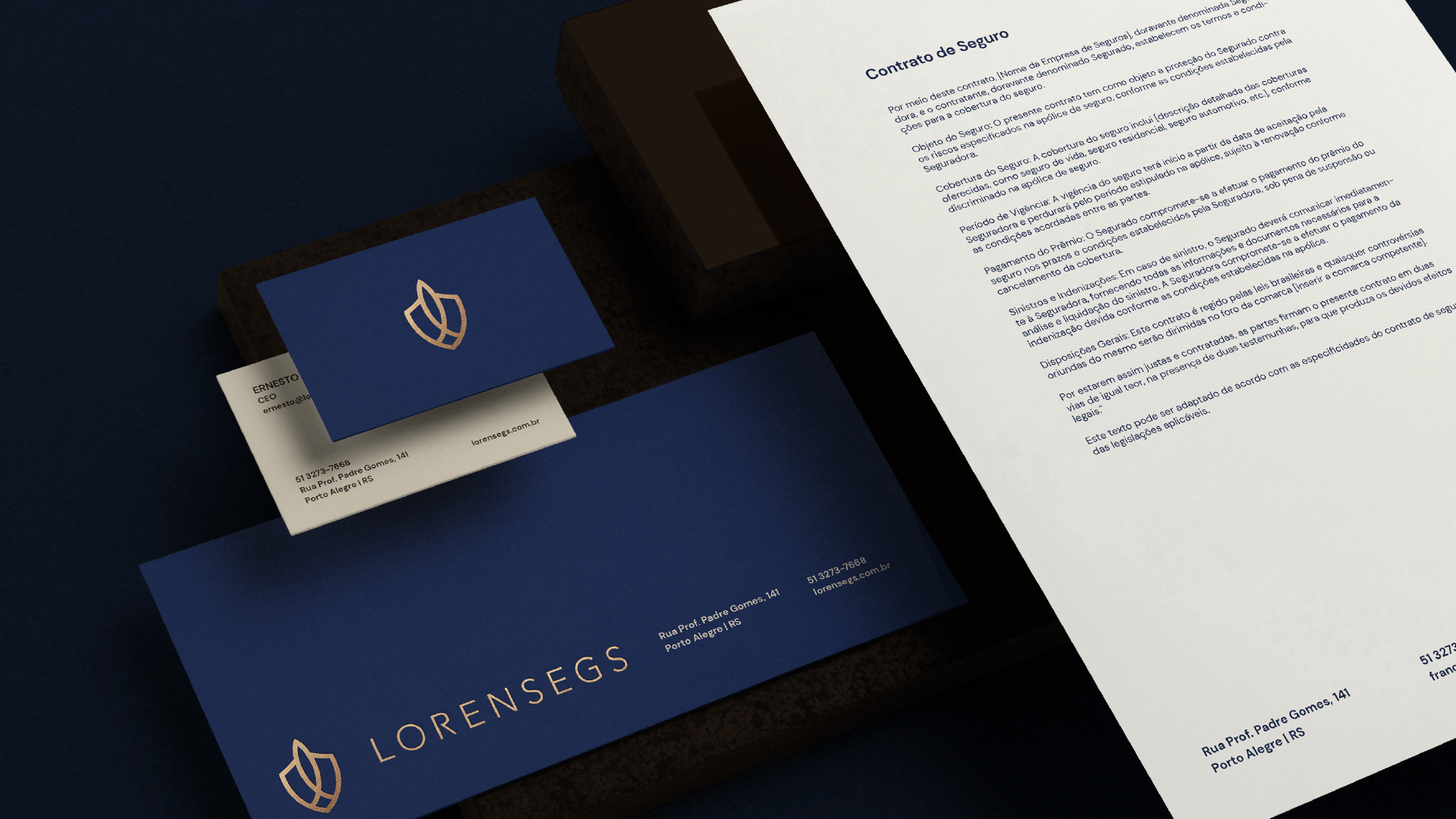
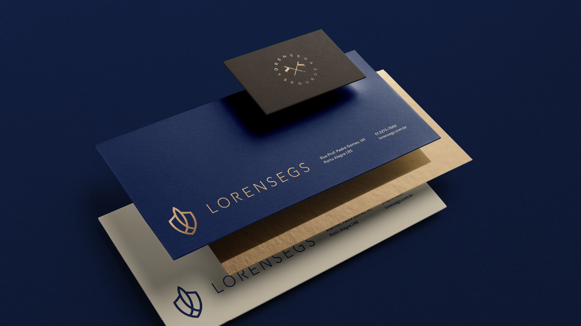
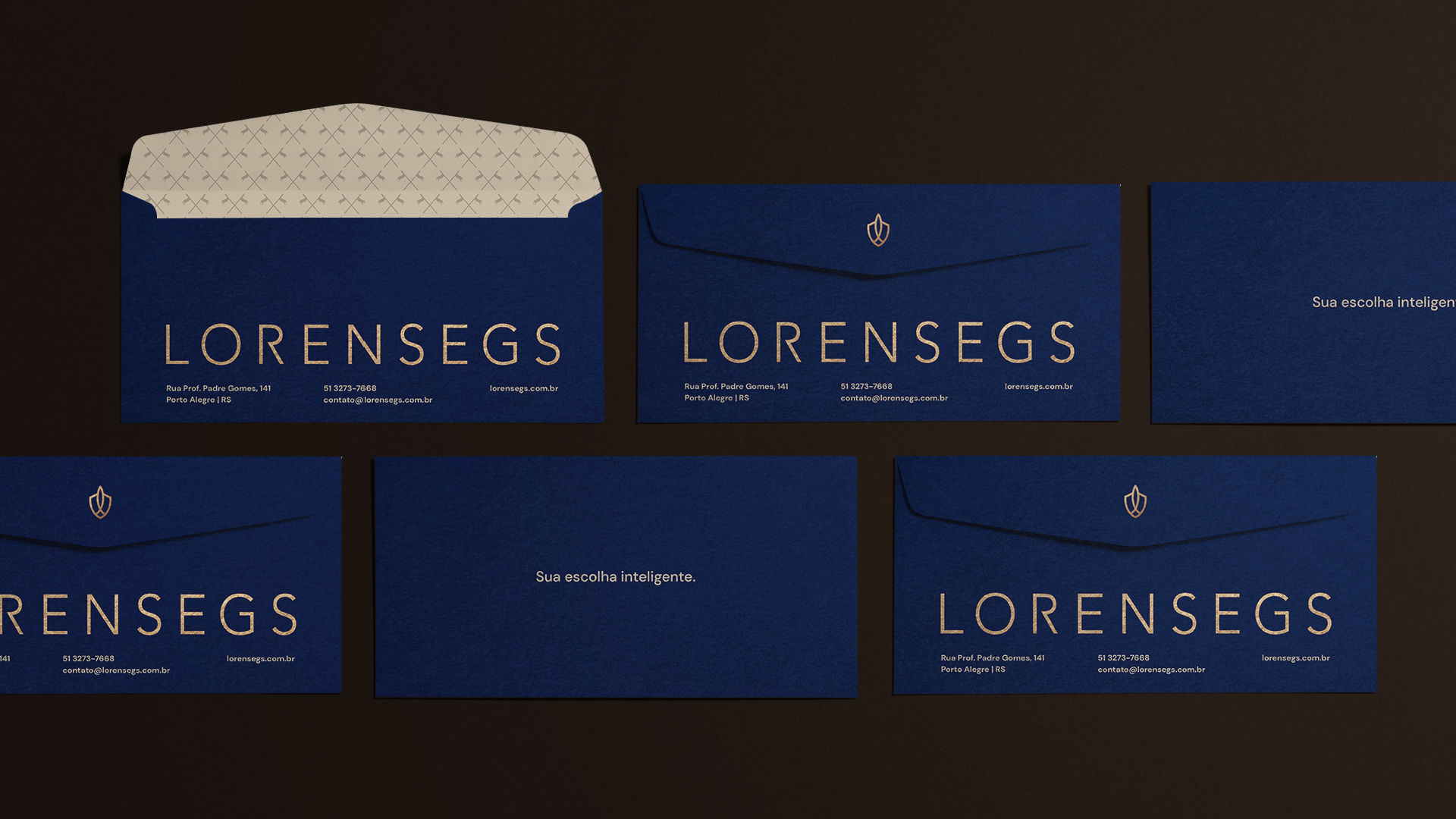
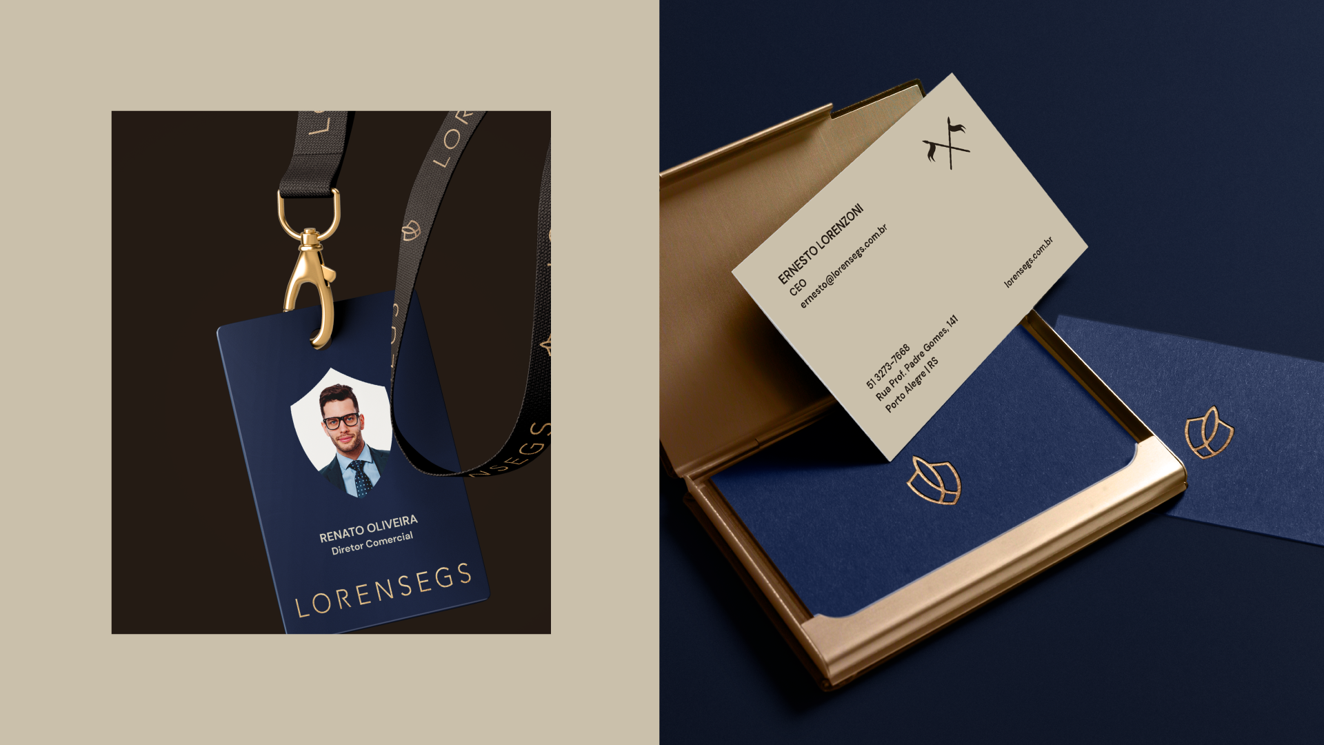
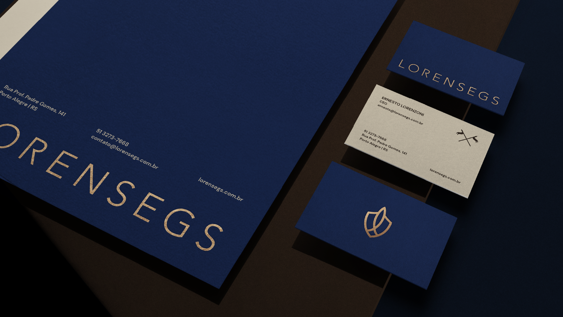
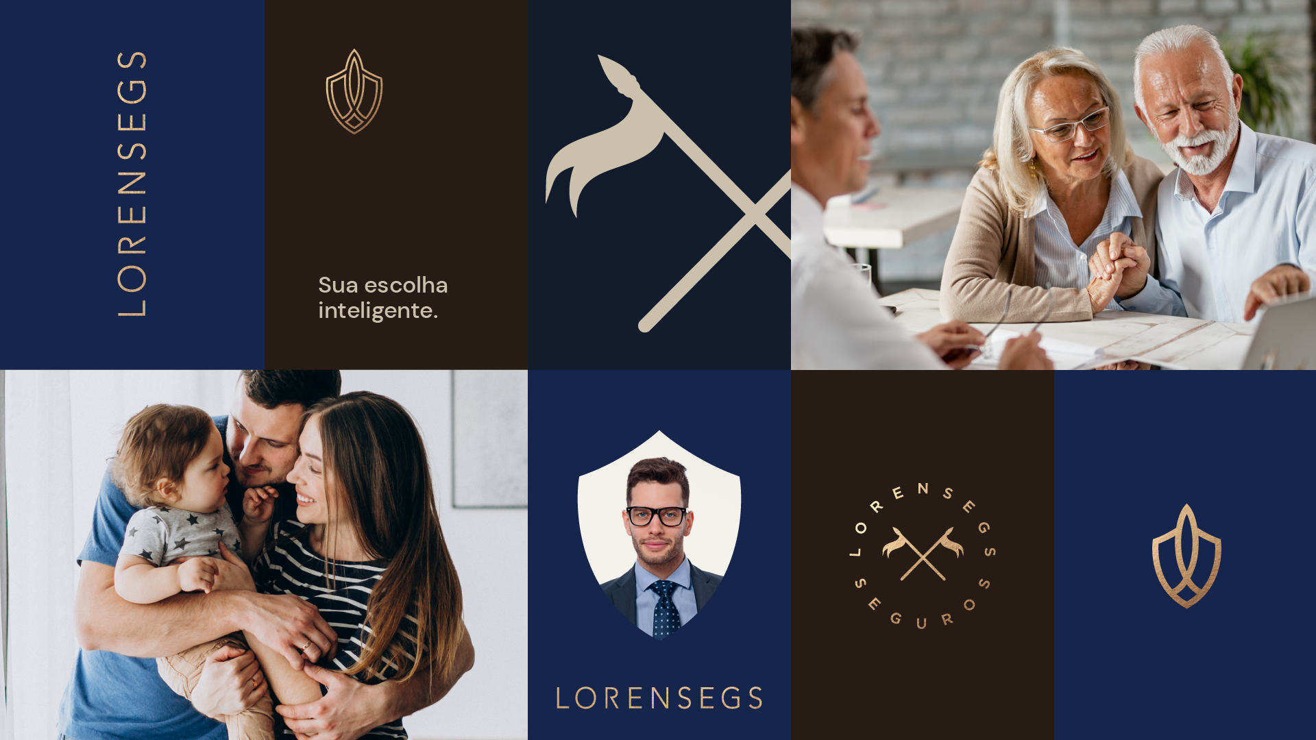
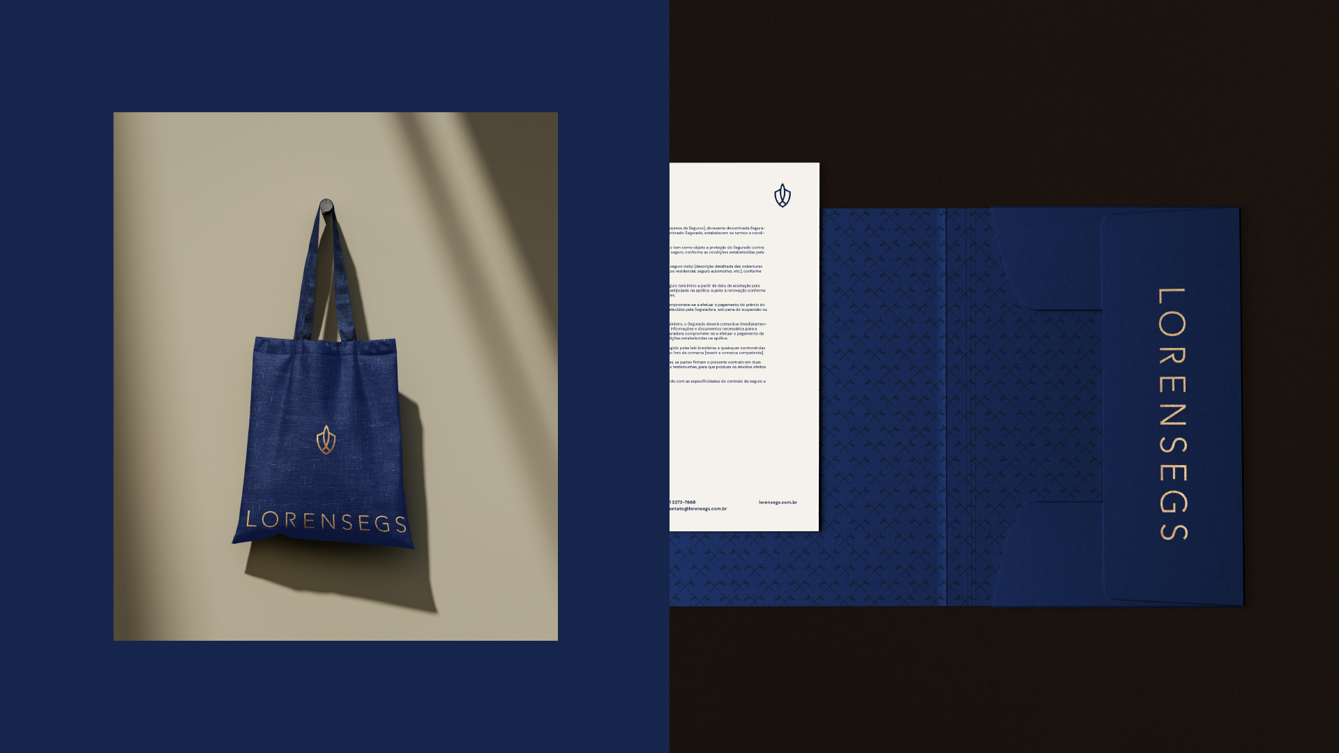
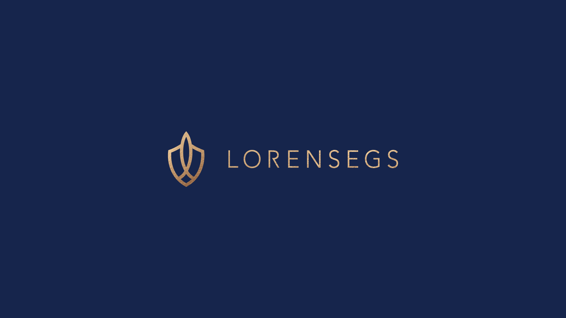
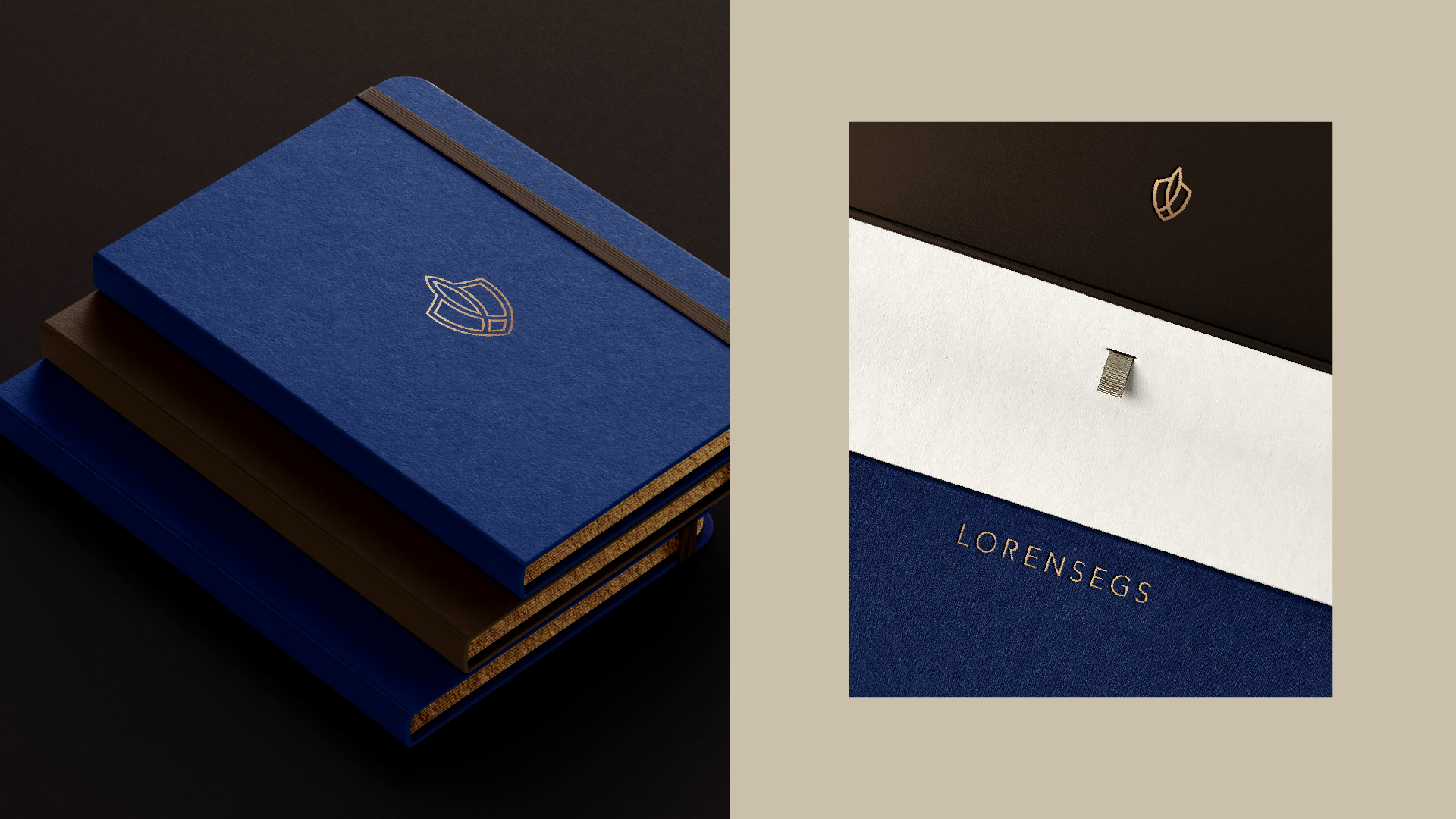
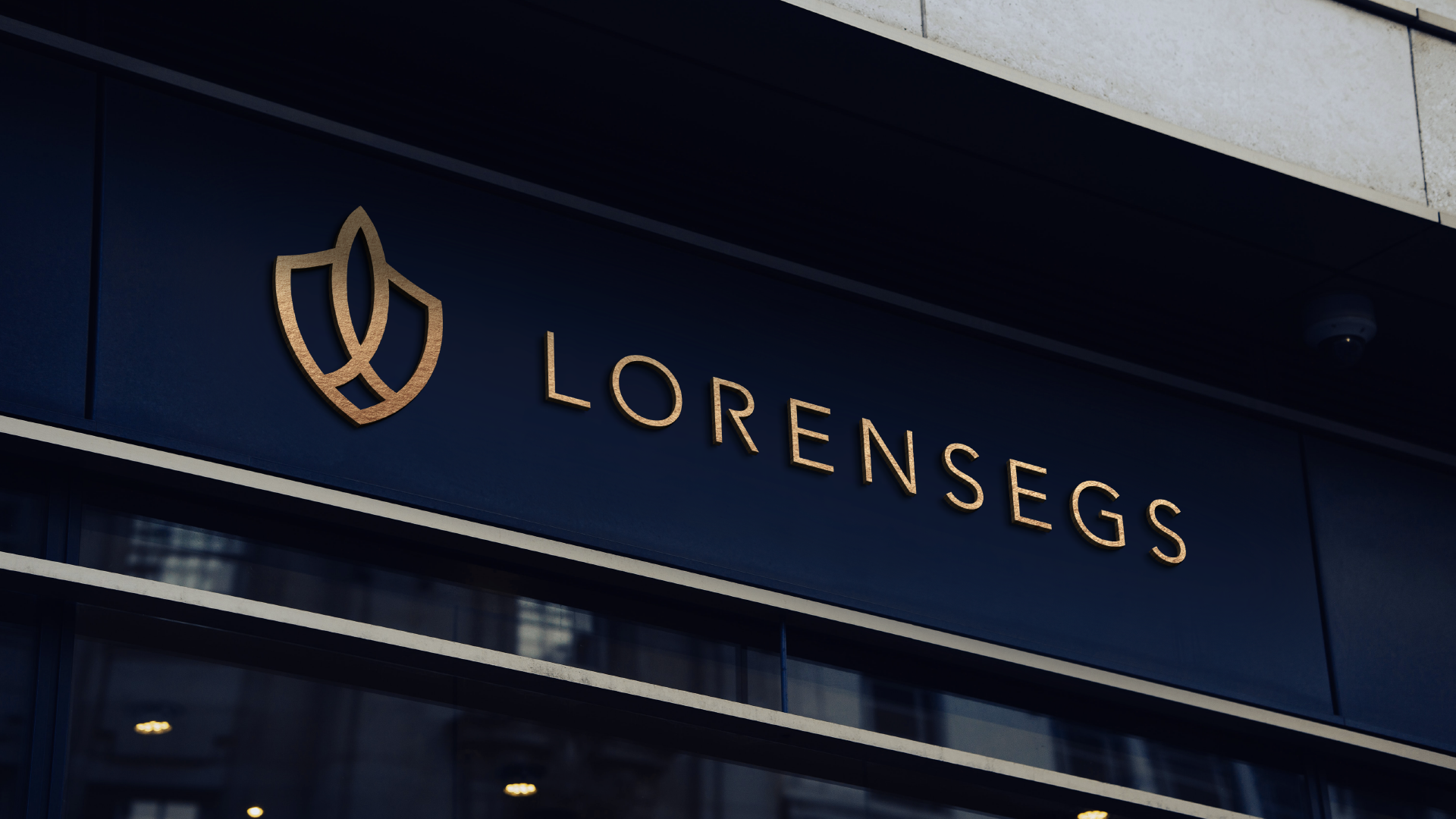
Drawing upon our expertise in branding, we developed a comprehensive solution to address Lorensegs' challenges and elevate its brand presence in the market. Central to our strategy was the creation of a visual identity system rooted in the principles of reliability, stability, and experience. The iconic shield emblem we designed serves as a powerful symbol of protection and security, resonating with Lorensegs' commitment to safeguarding its clients' interests. Complemented by a custom font and a bold, dark blue color palette, the logo exudes authority and professionalism, while the addition of gold accents symbolizes growth and prosperity.
Outcome
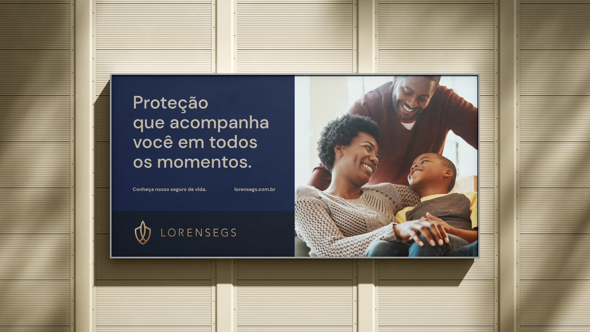
The implementation of our branding solution yielded significant results for Lorensegs, solidifying its position as a trusted leader in the insurance industry. The refined visual identity system effectively communicated Lorensegs' core values of security, trust, strength, and excellence to its target audience, fostering a sense of reliability and stability among customers. The elegant and impactful brand image we crafted helped Lorensegs establish a strong and trustworthy presence in the market, setting the stage for continued growth and success. With the tagline "Lorensegs, Sua escolha inteligente" (Your smart choice), the company confidently embraces its role as the intelligent choice for insurance solutions in Brazil.